Like many actors on stage, digital fonts are born and killed off over and over again. Due to Windows domination on desktop computers, for most people, Arial, designed in 1982 and released as a TrueType font in 1992 is the typical digital font. It was already a mockery of Helvetica, born in 1957.
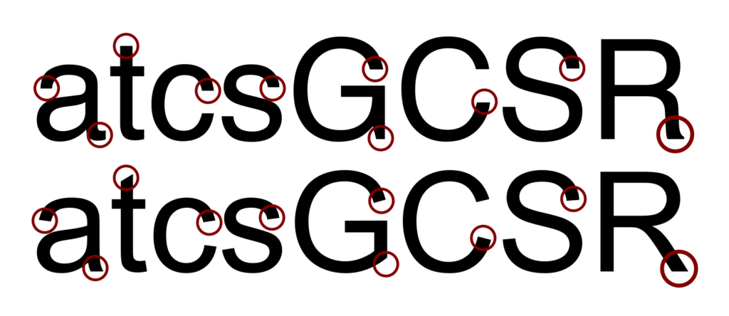
Comparison of the characters /atcsGCSR/ in Helvetica (top) and Arial (bottom) — source: Wikimedia (CC0)
We could envision a strange but sincere recent history of digital type through similar fonts, substitutes, tributes, surrogates etc, but also unexpected successes like Comic Sans, which never disappointed normal people. A popular typeface in a noble sense.
Of course there is also Times New Roman, first born in 1931 for a newspaper but then adapted for office clerks. Once a breakthrough, now an ordinary, bland typeface. How ironic! And then Calibri with its rounded shapes, which once meant the demise of a Pakistani former Prime Minister[1], so popular in fact that Microsoft resorted to organising a contest to supersede it[2].
Enough with the office comedy. Everything got faster with web fonts. Made possible by the @font-face CSS property in 2008, web fonts were boosted by the uprising of Google Fonts, which first appeared in 2010. Five years earlier, Google had bought Android, and in 2007-2008, the Droid fonts (designed by Steve Matesson of Ascender Corporation) were released. Droid fonts would become the foundation of Open Sans and Noto typefaces, major assets of a “new normal” digital font landscape. Since Monotype bought Ascender Corporation in 2010 and since Google owns Android, we can say that these assets form a kind of typographic joint venture between Monotype and Google, which is somehow odd because Monotype and Google do not share the same interest in type.
Monotype was saved from bankruptcy by making Arial for Microsoft, preventing the latter from paying huge royalties for Helvetica, then a Linotype asset. Linotype was eventually acquired by Monotype in 2006, so both Arial and Helvetica are Monotype assets now. But Arial and Helvetica are not the same typeface, Arial seems to be a kind of displacement of Helvetica, sharing mostly the same metrics but borrowing its shape from something much older[3].
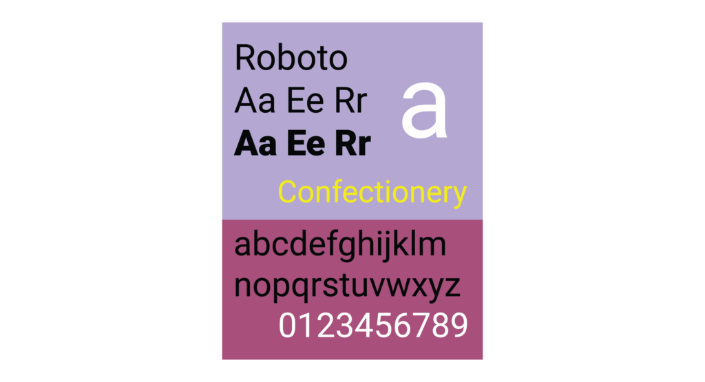
Google on the other end is the gateway to a web and mobile-first digital experience. In that scheme type is only a part of this digital experience. Iconic typefaces are not that important in this new context. The case of Roboto is quite eloquent. First appearing in 2011, it was depicted by type critic and type curator Stephen Coles as a “Frankenfont” borrowing from Helvetica, Univers, Myriad, FF Din among others[4]. The thing is that the type process of Roboto was anything but sacred, it was a work-in-progress and for the next round, in 2014[5], Google developed an improved and more accepted version of Roboto.
Roboto since 2014 (Source: J4lambert, Wikimedia, CC-BY-SA 4.0)
The Google Fonts library is a good vantage point for observing both the comedy and the tragedy of digital fonts as they are today.
Noto and Roboto are leading actors, born into digital-first rôles, after Helvetica, after Frutiger, after any sort of classic idea of authority even if they were actually designed by professional and experienced type designers.
Noto: a typeface to rule them all? (source: Faelis / Creative Commons, CC-BY-SA 4.0)
Noto as used in the recent rebranding of Pfizer – quite a significant and impactful company in our times, to say the least – is a good example of how the value of type is perceived and who eventually received all the kudos. I quote the Pfizer website[6]:
A clean, open typeface for a global future
Noto Sans is a font designed for tomorrow. Developed by Google to internationalize the internet, it is philosophically and aesthetically aligned with the new Pfizer.
Contemporary
Sleek and practical, minimal and inviting, Noto Sans asserts itself only when asked to.
Global
The font family accommodates more than 800 languages across the globe — a necessity in our line of work. Noto fonts are intended to be visually harmonious across multiple languages, with compatible heights and stroke thicknesses.
Modern
Accessible, inclusive, and free. The future will be written in Noto Sans.
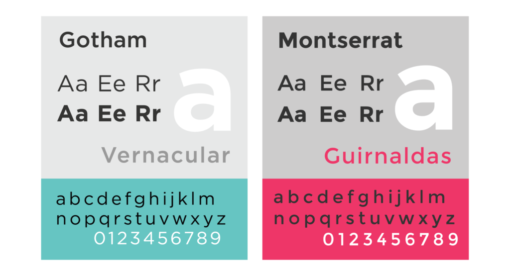
Montserrat is also an informative case. From a practical point of view it is an efficient and sufficient substitute for Gotham. Despite its popularity Gotham mostly missed the webfont explosion because of licensing hassle, and the Hoefler&Co pricing strategy for the web[7]. So Montserrat came up and filled that void. However, it seems that Hoefler&Co made some link-building using the Montserrat name to attract customers.
Proof is this link: https://www.typography.com/fonts/gotham/styles/Montserrat:a
If Montserrat is a substitute for Gotham, then Gotham is also a substitute for Montserrat. Anyway, now it is probably too late, I am afraid, Gotham is a Monotype asset, superseded on the web like many Monotype iconic assets are now.
Gotham and Montserrat side by side — source: Wikimedia
Like a deus ex machina, the NFTYPE initiative started to sell Helvetica collectibles (numbers in this case) as NFTs — https://nftype.art.
What are NFT’s? They are basically property certificates delivered by a notary who would intervene far beyond real estate, in art for instance and who would also do auction sales but online and encrypted — and he/she would be in fact a machine. “From a technical standpoint, NFTs are made up of blocks of information that contain metadata (author, signatures, dates, type, etc.) that are attached to a tangible or virtual item of value.” [8]
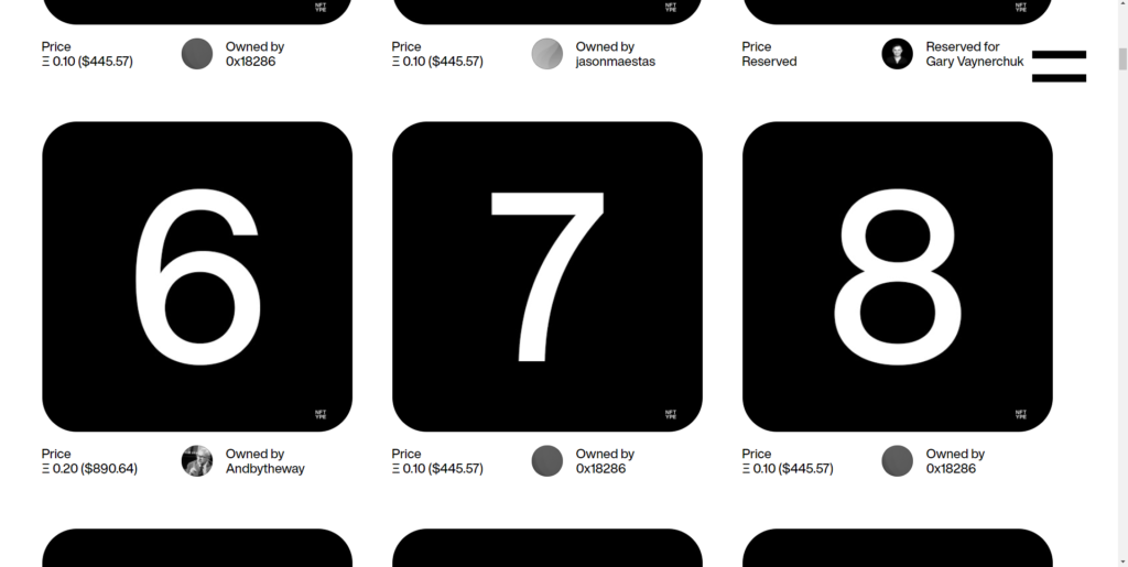
We could interview the artist NFTXYZ behind NFTYPE. This is a collective influenced by Massimo Vignelli. Very observant of the modernist tradition, NFTXYZ wanted to “make something that lasts”, a sustainable digital landmark. Considering that the use of art is type, NFTXYZ sells artwork based on Helvetica as NFTs. Thus it could be “online forever”.
Like a play, the entrance is important but also the exit.
The entrance first. Sometimes typefaces seem to be too late in the party. It is the case for Georama (once known as Panorama) by Production Type. It is variable in width and weight, it has proper italics, small caps but its release on Google Fonts seemed quite unnoticed.
About the exit now. Erik Spiekermann was quite clever to himself design the digital successor to FF Meta with Fira. IBM organized their exit from the costly licensing scheme of Helvetica with Plex. And both Fira and Plex are beautiful and heavily used type systems today.
Once digital, type is now mostly theatrical, with variable fonts they are more than ever animated, they are bound to either shout or to aptly talk and whisper. Indie foundries are probably best suited to make move and shine the “coat of many colors” that type is now, both light and warm, practical, discrete or chatty, exuberant or sober.
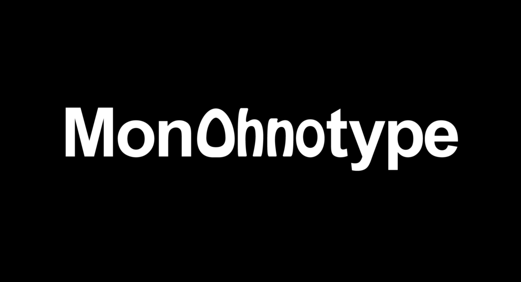
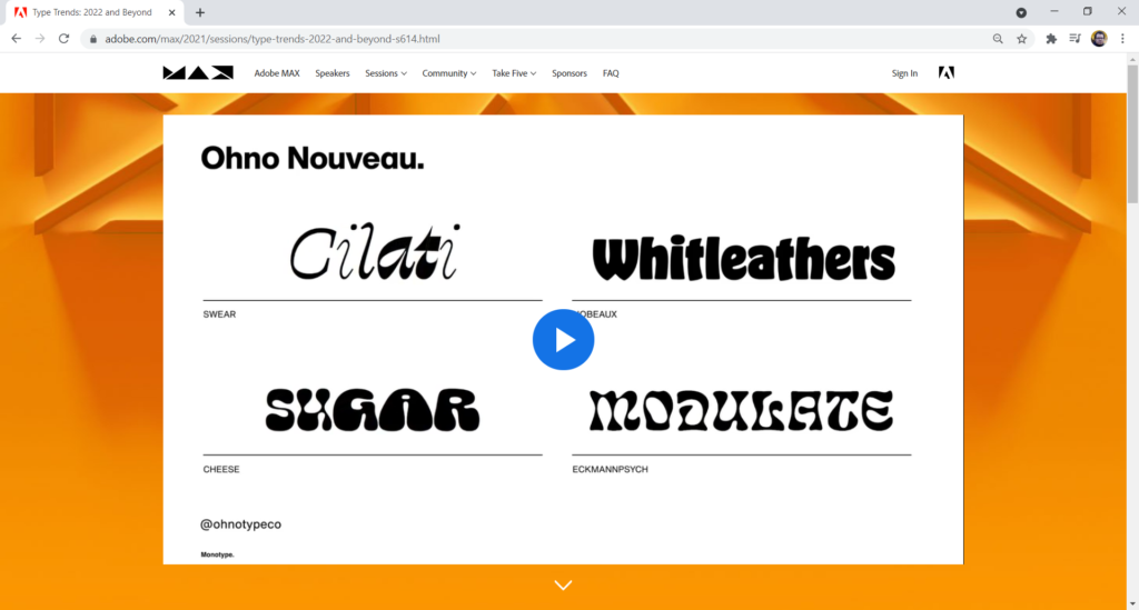
At Adobe Max 2021, Monotype in its keynote[9] advertised the vista and aesthetics of OhnoType, an indie type foundry. They called it “Ohno Nouveau”. It is obviously well deserved but it is quite weird at the same time. Why does Monotype so promote an unrelated (to our knowledge) indie foundry? Is there something happening backstage? From Monotype, it could be more heartfelt by the people who made the lecture, especially Phil Garnham, than strategized behind-the-scenes on a more decisive level. It feels both sincere and odd. From OhnoType, I would not assume firmly that this kind of advertisement was actively wanted or even hoped for. It is just that the very difference between Monotype and OhnoType makes this crossover especially unexpected.
Anyway, the show must go on after all, probably without any MonOhnoType in sight for now.
However, this case illustrates a deeper practice by Monotype of using and not always quoting works from indie foundries to illustrate its Type Trends reports[10]. In a way, it could look like an admission of weakness, saying something like “hey, we do not have this creativity in our midst but we can talk to you about other organizations who do”.
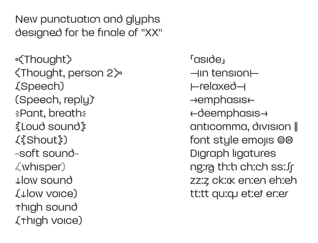
There will always be time and place for new venues of type. For instance, this great project by type designer and illustrator Rian Hughes for his book XX. What’s more theatrical than these strange and funny punctuation marks? A sound initiative, so to say.
Source: Courtesy of Rian Hugues (all rights reserved)
That’s all folks!
Frank Adebiaye
References
1. https://www.bbc.com/news/blogs-trending-40571708
2. https://www.microsoft.com/en-us/microsoft-365/blog/2021/04/28/beyond-calibri-finding-microsofts-next-default-font/
3. https://www.paulshawletterdesign.com/2011/09/blue-pencil-no-18%E2%80%94some-history-about-arial/
4. https://typographica.org/on-typography/roboto-typeface-is-a-four-headed-frankenstein/
5. https://developers.googleblog.com/2014/07/the-new-roboto.html
6. https://www.pfizer.com/our-visual-identity
7. https://www.typography.com/fonts/gotham/styles/screensmart
8. Anthony Masure, Guillaume Helleu, « Making the Multiple Singular: Artistic NFTs, Speculation and Redistribution », Multitudes, no 85, November 2021 (to be published). Translated from French by Aviva Cashmira Kakar, https://www.anthonymasure.com/en/articles/2021-11-singulariser-multiple-nft-artistiques
9. https://www.adobe.com/max/2021/sessions/type-trends-2022-and-beyond-s614.html
10. https://www.monotype.com/fr/node/4236
About Frank Adebiaye
A Chartered Accountant, Frank Adebiaye (Paris, France) is also a document designer and type designer. He founded the open source type foundry Velvetyne Type Foundry in 2010. He has written or co-written numerous articles on typography and graphic design as well as several books including François Boltana & la naissance de la typographique numérique (Atelier Perrousseaux, 2011), Fontes Libres (Floss Manuals/Organisation Internationale de la Francophonie, 2011) or La Commande de design graphique (CNAP, 2014). His typographic and writing work has been the subject of exhibitions (Casco gallery, Utrecht, latent stare*, 2012 ; Une Saison Graphique, Le Havre, 2014 ; LIFEWTR for PepsiCo, 2020), lectures (Rencontres de Lure, 2008, 2011, 2015, 2017) and radio programmes (France Culture).
Frank Adebiaye is also a regular speaker at HEAR and ANRT on font licensing and advises type foundries on their marketing strategy.
