Barnardo’s
Trial fontsCustom
Typeface
Together with UK agency The Clearing, we shaped the new identity of the UK’s largest children’s charity at a critical time for children, young people and families.
Barnardo’s has supported children, young people and their families for 150 years, becoming a significant part of the UK’s culture, with 600+ high-street charity shops, and 800+ specialist services in communities across all four nations. Influencing national decisions from extensive campaigns to coffee mornings.
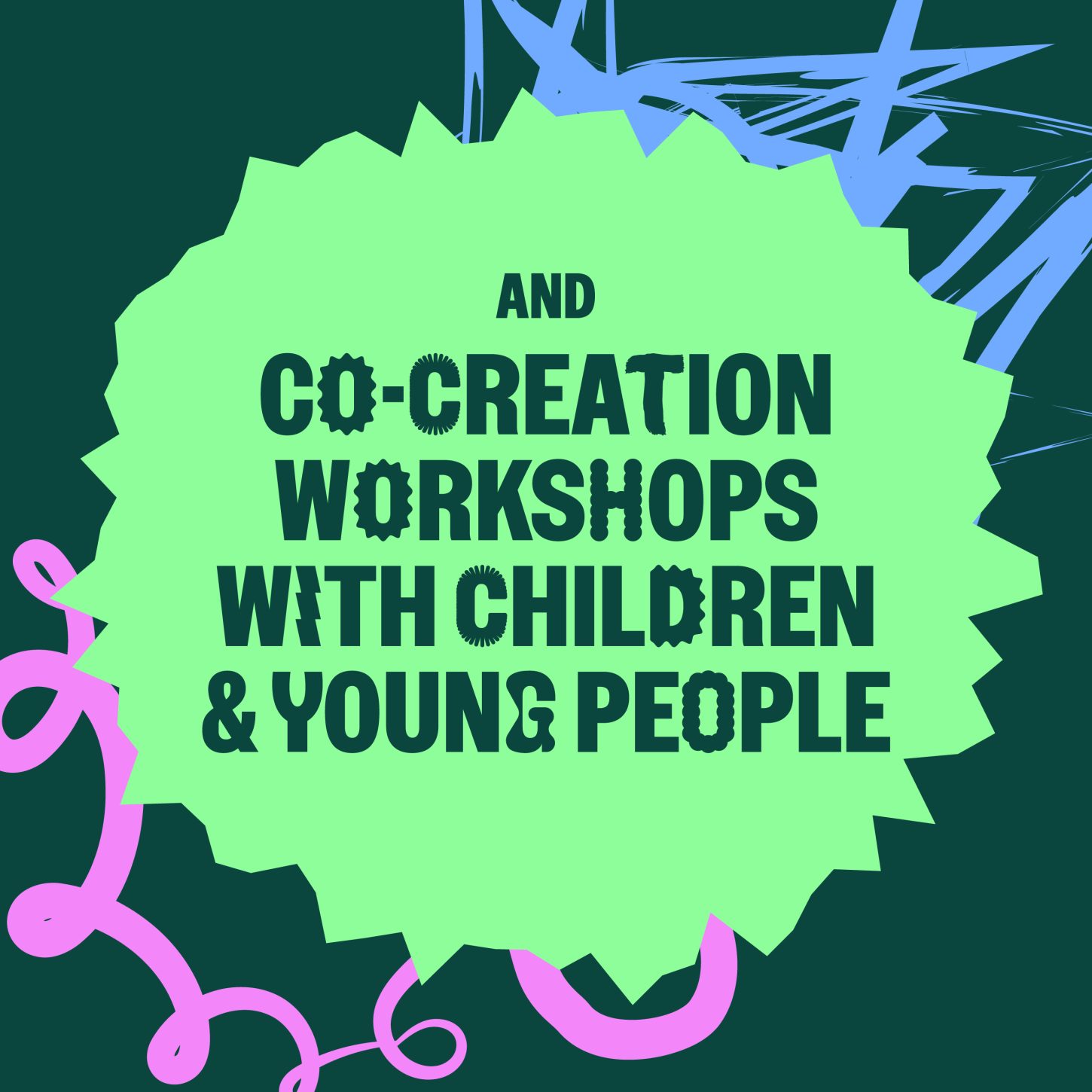
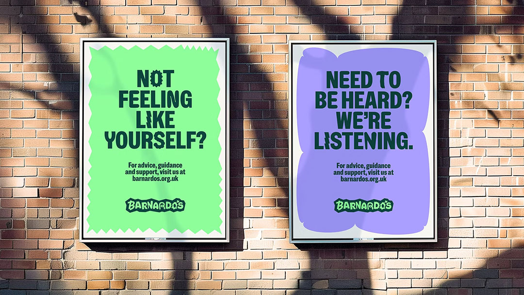
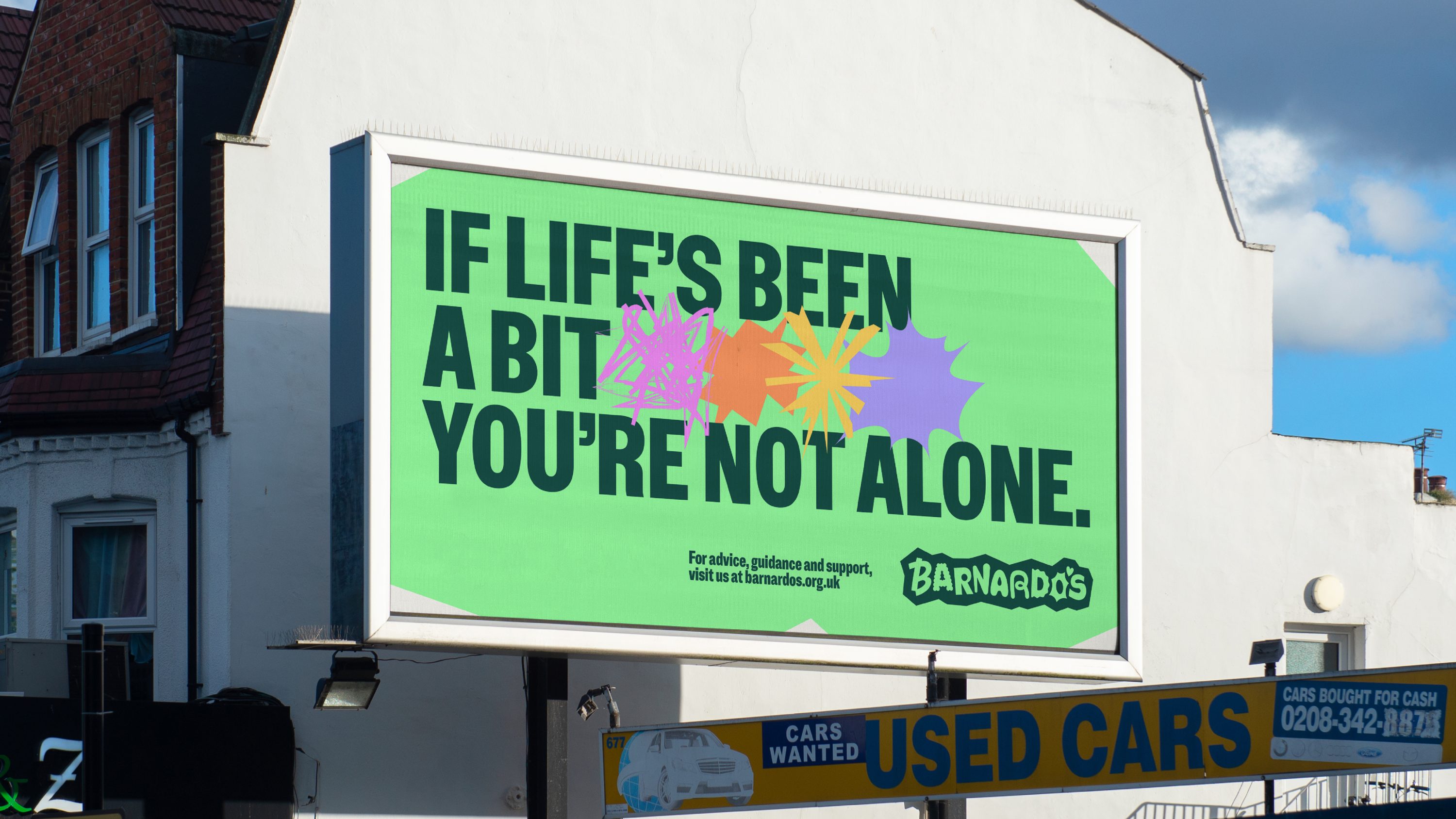
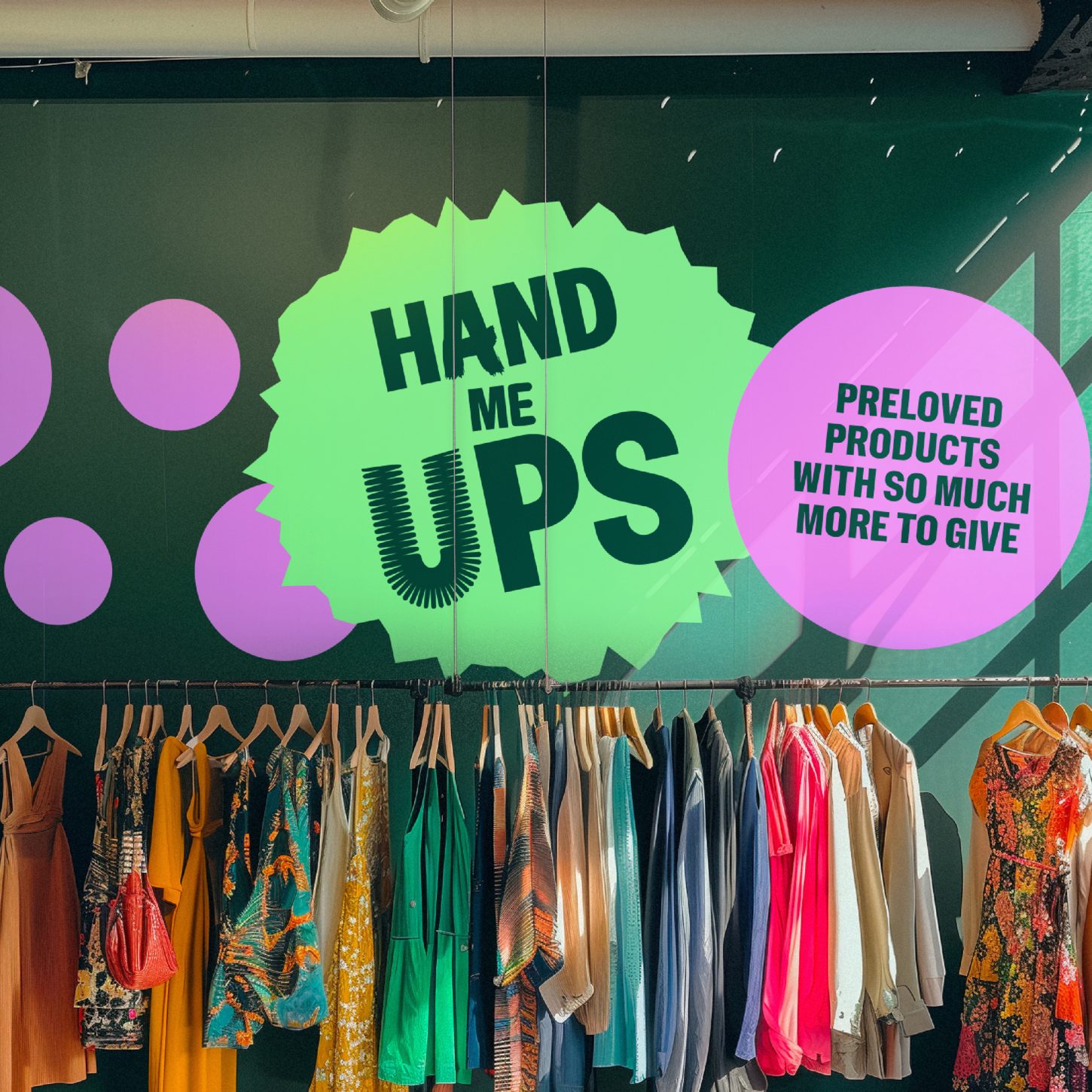
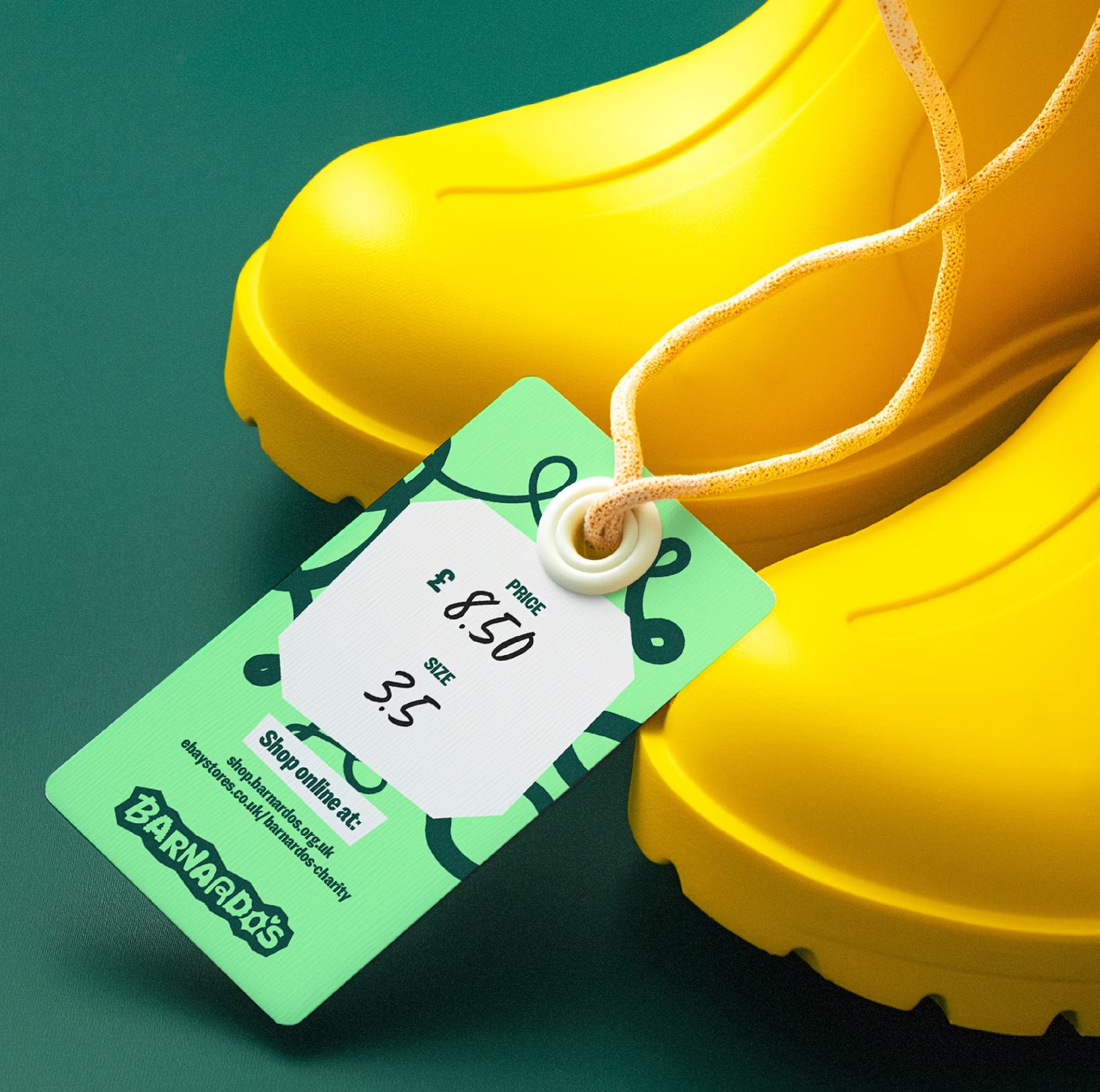
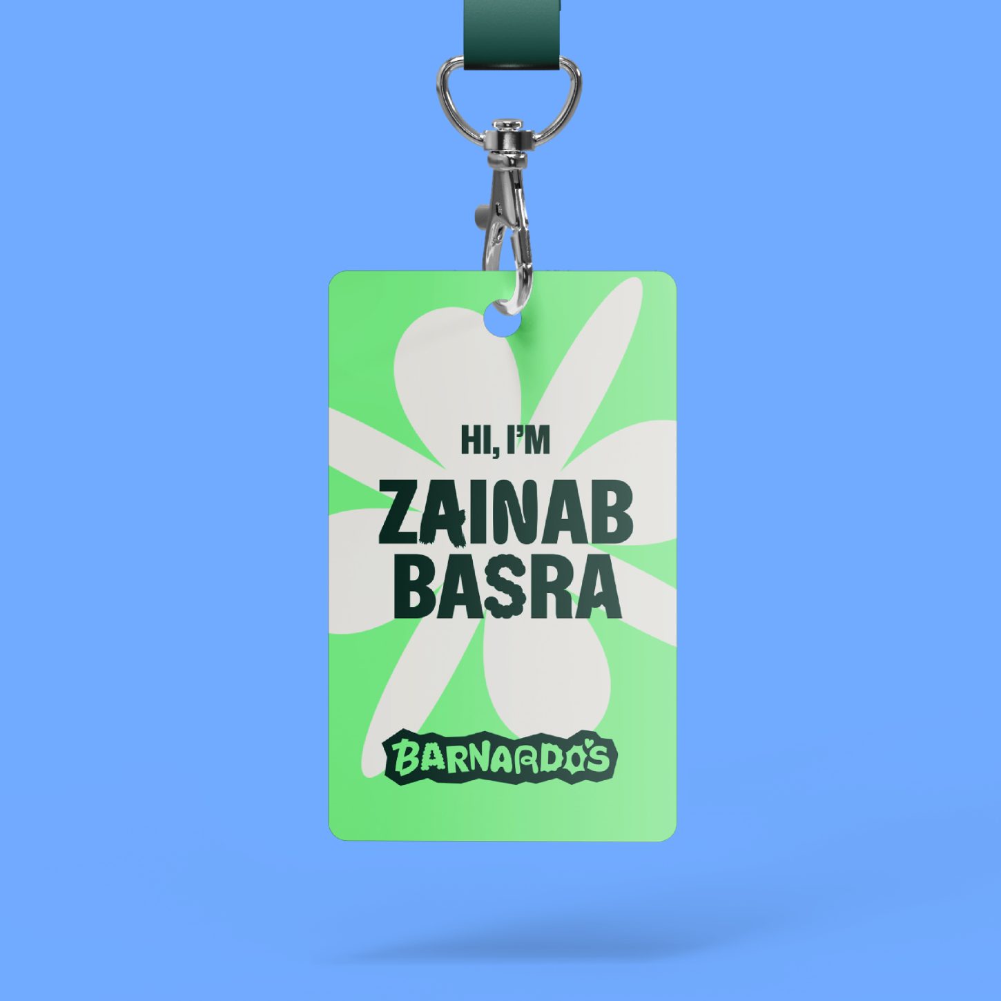
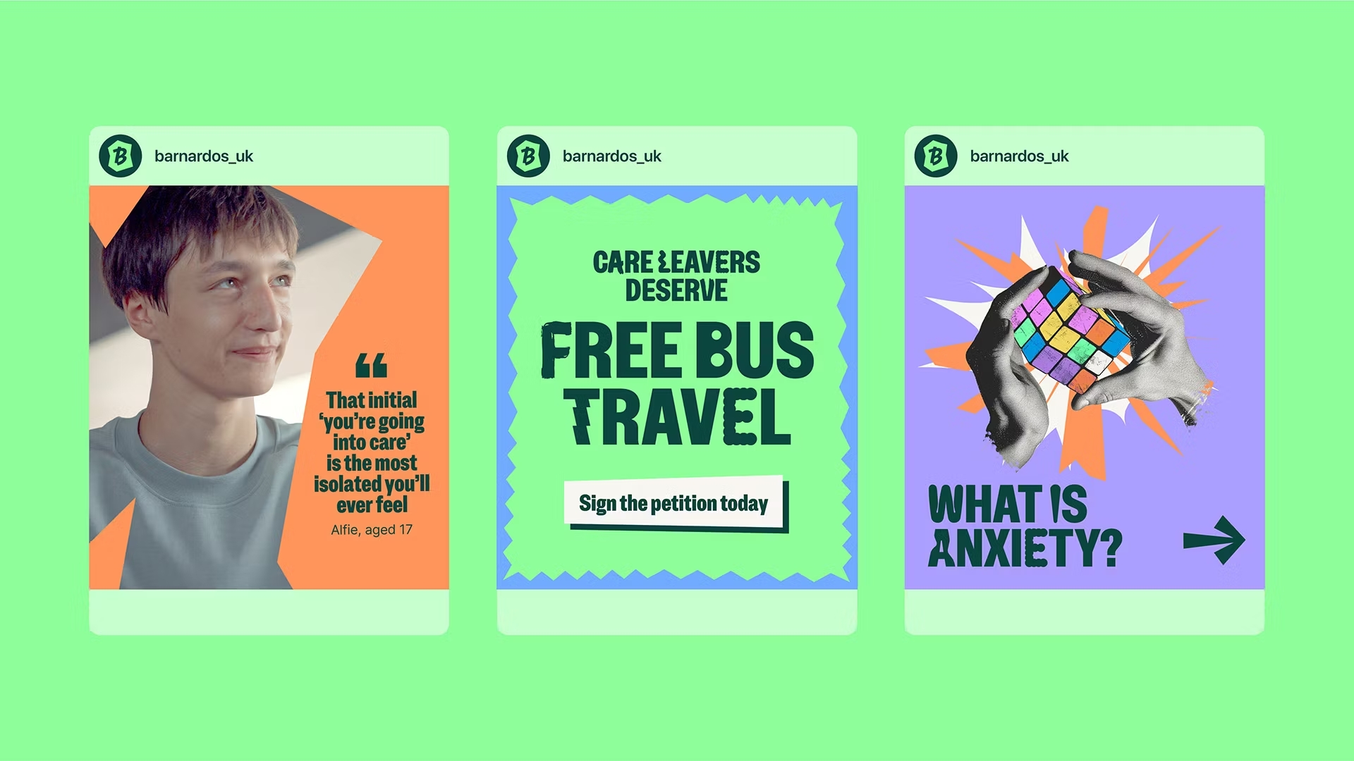
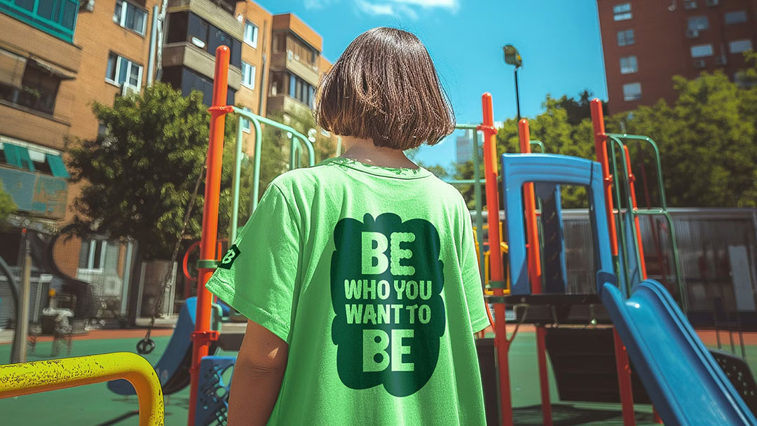
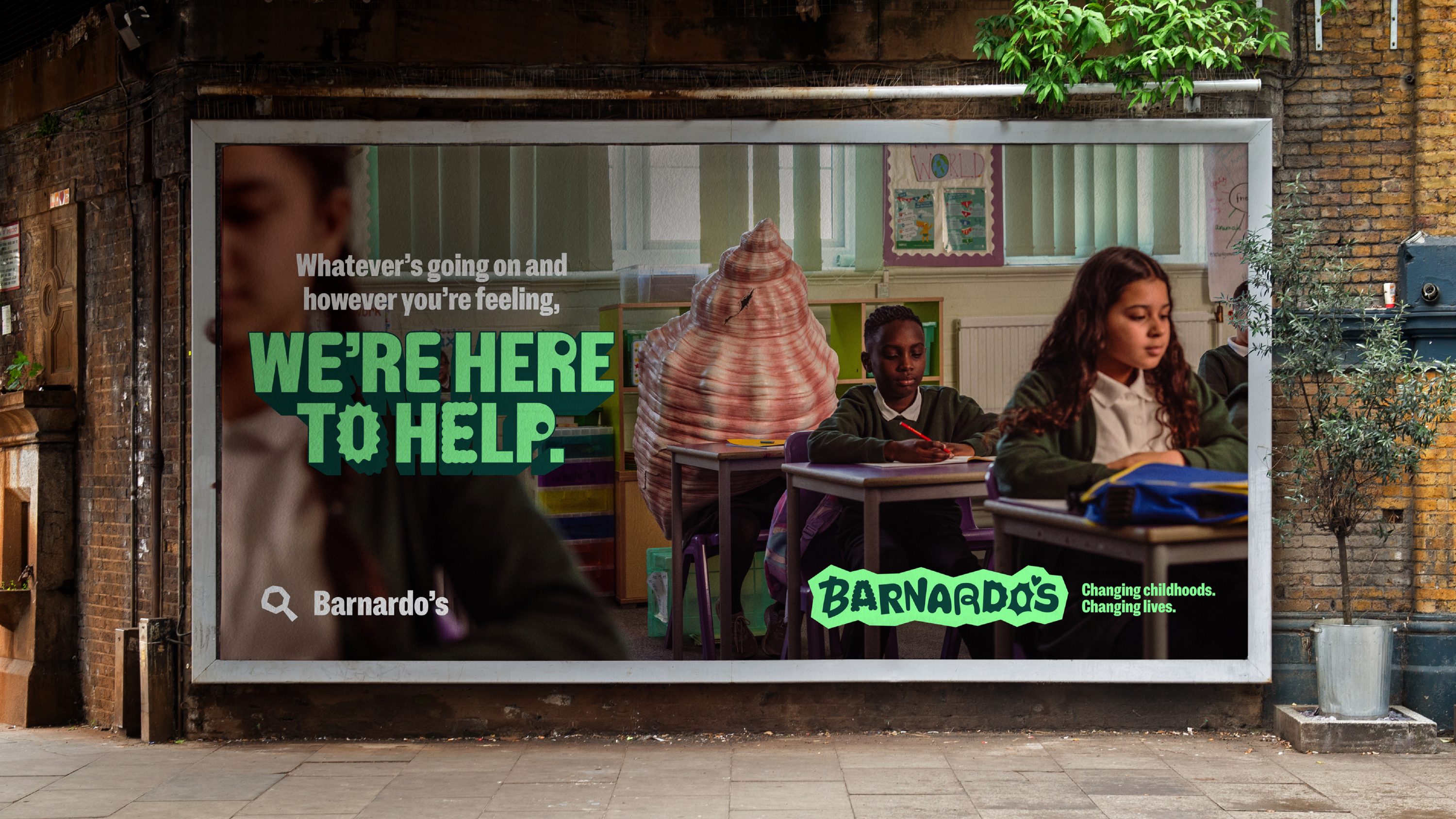
The Clearing created a brand where every child could feel like they belong, harnessing the logo as a visual metaphor for a safe space where everyone can express whatever they’re feeling. Following a creative workshop, each letter captures and conveys a different emotion – held within the ‘safe space’ of the holding device. We contributed to this project with a custom cut of our NaN Metrify family, making small details slightly rounder and friendlier, as well as introducing the many alternates created together with Barnardo’s children and employees.
The result is a project we’re really proud of, bringing together playfulness and social responsibility to create something that feels particularly NaN.


Custom Typeface
Year: 2024
Client: Barnardo’s
Agency: The Clearing
Team: NaN, The Clearing
