NaNtxt, a place to learn, love, research and move out of our comfort zone, reuniting essays by fellow authors.
Trial fonts013 NaN Archy: From the Stain to the Glitch
What begun as a simple translation from brush to machine became an introspective journey on what designing a typeface actually means today (and maybe only today). It’s also a testimony of the center place of the human hand and eye in the type making process.
Everything in type design is but an illusion: to appear identical or aligned, shapes need to have different sizes and weight (we call that “optical corrections”). This is the abc of type design.
Everything in type design is but an illusion: to appear identical or aligned, shapes need to have different sizes and weight (we call that “optical corrections”). This is the abc of type design.
012 Grok: A Logo a-logos
This essay explores how a seemingly simple graphic—the logo for xAI’s Grok—condenses and reveals the ideological logic of contemporary computation. Rather than treating the logo or the AI system it represents as inherently powerful or autonomous, the text offers a dialectical critique of how human-made systems come to appear seamless, sovereign, and self-grounding. Drawing on a range of critical thinkers, I show how computational infrastructures no longer merely mediate thought—they increasingly pre-empt it, replacing reflection with recursion, and critique with calculation.

011 The Serf Typographic System
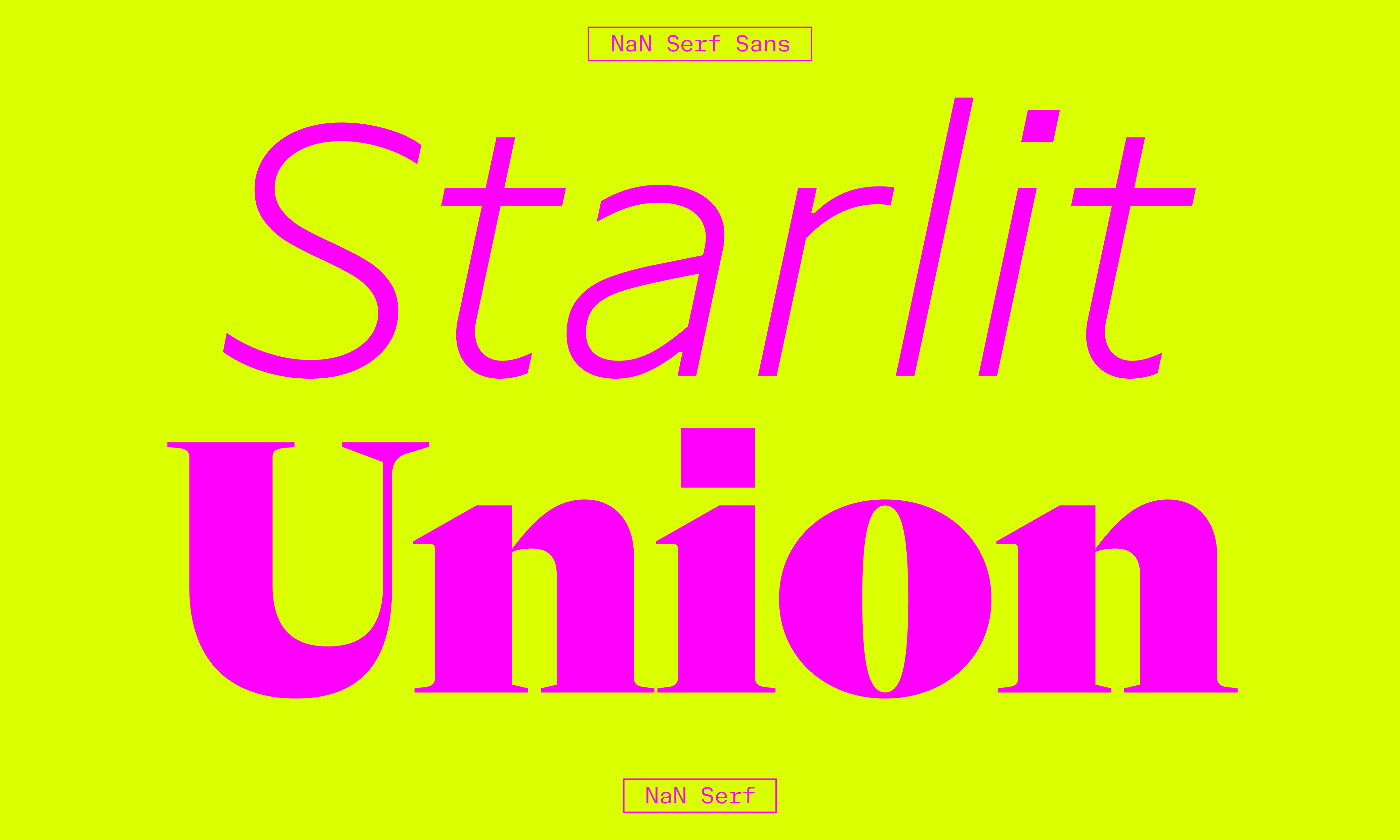
Although born in the 15th century, serif fonts are still up to use and still relevant today. This magical aspect of the story of type design is that trends and new shapes add to each others instead of replacing. The pool of available styles for designers is just getting bigger. In this context, one can only wonder why there is such normalization of the font styles used for almost any purpose in almost any place. Is this a side effect of our stage of the globalization of culture where a common visual language rises for the whole world, with no consideration for the local particularities or taste? I’m looking at you, neo-grotesque and geometric sans.
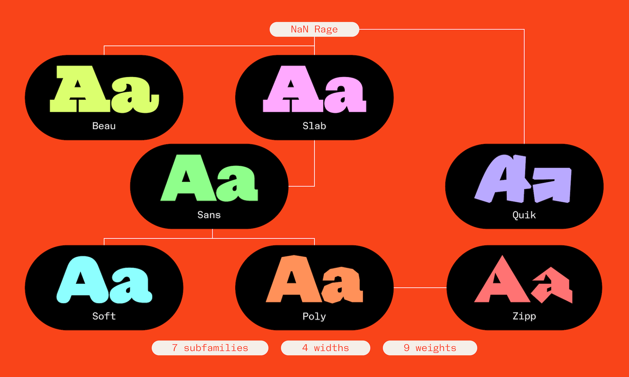
010 The Story Behind NaN Rage
With this project we told ourselves “this time we’ll keep it simple”, “only a weight and a width axis”. If only we had known.
Rage started at the beginning of the year 2024 as what is now the Rage Beau sub-family, an exploration on the sub-genre of Egyptian-style faces with our own added NaN spice. But things escalated, oh they did. Today as we release it, NaN Rage comprises 252 styles separated into 7 distinct sub-families, each with their own voice. We named these dramatis personae: Beau, Slab, Sans, Soft, Poly, Quik and Zipp. A bit like the 7 dwarfs, but different.
Rage started at the beginning of the year 2024 as what is now the Rage Beau sub-family, an exploration on the sub-genre of Egyptian-style faces with our own added NaN spice. But things escalated, oh they did. Today as we release it, NaN Rage comprises 252 styles separated into 7 distinct sub-families, each with their own voice. We named these dramatis personae: Beau, Slab, Sans, Soft, Poly, Quik and Zipp. A bit like the 7 dwarfs, but different.
009 Distant Relations
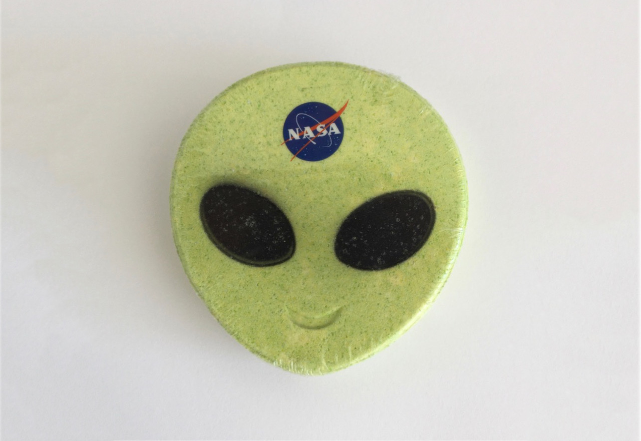
A bath bomb in my local chemist gave me pause for thought. It was formed into the shape of a smiley alien’s head; a classic Grey (although green) with a NASA logo stickered squarely between its eyes. I found it funny. NASA builds rockets and bath bombs – both are quite ‘science-y’, the position of the logo suggested the bath bomb had been used for target practice, or maybe the alien been playing with some kind of ‘which [space agency] are you?’ social media filter. The humour was short-lived; the current rhetoric surrounding real human aliens is appalling.
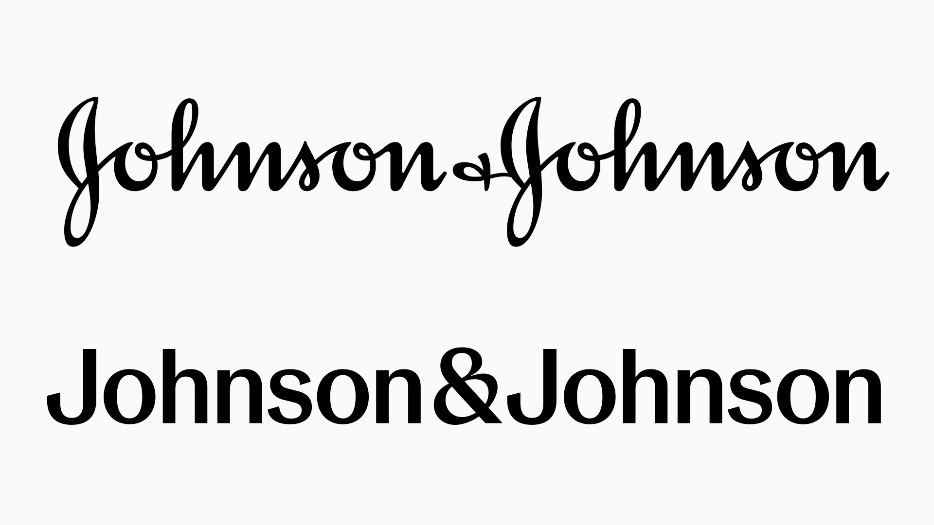
008 A Critique of Critiques of Blandification
To better understand the recent Johnson & Johnson rebrand, it’s essential to examine how the practice of branding has changed over time, moving from the era of merchant capitalism through consumer capitalism and into the contemporary context of financialisation and monopolisation driven by computational capitalism.
007 Libre Type as a Veblen Good

I have been experimenting with new business models for independent libre (open source) font development recently. I had my first hint that these models might work when my project GTL Type Label minted all 100 editions of its first font NFT. Enough people have been curious about what I am doing since then that it seems like the right time to put some of my thinking around libre type and NFTs into an essay.
006 Type Sovereignty
The invasion of Ukraine by Russia brings back the spectre of the Great Russia. Yet this return of history to Europe does not date from 2022. In fact, the Crimean War of 2014 was not over. Some of the sanctions put in place on that occasion were still in force, including those on fonts.
Seemingly innocuous yet essential elements of our daily lives, fonts offer a good vantage point for observing Russian ambitions and Western measures to counter-balance them.
Seemingly innocuous yet essential elements of our daily lives, fonts offer a good vantage point for observing Russian ambitions and Western measures to counter-balance them.
005 The Tragicomedy of Digital Fonts
Like many actors on stage, digital fonts are born and killed off over and over again. Due to Windows domination on desktop computers, for most people, Arial, designed in 1982 and released as a TrueType font in 1992 is the typical digital font. It was already a mockery of Helvetica, born in 1957. We could envision a strange but sincere recent history of digital type through similar fonts, substitutes, tributes, surrogates etc, but also unexpected successes like Comic Sans, which never disappointed normal people. A popular typeface in a noble sense…
004 Designing Afrikan Fonts
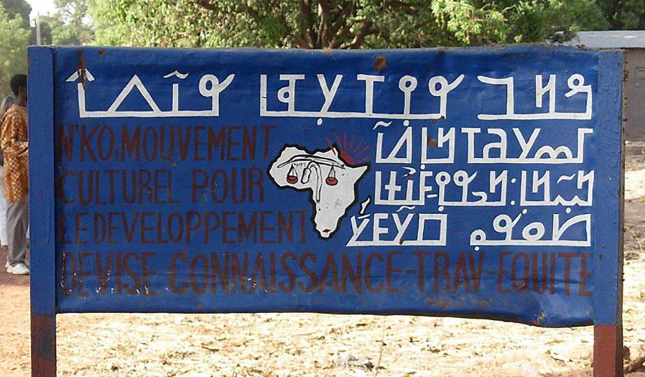
As a self taught designer, scavenging the internet for learning resources becomes a daily routine and I believe fellow learners can attest. When I ventured into design I relied a lot on suggested reading lists, tutorials, talks etc and I have to confess, there was a lot to learn and indeed I learnt, it was truly helpful. As the years passed by I started noticing a gap, there was little to no content on Afrikan design, typography in particular…grab a book titled, ‘History of Typography’ and what you actually get is the history of ‘Latin typography.’ This was further cemented when I watched Prof Saki Mafundikwa’s TED Talk, ‘Ingenuity and Elegance in Ancient African Alphabets’…
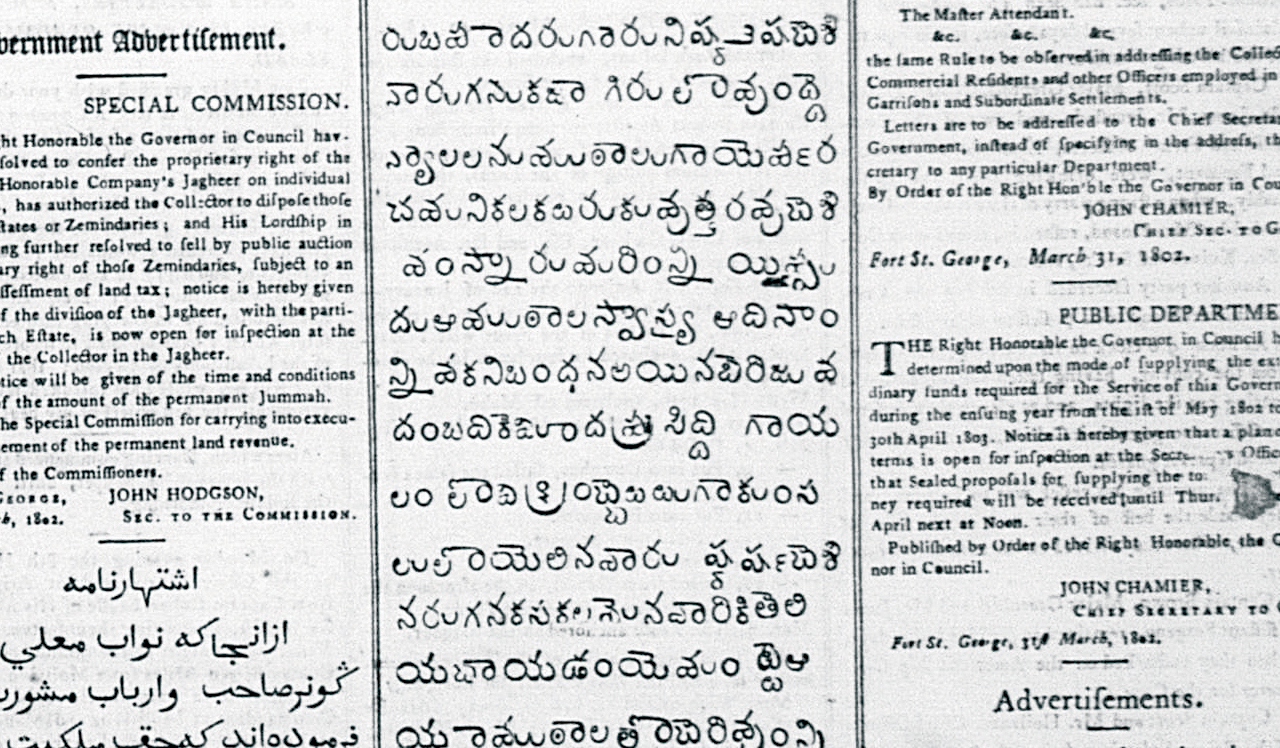
003 The First Telugu Foundry Type
The East India Company (EIC) saw the necessity for its personnel to learn the vernacular languages spoken in the areas it operated to communicate with its residents. Madras, the capital of the Madras Presidency, was multilingual. The Hindu population spoke Tamil and Telugu. The Muslims used Hindustani (currently referred to as Urdu, one of the two significant registers of Hindustani). Therefore the EIC intended on publishing a grammar and dictionary of the Telugu language…