Introduction
As a self taught designer, scavenging the internet for learning resources becomes a daily routine and I believe fellow learners can attest. When I ventured into design I relied a lot on suggested reading lists, tutorials, talks etc and I have to confess, there was a lot to learn and indeed I learnt, it was truly helpful. As the years passed by I started noticing a gap, there was little to no content on Afrikan design, typography in particular…grab a book titled, ‘History of Typography’ and what you actually get is the history of ‘Latin typography.’ This was further cemented when I watched Prof Saki Mafundikwa’s TED Talk, ‘Ingenuity and Elegance in Ancient African Alphabets’.
In his talk, he shows the many forms of writing systems found on the Afrikan continent. Sharing the history and legacy of these forms of writing, he urges Afrikan designers to look from within and draw inspiration from them; a call to action. And this, was my turning point. I knew I had to do something. The idea of creating fonts for Afrikan writing systems was born, and to this day it drives me so crazy I can’t sleep at night, and I’m turning it into a reality!
Background
The N’ko writing system was invented in 1949 by Solomon Kante of Guinea in West Afrika to better represent the naunces of Afrikan speech. It was created to write the Mande languages including Mandika, Dyula, Bambara and other related languages.
Kante made N’Ko in reaction to what he felt were convictions that Africans were a culture-less individuals due to presumptions that no indigenous African writing system for their dialects existed; a broadly told story is that Kante was rankled over a daily paper article composed by a Lebanese correspondent comparing African dialects “like those of the birds, impossible to transcribe”. Kante devised N’Ko as he was in Bingerville, Côte d’Ivoire and afterward brought to Kante’s natal region of Kankan, Guinea.
N’Ko started to be utilized in numerous instructive books when the script is believed to have been finalized on April 14, 1949 (presently N’Ko Alphabet Day); Kante had interpreted from religious to scientific and philosophical writing, even a dictionary. These materials were given as blessings to other Manding-speaking parts of West Africa. The script received its first specially made typewriter from Eastern Europe back when Guinea had ties with the Soviet Union in the 1950s.
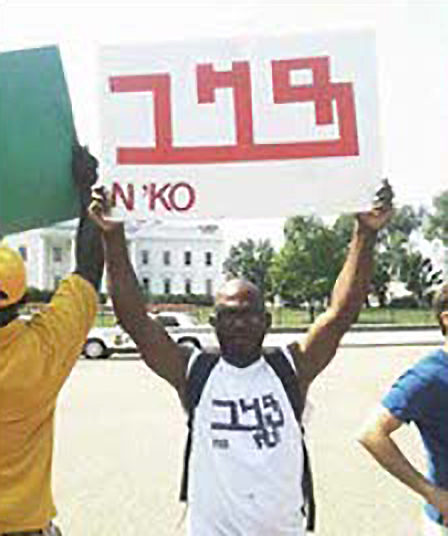
The introduction of the script led to a movement promoting literacy in the N’Ko script among Manding speakers in both Anglophone and Francophone West Africa. N’Ko literacy was instrumental in shaping the Maninka cultural identity in Guinea, and it has also strengthened the Manding identity in other parts of West Africa.
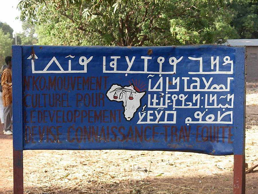
Hand painted signage using the latin and N’ko Alphabets.
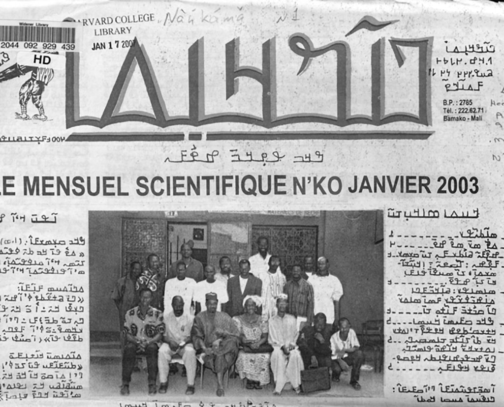
As of 2005, it is used mainly in Guinea and the Ivory Coast (respectively by Maninka and Dyula speakers), with an active user community in Mali (by Bambara-speakers). Publications include a translation of the Quran, a variety of textbooks on subjects such as physics and geography, poetic and philosophical works, descriptions of traditional medicine, a dictionary, and several local newspapers. Though taught mostly informally through N’ko literacy promotion associations, N’ko has also been introduced more recently into formal education through private primary schools in Upper Guinea. It has been classed as the most successful of the West African scripts.
Overview of the Writing System
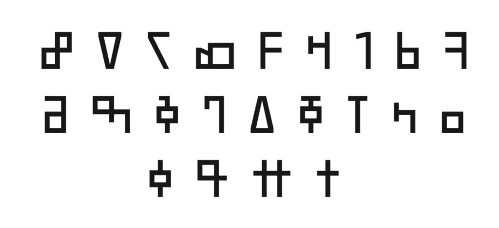
The alphabet is quite flexible with the ability to write any language and this is enabled by it’s Diverse vowel system. All in all, it has 27 letters, 10 numbers and 9 accents. It is written from right to left and has joining characters just like Arabic.
N’ko has seven characters to represent the vowel sounds.

19 consonants make up the rest of the letters, plus one sound that is not quite a consonant or a vowel, the nasal syllabic /n/ sound and two abstract consonants.
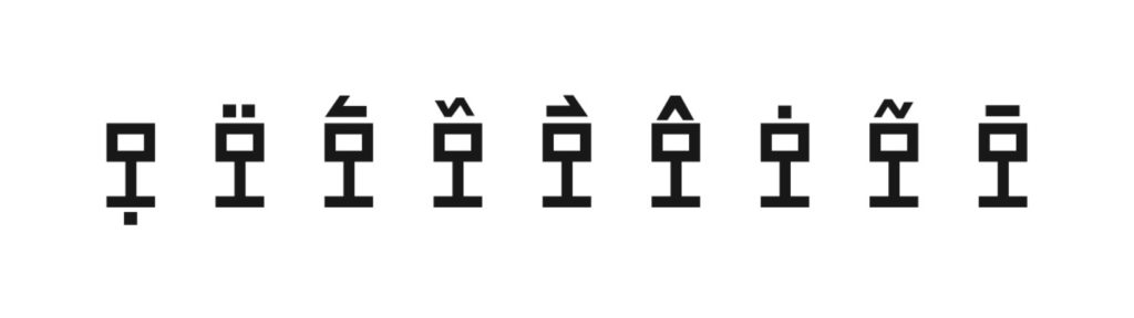
Vowel tones are represented by accents; there are 4 primary tones describing the pitch of the short vowel, four more secondary tones for long & stressed vowels and 1 accent depicing vowel nasalization.
N’ko has 10 numbers; 0-9 and numbers above 9 are written as a combination of numbers 0 to 9.

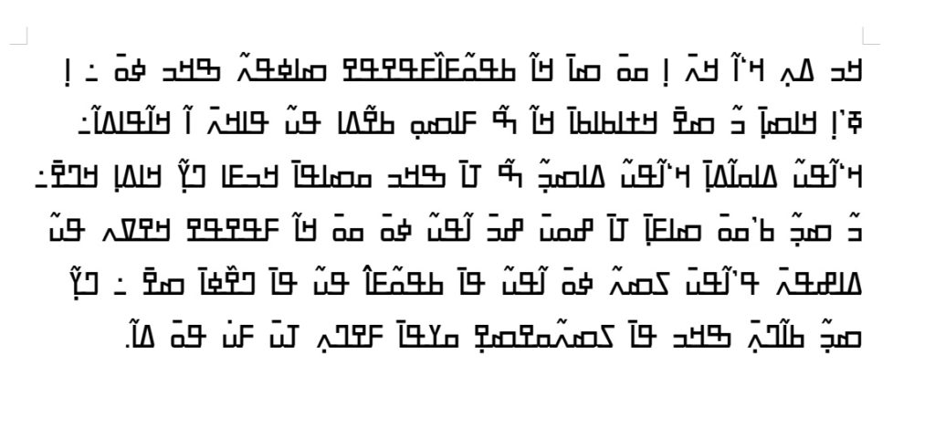
Some unique punctuation marks from the N’ko script.

Font Development Process
My process for constructing fonts became more defined when I started creating fonts for writing systems. The first step is the research phase where I look at the analog sources to understand the writing system, how it works, what it should look like, and it’s Unicode encoding (If it has passed that stage). Part of the process is demonstrated above.

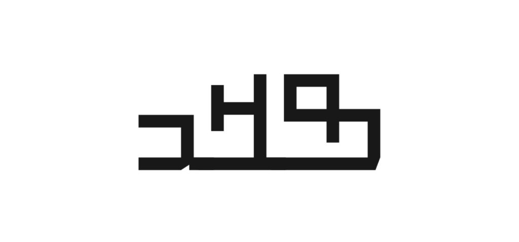
For my N’ko font, I decided to go a slightly unique route and create a font with very angular blocky shapes. This was inspired by the various styles found on hand lettered materials such as newspapers, books and signage.
After completing the research, the following stage involves the planning and drawing of the font. Planing the font basically is doing more research on the writing system, establishing the glyph repertoire and choosing a style. For N’ko, it has joining letters thus just like arabic, there are 4 variants of each letter; an Initial which is the first letter in a word, a Medial which goes in-between other letters, a Final which is present at the end of a word and lastly, an Isolated version which is not joined to other letters.
Isolated letters. Below: Joined letters

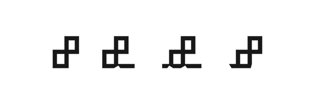
(from right to left) Initial, Medial, Final and Isolated.
Establishing the style, determining the archetypal shapes and strokes and drawing all the characters will become easier when the planning phase is done right. Once this is done, the Font production phase kicks in.
As already discussed, the N’ko font is written from right to left, has joining letters and has diacritics that indicate various tones, this means they’ll be a difference between the logical order of letters and the visual ordering. OpenType features will have to be written so that the script is displayed properly on various devices. In the OpenType model, script layout, such as N’ko, is handled collaboratively by a shaping engine found within the operating system or applications and the layout is in a font.
OpenType features are essentially used to manipulate the characters of the encoding into the presentation forms for display and a shaping engine such as Microsoft’s USE (Universal Shaping Engine) ,which supports the N’ko writing system, is a standardized means of handling the application of OpenType features.
Glyph Substitution
This contains the features that will be applied to specific characters based on joining properties. These are the init, med & fina features to ensure the characters have an accurate visual order.
Glyph Positioning
Positional features make it possible to attach marks to base glyphs. In N’ko we have above base marks (which go above a base character they’ll be modifying) and a below base mark placed below the base character. This will be anchor based and the generation of the features will be automatic.
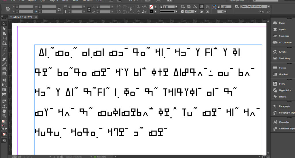
Testing becomes the next stage. It is of paramount importance to check if the visual ordering of the characters is correct; the mark placement, text direction and glyph substitution. During the testing phase of the N’ko font in various applications I started noticing some problems, mark positioning was misplaced, letters were not joining and in some cases glyphs were not being displayed.
Misplaced mark positioning and non-joining letters in Adobe Indesign.
It is worth noting that while massive work has been done to encode Afrikan writing systems into the Unicode consortium, a lot of work still needs to be done to ensure that the fonts function properly on all devices and platforms. There is so little done and so much to do.
Correct rendering of the N’ko font in Libre Office Word editor
References
Microsoft 2020: Creating and supporting OpenType fonts for the Universal Shaping Engine. r12a App: N’ko Character App
N’ko-The Unicode Standard, version 13.0: Unicode.org Charts
Cultures of West Africa: N’ko, A NATIVE AFRICAN ALPHABET
Saki Mafundikwa 2004: Afrikan Alphabets, West New York, N.J. :Mark Batty, 2004.
About Tapiwanashe S. Garikayi
Tapiwanashe S. Garikayi is a graphic design consultant & type designer based in Victoria Falls, Zimbabwe where he runs Stype Foundry. Among other things, he specialized in creating Afrikan inspired design & crafting fonts for Afrikan writing systems, some of them not being encoded yet. As he says: “the driving force behind my relentless mission is to create digital fonts for Afrikan writing systems, one letter at a time”.
