Deezer
Trial fontsCustom
Typeface
Working closely with Koto Berlin, we crafted the new corporate typeface for Deezer, the globally-revered music streaming service established in 2007.
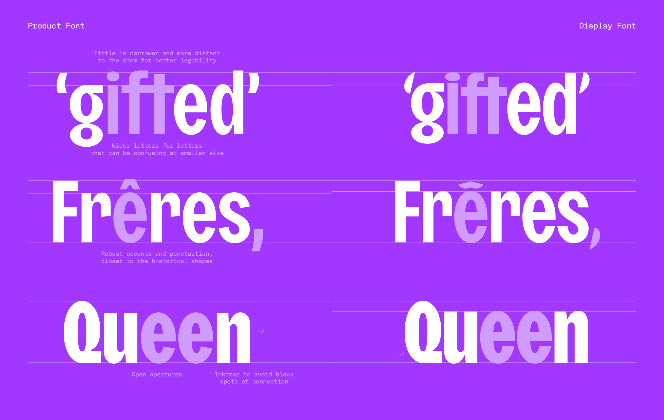
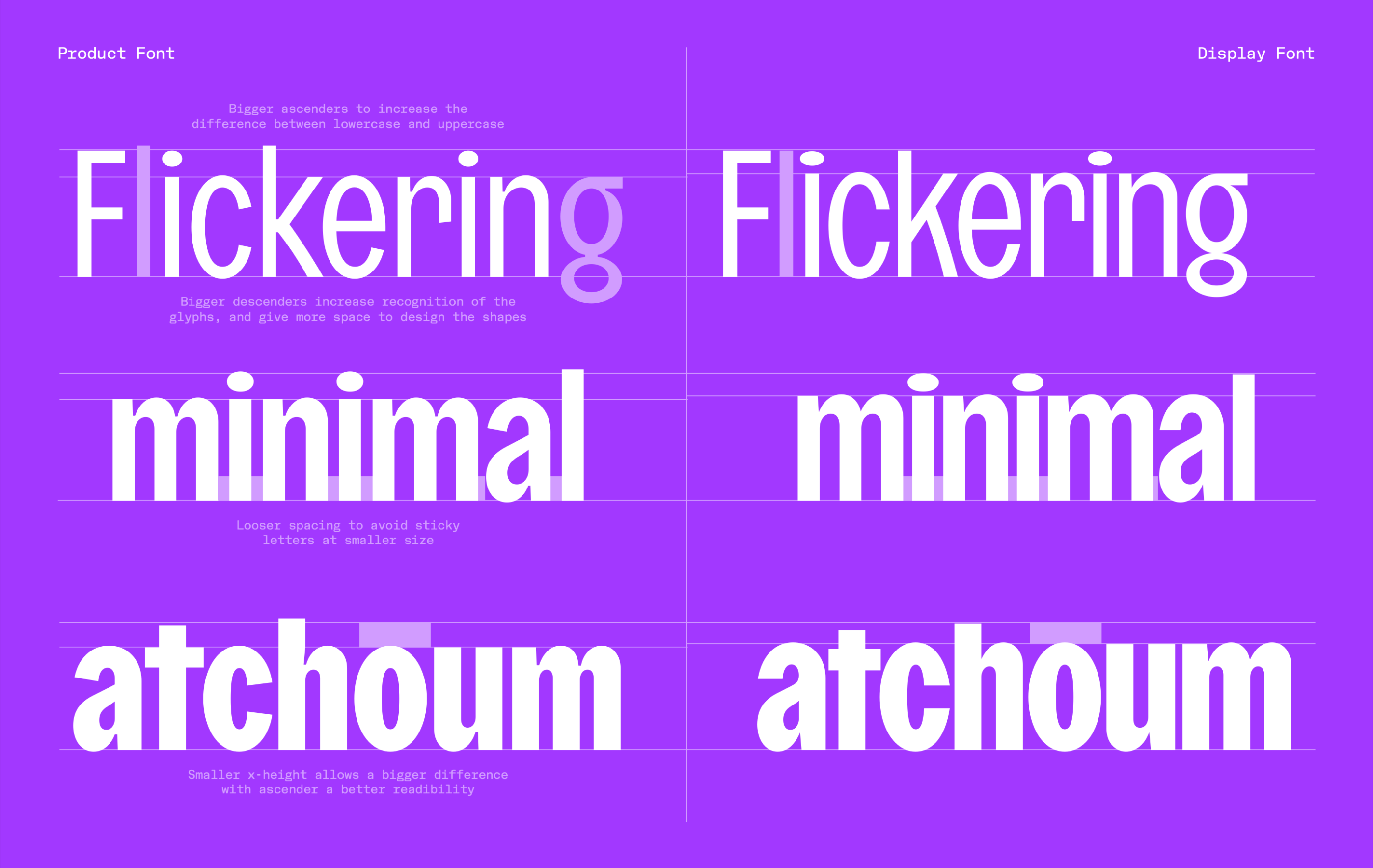
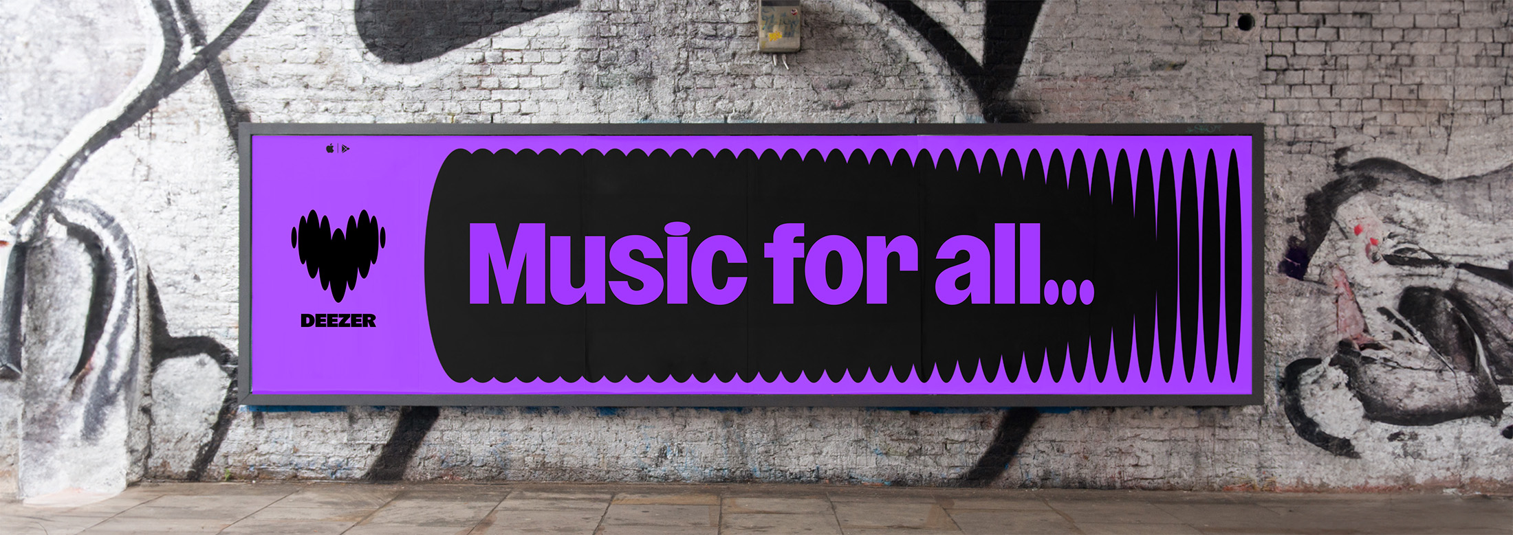
Extrapolating the beat’s unique form at the base of Deezer’s updated logo, we drew an extensive family led by this distinctive oval shape, resulting in Deezer Sans, the graphic foundation of the entire brand system. A variable font embodying versatility, Deezer Sans offered easily customisable typography across varied content types – from condensed cuts for long-form content to extended cuts for more concise messaging. As such, the brand’s inherent flexibility allowed the identity to stretch and adapt across a broad range of brand touchpoints.

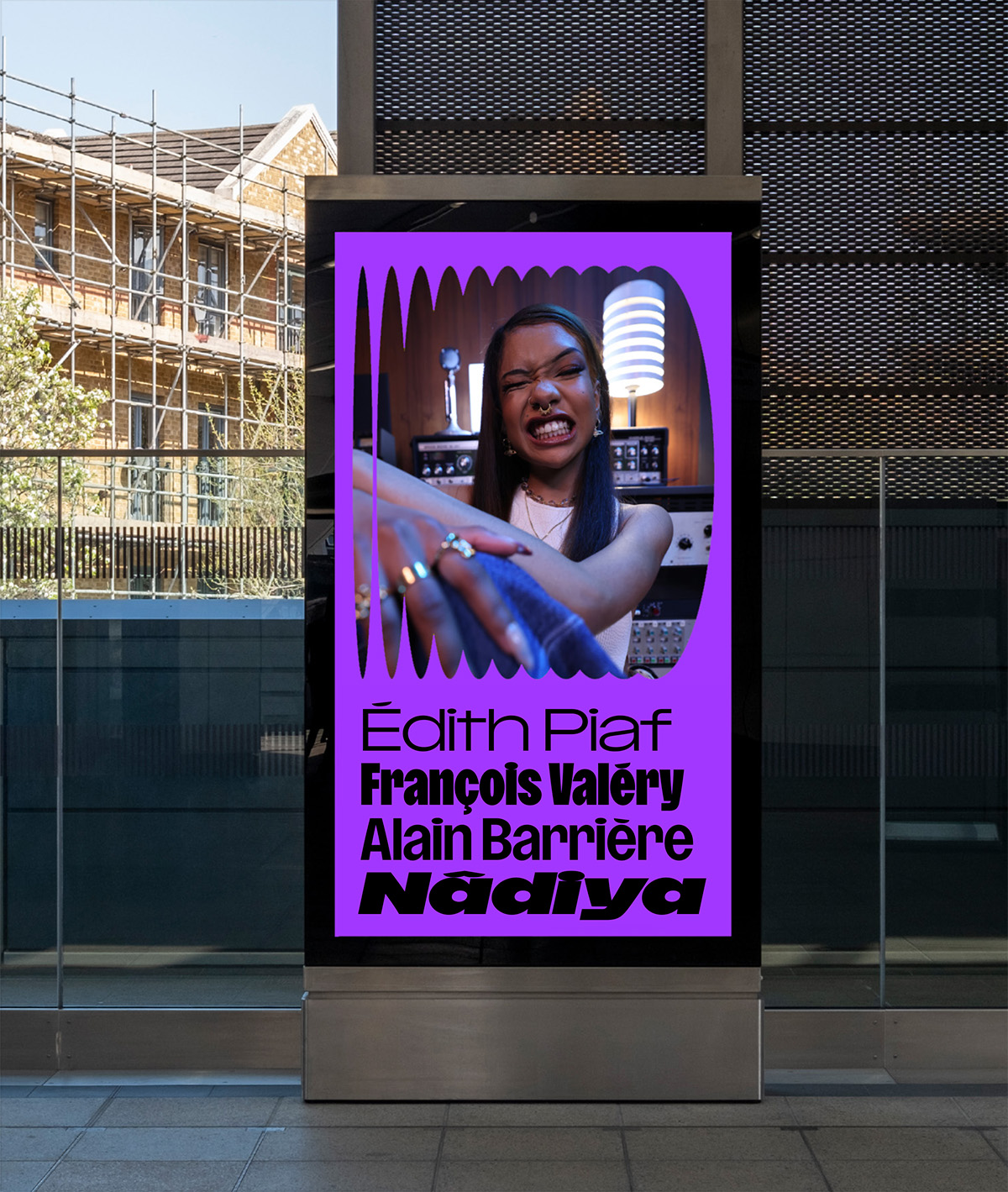
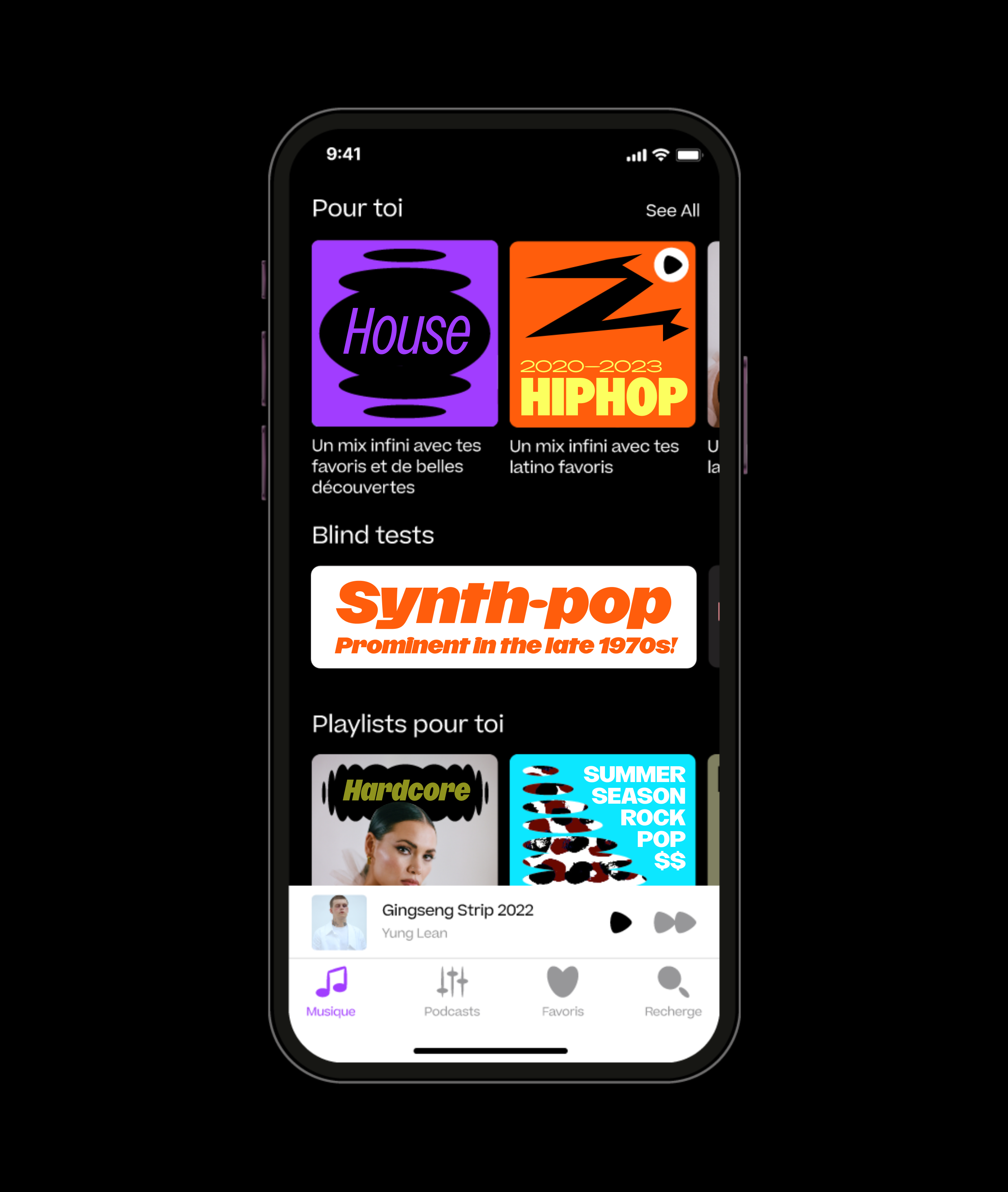
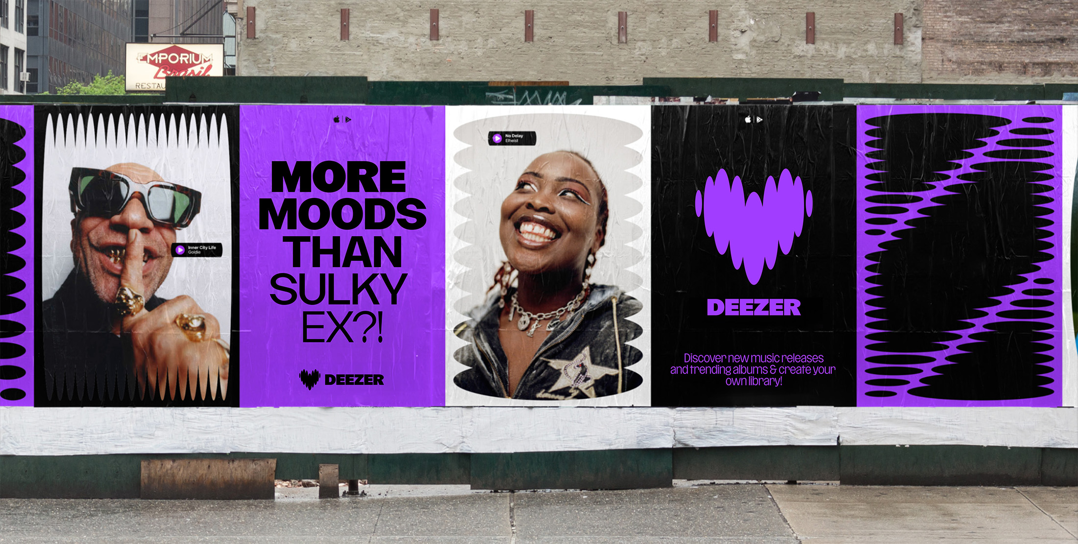
The condensed styles, widely used across Deezer’s UI and communication material, offered a way to render content in an original, compact way, especially in the landscape of apps dominated by geometric sans serifs. On top of the default styles, we also developed a set of gestural titling, street art-inspired alternates, allowing a more dynamic and younger tone of voice for specific spaces.
The oval shape at the core of Deezer’s logo and brand assets, also found in the shape of the lowercase /g and the tittle of the lowercase /i, inspired us to create alternate punctuation and accents throughout the type family, making for an even more consistent system.


Custom Typeface
Year: 2023
Client: Deezer
Agency: Koto London
Team: NaN (Luke Prowse, Jean-Baptiste Morizot, Léon Hugues, Florian Runge, Daria Cohen, Jolana Sýkorová), Koto London
