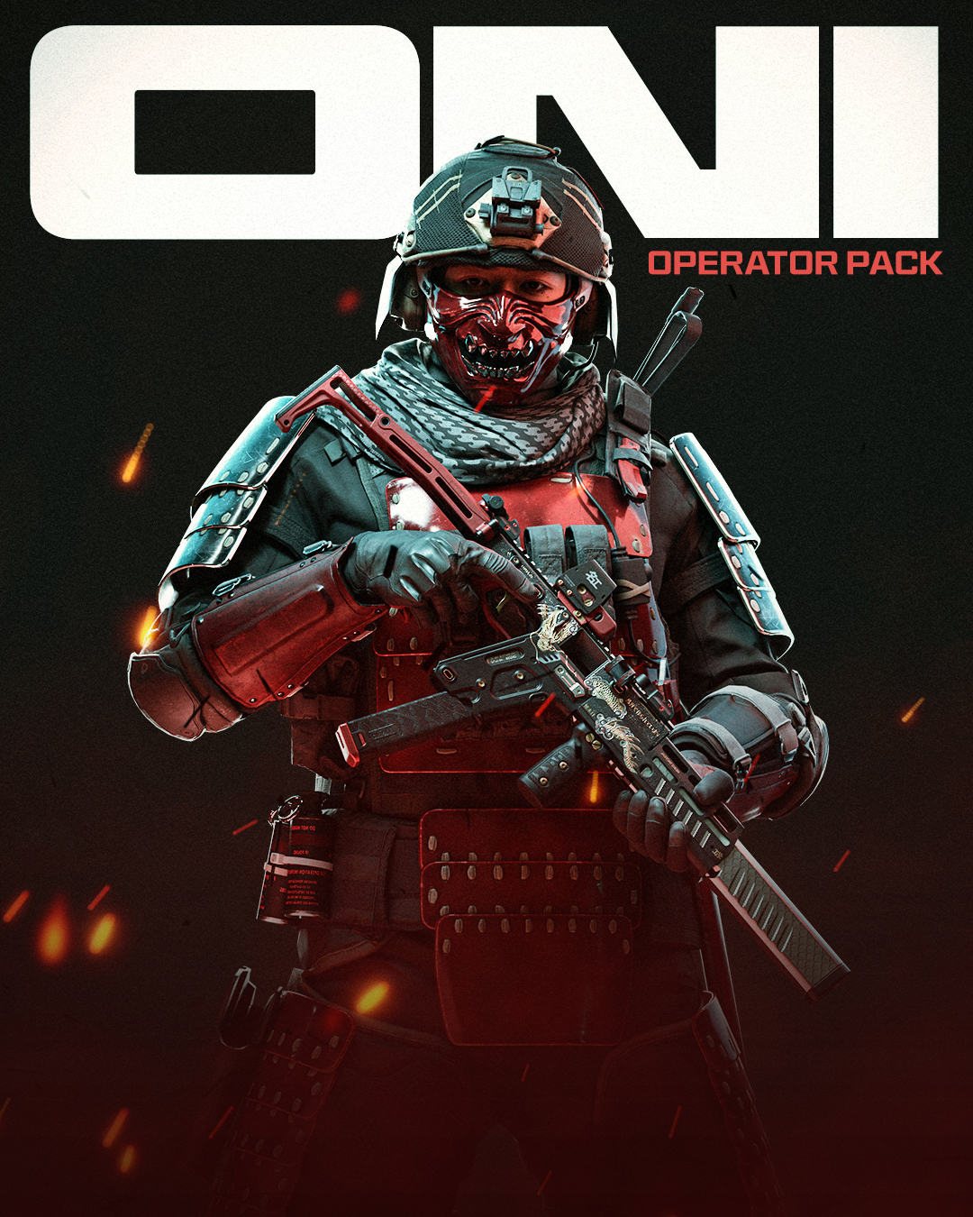
Call of Duty
Trial fontsCustom
Typeface
Call of Duty is one of the largest combat simulation game franchises in the world. So when Studio Koto came to us to work on CoD’s rebrand, we couldn’t contain our enthusiasm. What started as a logo refinement project quickly became a whole custom font project for the franchise.
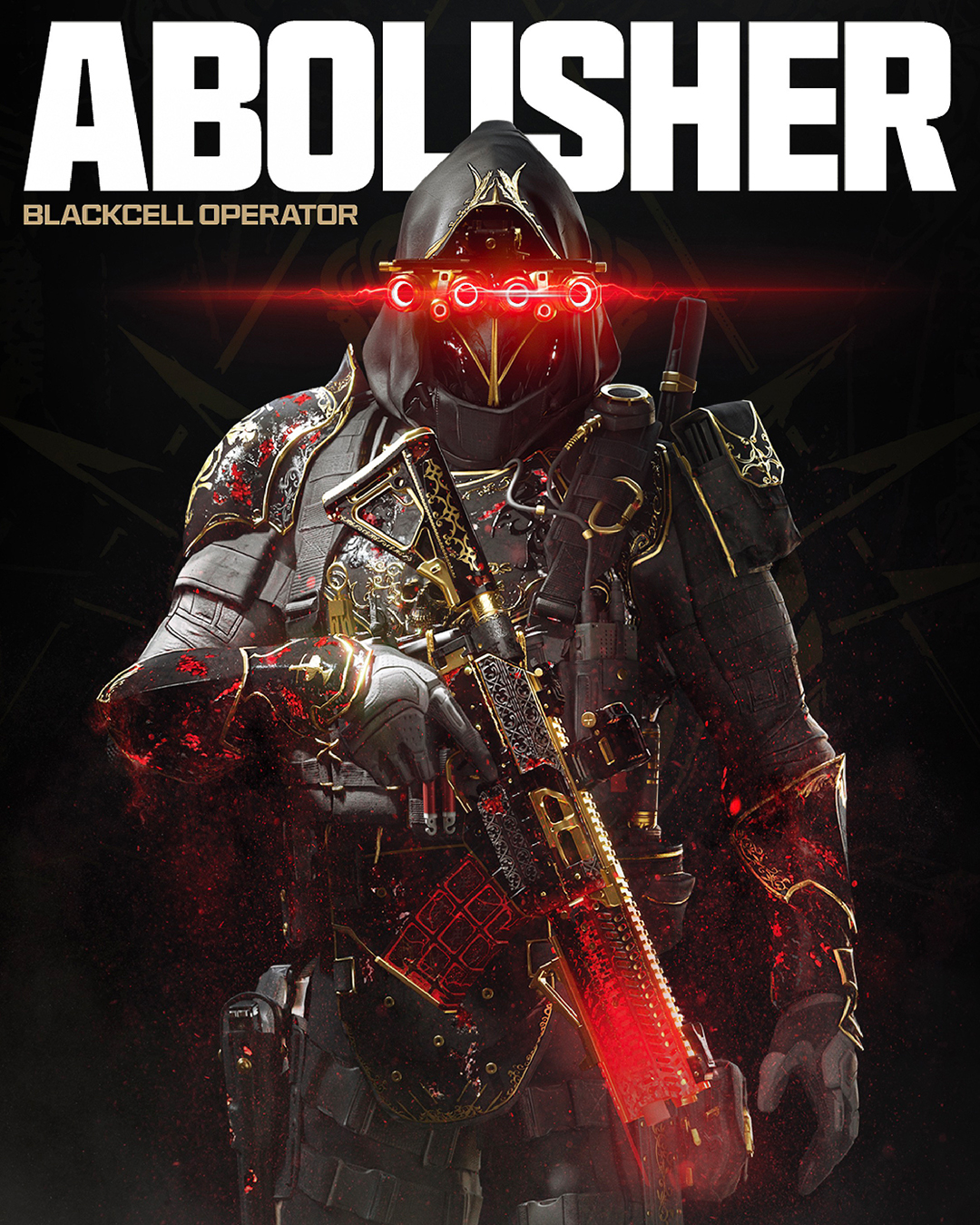
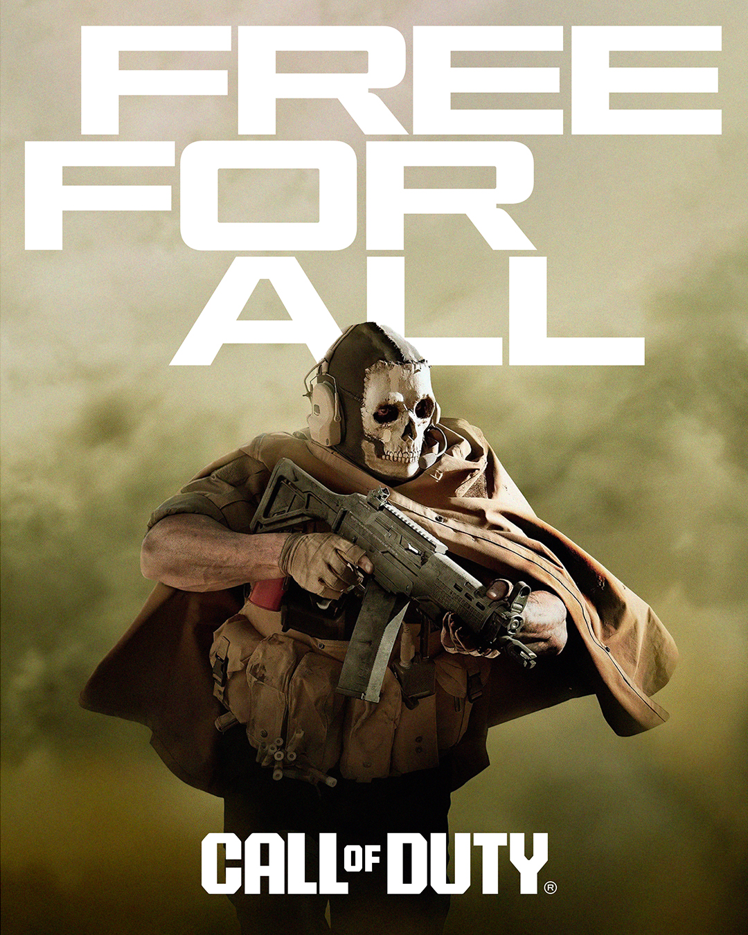
Hitmarker, the Latin and Cyrillic font family, is inspired by modern machined metal components, with Hitmarker’s letterforms alluding to stamped metal sheeting. With a mix of straight sides and angled or curved corners, the aromas of iron and ozone fumes are undeniable.

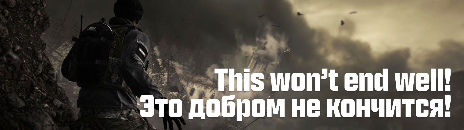
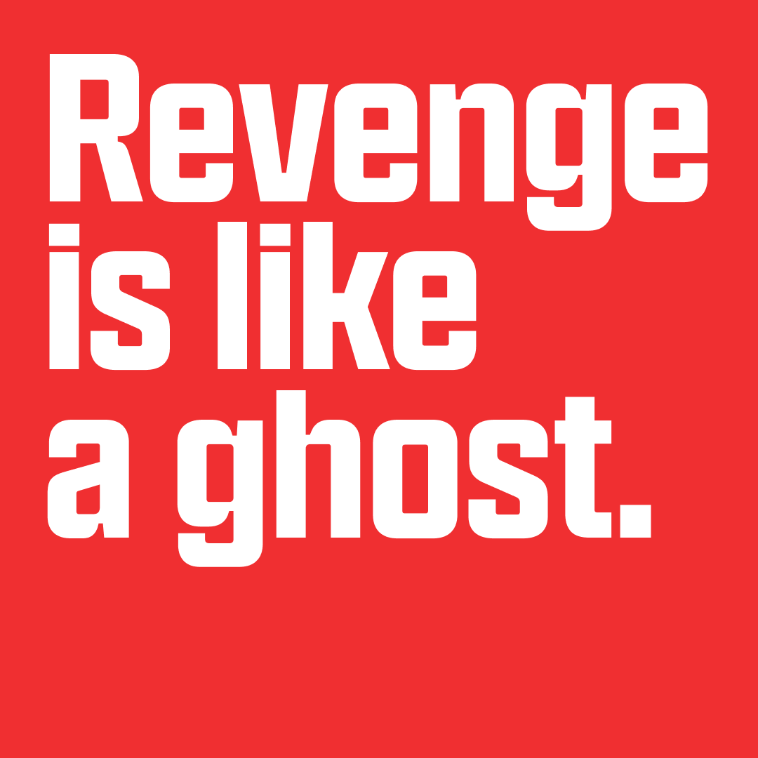

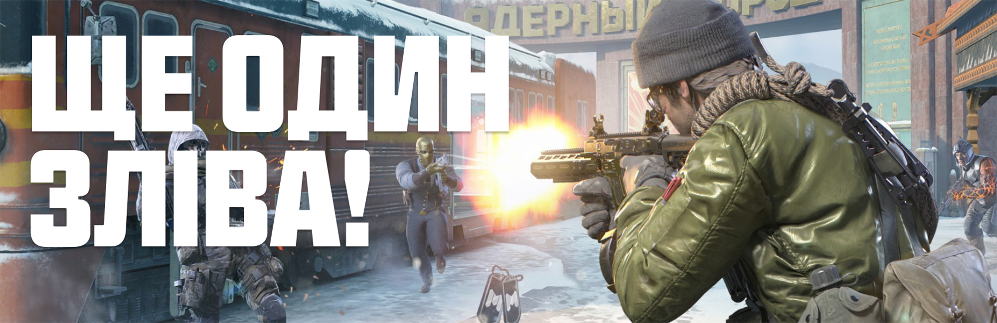
Besides the titling styles, we created a text-oriented subfamily that, while keeping most of its counterparts’ DNA, focuses more on legibility. The typeface’s smaller x-height, longer ascenders, looser spacing, and shorter terminals afford this accessibility, while still maintaining Hitmarker’s distinctive shapes and unmistakable characters. With its technological subtones, this text version comfortably serves for UI elements across CoD’s channels but also in-game – with its straight curves rendering fast and efficiently on screen and in small sizes.


Custom Typeface
Year: 2023
Client: Activision
Agency: Koto LA
Team: NaN (Luke Prowse, Jean-Baptiste Morizot, Léon Hugues, Daria Cohen, Florian Runge, Benjamin Blaess), Koto LA
