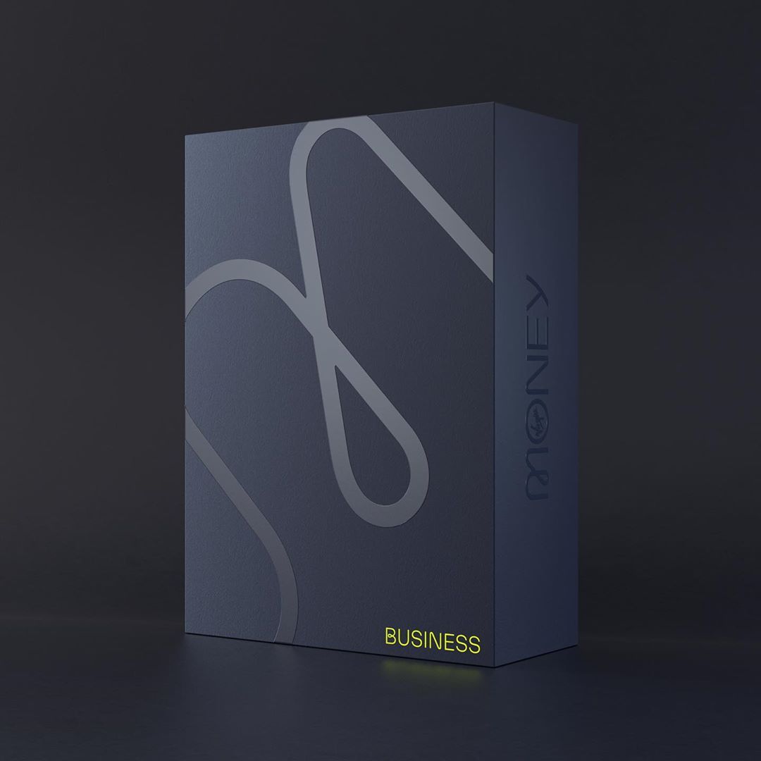
Virgin Money
Trial fontsCustom
Typeface
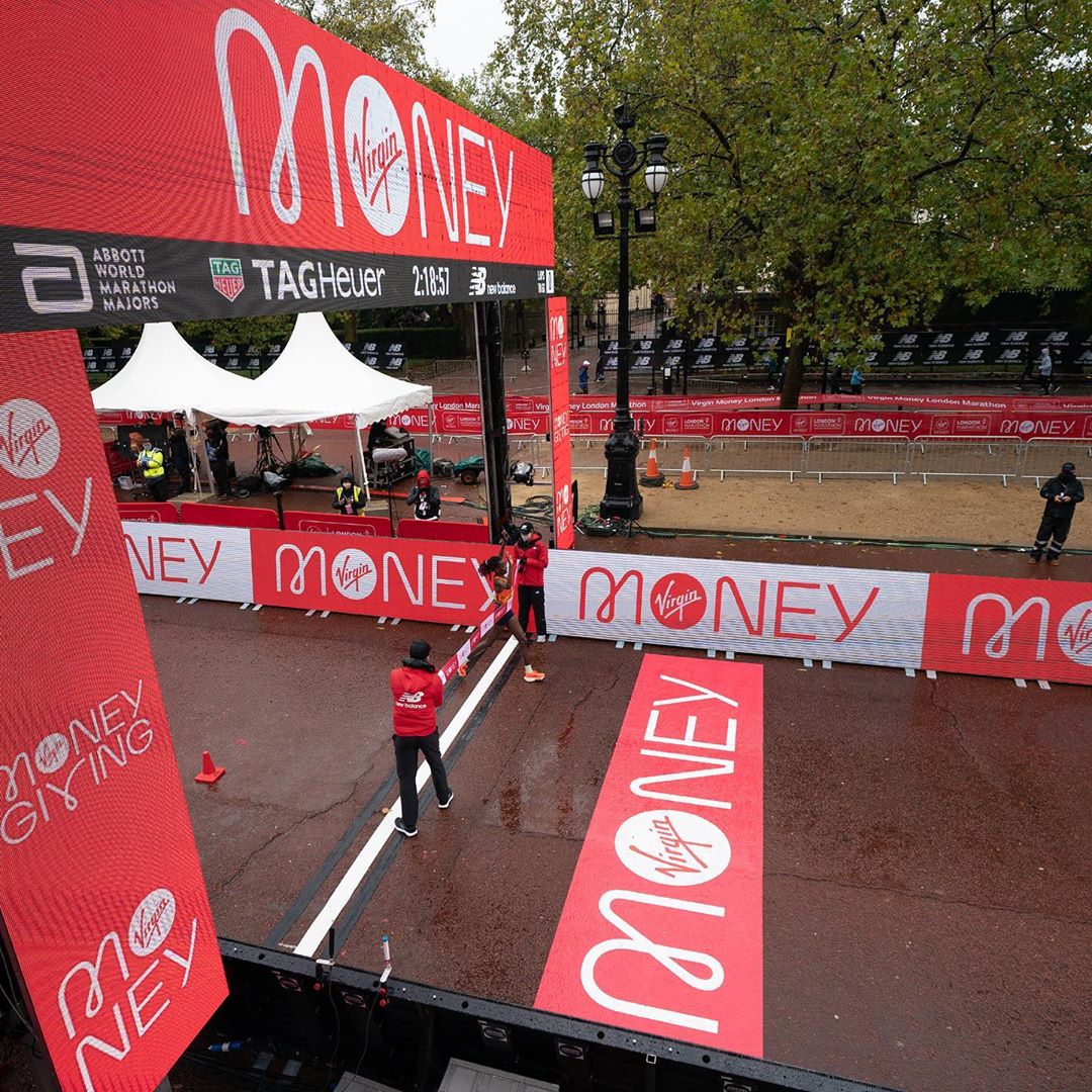
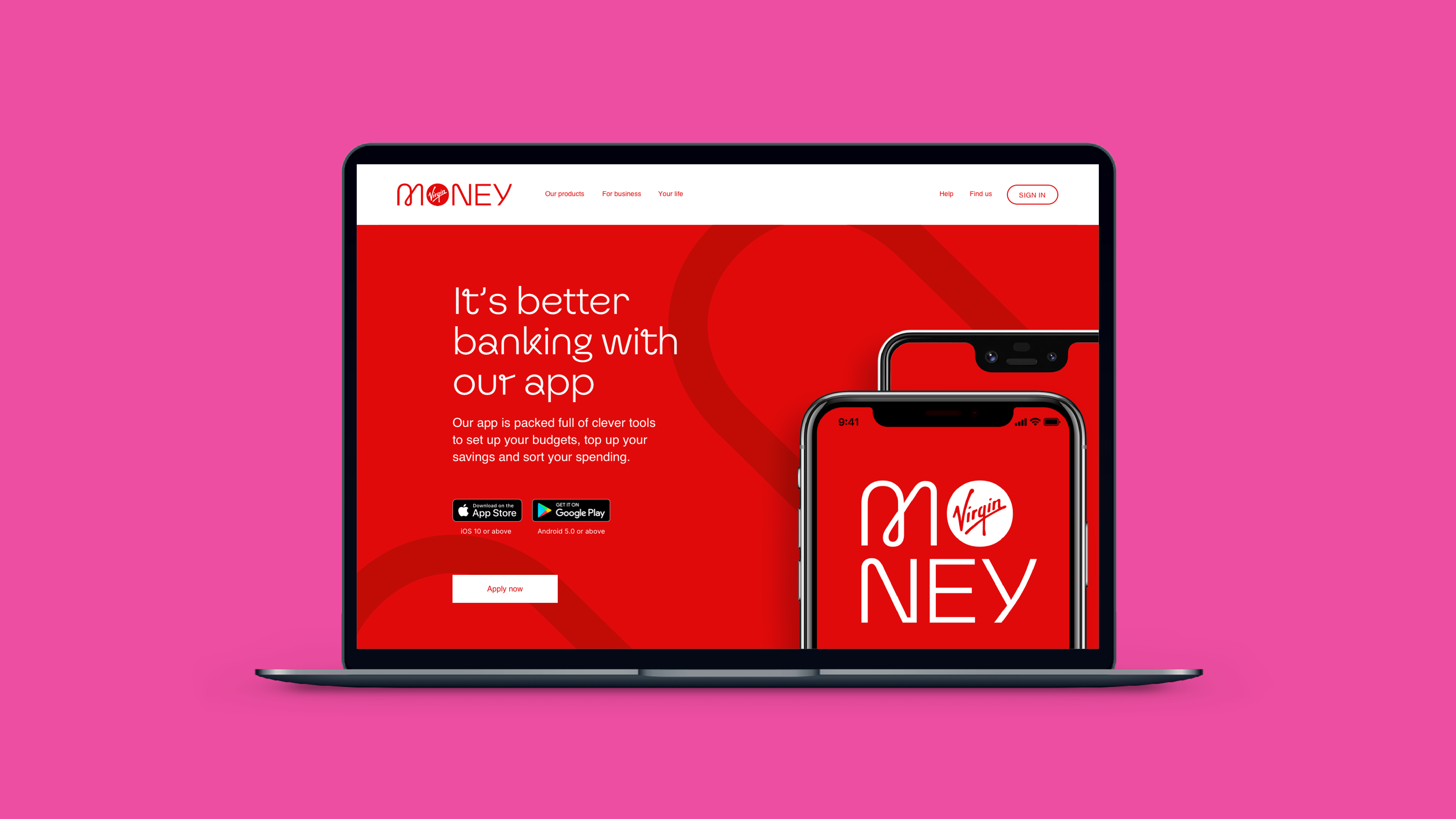
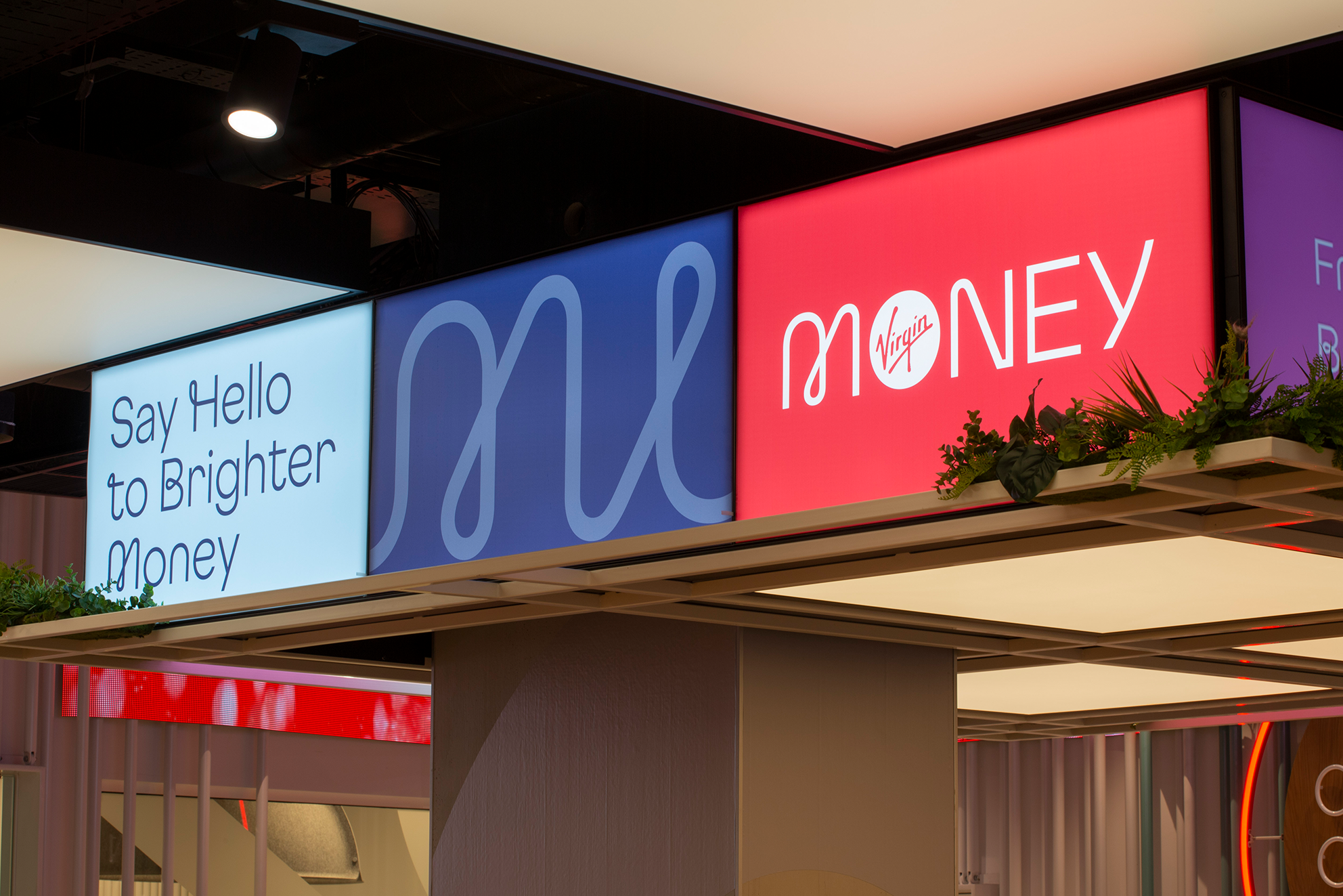
Working closely with Pentagram on Virgin Money’s rebrand, we created a lovely loopy (and non-loopy) headline font family for the customer-focused bank.
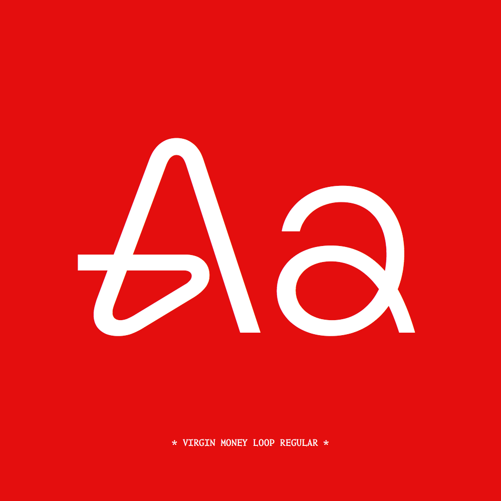
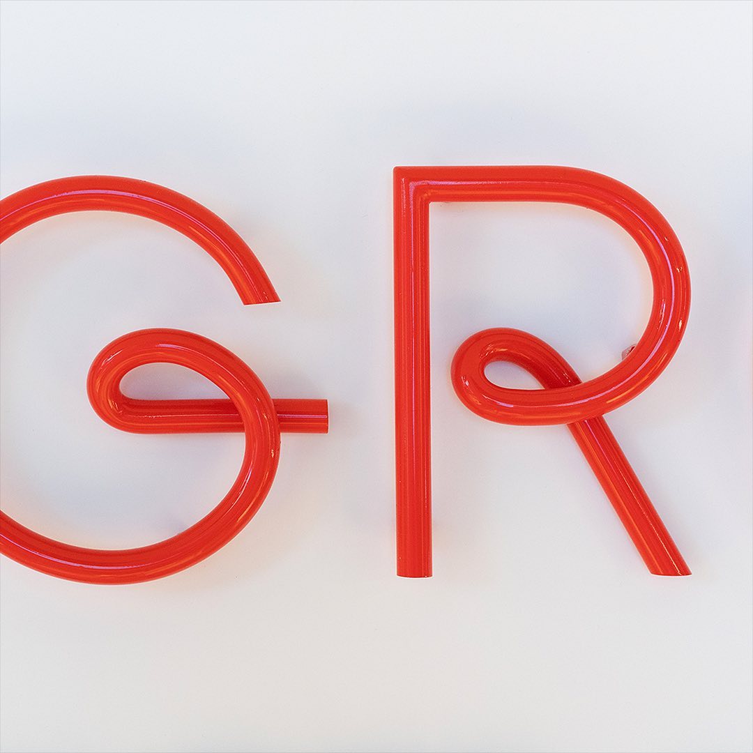
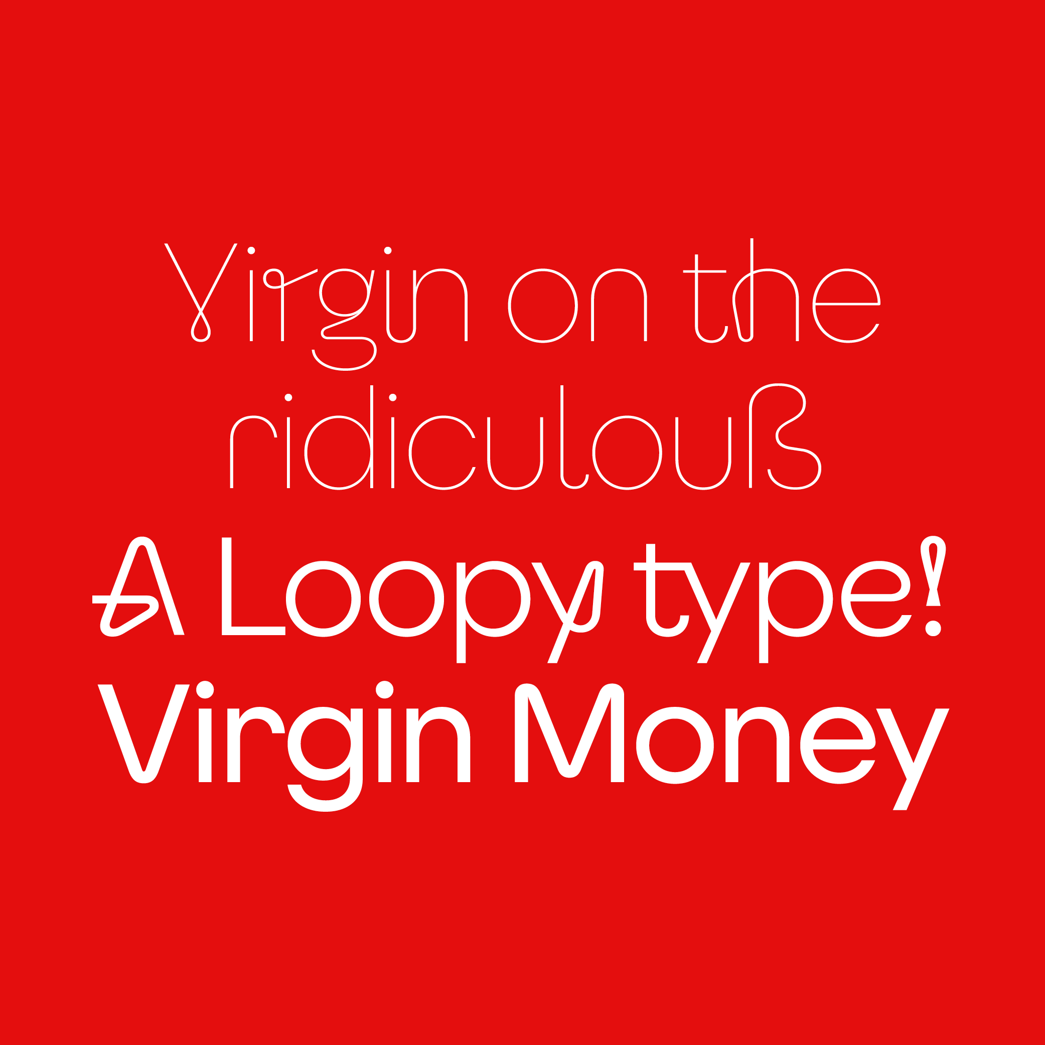
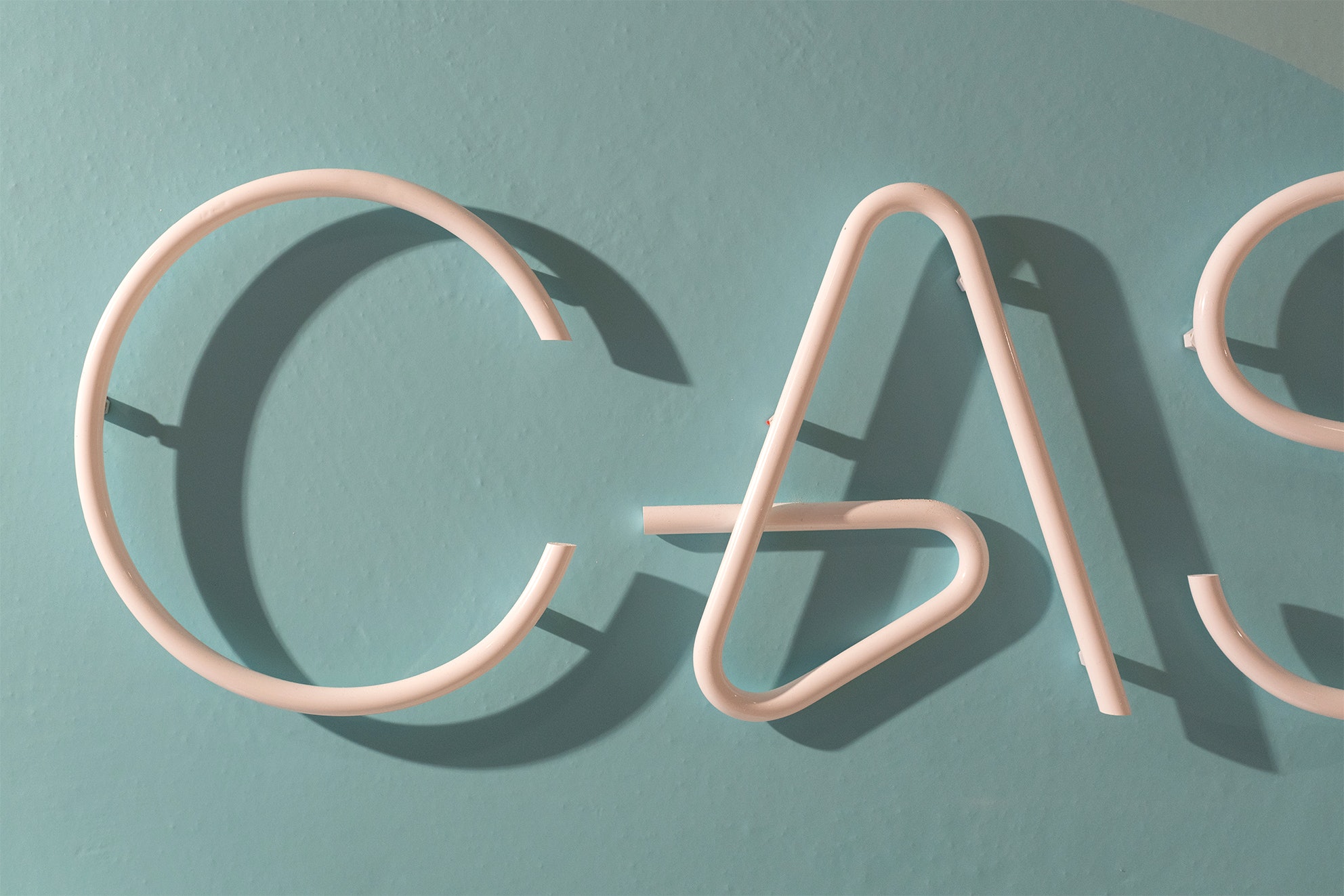
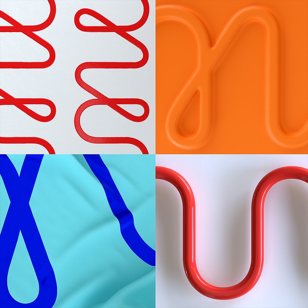
Starting from the bespoke mono-linear wordmark and its distinctive loops, we built the whole headline typeface to balance geometric curves, nuanced humanist forms, and hard edges and angles of the surrounding brand. This subtle balance reflects both the modern, pragmatic, forward-thinking values of Virgin Money as well as the people at the heart of everything they do.
Originating from the original typeface we developed for the brand, Virgin Money Loop uses a modified version of Virgin Money Sans as its base, incorporating the distinctive brand loop element into the character set. In doing so, these new forms create a sense of movement and, in some instances, the impression that the letters are made from a single line. Depending on the context, the number of looped characters or discretionary ligatures used within a word or phrase can be adjusted to reduce or augment the level of visual personality required.
Custom Typeface
Year: 2019
Client: Virgin Money
Agency: Pentagram
Team: NaN, Luke Powell, Jody Hudson Powell, Jack Llewellyn, Amy Joycey, Laura Chan
