East London Liquor Co.
Trial fontsCustom
Typeface
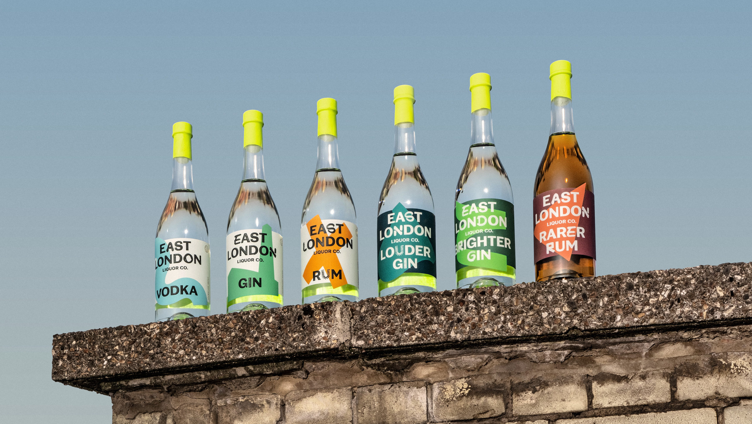
East London Liquor Co. is up for a fight.
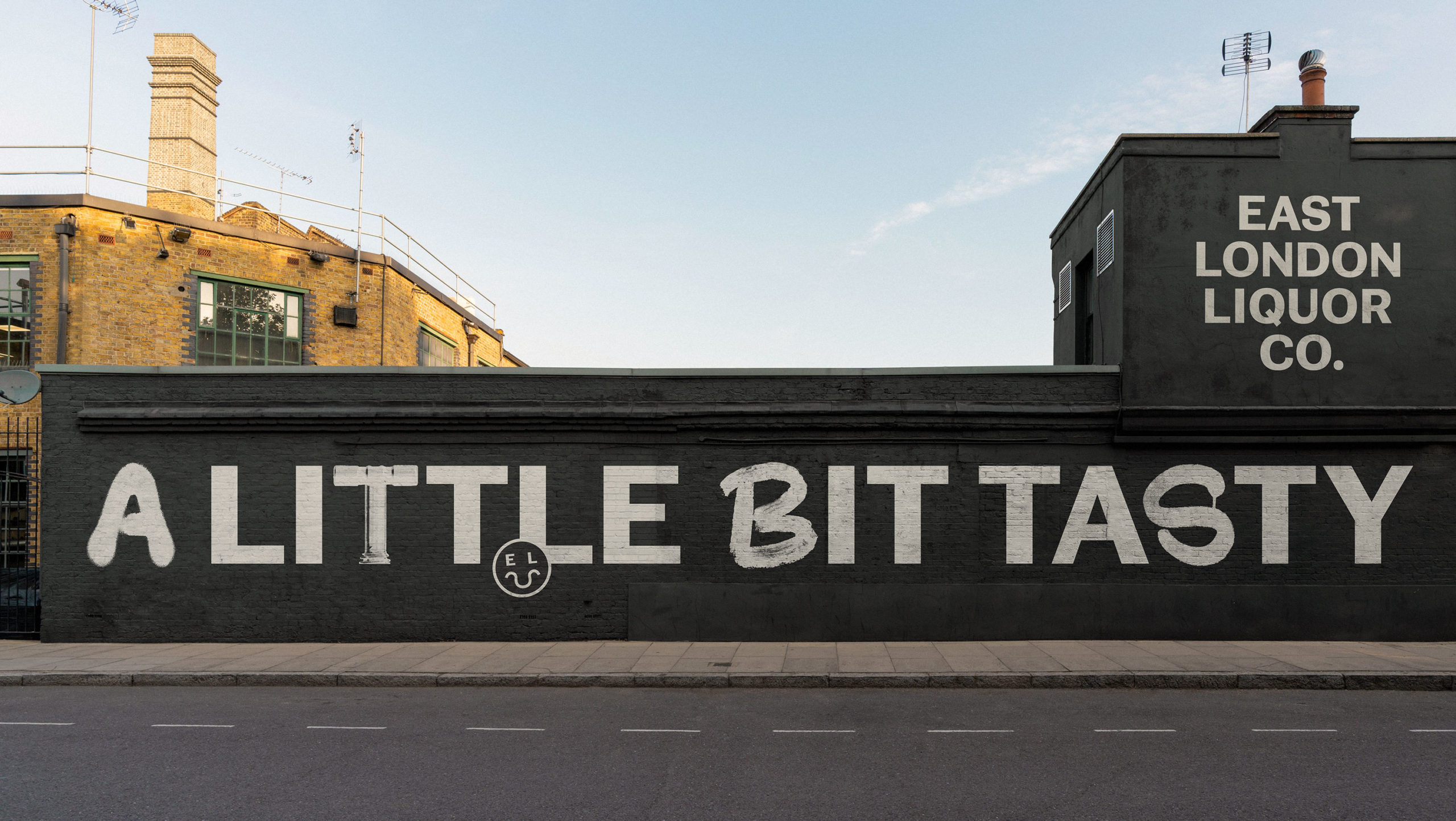
Drawing inspiration from around the brewery itself, we collaborated with Ragged Edge to develop an eye-catching display typeface for an era-defining rebrand. Setting the typographic trends to come.
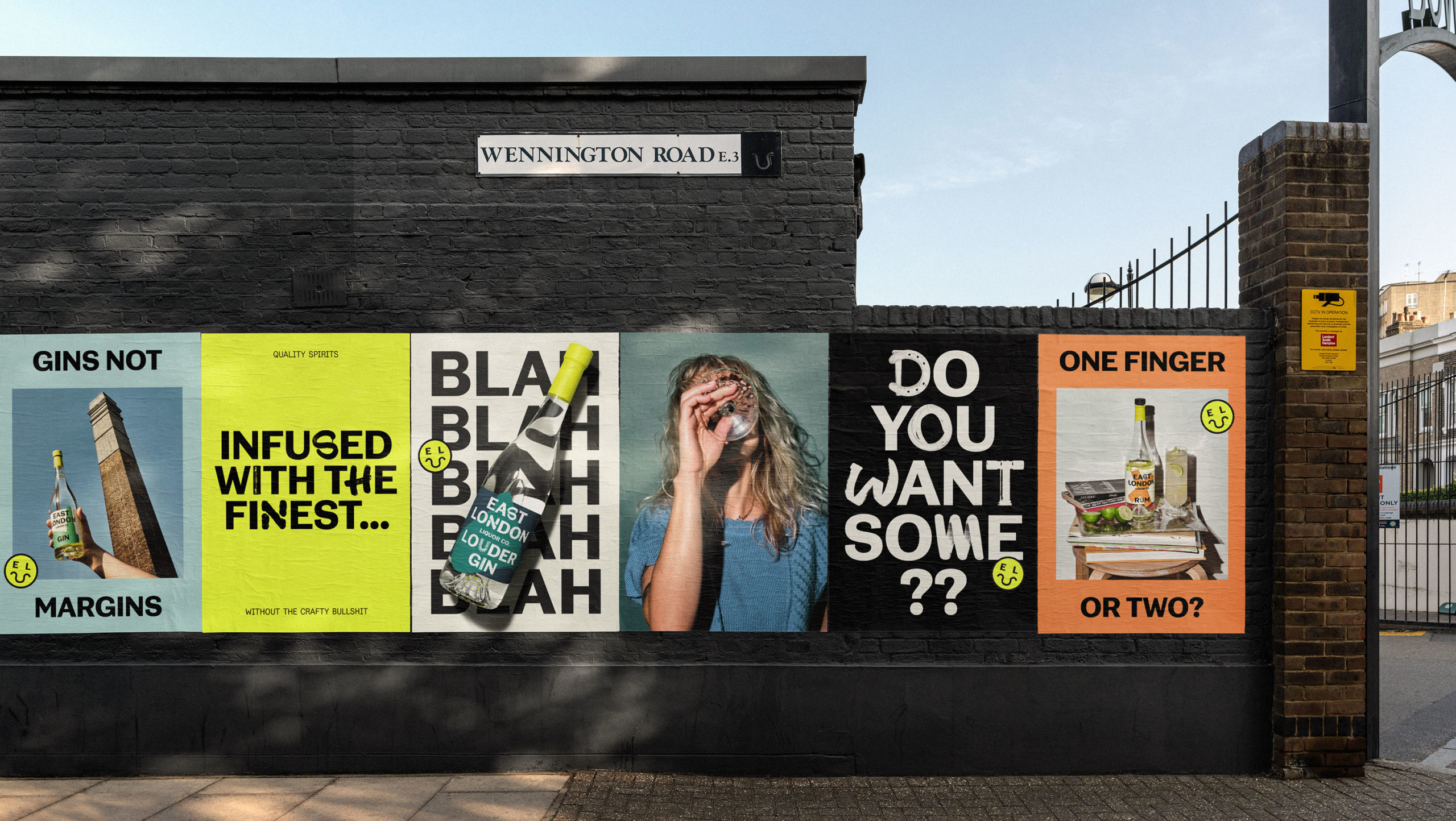
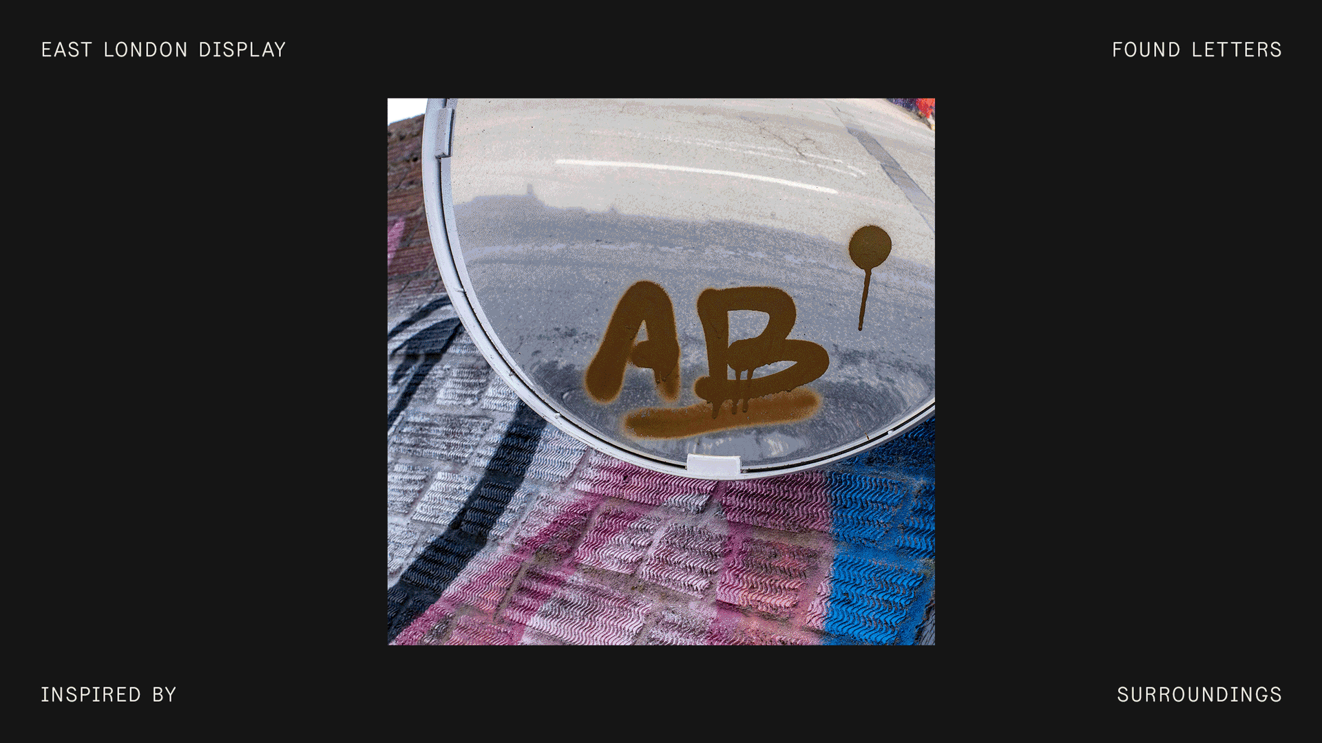
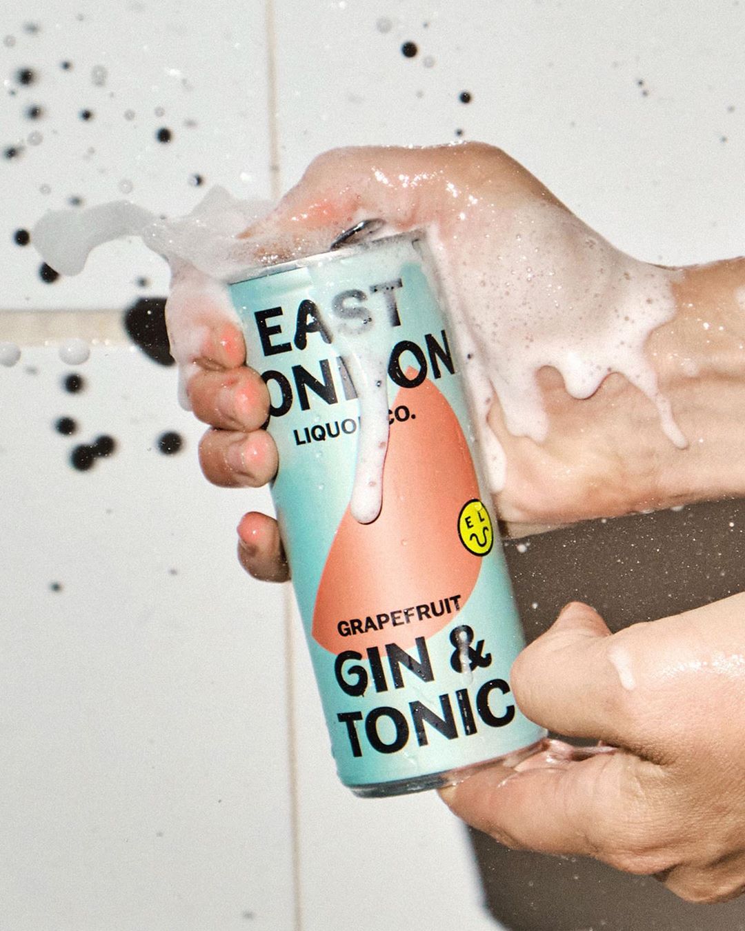
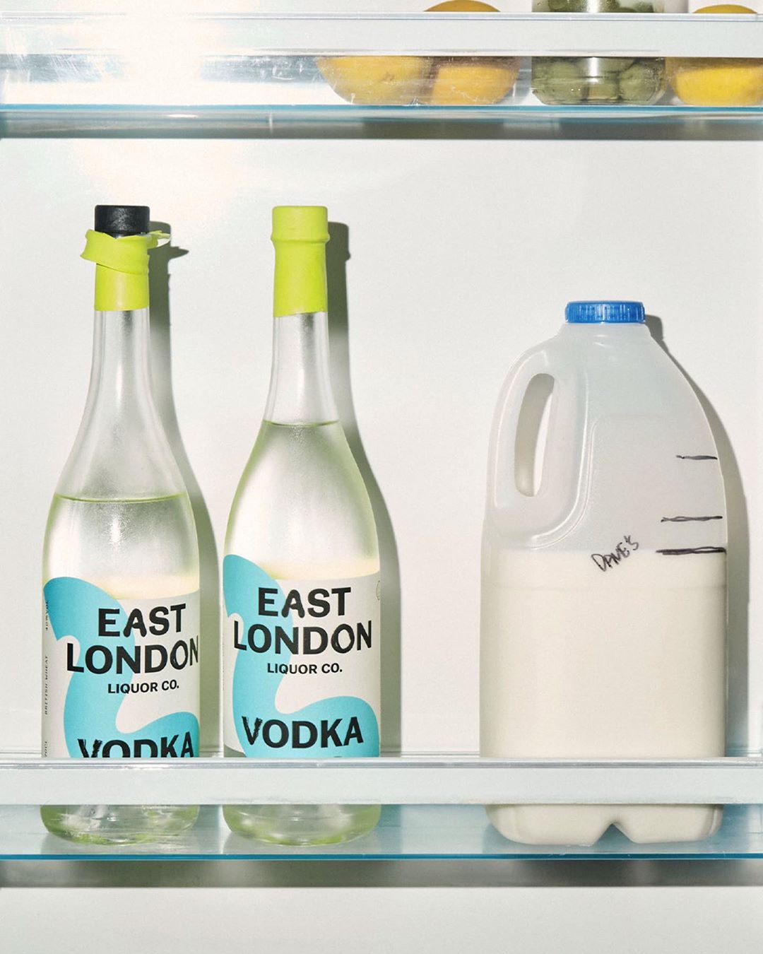
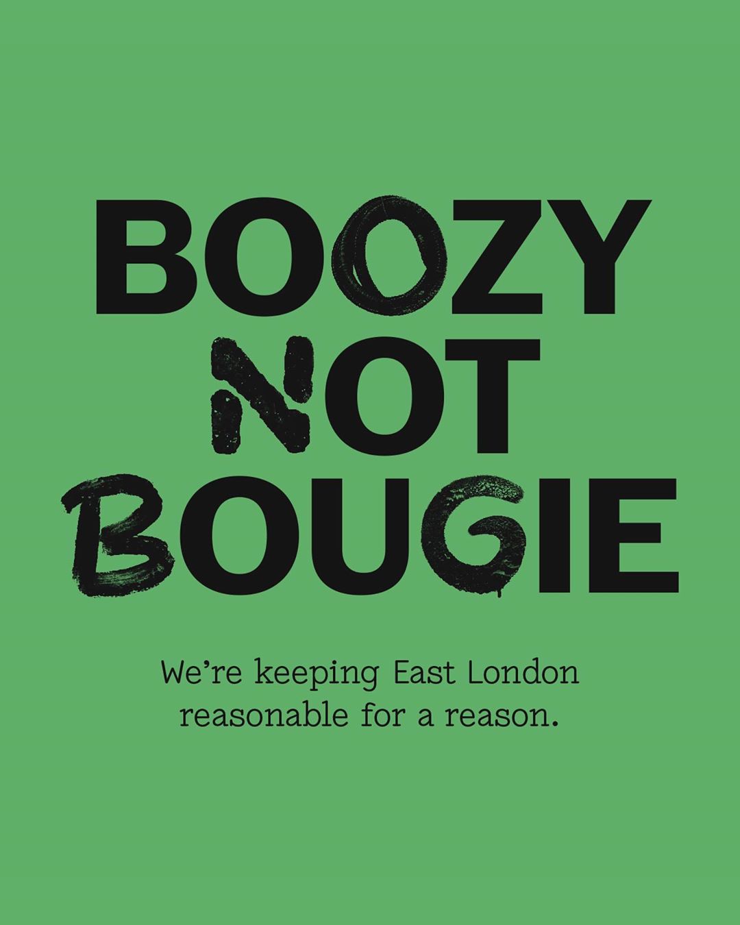
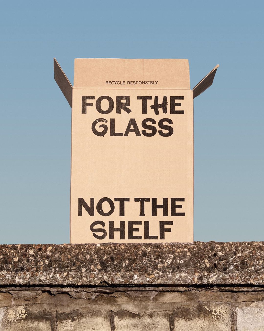
We found the solution in an all-caps grotesque rooted in London’s type history as the pragmatic base, while its scavenged alternates brought the identity firmly into the 21st century. Never taking itself too seriously, the alternates in question took the form of found graffiti, objects in and around the brewery, and simply happy accidents, enlivening the character set and allowing the typeface to embody the energetic feeling of this atypical brewery.
This rebrand takes a stand: unpretentious, unapologetic, and unabashed in its flagrant disrespect for the limits of the category. Undeniably leading the charge with a two-finger fighting spirit.
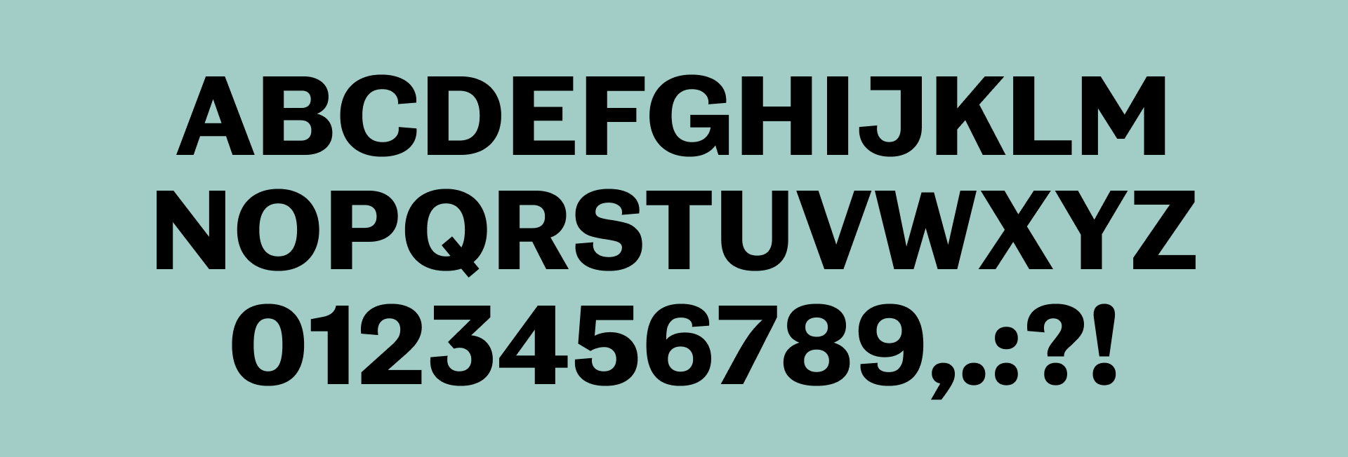
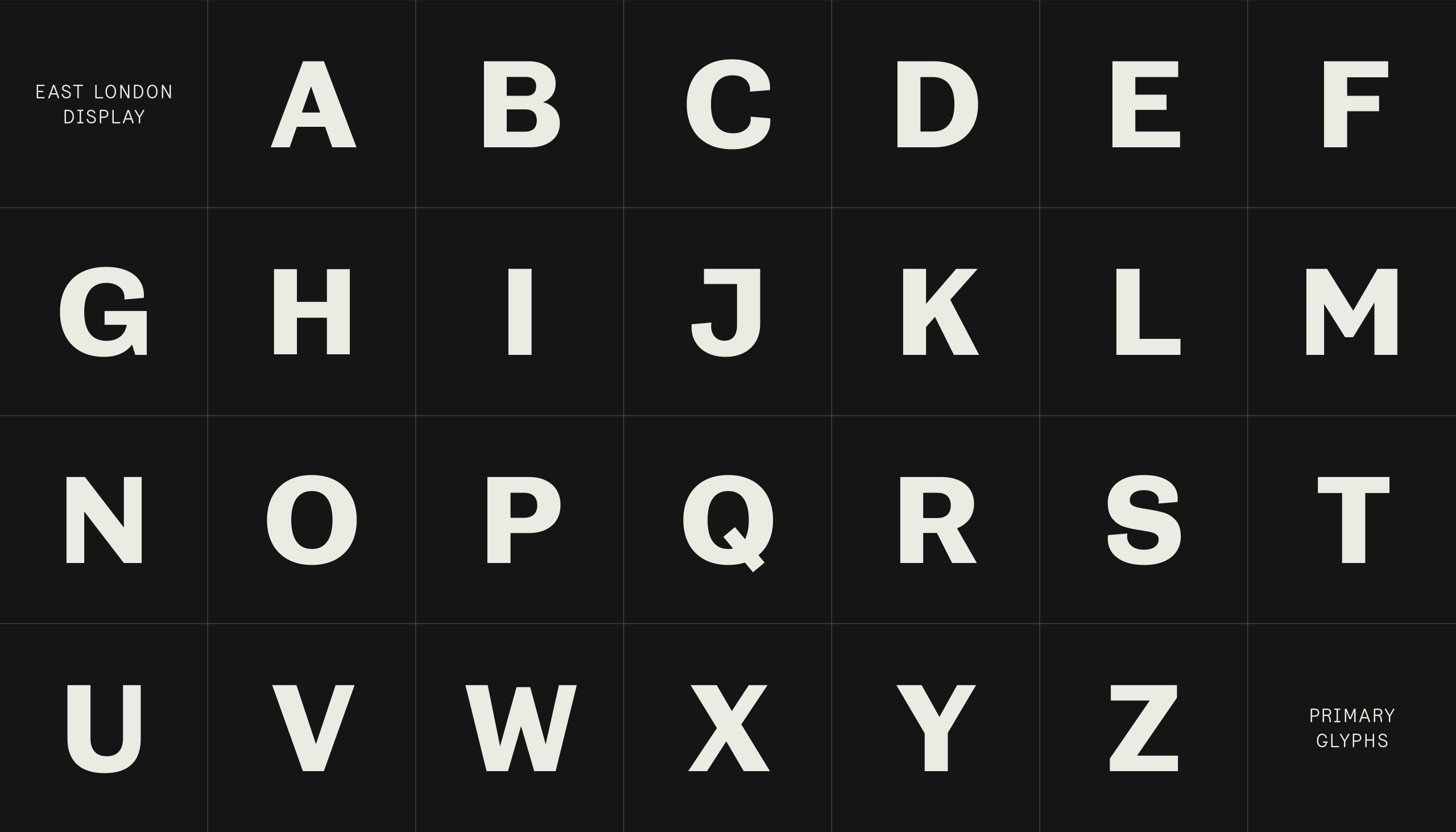

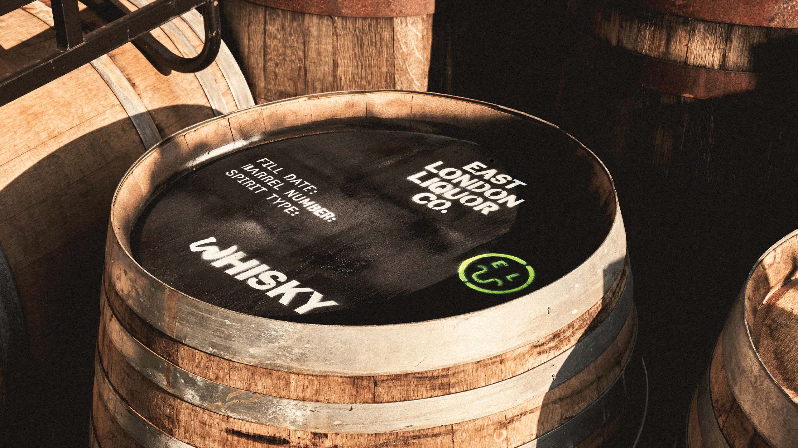
Custom Typeface
Year: 2020
Client: East London Liquor Co.
Agency: Ragged Edge
Team: NaN, Ragged Edge, Matt Smith, Venetia Thorneycroft, Luke Woodhouse, Charlie McKay
