Frieze Magazine & Art Fair
Trial fontsCustom
Typeface
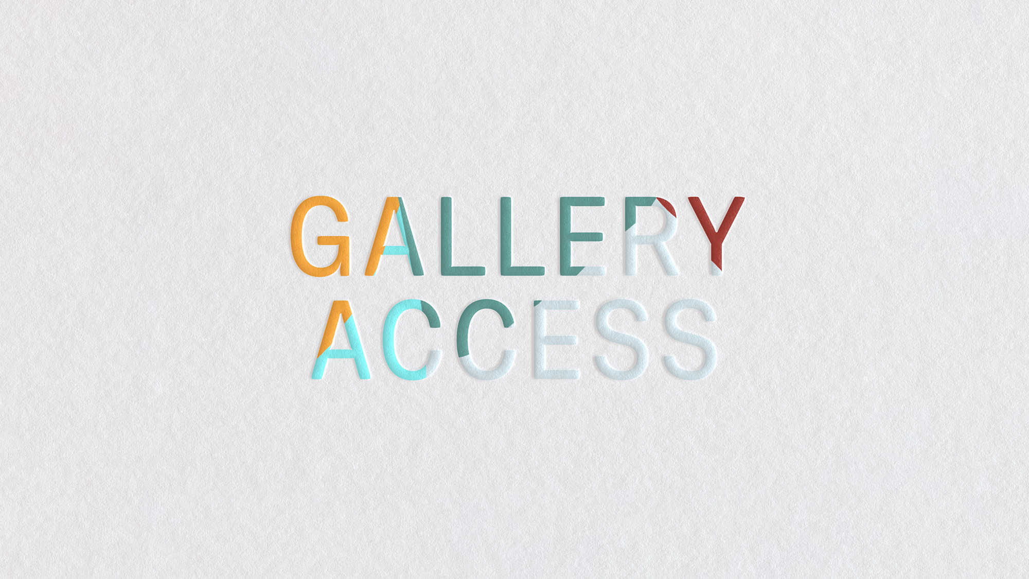
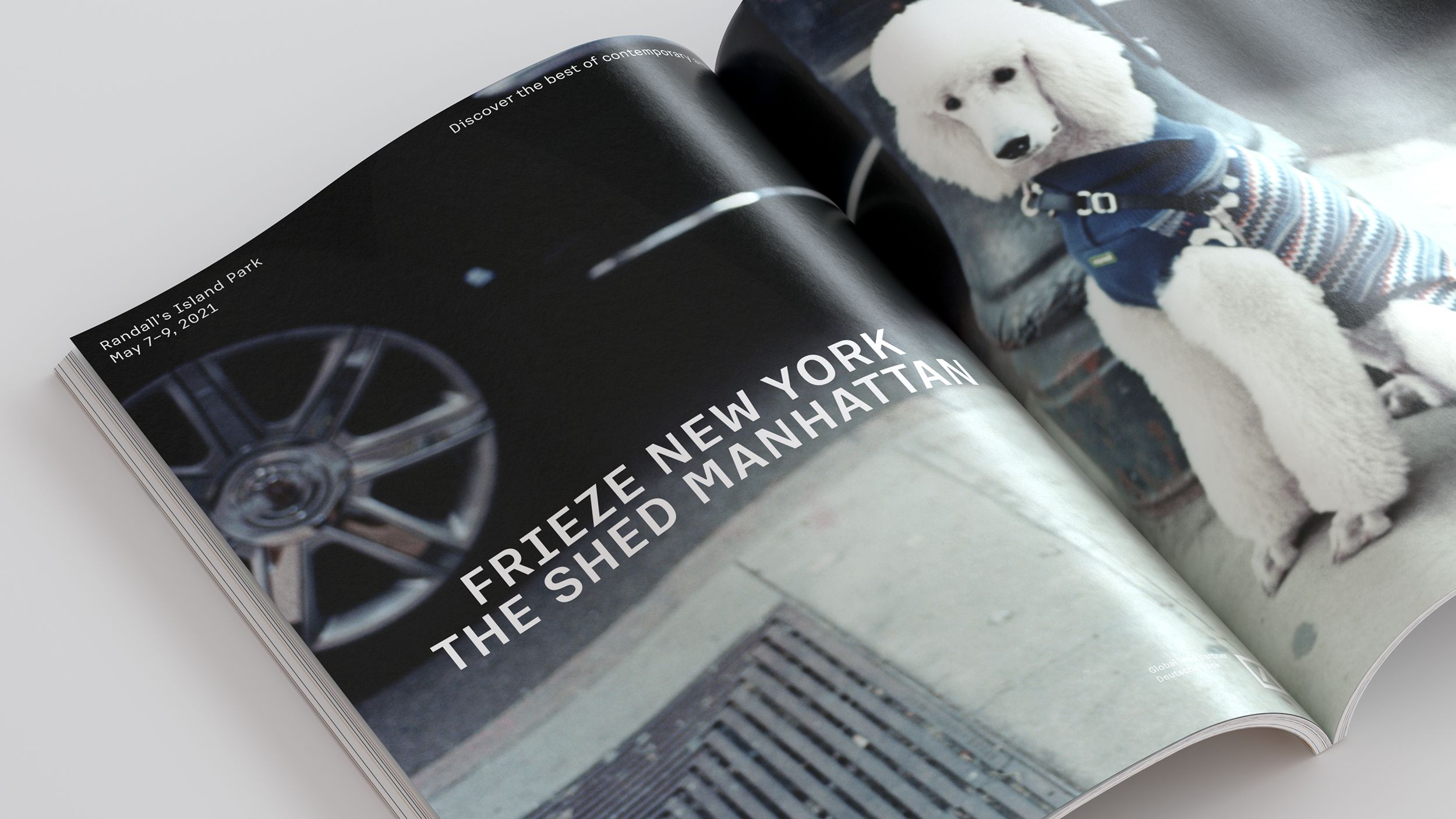
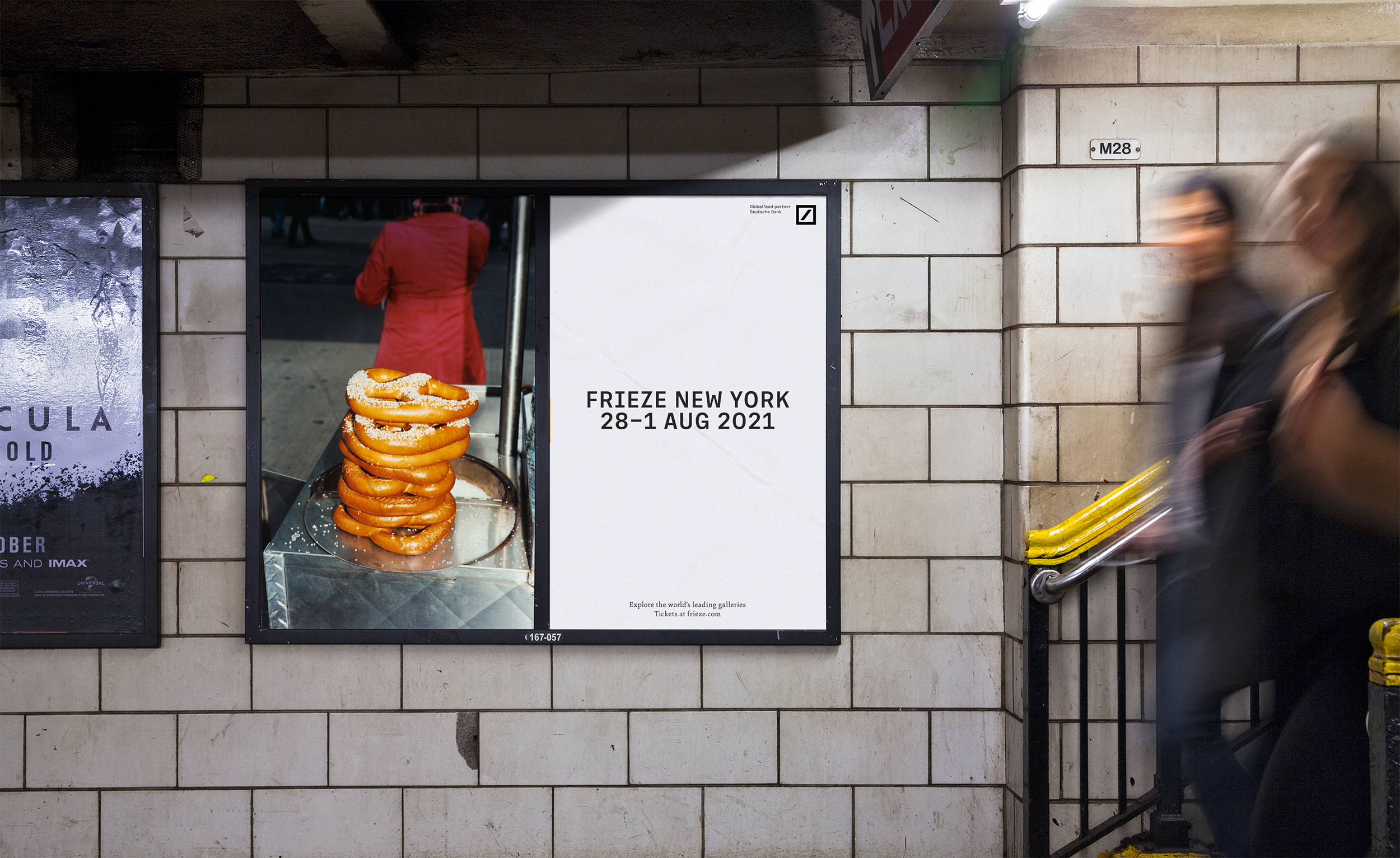
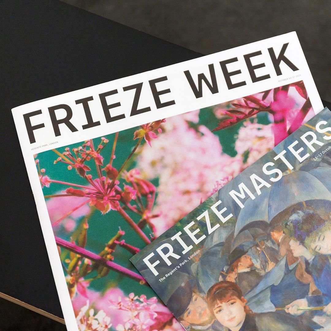
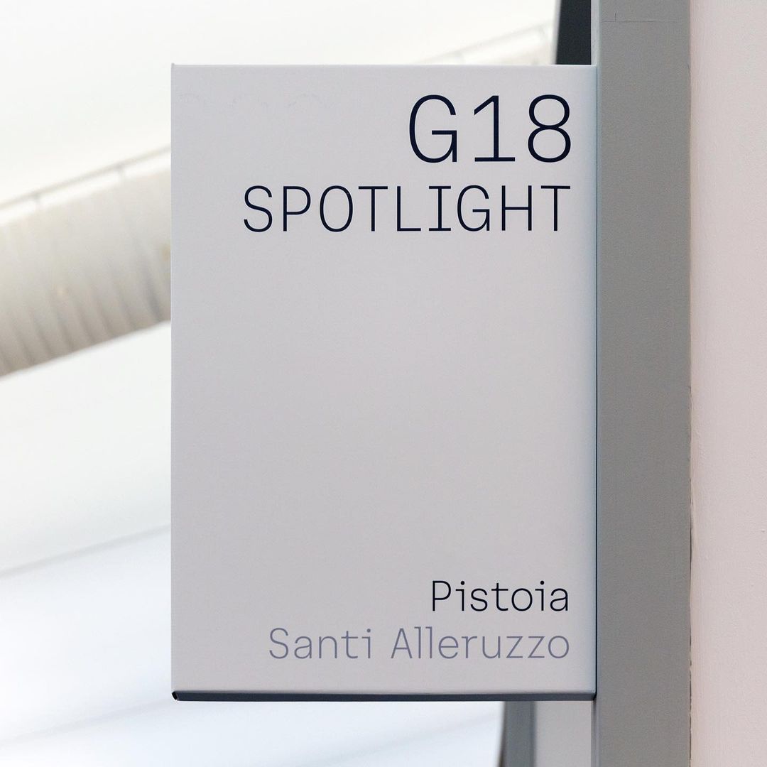
Crafted in conjunction with Luke and Jody, we designed a new typeface as part of Pentagram’s rebrand for the arts organisation Frieze, celebrating its 30th anniversary.
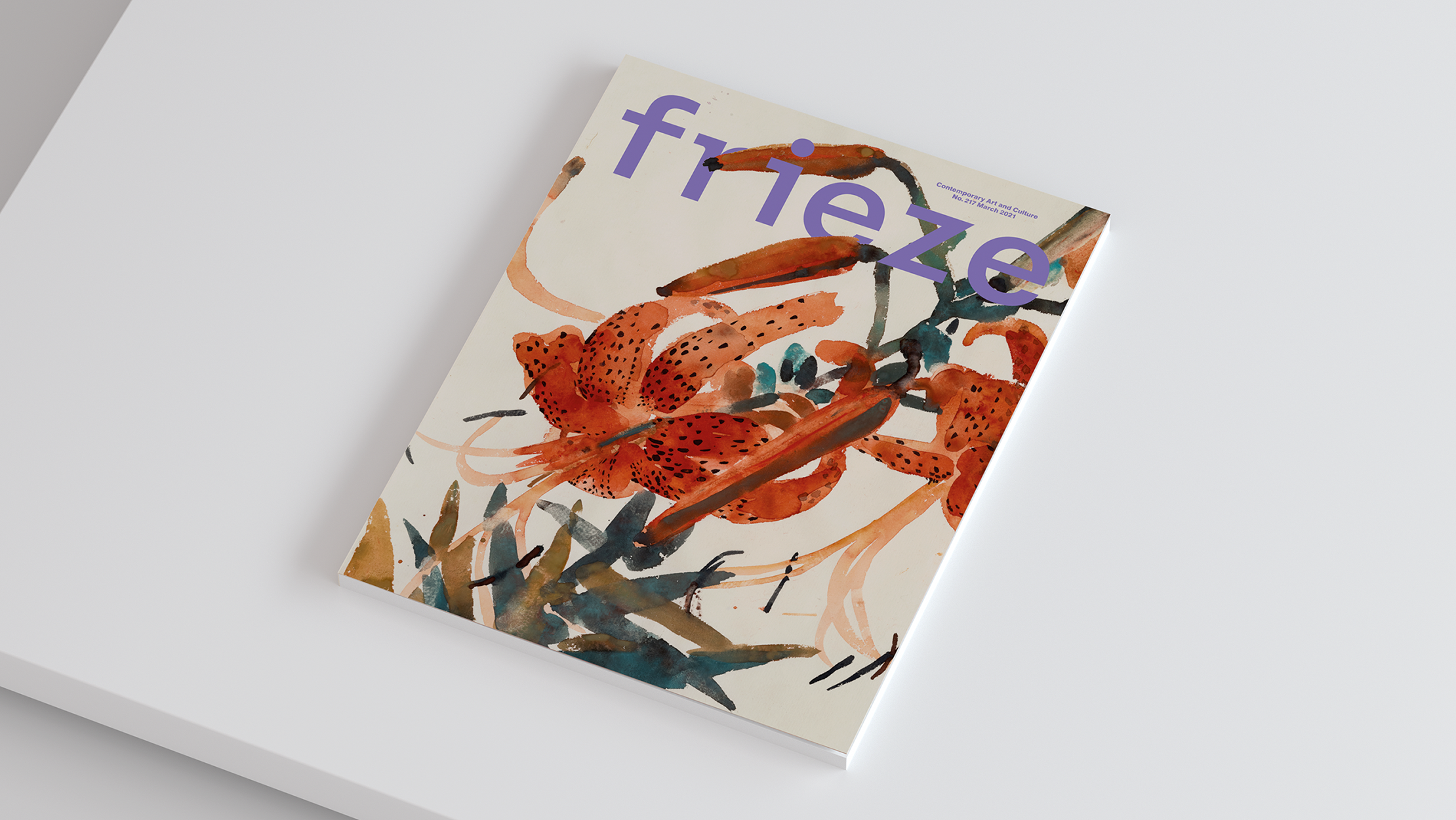
With a sensitivity to its heritage, the unique features of the Frieze magazine masthead – created by Tom Gidley and later redesigned by Paul Barnes – were used to create a modern, sophisticated and ownable typeface which could be used across the whole brand. Additional features were needed to expand the existing design into Frieze’s own original typeface, such as curved brackets and occasional slab serifs, whilst retaining the masthead’s original qualities.
By developing uniquely narrow uppercase characters, we were able to create a natural continuation of the masthead’s monospace, typewriter-inspired features, resulting in a custom typeface which embodies the essence of the brand itself.
Custom Typeface
Year: 2021
Client: Frieze
Agency: Pentagram
Team: NaN, Luke Powell, Jody Hudson Powell, Margherita Papini, Ceri Stock, Luis Gutiérrez Rico
