About NaN Metrify
NaN Metrify is NaN’s behemoth, no-bullshit take on the Neo/Grotesk sans-serif genre. Known for our library of wild horses, we thought it was about time for a workhorse or two (or three, in fact), and we ended up with quite a globe-hopping rogue of an equine at that.
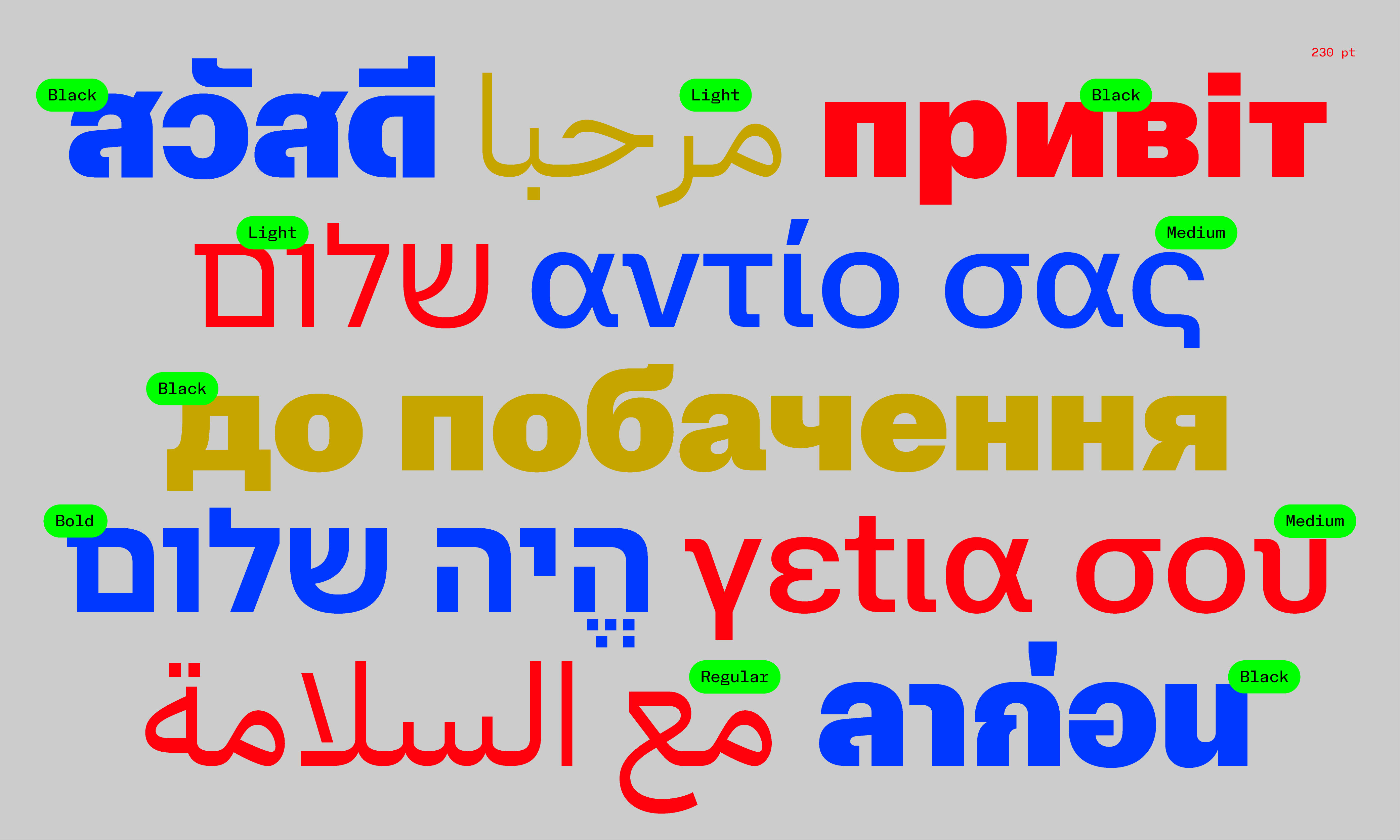
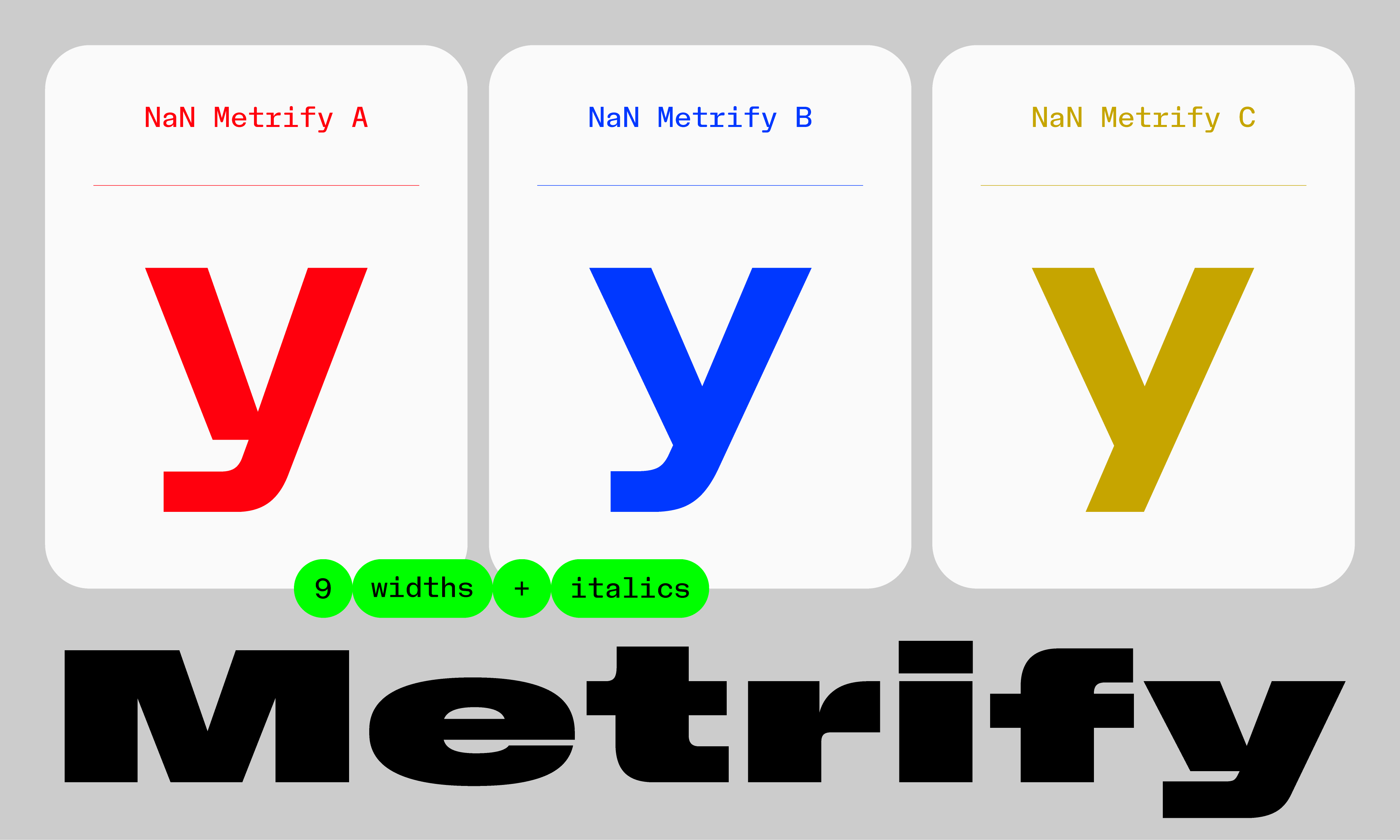
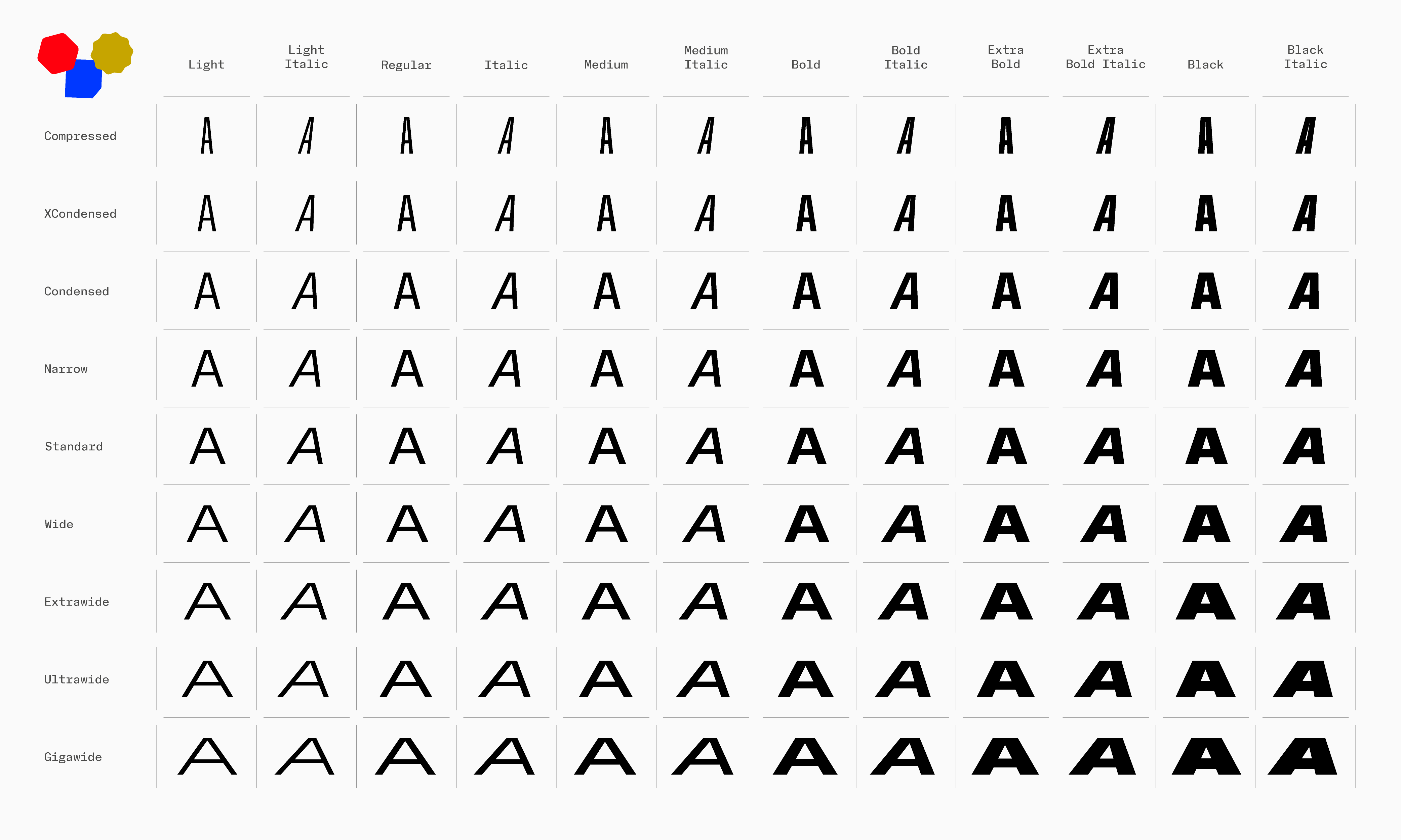
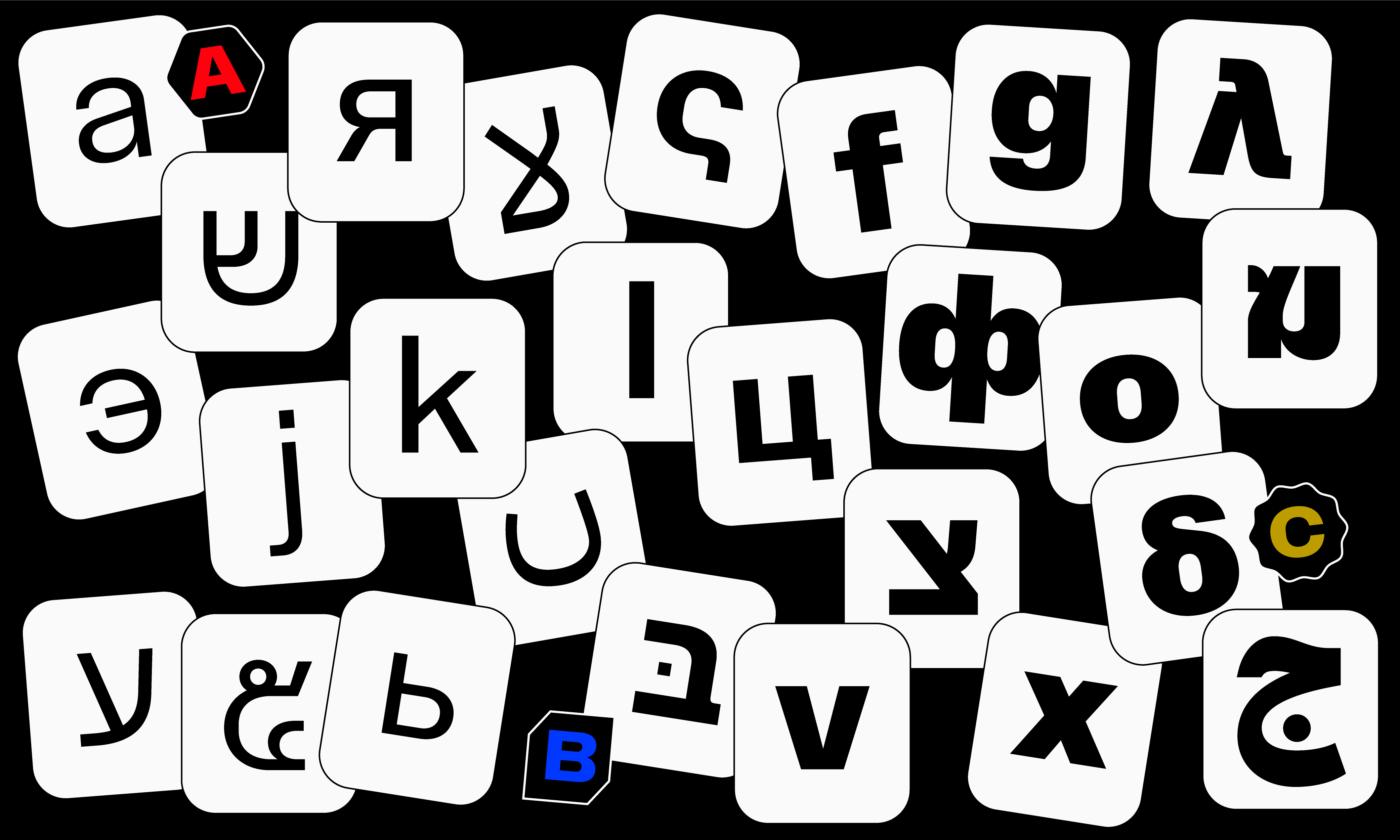
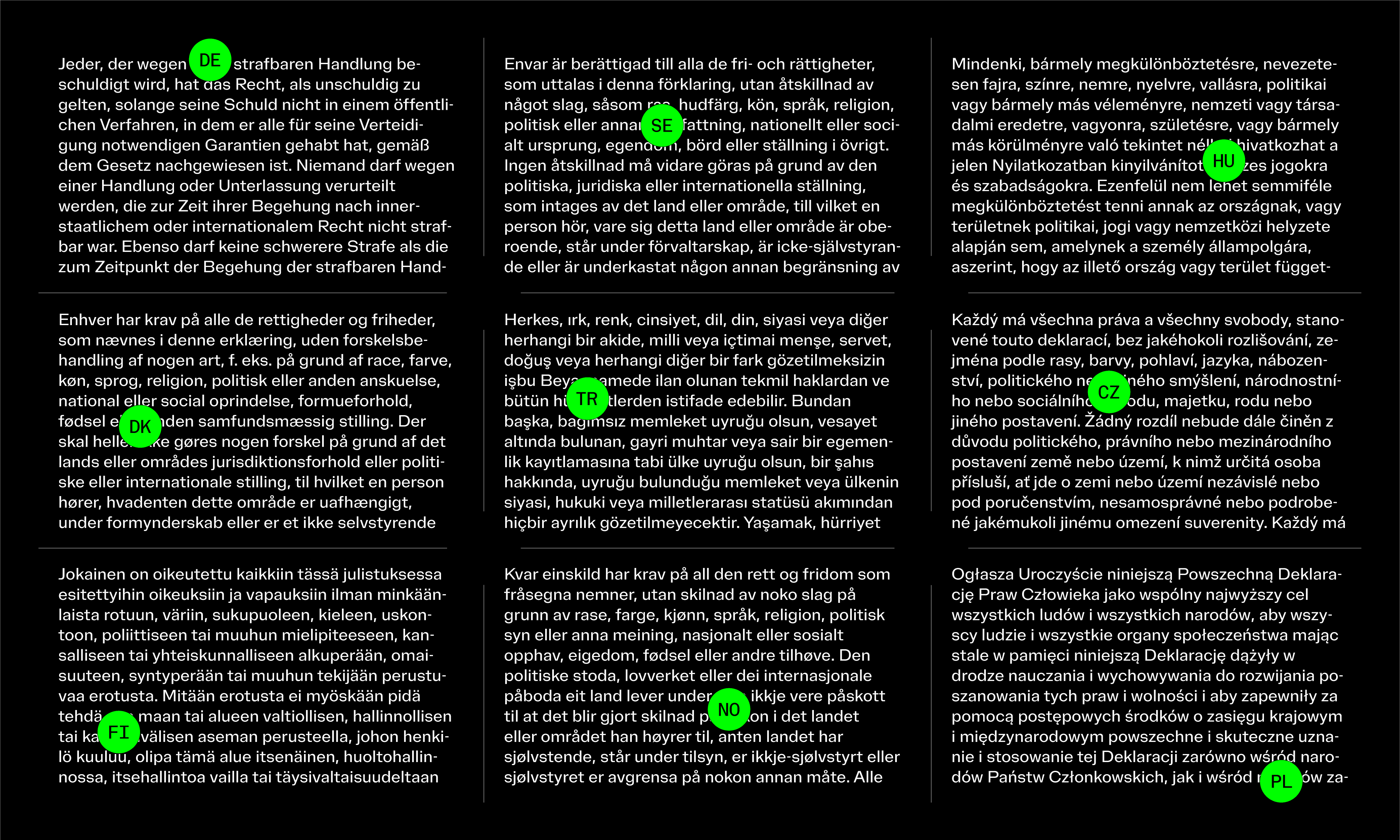
Neo-grotesks, through their role in contemporary design history, and their place in visual culture, represent an ubiquitous genre. Systemised and global, NaN’s approach is, in part, an answer to contemporary branding challenges. With nine widths, six weights and corresponding matching italics for each – bringing the number of styles to 108 per ABC version – plus standard versions available in Arabic, Cyrillic, Hebrew, Pan-African and Thai, Metrify is our first world-type family.
World-Ready (and waiting)
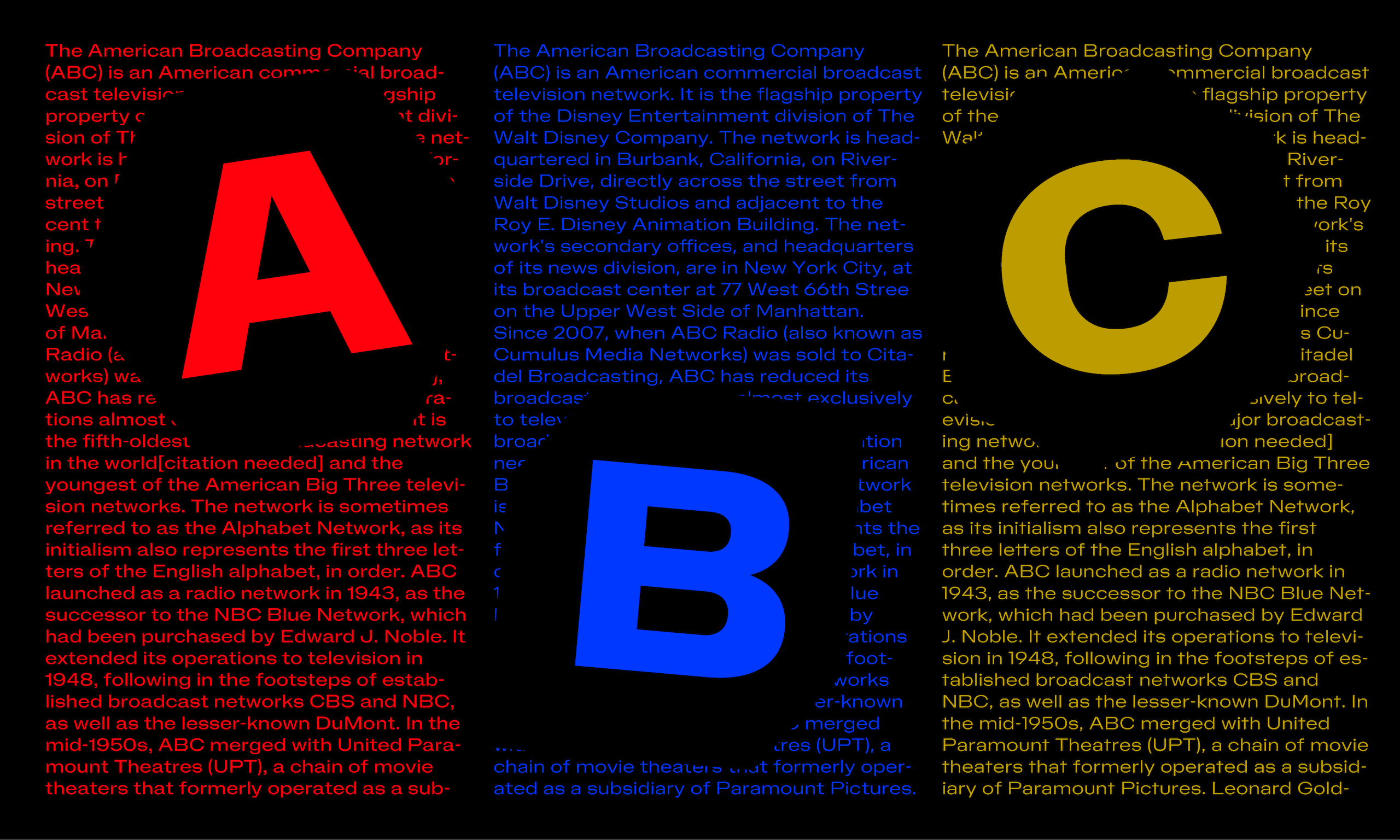
ABC
Style Range
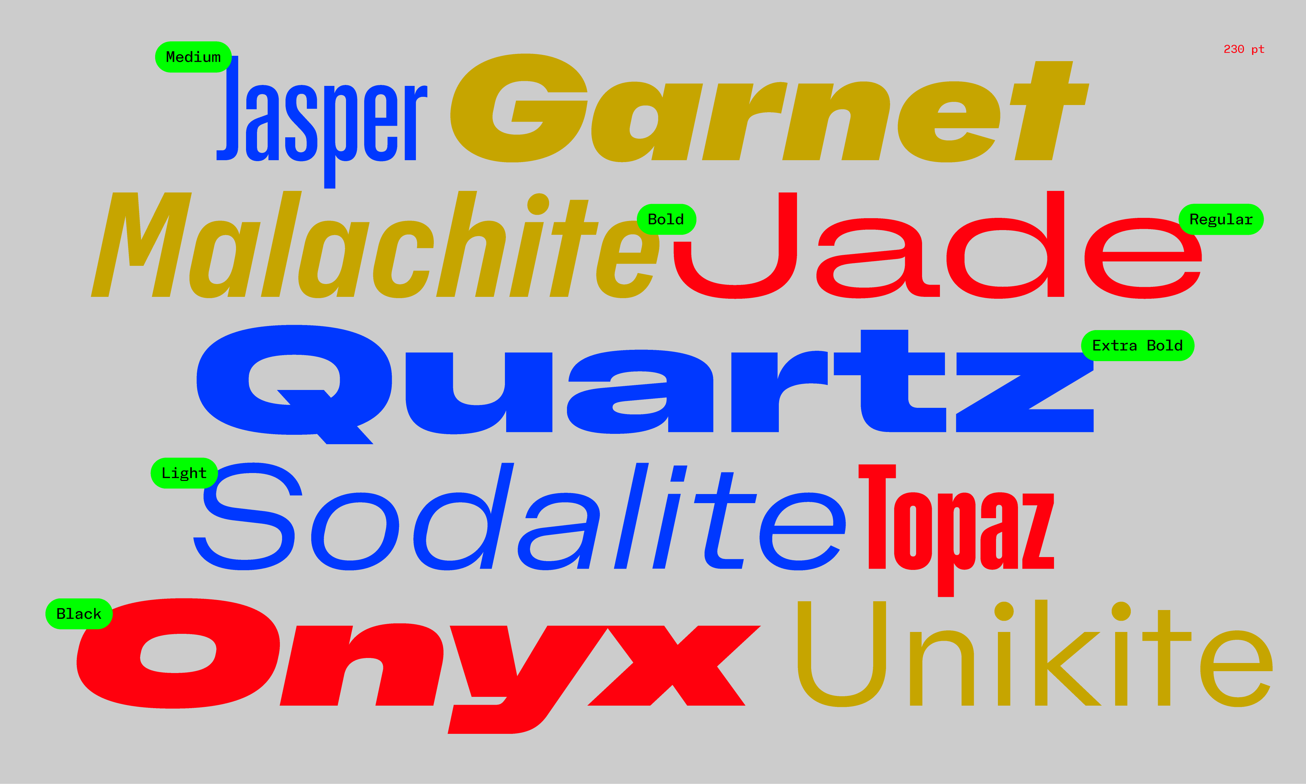
Fresh out the packet, NaN Metrify Latin populates a set of nine widths of six weights, each with matching italics, bringing the number of styles to 108 per ABC version. Its extreme range of widths – spanning Compressed and Gigawide – allows for super strong headlines, while the middle range (Narrow, Standard and Wide) are comfortable setting any running text.
▽ Download PDF specimen for detailed samples, glyphs overviews, language support and character sets.
www.metrify.world
Typeface: NaN MetrifyDesign: NaNLead Design: Luke Prowse & J.B MorizotEngineering: J.B MorizotAdditional Design & QA: Florian Runge, Léon Hugues, Fátima Lázaro, Benjamin BlaessArabic: Naïma Ben AyedCyrillic: Florian Runge & Daria CohenHebrew: Florian RungeGreek: Daria CohenThai: Ben Mitchell & Léon HuguesSpacing: Igino Marini
Script Consultants:Hebrew: Liron LaviGreek: Kostas BartsokasCyrillic: Daria CohenThai: Ben Mitchell
Year: 2022-2023Formats: TTF, WOFF2 (Autohinted)
▽ Download PDF Specimen
Microsite: www.metrify.world
NaN Metrify Arabic
NaN Metrify Cyrillic
NaN Metrify Greek
NaN Metrify Hebrew
NaN Metrify Latin XCondensed
NaN Metrify Latin Condensed
NaN Metrify Latin Compressed
NaN Metrify Latin Narrow
NaN Metrify Latin Standard
NaN Metrify Latin Wide
NaN Metrify Latin Gigawide
NaN Metrify Latin XWide
NaN Metrify Latin Ultrawide
NaN Metrify Panafrican
NaN Metrify Thai
Light A
Light B
Light C
Regular A
Regular B
Regular C
Medium A
Medium B
Medium C
Bold A
Bold B
Bold C
Extrabold A
Extrabold B
Extrabold C
Black A
Black B
Black C
Light A
Light B
Light C
Light Italic A
Light Italic B
Light Italic C
Regular A
Regular B
Regular C
Italic A
Italic B
Italic C
Medium A
Medium B
Medium C
Medium Italic A
Medium Italic B
Medium Italic C
Bold A
Bold B
Bold C
Bold Italic A
Bold Italic B
Bold Italic C
Extrabold A
Extrabold B
Extrabold C
Extrabold Italic A
Extrabold Italic B
Extrabold Italic C
Black A
Black B
Black C
Black Italic A
Black Italic B
Black Italic C
Light A
Light B
Light C
Regular A
Regular B
Regular C
Medium A
Medium B
Medium C
Bold A
Bold B
Bold C
Extrabold A
Extrabold B
Extrabold C
Black A
Black B
Black C
Light A
Light B
Light C
Light Italic A
Light Italic B
Light Italic C
Regular A
Regular B
Regular C
Italic A
Italic B
Italic C
Medium A
Medium B
Medium C
Medium Italic A
Medium Italic B
Medium Italic C
Bold A
Bold B
Bold C
Bold Italic A
Bold Italic B
Bold Italic C
Extrabold A
Extrabold B
Extrabold C
Extrabold Italic A
Extrabold Italic B
Extrabold Italic C
Black A
Black B
Black C
Black Italic A
Black Italic B
Black Italic C
Light A
Light B
Light C
Regular A
Regular B
Regular C
Medium A
Medium B
Medium C
Bold A
Bold B
Bold C
Extrabold A
Extrabold B
Extrabold C
Black A
Black B
Black C
Vitra – founded by Willi and Erika Fehlbaum, the owner of a shopfitting business – entered the furniture market in 1957 with the licensed production of furniture from the Herman Miller Collection for the European market – primarily designs by Charles and Ray Eames and George Nelson. In 1967 the company introduced the Panton Chair by Verner Panton – the first cantilever chair out of plastic. In 1977 Rolf Fehlbaum took over the management of Vitra. In 1984 the partnership that had been formed with Herman Miller was terminated by mutual consent. Subsequently, Vitra obtained the rights to designs by Charles and Ray Eames and George Nelson for Europe and the Middle East. Today, Vitra’s product line consists of designer furniture for use in offices, homes and public areas. In 2002, the company took in the realm of domestic living. Launched in 2004, the Home Collection includes classic furniture design pieces by Charles and Ray Eames, George Nelson, Verner Panton, Alexander Girard and Jean Prouvé, as well as the works of designers such as Antonio Citterio, Jasper Morrison, Alberto Meda, Maarten van Severen, Ronan and Erwan Bouroullec, Hella Jongerius and BarberOsgerby. After a major fire destroyed a large part of the Vitra production facilities in Weil am Rhein in 1981, British architect Nicholas Grimshaw was commissioned to design new factory buildings and develop a master plan for the company premises. Inspired by his acquaintance with Frank Gehry in the mid-1980s, Vitra departed from Grimshaw’s plan for a unified corporate project. Since that time, buildings have been erected on the Vitra grounds in Weil am Rhein by a wide-ranging group of architects, including Frank Gehry (Vitra Design Museum and Factory Building, 1989), Zaha Hadid (Fire Station, 1993), Tadao Ando (Conference Pavilion, 1993), Alvaro Siza (Factory Building, Passage Cover, Car Parking, 1994), Herzog & de Meuron (VitraHaus, 2010), and SANAA (Factory Building, 2011). Over the years, Vitra accumulated a growing collection of chairs and other furniture. With the aim of making the collection accessible to the public, a museum was established as an independent foundation dedicated to the research and popularization of design and architecture. The Vitra Design Museum from 1989 by Frank Gehry was the first public building on the campus as well as the architect’s first building in Europe. Today the museum is partly based on the own broad collection of 20th century furniture as well as host of visiting exhibitions.
NaN Metrify Arabic
NaN Metrify Cyrillic
NaN Metrify Greek
NaN Metrify Hebrew
NaN Metrify Latin XCondensed
NaN Metrify Latin Condensed
NaN Metrify Latin Compressed
NaN Metrify Latin Narrow
NaN Metrify Latin Standard
NaN Metrify Latin Wide
NaN Metrify Latin Gigawide
NaN Metrify Latin XWide
NaN Metrify Latin Ultrawide
NaN Metrify Panafrican
NaN Metrify Thai
Light A
Light B
Light C
Regular A
Regular B
Regular C
Medium A
Medium B
Medium C
Bold A
Bold B
Bold C
Extrabold A
Extrabold B
Extrabold C
Black A
Black B
Black C
Light A
Light B
Light C
Light Italic A
Light Italic B
Light Italic C
Regular A
Regular B
Regular C
Italic A
Italic B
Italic C
Medium A
Medium B
Medium C
Medium Italic A
Medium Italic B
Medium Italic C
Bold A
Bold B
Bold C
Bold Italic A
Bold Italic B
Bold Italic C
Extrabold A
Extrabold B
Extrabold C
Extrabold Italic A
Extrabold Italic B
Extrabold Italic C
Black A
Black B
Black C
Black Italic A
Black Italic B
Black Italic C
Light A
Light B
Light C
Light Italic A
Light Italic B
Light Italic C
Regular A
Regular B
Regular C
Italic A
Italic B
Italic C
Medium A
Medium B
Medium C
Medium Italic A
Medium Italic B
Medium Italic C
Bold A
Bold B
Bold C
Bold Italic A
Bold Italic B
Bold Italic C
Extrabold A
Extrabold B
Extrabold C
Extrabold Italic A
Extrabold Italic B
Extrabold Italic C
Black A
Black B
Black C
Black Italic A
Black Italic B
Black Italic C
Light A
Light B
Light C
Regular A
Regular B
Regular C
Medium A
Medium B
Medium C
Bold A
Bold B
Bold C
Extrabold A
Extrabold B
Extrabold C
Black A
Black B
Black C
Light A
Light B
Light C
Light Italic A
Light Italic B
Light Italic C
Regular A
Regular B
Regular C
Italic A
Italic B
Italic C
Medium A
Medium B
Medium C
Medium Italic A
Medium Italic B
Medium Italic C
Bold A
Bold B
Bold C
Bold Italic A
Bold Italic B
Bold Italic C
Extrabold A
Extrabold B
Extrabold C
Extrabold Italic A
Extrabold Italic B
Extrabold Italic C
Black A
Black B
Black C
Black Italic A
Black Italic B
Black Italic C
Light A
Light B
Light C
Light Italic A
Light Italic B
Light Italic C
Regular A
Regular B
Regular C
Italic A
Italic B
Italic C
Medium A
Medium B
Medium C
Medium Italic A
Medium Italic B
Medium Italic C
Bold A
Bold B
Bold C
Bold Italic A
Bold Italic B
Bold Italic C
Extrabold A
Extrabold B
Extrabold C
Extrabold Italic A
Extrabold Italic B
Extrabold Italic C
Black A
Black B
Black C
Black Italic A
Black Italic B
Black Italic C
Light A
Light B
Light C
Light Italic A
Light Italic B
Light Italic C
Regular A
Regular B
Regular C
Italic A
Italic B
Italic C
Medium A
Medium B
Medium C
Medium Italic A
Medium Italic B
Medium Italic C
Bold A
Bold B
Bold C
Bold Italic A
Bold Italic B
Bold Italic C
Extrabold A
Extrabold B
Extrabold C
Extrabold Italic A
Extrabold Italic B
Extrabold Italic C
Black A
Black B
Black C
Black Italic A
Black Italic B
Black Italic C
Light A
Light B
Light C
Light Italic A
Light Italic B
Light Italic C
Regular A
Regular B
Regular C
Italic A
Italic B
Italic C
Medium A
Medium B
Medium C
Medium Italic A
Medium Italic B
Medium Italic C
Bold A
Bold B
Bold C
Bold Italic A
Bold Italic B
Bold Italic C
Extrabold A
Extrabold B
Extrabold C
Extrabold Italic A
Extrabold Italic B
Extrabold Italic C
Black A
Black B
Black C
Black Italic A
Black Italic B
Black Italic C
Light A
Light B
Light C
Light Italic A
Light Italic B
Light Italic C
Regular A
Regular B
Regular C
Italic A
Italic B
Italic C
Medium A
Medium B
Medium C
Medium Italic A
Medium Italic B
Medium Italic C
Bold A
Bold B
Bold C
Bold Italic A
Bold Italic B
Bold Italic C
Extrabold A
Extrabold B
Extrabold C
Extrabold Italic A
Extrabold Italic B
Extrabold Italic C
Black A
Black B
Black C
Black Italic A
Black Italic B
Black Italic C
Light A
Light B
Light C
Light Italic A
Light Italic B
Light Italic C
Regular A
Regular B
Regular C
Italic A
Italic B
Italic C
Medium A
Medium B
Medium C
Medium Italic A
Medium Italic B
Medium Italic C
Bold A
Bold B
Bold C
Bold Italic A
Bold Italic B
Bold Italic C
Extrabold A
Extrabold B
Extrabold C
Extrabold Italic A
Extrabold Italic B
Extrabold Italic C
Black A
Black B
Black C
Black Italic A
Black Italic B
Black Italic C
Light A
Light B
Light C
Light Italic A
Light Italic B
Light Italic C
Regular A
Regular B
Regular C
Italic A
Italic B
Italic C
Medium A
Medium B
Medium C
Medium Italic A
Medium Italic B
Medium Italic C
Bold A
Bold B
Bold C
Bold Italic A
Bold Italic B
Bold Italic C
Extrabold A
Extrabold B
Extrabold C
Extrabold Italic A
Extrabold Italic B
Extrabold Italic C
Black A
Black B
Black C
Black Italic A
Black Italic B
Black Italic C
Light A
Light B
Light C
Light Italic A
Light Italic B
Light Italic C
Regular A
Regular B
Regular C
Italic A
Italic B
Italic C
Medium A
Medium B
Medium C
Medium Italic A
Medium Italic B
Medium Italic C
Bold A
Bold B
Bold C
Bold Italic A
Bold Italic B
Bold Italic C
Extrabold A
Extrabold B
Extrabold C
Extrabold Italic A
Extrabold Italic B
Extrabold Italic C
Black A
Black B
Black C
Black Italic A
Black Italic B
Black Italic C
Light A
Light B
Light C
Light Italic A
Light Italic B
Light Italic C
Regular A
Regular B
Regular C
Italic A
Italic B
Italic C
Medium A
Medium B
Medium C
Medium Italic A
Medium Italic B
Medium Italic C
Bold A
Bold B
Bold C
Bold Italic A
Bold Italic B
Bold Italic C
Extrabold A
Extrabold B
Extrabold C
Extrabold Italic A
Extrabold Italic B
Extrabold Italic C
Black A
Black B
Black C
Black Italic A
Black Italic B
Black Italic C
Light A
Light B
Light C
Light Italic A
Light Italic B
Light Italic C
Regular A
Regular B
Regular C
Italic A
Italic B
Italic C
Medium A
Medium B
Medium C
Medium Italic A
Medium Italic B
Medium Italic C
Bold A
Bold B
Bold C
Bold Italic A
Bold Italic B
Bold Italic C
Extrabold A
Extrabold B
Extrabold C
Extrabold Italic A
Extrabold Italic B
Extrabold Italic C
Black A
Black B
Black C
Black Italic A
Black Italic B
Black Italic C
Light A
Light B
Light C
Regular A
Regular B
Regular C
Medium A
Medium B
Medium C
Bold A
Bold B
Bold C
Extrabold A
Extrabold B
Extrabold C
Black A
Black B
Black C
{Speaks many languages}[06]
NaN Metrify Arabic
NaN Metrify Cyrillic
NaN Metrify Greek
NaN Metrify Hebrew
NaN Metrify Latin XCondensed
NaN Metrify Latin Condensed
NaN Metrify Latin Compressed
NaN Metrify Latin Narrow
NaN Metrify Latin Standard
NaN Metrify Latin Wide
NaN Metrify Latin Gigawide
NaN Metrify Latin XWide
NaN Metrify Latin Ultrawide
NaN Metrify Panafrican
NaN Metrify Thai
Light A
Light B
Light C
Regular A
Regular B
Regular C
Medium A
Medium B
Medium C
Bold A
Bold B
Bold C
Extrabold A
Extrabold B
Extrabold C
Black A
Black B
Black C
Light A
Light B
Light C
Light Italic A
Light Italic B
Light Italic C
Regular A
Regular B
Regular C
Italic A
Italic B
Italic C
Medium A
Medium B
Medium C
Medium Italic A
Medium Italic B
Medium Italic C
Bold A
Bold B
Bold C
Bold Italic A
Bold Italic B
Bold Italic C
Extrabold A
Extrabold B
Extrabold C
Extrabold Italic A
Extrabold Italic B
Extrabold Italic C
Black A
Black B
Black C
Black Italic A
Black Italic B
Black Italic C
Light A
Light B
Light C
Light Italic A
Light Italic B
Light Italic C
Regular A
Regular B
Regular C
Italic A
Italic B
Italic C
Medium A
Medium B
Medium C
Medium Italic A
Medium Italic B
Medium Italic C
Bold A
Bold B
Bold C
Bold Italic A
Bold Italic B
Bold Italic C
Extrabold A
Extrabold B
Extrabold C
Extrabold Italic A
Extrabold Italic B
Extrabold Italic C
Black A
Black B
Black C
Black Italic A
Black Italic B
Black Italic C
Light A
Light B
Light C
Regular A
Regular B
Regular C
Medium A
Medium B
Medium C
Bold A
Bold B
Bold C
Extrabold A
Extrabold B
Extrabold C
Black A
Black B
Black C
Light A
Light B
Light C
Light Italic A
Light Italic B
Light Italic C
Regular A
Regular B
Regular C
Italic A
Italic B
Italic C
Medium A
Medium B
Medium C
Medium Italic A
Medium Italic B
Medium Italic C
Bold A
Bold B
Bold C
Bold Italic A
Bold Italic B
Bold Italic C
Extrabold A
Extrabold B
Extrabold C
Extrabold Italic A
Extrabold Italic B
Extrabold Italic C
Black A
Black B
Black C
Black Italic A
Black Italic B
Black Italic C
Light A
Light B
Light C
Light Italic A
Light Italic B
Light Italic C
Regular A
Regular B
Regular C
Italic A
Italic B
Italic C
Medium A
Medium B
Medium C
Medium Italic A
Medium Italic B
Medium Italic C
Bold A
Bold B
Bold C
Bold Italic A
Bold Italic B
Bold Italic C
Extrabold A
Extrabold B
Extrabold C
Extrabold Italic A
Extrabold Italic B
Extrabold Italic C
Black A
Black B
Black C
Black Italic A
Black Italic B
Black Italic C
Light A
Light B
Light C
Light Italic A
Light Italic B
Light Italic C
Regular A
Regular B
Regular C
Italic A
Italic B
Italic C
Medium A
Medium B
Medium C
Medium Italic A
Medium Italic B
Medium Italic C
Bold A
Bold B
Bold C
Bold Italic A
Bold Italic B
Bold Italic C
Extrabold A
Extrabold B
Extrabold C
Extrabold Italic A
Extrabold Italic B
Extrabold Italic C
Black A
Black B
Black C
Black Italic A
Black Italic B
Black Italic C
Light A
Light B
Light C
Light Italic A
Light Italic B
Light Italic C
Regular A
Regular B
Regular C
Italic A
Italic B
Italic C
Medium A
Medium B
Medium C
Medium Italic A
Medium Italic B
Medium Italic C
Bold A
Bold B
Bold C
Bold Italic A
Bold Italic B
Bold Italic C
Extrabold A
Extrabold B
Extrabold C
Extrabold Italic A
Extrabold Italic B
Extrabold Italic C
Black A
Black B
Black C
Black Italic A
Black Italic B
Black Italic C
Light A
Light B
Light C
Light Italic A
Light Italic B
Light Italic C
Regular A
Regular B
Regular C
Italic A
Italic B
Italic C
Medium A
Medium B
Medium C
Medium Italic A
Medium Italic B
Medium Italic C
Bold A
Bold B
Bold C
Bold Italic A
Bold Italic B
Bold Italic C
Extrabold A
Extrabold B
Extrabold C
Extrabold Italic A
Extrabold Italic B
Extrabold Italic C
Black A
Black B
Black C
Black Italic A
Black Italic B
Black Italic C
Light A
Light B
Light C
Light Italic A
Light Italic B
Light Italic C
Regular A
Regular B
Regular C
Italic A
Italic B
Italic C
Medium A
Medium B
Medium C
Medium Italic A
Medium Italic B
Medium Italic C
Bold A
Bold B
Bold C
Bold Italic A
Bold Italic B
Bold Italic C
Extrabold A
Extrabold B
Extrabold C
Extrabold Italic A
Extrabold Italic B
Extrabold Italic C
Black A
Black B
Black C
Black Italic A
Black Italic B
Black Italic C
Light A
Light B
Light C
Light Italic A
Light Italic B
Light Italic C
Regular A
Regular B
Regular C
Italic A
Italic B
Italic C
Medium A
Medium B
Medium C
Medium Italic A
Medium Italic B
Medium Italic C
Bold A
Bold B
Bold C
Bold Italic A
Bold Italic B
Bold Italic C
Extrabold A
Extrabold B
Extrabold C
Extrabold Italic A
Extrabold Italic B
Extrabold Italic C
Black A
Black B
Black C
Black Italic A
Black Italic B
Black Italic C
Light A
Light B
Light C
Light Italic A
Light Italic B
Light Italic C
Regular A
Regular B
Regular C
Italic A
Italic B
Italic C
Medium A
Medium B
Medium C
Medium Italic A
Medium Italic B
Medium Italic C
Bold A
Bold B
Bold C
Bold Italic A
Bold Italic B
Bold Italic C
Extrabold A
Extrabold B
Extrabold C
Extrabold Italic A
Extrabold Italic B
Extrabold Italic C
Black A
Black B
Black C
Black Italic A
Black Italic B
Black Italic C
Light A
Light B
Light C
Light Italic A
Light Italic B
Light Italic C
Regular A
Regular B
Regular C
Italic A
Italic B
Italic C
Medium A
Medium B
Medium C
Medium Italic A
Medium Italic B
Medium Italic C
Bold A
Bold B
Bold C
Bold Italic A
Bold Italic B
Bold Italic C
Extrabold A
Extrabold B
Extrabold C
Extrabold Italic A
Extrabold Italic B
Extrabold Italic C
Black A
Black B
Black C
Black Italic A
Black Italic B
Black Italic C
Light A
Light B
Light C
Light Italic A
Light Italic B
Light Italic C
Regular A
Regular B
Regular C
Italic A
Italic B
Italic C
Medium A
Medium B
Medium C
Medium Italic A
Medium Italic B
Medium Italic C
Bold A
Bold B
Bold C
Bold Italic A
Bold Italic B
Bold Italic C
Extrabold A
Extrabold B
Extrabold C
Extrabold Italic A
Extrabold Italic B
Extrabold Italic C
Black A
Black B
Black C
Black Italic A
Black Italic B
Black Italic C
Light A
Light B
Light C
Regular A
Regular B
Regular C
Medium A
Medium B
Medium C
Bold A
Bold B
Bold C
Extrabold A
Extrabold B
Extrabold C
Black A
Black B
Black C
إذا كان الصوت الخاص بك لا يعمل مع (معظم) المتصفحات الحديثة ، فالرجاء استخدام لوحة تحكم الموقع لتغيير إعدادات الصوت الخاصة بك إلى. تأكد من النقر فوق “حفظ التغييرات” في الزاوية اليسرى السفلية لتطبيق الإعداد. هذه الخطوة ضرورية لأننا للأسف غير قادرينعلى تعديل القيمة (القيم) “الافتراضيةعدادات موقع في الوأضًا ، يرجى ملاحظة أن هذا الموقع يحت ميزتي “بحث / بحث” مختلفتين منفصلتين تمامًا. في حين أن كلا الوضعين يقبلان مصطلحات البحث باللغة الإنجليزية أو التايلاندية للبحث الكامل في قاموسنا التايلاندي على الإنترنت ، فإن مربع “البحث” في الزاوية اليسرى العلوية يكون عمومًا أقل فائدة لأنه قد يوفر نتائج كثيرة جدًا وبترتيب عشوائي. بدلاً من ذلك ، ضع في اعتبارك استخدام اللوحة في علامة تبويب القاموس (في أعلى الصفحة) عند البحث عن الكلمات والعبارات التايلاندية. يحتوي هذا البحث على بعض التحسينات التي قد تجدها مفيدة.
NaN Metrify Arabic
NaN Metrify Cyrillic
NaN Metrify Greek
NaN Metrify Hebrew
NaN Metrify Latin XCondensed
NaN Metrify Latin Condensed
NaN Metrify Latin Compressed
NaN Metrify Latin Narrow
NaN Metrify Latin Standard
NaN Metrify Latin Wide
NaN Metrify Latin Gigawide
NaN Metrify Latin XWide
NaN Metrify Latin Ultrawide
NaN Metrify Panafrican
NaN Metrify Thai
Light A
Light B
Light C
Regular A
Regular B
Regular C
Medium A
Medium B
Medium C
Bold A
Bold B
Bold C
Extrabold A
Extrabold B
Extrabold C
Black A
Black B
Black C
Light A
Light B
Light C
Light Italic A
Light Italic B
Light Italic C
Regular A
Regular B
Regular C
Italic A
Italic B
Italic C
Medium A
Medium B
Medium C
Medium Italic A
Medium Italic B
Medium Italic C
Bold A
Bold B
Bold C
Bold Italic A
Bold Italic B
Bold Italic C
Extrabold A
Extrabold B
Extrabold C
Extrabold Italic A
Extrabold Italic B
Extrabold Italic C
Black A
Black B
Black C
Black Italic A
Black Italic B
Black Italic C
Light A
Light B
Light C
Light Italic A
Light Italic B
Light Italic C
Regular A
Regular B
Regular C
Italic A
Italic B
Italic C
Medium A
Medium B
Medium C
Medium Italic A
Medium Italic B
Medium Italic C
Bold A
Bold B
Bold C
Bold Italic A
Bold Italic B
Bold Italic C
Extrabold A
Extrabold B
Extrabold C
Extrabold Italic A
Extrabold Italic B
Extrabold Italic C
Black A
Black B
Black C
Black Italic A
Black Italic B
Black Italic C
Light A
Light B
Light C
Regular A
Regular B
Regular C
Medium A
Medium B
Medium C
Bold A
Bold B
Bold C
Extrabold A
Extrabold B
Extrabold C
Black A
Black B
Black C
Light A
Light B
Light C
Light Italic A
Light Italic B
Light Italic C
Regular A
Regular B
Regular C
Italic A
Italic B
Italic C
Medium A
Medium B
Medium C
Medium Italic A
Medium Italic B
Medium Italic C
Bold A
Bold B
Bold C
Bold Italic A
Bold Italic B
Bold Italic C
Extrabold A
Extrabold B
Extrabold C
Extrabold Italic A
Extrabold Italic B
Extrabold Italic C
Black A
Black B
Black C
Black Italic A
Black Italic B
Black Italic C
Light A
Light B
Light C
Light Italic A
Light Italic B
Light Italic C
Regular A
Regular B
Regular C
Italic A
Italic B
Italic C
Medium A
Medium B
Medium C
Medium Italic A
Medium Italic B
Medium Italic C
Bold A
Bold B
Bold C
Bold Italic A
Bold Italic B
Bold Italic C
Extrabold A
Extrabold B
Extrabold C
Extrabold Italic A
Extrabold Italic B
Extrabold Italic C
Black A
Black B
Black C
Black Italic A
Black Italic B
Black Italic C
Light A
Light B
Light C
Light Italic A
Light Italic B
Light Italic C
Regular A
Regular B
Regular C
Italic A
Italic B
Italic C
Medium A
Medium B
Medium C
Medium Italic A
Medium Italic B
Medium Italic C
Bold A
Bold B
Bold C
Bold Italic A
Bold Italic B
Bold Italic C
Extrabold A
Extrabold B
Extrabold C
Extrabold Italic A
Extrabold Italic B
Extrabold Italic C
Black A
Black B
Black C
Black Italic A
Black Italic B
Black Italic C
Light A
Light B
Light C
Light Italic A
Light Italic B
Light Italic C
Regular A
Regular B
Regular C
Italic A
Italic B
Italic C
Medium A
Medium B
Medium C
Medium Italic A
Medium Italic B
Medium Italic C
Bold A
Bold B
Bold C
Bold Italic A
Bold Italic B
Bold Italic C
Extrabold A
Extrabold B
Extrabold C
Extrabold Italic A
Extrabold Italic B
Extrabold Italic C
Black A
Black B
Black C
Black Italic A
Black Italic B
Black Italic C
Light A
Light B
Light C
Light Italic A
Light Italic B
Light Italic C
Regular A
Regular B
Regular C
Italic A
Italic B
Italic C
Medium A
Medium B
Medium C
Medium Italic A
Medium Italic B
Medium Italic C
Bold A
Bold B
Bold C
Bold Italic A
Bold Italic B
Bold Italic C
Extrabold A
Extrabold B
Extrabold C
Extrabold Italic A
Extrabold Italic B
Extrabold Italic C
Black A
Black B
Black C
Black Italic A
Black Italic B
Black Italic C
Light A
Light B
Light C
Light Italic A
Light Italic B
Light Italic C
Regular A
Regular B
Regular C
Italic A
Italic B
Italic C
Medium A
Medium B
Medium C
Medium Italic A
Medium Italic B
Medium Italic C
Bold A
Bold B
Bold C
Bold Italic A
Bold Italic B
Bold Italic C
Extrabold A
Extrabold B
Extrabold C
Extrabold Italic A
Extrabold Italic B
Extrabold Italic C
Black A
Black B
Black C
Black Italic A
Black Italic B
Black Italic C
Light A
Light B
Light C
Light Italic A
Light Italic B
Light Italic C
Regular A
Regular B
Regular C
Italic A
Italic B
Italic C
Medium A
Medium B
Medium C
Medium Italic A
Medium Italic B
Medium Italic C
Bold A
Bold B
Bold C
Bold Italic A
Bold Italic B
Bold Italic C
Extrabold A
Extrabold B
Extrabold C
Extrabold Italic A
Extrabold Italic B
Extrabold Italic C
Black A
Black B
Black C
Black Italic A
Black Italic B
Black Italic C
Light A
Light B
Light C
Light Italic A
Light Italic B
Light Italic C
Regular A
Regular B
Regular C
Italic A
Italic B
Italic C
Medium A
Medium B
Medium C
Medium Italic A
Medium Italic B
Medium Italic C
Bold A
Bold B
Bold C
Bold Italic A
Bold Italic B
Bold Italic C
Extrabold A
Extrabold B
Extrabold C
Extrabold Italic A
Extrabold Italic B
Extrabold Italic C
Black A
Black B
Black C
Black Italic A
Black Italic B
Black Italic C
Light A
Light B
Light C
Light Italic A
Light Italic B
Light Italic C
Regular A
Regular B
Regular C
Italic A
Italic B
Italic C
Medium A
Medium B
Medium C
Medium Italic A
Medium Italic B
Medium Italic C
Bold A
Bold B
Bold C
Bold Italic A
Bold Italic B
Bold Italic C
Extrabold A
Extrabold B
Extrabold C
Extrabold Italic A
Extrabold Italic B
Extrabold Italic C
Black A
Black B
Black C
Black Italic A
Black Italic B
Black Italic C
Light A
Light B
Light C
Light Italic A
Light Italic B
Light Italic C
Regular A
Regular B
Regular C
Italic A
Italic B
Italic C
Medium A
Medium B
Medium C
Medium Italic A
Medium Italic B
Medium Italic C
Bold A
Bold B
Bold C
Bold Italic A
Bold Italic B
Bold Italic C
Extrabold A
Extrabold B
Extrabold C
Extrabold Italic A
Extrabold Italic B
Extrabold Italic C
Black A
Black B
Black C
Black Italic A
Black Italic B
Black Italic C
Light A
Light B
Light C
Regular A
Regular B
Regular C
Medium A
Medium B
Medium C
Bold A
Bold B
Bold C
Extrabold A
Extrabold B
Extrabold C
Black A
Black B
Black C
“I’m not saying I’d make a better CEO. That’s unsaid.”
NaN Metrify Latin XCondensed
NaN Metrify Latin Condensed
NaN Metrify Latin Compressed
NaN Metrify Latin Narrow
NaN Metrify Latin Standard
NaN Metrify Latin Wide
NaN Metrify Latin Gigawide
NaN Metrify Latin XWide
NaN Metrify Latin Ultrawide
Light A
Light B
Light C
Light Italic A
Light Italic B
Light Italic C
Regular A
Regular B
Regular C
Italic A
Italic B
Italic C
Medium A
Medium B
Medium C
Medium Italic A
Medium Italic B
Medium Italic C
Bold A
Bold B
Bold C
Bold Italic A
Bold Italic B
Bold Italic C
Extrabold A
Extrabold B
Extrabold C
Extrabold Italic A
Extrabold Italic B
Extrabold Italic C
Black A
Black B
Black C
Black Italic A
Black Italic B
Black Italic C
Light A
Light B
Light C
Light Italic A
Light Italic B
Light Italic C
Regular A
Regular B
Regular C
Italic A
Italic B
Italic C
Medium A
Medium B
Medium C
Medium Italic A
Medium Italic B
Medium Italic C
Bold A
Bold B
Bold C
Bold Italic A
Bold Italic B
Bold Italic C
Extrabold A
Extrabold B
Extrabold C
Extrabold Italic A
Extrabold Italic B
Extrabold Italic C
Black A
Black B
Black C
Black Italic A
Black Italic B
Black Italic C
OEFENMATCHEN. KV Mechelen klopt Genk, zuinige zege voor Standard
Rays Center Fielder No. 947 in Draft, No. 1 in Defense
ANALYSE. Iedereen kijkt naar Sagan (behalve zijn eigen team)
Mendes vs. McGregor: UFC 189 Main Event Odds, Predictions and Tale of the Tape
National reaction to Greg Hardy’s reduced suspension: ‘I’m going to throw up in my mouth’
En Turquie, Erdogan plaide l’urgence d’un référendum pour un régime présidentiel à sa mesure. Video: What It’s Like to Face a 150 M.P.H. Tennis Serve
Giants’ Jason Pierre-Paul Should Be Able to Overcome Loss of Finger, Former Players Say
Orienteering’s Key to Winning: Not Getting Lost
Boston’s 2024 Olympic Bid Faces Skepticism Despite New Proposal, Poll Finds
NaN Metrify Arabic
NaN Metrify Cyrillic
NaN Metrify Greek
NaN Metrify Hebrew
NaN Metrify Latin XCondensed
NaN Metrify Latin Condensed
NaN Metrify Latin Compressed
NaN Metrify Latin Narrow
NaN Metrify Latin Standard
NaN Metrify Latin Wide
NaN Metrify Latin Gigawide
NaN Metrify Latin XWide
NaN Metrify Latin Ultrawide
NaN Metrify Panafrican
NaN Metrify Thai
Light A
Light B
Light C
Regular A
Regular B
Regular C
Medium A
Medium B
Medium C
Bold A
Bold B
Bold C
Extrabold A
Extrabold B
Extrabold C
Black A
Black B
Black C
Light A
Light B
Light C
Light Italic A
Light Italic B
Light Italic C
Regular A
Regular B
Regular C
Italic A
Italic B
Italic C
Medium A
Medium B
Medium C
Medium Italic A
Medium Italic B
Medium Italic C
Bold A
Bold B
Bold C
Bold Italic A
Bold Italic B
Bold Italic C
Extrabold A
Extrabold B
Extrabold C
Extrabold Italic A
Extrabold Italic B
Extrabold Italic C
Black A
Black B
Black C
Black Italic A
Black Italic B
Black Italic C
Light A
Light B
Light C
Light Italic A
Light Italic B
Light Italic C
Regular A
Regular B
Regular C
Italic A
Italic B
Italic C
Medium A
Medium B
Medium C
Medium Italic A
Medium Italic B
Medium Italic C
Bold A
Bold B
Bold C
Bold Italic A
Bold Italic B
Bold Italic C
Extrabold A
Extrabold B
Extrabold C
Extrabold Italic A
Extrabold Italic B
Extrabold Italic C
Black A
Black B
Black C
Black Italic A
Black Italic B
Black Italic C
Light A
Light B
Light C
Regular A
Regular B
Regular C
Medium A
Medium B
Medium C
Bold A
Bold B
Bold C
Extrabold A
Extrabold B
Extrabold C
Black A
Black B
Black C
Light A
Light B
Light C
Light Italic A
Light Italic B
Light Italic C
Regular A
Regular B
Regular C
Italic A
Italic B
Italic C
Medium A
Medium B
Medium C
Medium Italic A
Medium Italic B
Medium Italic C
Bold A
Bold B
Bold C
Bold Italic A
Bold Italic B
Bold Italic C
Extrabold A
Extrabold B
Extrabold C
Extrabold Italic A
Extrabold Italic B
Extrabold Italic C
Black A
Black B
Black C
Black Italic A
Black Italic B
Black Italic C
Light A
Light B
Light C
Light Italic A
Light Italic B
Light Italic C
Regular A
Regular B
Regular C
Italic A
Italic B
Italic C
Medium A
Medium B
Medium C
Medium Italic A
Medium Italic B
Medium Italic C
Bold A
Bold B
Bold C
Bold Italic A
Bold Italic B
Bold Italic C
Extrabold A
Extrabold B
Extrabold C
Extrabold Italic A
Extrabold Italic B
Extrabold Italic C
Black A
Black B
Black C
Black Italic A
Black Italic B
Black Italic C
Light A
Light B
Light C
Light Italic A
Light Italic B
Light Italic C
Regular A
Regular B
Regular C
Italic A
Italic B
Italic C
Medium A
Medium B
Medium C
Medium Italic A
Medium Italic B
Medium Italic C
Bold A
Bold B
Bold C
Bold Italic A
Bold Italic B
Bold Italic C
Extrabold A
Extrabold B
Extrabold C
Extrabold Italic A
Extrabold Italic B
Extrabold Italic C
Black A
Black B
Black C
Black Italic A
Black Italic B
Black Italic C
Light A
Light B
Light C
Light Italic A
Light Italic B
Light Italic C
Regular A
Regular B
Regular C
Italic A
Italic B
Italic C
Medium A
Medium B
Medium C
Medium Italic A
Medium Italic B
Medium Italic C
Bold A
Bold B
Bold C
Bold Italic A
Bold Italic B
Bold Italic C
Extrabold A
Extrabold B
Extrabold C
Extrabold Italic A
Extrabold Italic B
Extrabold Italic C
Black A
Black B
Black C
Black Italic A
Black Italic B
Black Italic C
Light A
Light B
Light C
Light Italic A
Light Italic B
Light Italic C
Regular A
Regular B
Regular C
Italic A
Italic B
Italic C
Medium A
Medium B
Medium C
Medium Italic A
Medium Italic B
Medium Italic C
Bold A
Bold B
Bold C
Bold Italic A
Bold Italic B
Bold Italic C
Extrabold A
Extrabold B
Extrabold C
Extrabold Italic A
Extrabold Italic B
Extrabold Italic C
Black A
Black B
Black C
Black Italic A
Black Italic B
Black Italic C
Light A
Light B
Light C
Light Italic A
Light Italic B
Light Italic C
Regular A
Regular B
Regular C
Italic A
Italic B
Italic C
Medium A
Medium B
Medium C
Medium Italic A
Medium Italic B
Medium Italic C
Bold A
Bold B
Bold C
Bold Italic A
Bold Italic B
Bold Italic C
Extrabold A
Extrabold B
Extrabold C
Extrabold Italic A
Extrabold Italic B
Extrabold Italic C
Black A
Black B
Black C
Black Italic A
Black Italic B
Black Italic C
Light A
Light B
Light C
Light Italic A
Light Italic B
Light Italic C
Regular A
Regular B
Regular C
Italic A
Italic B
Italic C
Medium A
Medium B
Medium C
Medium Italic A
Medium Italic B
Medium Italic C
Bold A
Bold B
Bold C
Bold Italic A
Bold Italic B
Bold Italic C
Extrabold A
Extrabold B
Extrabold C
Extrabold Italic A
Extrabold Italic B
Extrabold Italic C
Black A
Black B
Black C
Black Italic A
Black Italic B
Black Italic C
Light A
Light B
Light C
Light Italic A
Light Italic B
Light Italic C
Regular A
Regular B
Regular C
Italic A
Italic B
Italic C
Medium A
Medium B
Medium C
Medium Italic A
Medium Italic B
Medium Italic C
Bold A
Bold B
Bold C
Bold Italic A
Bold Italic B
Bold Italic C
Extrabold A
Extrabold B
Extrabold C
Extrabold Italic A
Extrabold Italic B
Extrabold Italic C
Black A
Black B
Black C
Black Italic A
Black Italic B
Black Italic C
Light A
Light B
Light C
Light Italic A
Light Italic B
Light Italic C
Regular A
Regular B
Regular C
Italic A
Italic B
Italic C
Medium A
Medium B
Medium C
Medium Italic A
Medium Italic B
Medium Italic C
Bold A
Bold B
Bold C
Bold Italic A
Bold Italic B
Bold Italic C
Extrabold A
Extrabold B
Extrabold C
Extrabold Italic A
Extrabold Italic B
Extrabold Italic C
Black A
Black B
Black C
Black Italic A
Black Italic B
Black Italic C
Light A
Light B
Light C
Light Italic A
Light Italic B
Light Italic C
Regular A
Regular B
Regular C
Italic A
Italic B
Italic C
Medium A
Medium B
Medium C
Medium Italic A
Medium Italic B
Medium Italic C
Bold A
Bold B
Bold C
Bold Italic A
Bold Italic B
Bold Italic C
Extrabold A
Extrabold B
Extrabold C
Extrabold Italic A
Extrabold Italic B
Extrabold Italic C
Black A
Black B
Black C
Black Italic A
Black Italic B
Black Italic C
Light A
Light B
Light C
Regular A
Regular B
Regular C
Medium A
Medium B
Medium C
Bold A
Bold B
Bold C
Extrabold A
Extrabold B
Extrabold C
Black A
Black B
Black C
Light A
Light B
Light C
Light Italic A
Light Italic B
Light Italic C
Regular A
Regular B
Regular C
Italic A
Italic B
Italic C
Medium A
Medium B
Medium C
Medium Italic A
Medium Italic B
Medium Italic C
Bold A
Bold B
Bold C
Bold Italic A
Bold Italic B
Bold Italic C
Extrabold A
Extrabold B
Extrabold C
Extrabold Italic A
Extrabold Italic B
Extrabold Italic C
Black A
Black B
Black C
Black Italic A
Black Italic B
Black Italic C
Cabe aquí una diferencia muy clara planteada por Wilhelm Röpke al clasificar las intervenciones del Estado en «conformes» y «no conformes». Las primeras son aquellas que tienden a asegurar el funcionamiento de las leyes del mercado. Como ejemplo, podemos citar la legislación anti-monopolios.
NaN Metrify Latin XCondensed
NaN Metrify Latin Condensed
NaN Metrify Latin Compressed
NaN Metrify Latin Narrow
NaN Metrify Latin Standard
NaN Metrify Latin Wide
NaN Metrify Latin Gigawide
NaN Metrify Latin XWide
NaN Metrify Latin Ultrawide
Light A
Light B
Light C
Light Italic A
Light Italic B
Light Italic C
Regular A
Regular B
Regular C
Italic A
Italic B
Italic C
Medium A
Medium B
Medium C
Medium Italic A
Medium Italic B
Medium Italic C
Bold A
Bold B
Bold C
Bold Italic A
Bold Italic B
Bold Italic C
Extrabold A
Extrabold B
Extrabold C
Extrabold Italic A
Extrabold Italic B
Extrabold Italic C
Black A
Black B
Black C
Black Italic A
Black Italic B
Black Italic C
โดยที่รัฐสมาชิกต่างปฎิญาณ จะให้บรรลุถึงซึ่งการส่งเสริม การเคารพและการปฎิบัติตาม ทั่วสากลต่อสิทธิมนุษยชนและ
อิสรภาพหลักมูล โดยร่วมมือ กับสหประชาชาติ
Light A
Light B
Light C
Regular A
Regular B
Regular C
Medium A
Medium B
Medium C
Bold A
Bold B
Bold C
Extrabold A
Extrabold B
Extrabold C
Black A
Black B
Black C
NaN Metrify Latin XCondensed
NaN Metrify Latin Condensed
NaN Metrify Latin Compressed
NaN Metrify Latin Narrow
NaN Metrify Latin Standard
NaN Metrify Latin Wide
NaN Metrify Latin Gigawide
NaN Metrify Latin XWide
NaN Metrify Latin Ultrawide
Light A
Light B
Light C
Light Italic A
Light Italic B
Light Italic C
Regular A
Regular B
Regular C
Italic A
Italic B
Italic C
Medium A
Medium B
Medium C
Medium Italic A
Medium Italic B
Medium Italic C
Bold A
Bold B
Bold C
Bold Italic A
Bold Italic B
Bold Italic C
Extrabold A
Extrabold B
Extrabold C
Extrabold Italic A
Extrabold Italic B
Extrabold Italic C
Black A
Black B
Black C
Black Italic A
Black Italic B
Black Italic C
Light A
Light B
Light C
Light Italic A
Light Italic B
Light Italic C
Regular A
Regular B
Regular C
Italic A
Italic B
Italic C
Medium A
Medium B
Medium C
Medium Italic A
Medium Italic B
Medium Italic C
Bold A
Bold B
Bold C
Bold Italic A
Bold Italic B
Bold Italic C
Extrabold A
Extrabold B
Extrabold C
Extrabold Italic A
Extrabold Italic B
Extrabold Italic C
Black A
Black B
Black C
Black Italic A
Black Italic B
Black Italic C
Light A
Light B
Light C
Light Italic A
Light Italic B
Light Italic C
Regular A
Regular B
Regular C
Italic A
Italic B
Italic C
Medium A
Medium B
Medium C
Medium Italic A
Medium Italic B
Medium Italic C
Bold A
Bold B
Bold C
Bold Italic A
Bold Italic B
Bold Italic C
Extrabold A
Extrabold B
Extrabold C
Extrabold Italic A
Extrabold Italic B
Extrabold Italic C
Black A
Black B
Black C
Black Italic A
Black Italic B
Black Italic C
Light A
Light B
Light C
Light Italic A
Light Italic B
Light Italic C
Regular A
Regular B
Regular C
Italic A
Italic B
Italic C
Medium A
Medium B
Medium C
Medium Italic A
Medium Italic B
Medium Italic C
Bold A
Bold B
Bold C
Bold Italic A
Bold Italic B
Bold Italic C
Extrabold A
Extrabold B
Extrabold C
Extrabold Italic A
Extrabold Italic B
Extrabold Italic C
Black A
Black B
Black C
Black Italic A
Black Italic B
Black Italic C
Light A
Light B
Light C
Light Italic A
Light Italic B
Light Italic C
Regular A
Regular B
Regular C
Italic A
Italic B
Italic C
Medium A
Medium B
Medium C
Medium Italic A
Medium Italic B
Medium Italic C
Bold A
Bold B
Bold C
Bold Italic A
Bold Italic B
Bold Italic C
Extrabold A
Extrabold B
Extrabold C
Extrabold Italic A
Extrabold Italic B
Extrabold Italic C
Black A
Black B
Black C
Black Italic A
Black Italic B
Black Italic C
Light A
Light B
Light C
Light Italic A
Light Italic B
Light Italic C
Regular A
Regular B
Regular C
Italic A
Italic B
Italic C
Medium A
Medium B
Medium C
Medium Italic A
Medium Italic B
Medium Italic C
Bold A
Bold B
Bold C
Bold Italic A
Bold Italic B
Bold Italic C
Extrabold A
Extrabold B
Extrabold C
Extrabold Italic A
Extrabold Italic B
Extrabold Italic C
Black A
Black B
Black C
Black Italic A
Black Italic B
Black Italic C
Light A
Light B
Light C
Light Italic A
Light Italic B
Light Italic C
Regular A
Regular B
Regular C
Italic A
Italic B
Italic C
Medium A
Medium B
Medium C
Medium Italic A
Medium Italic B
Medium Italic C
Bold A
Bold B
Bold C
Bold Italic A
Bold Italic B
Bold Italic C
Extrabold A
Extrabold B
Extrabold C
Extrabold Italic A
Extrabold Italic B
Extrabold Italic C
Black A
Black B
Black C
Black Italic A
Black Italic B
Black Italic C
Light A
Light B
Light C
Light Italic A
Light Italic B
Light Italic C
Regular A
Regular B
Regular C
Italic A
Italic B
Italic C
Medium A
Medium B
Medium C
Medium Italic A
Medium Italic B
Medium Italic C
Bold A
Bold B
Bold C
Bold Italic A
Bold Italic B
Bold Italic C
Extrabold A
Extrabold B
Extrabold C
Extrabold Italic A
Extrabold Italic B
Extrabold Italic C
Black A
Black B
Black C
Black Italic A
Black Italic B
Black Italic C
Light A
Light B
Light C
Light Italic A
Light Italic B
Light Italic C
Regular A
Regular B
Regular C
Italic A
Italic B
Italic C
Medium A
Medium B
Medium C
Medium Italic A
Medium Italic B
Medium Italic C
Bold A
Bold B
Bold C
Bold Italic A
Bold Italic B
Bold Italic C
Extrabold A
Extrabold B
Extrabold C
Extrabold Italic A
Extrabold Italic B
Extrabold Italic C
Black A
Black B
Black C
Black Italic A
Black Italic B
Black Italic C
Light A
Light B
Light C
Regular A
Regular B
Regular C
Medium A
Medium B
Medium C
Bold A
Bold B
Bold C
Extrabold A
Extrabold B
Extrabold C
Black A
Black B
Black C
To build more sustainably in the future, European architects should draw inspiration from the continent’s past. Such is the premise of Slovenia’s exhibit at this year’s Venice Architecture Biennale, which shows how our ancestors used building techniques and interior design to keep their homes warm or cool. Examples in the exhibition — entitled +/- 1 °C: In Search of Well-Tempered Architecture — include Belgian cottages where box beds are located to trap the fireplace’s heat, glazed balconies from houses on Spain’s rainy northern coast and seasonal shepherds’ huts from Slovenia where animal shelters ring the human quarters to keep them warm. Many of the examples make practical sense. In parts of Poland, for example, residents would gain an extra layer of winter insulation by tenting high-ceilinged rooms with heavy fabric during winter. This reduced the space requiring heat without permanently lowering the ceiling, which could have left the room uncomfortable due to poorer air circulation during Poland’s frequently hot summers. Others might be a little less easy to adapt to contemporary life. A type of farmstead once common in parts of central Sweden, for example, went a stage further than Polish tented ceilings by having separate spaces for summer and winter. The design sandwiched a low-roofed house between two taller buildings whose use changed throughout the year. In winter, the residents would retire to the low-roofed part of the cottage, which was easier to heat, leaving the higher wings for storage or workspaces. When the weather warmed, people would spread out across the whole structure, using the taller wings as bedroom space that stayed cooler and afforded more privacy. The arrangement makes sense, but it might be less easy to emulate today, with our typically higher land costs and lower tolerance of being confined to a room or two with our families for months.
NaN Metrify Arabic
NaN Metrify Cyrillic
NaN Metrify Greek
NaN Metrify Hebrew
NaN Metrify Latin XCondensed
NaN Metrify Latin Condensed
NaN Metrify Latin Compressed
NaN Metrify Latin Narrow
NaN Metrify Latin Standard
NaN Metrify Latin Wide
NaN Metrify Latin Gigawide
NaN Metrify Latin XWide
NaN Metrify Latin Ultrawide
NaN Metrify Panafrican
NaN Metrify Thai
Light A
Light B
Light C
Regular A
Regular B
Regular C
Medium A
Medium B
Medium C
Bold A
Bold B
Bold C
Extrabold A
Extrabold B
Extrabold C
Black A
Black B
Black C
Light A
Light B
Light C
Light Italic A
Light Italic B
Light Italic C
Regular A
Regular B
Regular C
Italic A
Italic B
Italic C
Medium A
Medium B
Medium C
Medium Italic A
Medium Italic B
Medium Italic C
Bold A
Bold B
Bold C
Bold Italic A
Bold Italic B
Bold Italic C
Extrabold A
Extrabold B
Extrabold C
Extrabold Italic A
Extrabold Italic B
Extrabold Italic C
Black A
Black B
Black C
Black Italic A
Black Italic B
Black Italic C
Light A
Light B
Light C
Light Italic A
Light Italic B
Light Italic C
Regular A
Regular B
Regular C
Italic A
Italic B
Italic C
Medium A
Medium B
Medium C
Medium Italic A
Medium Italic B
Medium Italic C
Bold A
Bold B
Bold C
Bold Italic A
Bold Italic B
Bold Italic C
Extrabold A
Extrabold B
Extrabold C
Extrabold Italic A
Extrabold Italic B
Extrabold Italic C
Black A
Black B
Black C
Black Italic A
Black Italic B
Black Italic C
Light A
Light B
Light C
Regular A
Regular B
Regular C
Medium A
Medium B
Medium C
Bold A
Bold B
Bold C
Extrabold A
Extrabold B
Extrabold C
Black A
Black B
Black C
Light A
Light B
Light C
Light Italic A
Light Italic B
Light Italic C
Regular A
Regular B
Regular C
Italic A
Italic B
Italic C
Medium A
Medium B
Medium C
Medium Italic A
Medium Italic B
Medium Italic C
Bold A
Bold B
Bold C
Bold Italic A
Bold Italic B
Bold Italic C
Extrabold A
Extrabold B
Extrabold C
Extrabold Italic A
Extrabold Italic B
Extrabold Italic C
Black A
Black B
Black C
Black Italic A
Black Italic B
Black Italic C
Light A
Light B
Light C
Light Italic A
Light Italic B
Light Italic C
Regular A
Regular B
Regular C
Italic A
Italic B
Italic C
Medium A
Medium B
Medium C
Medium Italic A
Medium Italic B
Medium Italic C
Bold A
Bold B
Bold C
Bold Italic A
Bold Italic B
Bold Italic C
Extrabold A
Extrabold B
Extrabold C
Extrabold Italic A
Extrabold Italic B
Extrabold Italic C
Black A
Black B
Black C
Black Italic A
Black Italic B
Black Italic C
Light A
Light B
Light C
Light Italic A
Light Italic B
Light Italic C
Regular A
Regular B
Regular C
Italic A
Italic B
Italic C
Medium A
Medium B
Medium C
Medium Italic A
Medium Italic B
Medium Italic C
Bold A
Bold B
Bold C
Bold Italic A
Bold Italic B
Bold Italic C
Extrabold A
Extrabold B
Extrabold C
Extrabold Italic A
Extrabold Italic B
Extrabold Italic C
Black A
Black B
Black C
Black Italic A
Black Italic B
Black Italic C
Light A
Light B
Light C
Light Italic A
Light Italic B
Light Italic C
Regular A
Regular B
Regular C
Italic A
Italic B
Italic C
Medium A
Medium B
Medium C
Medium Italic A
Medium Italic B
Medium Italic C
Bold A
Bold B
Bold C
Bold Italic A
Bold Italic B
Bold Italic C
Extrabold A
Extrabold B
Extrabold C
Extrabold Italic A
Extrabold Italic B
Extrabold Italic C
Black A
Black B
Black C
Black Italic A
Black Italic B
Black Italic C
Light A
Light B
Light C
Light Italic A
Light Italic B
Light Italic C
Regular A
Regular B
Regular C
Italic A
Italic B
Italic C
Medium A
Medium B
Medium C
Medium Italic A
Medium Italic B
Medium Italic C
Bold A
Bold B
Bold C
Bold Italic A
Bold Italic B
Bold Italic C
Extrabold A
Extrabold B
Extrabold C
Extrabold Italic A
Extrabold Italic B
Extrabold Italic C
Black A
Black B
Black C
Black Italic A
Black Italic B
Black Italic C
Light A
Light B
Light C
Light Italic A
Light Italic B
Light Italic C
Regular A
Regular B
Regular C
Italic A
Italic B
Italic C
Medium A
Medium B
Medium C
Medium Italic A
Medium Italic B
Medium Italic C
Bold A
Bold B
Bold C
Bold Italic A
Bold Italic B
Bold Italic C
Extrabold A
Extrabold B
Extrabold C
Extrabold Italic A
Extrabold Italic B
Extrabold Italic C
Black A
Black B
Black C
Black Italic A
Black Italic B
Black Italic C
Light A
Light B
Light C
Light Italic A
Light Italic B
Light Italic C
Regular A
Regular B
Regular C
Italic A
Italic B
Italic C
Medium A
Medium B
Medium C
Medium Italic A
Medium Italic B
Medium Italic C
Bold A
Bold B
Bold C
Bold Italic A
Bold Italic B
Bold Italic C
Extrabold A
Extrabold B
Extrabold C
Extrabold Italic A
Extrabold Italic B
Extrabold Italic C
Black A
Black B
Black C
Black Italic A
Black Italic B
Black Italic C
Light A
Light B
Light C
Light Italic A
Light Italic B
Light Italic C
Regular A
Regular B
Regular C
Italic A
Italic B
Italic C
Medium A
Medium B
Medium C
Medium Italic A
Medium Italic B
Medium Italic C
Bold A
Bold B
Bold C
Bold Italic A
Bold Italic B
Bold Italic C
Extrabold A
Extrabold B
Extrabold C
Extrabold Italic A
Extrabold Italic B
Extrabold Italic C
Black A
Black B
Black C
Black Italic A
Black Italic B
Black Italic C
Light A
Light B
Light C
Light Italic A
Light Italic B
Light Italic C
Regular A
Regular B
Regular C
Italic A
Italic B
Italic C
Medium A
Medium B
Medium C
Medium Italic A
Medium Italic B
Medium Italic C
Bold A
Bold B
Bold C
Bold Italic A
Bold Italic B
Bold Italic C
Extrabold A
Extrabold B
Extrabold C
Extrabold Italic A
Extrabold Italic B
Extrabold Italic C
Black A
Black B
Black C
Black Italic A
Black Italic B
Black Italic C
Light A
Light B
Light C
Light Italic A
Light Italic B
Light Italic C
Regular A
Regular B
Regular C
Italic A
Italic B
Italic C
Medium A
Medium B
Medium C
Medium Italic A
Medium Italic B
Medium Italic C
Bold A
Bold B
Bold C
Bold Italic A
Bold Italic B
Bold Italic C
Extrabold A
Extrabold B
Extrabold C
Extrabold Italic A
Extrabold Italic B
Extrabold Italic C
Black A
Black B
Black C
Black Italic A
Black Italic B
Black Italic C
Light A
Light B
Light C
Regular A
Regular B
Regular C
Medium A
Medium B
Medium C
Bold A
Bold B
Bold C
Extrabold A
Extrabold B
Extrabold C
Black A
Black B
Black C
הואיל והכרח חיוני הוא שזכויות האדם תהיינה מוגנות בכוח שלטונו של החוק, שלא יהא האדם אנוס, כמפלט אחרון, להשליך את יהבו על מרידה בעריצות ובדיכוי
Light A
Light B
Light C
Regular A
Regular B
Regular C
Medium A
Medium B
Medium C
Bold A
Bold B
Bold C
Extrabold A
Extrabold B
Extrabold C
Black A
Black B
Black C
NaN Metrify Arabic
NaN Metrify Cyrillic
NaN Metrify Greek
NaN Metrify Hebrew
NaN Metrify Latin XCondensed
NaN Metrify Latin Condensed
NaN Metrify Latin Compressed
NaN Metrify Latin Narrow
NaN Metrify Latin Standard
NaN Metrify Latin Wide
NaN Metrify Latin Gigawide
NaN Metrify Latin XWide
NaN Metrify Latin Ultrawide
NaN Metrify Panafrican
NaN Metrify Thai
Light A
Light B
Light C
Regular A
Regular B
Regular C
Medium A
Medium B
Medium C
Bold A
Bold B
Bold C
Extrabold A
Extrabold B
Extrabold C
Black A
Black B
Black C
Light A
Light B
Light C
Light Italic A
Light Italic B
Light Italic C
Regular A
Regular B
Regular C
Italic A
Italic B
Italic C
Medium A
Medium B
Medium C
Medium Italic A
Medium Italic B
Medium Italic C
Bold A
Bold B
Bold C
Bold Italic A
Bold Italic B
Bold Italic C
Extrabold A
Extrabold B
Extrabold C
Extrabold Italic A
Extrabold Italic B
Extrabold Italic C
Black A
Black B
Black C
Black Italic A
Black Italic B
Black Italic C
Light A
Light B
Light C
Light Italic A
Light Italic B
Light Italic C
Regular A
Regular B
Regular C
Italic A
Italic B
Italic C
Medium A
Medium B
Medium C
Medium Italic A
Medium Italic B
Medium Italic C
Bold A
Bold B
Bold C
Bold Italic A
Bold Italic B
Bold Italic C
Extrabold A
Extrabold B
Extrabold C
Extrabold Italic A
Extrabold Italic B
Extrabold Italic C
Black A
Black B
Black C
Black Italic A
Black Italic B
Black Italic C
Light A
Light B
Light C
Regular A
Regular B
Regular C
Medium A
Medium B
Medium C
Bold A
Bold B
Bold C
Extrabold A
Extrabold B
Extrabold C
Black A
Black B
Black C
Light A
Light B
Light C
Light Italic A
Light Italic B
Light Italic C
Regular A
Regular B
Regular C
Italic A
Italic B
Italic C
Medium A
Medium B
Medium C
Medium Italic A
Medium Italic B
Medium Italic C
Bold A
Bold B
Bold C
Bold Italic A
Bold Italic B
Bold Italic C
Extrabold A
Extrabold B
Extrabold C
Extrabold Italic A
Extrabold Italic B
Extrabold Italic C
Black A
Black B
Black C
Black Italic A
Black Italic B
Black Italic C
Light A
Light B
Light C
Light Italic A
Light Italic B
Light Italic C
Regular A
Regular B
Regular C
Italic A
Italic B
Italic C
Medium A
Medium B
Medium C
Medium Italic A
Medium Italic B
Medium Italic C
Bold A
Bold B
Bold C
Bold Italic A
Bold Italic B
Bold Italic C
Extrabold A
Extrabold B
Extrabold C
Extrabold Italic A
Extrabold Italic B
Extrabold Italic C
Black A
Black B
Black C
Black Italic A
Black Italic B
Black Italic C
Light A
Light B
Light C
Light Italic A
Light Italic B
Light Italic C
Regular A
Regular B
Regular C
Italic A
Italic B
Italic C
Medium A
Medium B
Medium C
Medium Italic A
Medium Italic B
Medium Italic C
Bold A
Bold B
Bold C
Bold Italic A
Bold Italic B
Bold Italic C
Extrabold A
Extrabold B
Extrabold C
Extrabold Italic A
Extrabold Italic B
Extrabold Italic C
Black A
Black B
Black C
Black Italic A
Black Italic B
Black Italic C
Light A
Light B
Light C
Light Italic A
Light Italic B
Light Italic C
Regular A
Regular B
Regular C
Italic A
Italic B
Italic C
Medium A
Medium B
Medium C
Medium Italic A
Medium Italic B
Medium Italic C
Bold A
Bold B
Bold C
Bold Italic A
Bold Italic B
Bold Italic C
Extrabold A
Extrabold B
Extrabold C
Extrabold Italic A
Extrabold Italic B
Extrabold Italic C
Black A
Black B
Black C
Black Italic A
Black Italic B
Black Italic C
Light A
Light B
Light C
Light Italic A
Light Italic B
Light Italic C
Regular A
Regular B
Regular C
Italic A
Italic B
Italic C
Medium A
Medium B
Medium C
Medium Italic A
Medium Italic B
Medium Italic C
Bold A
Bold B
Bold C
Bold Italic A
Bold Italic B
Bold Italic C
Extrabold A
Extrabold B
Extrabold C
Extrabold Italic A
Extrabold Italic B
Extrabold Italic C
Black A
Black B
Black C
Black Italic A
Black Italic B
Black Italic C
Light A
Light B
Light C
Light Italic A
Light Italic B
Light Italic C
Regular A
Regular B
Regular C
Italic A
Italic B
Italic C
Medium A
Medium B
Medium C
Medium Italic A
Medium Italic B
Medium Italic C
Bold A
Bold B
Bold C
Bold Italic A
Bold Italic B
Bold Italic C
Extrabold A
Extrabold B
Extrabold C
Extrabold Italic A
Extrabold Italic B
Extrabold Italic C
Black A
Black B
Black C
Black Italic A
Black Italic B
Black Italic C
Light A
Light B
Light C
Light Italic A
Light Italic B
Light Italic C
Regular A
Regular B
Regular C
Italic A
Italic B
Italic C
Medium A
Medium B
Medium C
Medium Italic A
Medium Italic B
Medium Italic C
Bold A
Bold B
Bold C
Bold Italic A
Bold Italic B
Bold Italic C
Extrabold A
Extrabold B
Extrabold C
Extrabold Italic A
Extrabold Italic B
Extrabold Italic C
Black A
Black B
Black C
Black Italic A
Black Italic B
Black Italic C
Light A
Light B
Light C
Light Italic A
Light Italic B
Light Italic C
Regular A
Regular B
Regular C
Italic A
Italic B
Italic C
Medium A
Medium B
Medium C
Medium Italic A
Medium Italic B
Medium Italic C
Bold A
Bold B
Bold C
Bold Italic A
Bold Italic B
Bold Italic C
Extrabold A
Extrabold B
Extrabold C
Extrabold Italic A
Extrabold Italic B
Extrabold Italic C
Black A
Black B
Black C
Black Italic A
Black Italic B
Black Italic C
Light A
Light B
Light C
Light Italic A
Light Italic B
Light Italic C
Regular A
Regular B
Regular C
Italic A
Italic B
Italic C
Medium A
Medium B
Medium C
Medium Italic A
Medium Italic B
Medium Italic C
Bold A
Bold B
Bold C
Bold Italic A
Bold Italic B
Bold Italic C
Extrabold A
Extrabold B
Extrabold C
Extrabold Italic A
Extrabold Italic B
Extrabold Italic C
Black A
Black B
Black C
Black Italic A
Black Italic B
Black Italic C
Light A
Light B
Light C
Light Italic A
Light Italic B
Light Italic C
Regular A
Regular B
Regular C
Italic A
Italic B
Italic C
Medium A
Medium B
Medium C
Medium Italic A
Medium Italic B
Medium Italic C
Bold A
Bold B
Bold C
Bold Italic A
Bold Italic B
Bold Italic C
Extrabold A
Extrabold B
Extrabold C
Extrabold Italic A
Extrabold Italic B
Extrabold Italic C
Black A
Black B
Black C
Black Italic A
Black Italic B
Black Italic C
Light A
Light B
Light C
Regular A
Regular B
Regular C
Medium A
Medium B
Medium C
Bold A
Bold B
Bold C
Extrabold A
Extrabold B
Extrabold C
Black A
Black B
Black C
Кожна людина має право брати участь в управлінні своєю країною безпосередньо або через вільно обраних представників
Light A
Light B
Light C
Light Italic A
Light Italic B
Light Italic C
Regular A
Regular B
Regular C
Italic A
Italic B
Italic C
Medium A
Medium B
Medium C
Medium Italic A
Medium Italic B
Medium Italic C
Bold A
Bold B
Bold C
Bold Italic A
Bold Italic B
Bold Italic C
Extrabold A
Extrabold B
Extrabold C
Extrabold Italic A
Extrabold Italic B
Extrabold Italic C
Black A
Black B
Black C
Black Italic A
Black Italic B
Black Italic C
Light A
Light B
Light C
Light Italic A
Light Italic B
Light Italic C
Regular A
Regular B
Regular C
Italic A
Italic B
Italic C
Medium A
Medium B
Medium C
Medium Italic A
Medium Italic B
Medium Italic C
Bold A
Bold B
Bold C
Bold Italic A
Bold Italic B
Bold Italic C
Extrabold A
Extrabold B
Extrabold C
Extrabold Italic A
Extrabold Italic B
Extrabold Italic C
Black A
Black B
Black C
Black Italic A
Black Italic B
Black Italic C
Maala kaa nui lɔpee gəle yei ŋɔɔ kiliɲahie lɛ ə gweiwooɓo, ə gilipuju kwɛli, ə jɔlɔɓo ə nɛi nuta kpɛli ŋaa diə kɛnakele yi ɲɔu hwa kɛ ju.
Light A
Light B
Light C
Light Italic A
Light Italic B
Light Italic C
Regular A
Regular B
Regular C
Italic A
Italic B
Italic C
Medium A
Medium B
Medium C
Medium Italic A
Medium Italic B
Medium Italic C
Bold A
Bold B
Bold C
Bold Italic A
Bold Italic B
Bold Italic C
Extrabold A
Extrabold B
Extrabold C
Extrabold Italic A
Extrabold Italic B
Extrabold Italic C
Black A
Black B
Black C
Black Italic A
Black Italic B
Black Italic C
2026-06-19: Aircraft Mega-Deals Prompt Bubble Warning From Industry Veterans
NaN Metrify Arabic
NaN Metrify Cyrillic
NaN Metrify Greek
NaN Metrify Hebrew
NaN Metrify Latin XCondensed
NaN Metrify Latin Condensed
NaN Metrify Latin Compressed
NaN Metrify Latin Narrow
NaN Metrify Latin Standard
NaN Metrify Latin Wide
NaN Metrify Latin Gigawide
NaN Metrify Latin XWide
NaN Metrify Latin Ultrawide
NaN Metrify Panafrican
NaN Metrify Thai
Light A
Light B
Light C
Regular A
Regular B
Regular C
Medium A
Medium B
Medium C
Bold A
Bold B
Bold C
Extrabold A
Extrabold B
Extrabold C
Black A
Black B
Black C
Light A
Light B
Light C
Light Italic A
Light Italic B
Light Italic C
Regular A
Regular B
Regular C
Italic A
Italic B
Italic C
Medium A
Medium B
Medium C
Medium Italic A
Medium Italic B
Medium Italic C
Bold A
Bold B
Bold C
Bold Italic A
Bold Italic B
Bold Italic C
Extrabold A
Extrabold B
Extrabold C
Extrabold Italic A
Extrabold Italic B
Extrabold Italic C
Black A
Black B
Black C
Black Italic A
Black Italic B
Black Italic C
Light A
Light B
Light C
Light Italic A
Light Italic B
Light Italic C
Regular A
Regular B
Regular C
Italic A
Italic B
Italic C
Medium A
Medium B
Medium C
Medium Italic A
Medium Italic B
Medium Italic C
Bold A
Bold B
Bold C
Bold Italic A
Bold Italic B
Bold Italic C
Extrabold A
Extrabold B
Extrabold C
Extrabold Italic A
Extrabold Italic B
Extrabold Italic C
Black A
Black B
Black C
Black Italic A
Black Italic B
Black Italic C
Light A
Light B
Light C
Regular A
Regular B
Regular C
Medium A
Medium B
Medium C
Bold A
Bold B
Bold C
Extrabold A
Extrabold B
Extrabold C
Black A
Black B
Black C
Light A
Light B
Light C
Light Italic A
Light Italic B
Light Italic C
Regular A
Regular B
Regular C
Italic A
Italic B
Italic C
Medium A
Medium B
Medium C
Medium Italic A
Medium Italic B
Medium Italic C
Bold A
Bold B
Bold C
Bold Italic A
Bold Italic B
Bold Italic C
Extrabold A
Extrabold B
Extrabold C
Extrabold Italic A
Extrabold Italic B
Extrabold Italic C
Black A
Black B
Black C
Black Italic A
Black Italic B
Black Italic C
Light A
Light B
Light C
Light Italic A
Light Italic B
Light Italic C
Regular A
Regular B
Regular C
Italic A
Italic B
Italic C
Medium A
Medium B
Medium C
Medium Italic A
Medium Italic B
Medium Italic C
Bold A
Bold B
Bold C
Bold Italic A
Bold Italic B
Bold Italic C
Extrabold A
Extrabold B
Extrabold C
Extrabold Italic A
Extrabold Italic B
Extrabold Italic C
Black A
Black B
Black C
Black Italic A
Black Italic B
Black Italic C
Light A
Light B
Light C
Light Italic A
Light Italic B
Light Italic C
Regular A
Regular B
Regular C
Italic A
Italic B
Italic C
Medium A
Medium B
Medium C
Medium Italic A
Medium Italic B
Medium Italic C
Bold A
Bold B
Bold C
Bold Italic A
Bold Italic B
Bold Italic C
Extrabold A
Extrabold B
Extrabold C
Extrabold Italic A
Extrabold Italic B
Extrabold Italic C
Black A
Black B
Black C
Black Italic A
Black Italic B
Black Italic C
Light A
Light B
Light C
Light Italic A
Light Italic B
Light Italic C
Regular A
Regular B
Regular C
Italic A
Italic B
Italic C
Medium A
Medium B
Medium C
Medium Italic A
Medium Italic B
Medium Italic C
Bold A
Bold B
Bold C
Bold Italic A
Bold Italic B
Bold Italic C
Extrabold A
Extrabold B
Extrabold C
Extrabold Italic A
Extrabold Italic B
Extrabold Italic C
Black A
Black B
Black C
Black Italic A
Black Italic B
Black Italic C
Light A
Light B
Light C
Light Italic A
Light Italic B
Light Italic C
Regular A
Regular B
Regular C
Italic A
Italic B
Italic C
Medium A
Medium B
Medium C
Medium Italic A
Medium Italic B
Medium Italic C
Bold A
Bold B
Bold C
Bold Italic A
Bold Italic B
Bold Italic C
Extrabold A
Extrabold B
Extrabold C
Extrabold Italic A
Extrabold Italic B
Extrabold Italic C
Black A
Black B
Black C
Black Italic A
Black Italic B
Black Italic C
Light A
Light B
Light C
Light Italic A
Light Italic B
Light Italic C
Regular A
Regular B
Regular C
Italic A
Italic B
Italic C
Medium A
Medium B
Medium C
Medium Italic A
Medium Italic B
Medium Italic C
Bold A
Bold B
Bold C
Bold Italic A
Bold Italic B
Bold Italic C
Extrabold A
Extrabold B
Extrabold C
Extrabold Italic A
Extrabold Italic B
Extrabold Italic C
Black A
Black B
Black C
Black Italic A
Black Italic B
Black Italic C
Light A
Light B
Light C
Light Italic A
Light Italic B
Light Italic C
Regular A
Regular B
Regular C
Italic A
Italic B
Italic C
Medium A
Medium B
Medium C
Medium Italic A
Medium Italic B
Medium Italic C
Bold A
Bold B
Bold C
Bold Italic A
Bold Italic B
Bold Italic C
Extrabold A
Extrabold B
Extrabold C
Extrabold Italic A
Extrabold Italic B
Extrabold Italic C
Black A
Black B
Black C
Black Italic A
Black Italic B
Black Italic C
Light A
Light B
Light C
Light Italic A
Light Italic B
Light Italic C
Regular A
Regular B
Regular C
Italic A
Italic B
Italic C
Medium A
Medium B
Medium C
Medium Italic A
Medium Italic B
Medium Italic C
Bold A
Bold B
Bold C
Bold Italic A
Bold Italic B
Bold Italic C
Extrabold A
Extrabold B
Extrabold C
Extrabold Italic A
Extrabold Italic B
Extrabold Italic C
Black A
Black B
Black C
Black Italic A
Black Italic B
Black Italic C
Light A
Light B
Light C
Light Italic A
Light Italic B
Light Italic C
Regular A
Regular B
Regular C
Italic A
Italic B
Italic C
Medium A
Medium B
Medium C
Medium Italic A
Medium Italic B
Medium Italic C
Bold A
Bold B
Bold C
Bold Italic A
Bold Italic B
Bold Italic C
Extrabold A
Extrabold B
Extrabold C
Extrabold Italic A
Extrabold Italic B
Extrabold Italic C
Black A
Black B
Black C
Black Italic A
Black Italic B
Black Italic C
Light A
Light B
Light C
Light Italic A
Light Italic B
Light Italic C
Regular A
Regular B
Regular C
Italic A
Italic B
Italic C
Medium A
Medium B
Medium C
Medium Italic A
Medium Italic B
Medium Italic C
Bold A
Bold B
Bold C
Bold Italic A
Bold Italic B
Bold Italic C
Extrabold A
Extrabold B
Extrabold C
Extrabold Italic A
Extrabold Italic B
Extrabold Italic C
Black A
Black B
Black C
Black Italic A
Black Italic B
Black Italic C
Light A
Light B
Light C
Regular A
Regular B
Regular C
Medium A
Medium B
Medium C
Bold A
Bold B
Bold C
Extrabold A
Extrabold B
Extrabold C
Black A
Black B
Black C
لما كان الاعتراف بالكرامة المتأصلة في جميع أعضاء الأسرة البشرية وبحقوقهم المتساوية الثابتة هو أساس الحرية والعدل والسلام في العالم
Light A
Light B
Light C
Regular A
Regular B
Regular C
Medium A
Medium B
Medium C
Bold A
Bold B
Bold C
Extrabold A
Extrabold B
Extrabold C
Black A
Black B
Black C
Vitra – founded by Willi and Erika Fehlbaum, the owner of a shopfitting business – entered the furniture market in 1957 with the licensed production of furniture from the Herman Miller Collection for the European market – primarily designs by Charles and Ray Eames and George Nelson. In 1967 the company introduced the Panton Chair by Verner Panton – the first cantilever chair out of plastic. In 1977 Rolf Fehlbaum took over the management of Vitra. In 1984 the partnership that had been formed with Herman Miller was terminated by mutual consent. Subsequently, Vitra obtained the rights to designs by Charles and Ray Eames and George Nelson for Europe and the Middle East. Today, Vitra’s product line consists of designer furniture for use in offices, homes and public areas. In 2002, the company took in the realm of domestic living. Launched in 2004, the Home Collection includes classic furniture design pieces by Charles and Ray Eames, George Nelson, Verner Panton, Alexander Girard and Jean Prouvé, as well as the works of designers such as Antonio Citterio, Jasper Morrison, Alberto Meda, Maarten van Severen, Ronan and Erwan Bouroullec, Hella Jongerius and BarberOsgerby. After a major fire destroyed a large part of the Vitra production facilities in Weil am Rhein in 1981, British architect Nicholas Grimshaw was commissioned to design new factory buildings and develop a master plan for the company premises. Inspired by his acquaintance with Frank Gehry in the mid-1980s, Vitra departed from Grimshaw’s plan for a unified corporate project. Since that time, buildings have been erected on the Vitra grounds in Weil am Rhein by a wide-ranging group of architects, including Frank Gehry (Vitra Design Museum and Factory Building, 1989), Zaha Hadid (Fire Station, 1993), Tadao Ando (Conference Pavilion, 1993), Alvaro Siza (Factory Building, Passage Cover, Car Parking, 1994), Herzog & de Meuron (VitraHaus, 2010), and SANAA (Factory Building, 2011). Over the years, Vitra accumulated a growing collection of chairs and other furniture. With the aim of making the collection accessible to the public, a museum was established as an independent foundation dedicated to the research and popularization of design and architecture. The Vitra Design Museum from 1989 by Frank Gehry was the first public building on the campus as well as the architect’s first building in Europe. Today the museum is partly based on the own broad collection of 20th century furniture as well as host of visiting exhibitions.
Literatur:
• Rolf Fehlbaum: Vitra. Vom Umgang mit Design, Gegenwart und Ökonomie. Steidl, Göttingen 1991, 221 S., Ill.
• Dietmar Stock-Nieden: Die Bauten der Vitra Design GmbH in Weil am Rhein 1981–1994. Untersuchungen zur Architektur- und Ideengeschichte eines Industrieunternehmens am Ende des 20. Jahrhunderts. Dissertation, Albert-Ludwigs-Universität Freiburg, Philosophische Fakultät, 2006, online-Datei, 13,3 MB, PDF, 313 S., mit grossem Bildanhang
• Rolf Fehlbaum: Projekt Vitra. Orte, Produkte, Autoren, Museum, Sammlungen, Zeichen; Chronik, Glossar, [1957–2007], hrsg. von Cornel Windlin und Rolf Fehlbaum. Birkhäuser, Basel 2008, 2., korr. Auflage, ISBN 978-3-7643-8592-7[8]
• Matthias Pühl: Projekt Vitra – ein weit gefasster Kulturbegriff als zentrales Element der Unternehmenskultur. In: Archiv und Wirtschaft. Zeitschrift für das Archivwesen der Wirtschaft, Bd. 55 (2022), S. 126–137.
NaN Metrify Arabic
NaN Metrify Cyrillic
NaN Metrify Greek
NaN Metrify Hebrew
NaN Metrify Latin XCondensed
NaN Metrify Latin Condensed
NaN Metrify Latin Compressed
NaN Metrify Latin Narrow
NaN Metrify Latin Standard
NaN Metrify Latin Wide
NaN Metrify Latin Gigawide
NaN Metrify Latin XWide
NaN Metrify Latin Ultrawide
NaN Metrify Panafrican
NaN Metrify Thai
Light A
Light B
Light C
Regular A
Regular B
Regular C
Medium A
Medium B
Medium C
Bold A
Bold B
Bold C
Extrabold A
Extrabold B
Extrabold C
Black A
Black B
Black C
Light A
Light B
Light C
Light Italic A
Light Italic B
Light Italic C
Regular A
Regular B
Regular C
Italic A
Italic B
Italic C
Medium A
Medium B
Medium C
Medium Italic A
Medium Italic B
Medium Italic C
Bold A
Bold B
Bold C
Bold Italic A
Bold Italic B
Bold Italic C
Extrabold A
Extrabold B
Extrabold C
Extrabold Italic A
Extrabold Italic B
Extrabold Italic C
Black A
Black B
Black C
Black Italic A
Black Italic B
Black Italic C
Light A
Light B
Light C
Light Italic A
Light Italic B
Light Italic C
Regular A
Regular B
Regular C
Italic A
Italic B
Italic C
Medium A
Medium B
Medium C
Medium Italic A
Medium Italic B
Medium Italic C
Bold A
Bold B
Bold C
Bold Italic A
Bold Italic B
Bold Italic C
Extrabold A
Extrabold B
Extrabold C
Extrabold Italic A
Extrabold Italic B
Extrabold Italic C
Black A
Black B
Black C
Black Italic A
Black Italic B
Black Italic C
Light A
Light B
Light C
Regular A
Regular B
Regular C
Medium A
Medium B
Medium C
Bold A
Bold B
Bold C
Extrabold A
Extrabold B
Extrabold C
Black A
Black B
Black C
Light A
Light B
Light C
Light Italic A
Light Italic B
Light Italic C
Regular A
Regular B
Regular C
Italic A
Italic B
Italic C
Medium A
Medium B
Medium C
Medium Italic A
Medium Italic B
Medium Italic C
Bold A
Bold B
Bold C
Bold Italic A
Bold Italic B
Bold Italic C
Extrabold A
Extrabold B
Extrabold C
Extrabold Italic A
Extrabold Italic B
Extrabold Italic C
Black A
Black B
Black C
Black Italic A
Black Italic B
Black Italic C
Light A
Light B
Light C
Light Italic A
Light Italic B
Light Italic C
Regular A
Regular B
Regular C
Italic A
Italic B
Italic C
Medium A
Medium B
Medium C
Medium Italic A
Medium Italic B
Medium Italic C
Bold A
Bold B
Bold C
Bold Italic A
Bold Italic B
Bold Italic C
Extrabold A
Extrabold B
Extrabold C
Extrabold Italic A
Extrabold Italic B
Extrabold Italic C
Black A
Black B
Black C
Black Italic A
Black Italic B
Black Italic C
Light A
Light B
Light C
Light Italic A
Light Italic B
Light Italic C
Regular A
Regular B
Regular C
Italic A
Italic B
Italic C
Medium A
Medium B
Medium C
Medium Italic A
Medium Italic B
Medium Italic C
Bold A
Bold B
Bold C
Bold Italic A
Bold Italic B
Bold Italic C
Extrabold A
Extrabold B
Extrabold C
Extrabold Italic A
Extrabold Italic B
Extrabold Italic C
Black A
Black B
Black C
Black Italic A
Black Italic B
Black Italic C
Light A
Light B
Light C
Light Italic A
Light Italic B
Light Italic C
Regular A
Regular B
Regular C
Italic A
Italic B
Italic C
Medium A
Medium B
Medium C
Medium Italic A
Medium Italic B
Medium Italic C
Bold A
Bold B
Bold C
Bold Italic A
Bold Italic B
Bold Italic C
Extrabold A
Extrabold B
Extrabold C
Extrabold Italic A
Extrabold Italic B
Extrabold Italic C
Black A
Black B
Black C
Black Italic A
Black Italic B
Black Italic C
Light A
Light B
Light C
Light Italic A
Light Italic B
Light Italic C
Regular A
Regular B
Regular C
Italic A
Italic B
Italic C
Medium A
Medium B
Medium C
Medium Italic A
Medium Italic B
Medium Italic C
Bold A
Bold B
Bold C
Bold Italic A
Bold Italic B
Bold Italic C
Extrabold A
Extrabold B
Extrabold C
Extrabold Italic A
Extrabold Italic B
Extrabold Italic C
Black A
Black B
Black C
Black Italic A
Black Italic B
Black Italic C
Light A
Light B
Light C
Light Italic A
Light Italic B
Light Italic C
Regular A
Regular B
Regular C
Italic A
Italic B
Italic C
Medium A
Medium B
Medium C
Medium Italic A
Medium Italic B
Medium Italic C
Bold A
Bold B
Bold C
Bold Italic A
Bold Italic B
Bold Italic C
Extrabold A
Extrabold B
Extrabold C
Extrabold Italic A
Extrabold Italic B
Extrabold Italic C
Black A
Black B
Black C
Black Italic A
Black Italic B
Black Italic C
Light A
Light B
Light C
Light Italic A
Light Italic B
Light Italic C
Regular A
Regular B
Regular C
Italic A
Italic B
Italic C
Medium A
Medium B
Medium C
Medium Italic A
Medium Italic B
Medium Italic C
Bold A
Bold B
Bold C
Bold Italic A
Bold Italic B
Bold Italic C
Extrabold A
Extrabold B
Extrabold C
Extrabold Italic A
Extrabold Italic B
Extrabold Italic C
Black A
Black B
Black C
Black Italic A
Black Italic B
Black Italic C
Light A
Light B
Light C
Light Italic A
Light Italic B
Light Italic C
Regular A
Regular B
Regular C
Italic A
Italic B
Italic C
Medium A
Medium B
Medium C
Medium Italic A
Medium Italic B
Medium Italic C
Bold A
Bold B
Bold C
Bold Italic A
Bold Italic B
Bold Italic C
Extrabold A
Extrabold B
Extrabold C
Extrabold Italic A
Extrabold Italic B
Extrabold Italic C
Black A
Black B
Black C
Black Italic A
Black Italic B
Black Italic C
Light A
Light B
Light C
Light Italic A
Light Italic B
Light Italic C
Regular A
Regular B
Regular C
Italic A
Italic B
Italic C
Medium A
Medium B
Medium C
Medium Italic A
Medium Italic B
Medium Italic C
Bold A
Bold B
Bold C
Bold Italic A
Bold Italic B
Bold Italic C
Extrabold A
Extrabold B
Extrabold C
Extrabold Italic A
Extrabold Italic B
Extrabold Italic C
Black A
Black B
Black C
Black Italic A
Black Italic B
Black Italic C
Light A
Light B
Light C
Light Italic A
Light Italic B
Light Italic C
Regular A
Regular B
Regular C
Italic A
Italic B
Italic C
Medium A
Medium B
Medium C
Medium Italic A
Medium Italic B
Medium Italic C
Bold A
Bold B
Bold C
Bold Italic A
Bold Italic B
Bold Italic C
Extrabold A
Extrabold B
Extrabold C
Extrabold Italic A
Extrabold Italic B
Extrabold Italic C
Black A
Black B
Black C
Black Italic A
Black Italic B
Black Italic C
Light A
Light B
Light C
Regular A
Regular B
Regular C
Medium A
Medium B
Medium C
Bold A
Bold B
Bold C
Extrabold A
Extrabold B
Extrabold C
Black A
Black B
Black C
Light A
Light B
Light C
Regular A
Regular B
Regular C
Medium A
Medium B
Medium C
Bold A
Bold B
Bold C
Extrabold A
Extrabold B
Extrabold C
Black A
Black B
Black C
Κανείς δεν επιτρέπεται να υποβάλλεται σε βασανιστήρια ούτε σε ποινή ή μεταχείριση σκληρή, απάνθρωπη ή ταπεινωτική
Light A
Light B
Light C
Light Italic A
Light Italic B
Light Italic C
Regular A
Regular B
Regular C
Italic A
Italic B
Italic C
Medium A
Medium B
Medium C
Medium Italic A
Medium Italic B
Medium Italic C
Bold A
Bold B
Bold C
Bold Italic A
Bold Italic B
Bold Italic C
Extrabold A
Extrabold B
Extrabold C
Extrabold Italic A
Extrabold Italic B
Extrabold Italic C
Black A
Black B
Black C
Black Italic A
Black Italic B
Black Italic C
NaN Metrify Arabic
NaN Metrify Cyrillic
NaN Metrify Greek
NaN Metrify Hebrew
NaN Metrify Latin XCondensed
NaN Metrify Latin Condensed
NaN Metrify Latin Compressed
NaN Metrify Latin Narrow
NaN Metrify Latin Standard
NaN Metrify Latin Wide
NaN Metrify Latin Gigawide
NaN Metrify Latin XWide
NaN Metrify Latin Ultrawide
NaN Metrify Panafrican
NaN Metrify Thai
Light A
Light B
Light C
Regular A
Regular B
Regular C
Medium A
Medium B
Medium C
Bold A
Bold B
Bold C
Extrabold A
Extrabold B
Extrabold C
Black A
Black B
Black C
Light A
Light B
Light C
Light Italic A
Light Italic B
Light Italic C
Regular A
Regular B
Regular C
Italic A
Italic B
Italic C
Medium A
Medium B
Medium C
Medium Italic A
Medium Italic B
Medium Italic C
Bold A
Bold B
Bold C
Bold Italic A
Bold Italic B
Bold Italic C
Extrabold A
Extrabold B
Extrabold C
Extrabold Italic A
Extrabold Italic B
Extrabold Italic C
Black A
Black B
Black C
Black Italic A
Black Italic B
Black Italic C
Light A
Light B
Light C
Light Italic A
Light Italic B
Light Italic C
Regular A
Regular B
Regular C
Italic A
Italic B
Italic C
Medium A
Medium B
Medium C
Medium Italic A
Medium Italic B
Medium Italic C
Bold A
Bold B
Bold C
Bold Italic A
Bold Italic B
Bold Italic C
Extrabold A
Extrabold B
Extrabold C
Extrabold Italic A
Extrabold Italic B
Extrabold Italic C
Black A
Black B
Black C
Black Italic A
Black Italic B
Black Italic C
Light A
Light B
Light C
Regular A
Regular B
Regular C
Medium A
Medium B
Medium C
Bold A
Bold B
Bold C
Extrabold A
Extrabold B
Extrabold C
Black A
Black B
Black C
Light A
Light B
Light C
Light Italic A
Light Italic B
Light Italic C
Regular A
Regular B
Regular C
Italic A
Italic B
Italic C
Medium A
Medium B
Medium C
Medium Italic A
Medium Italic B
Medium Italic C
Bold A
Bold B
Bold C
Bold Italic A
Bold Italic B
Bold Italic C
Extrabold A
Extrabold B
Extrabold C
Extrabold Italic A
Extrabold Italic B
Extrabold Italic C
Black A
Black B
Black C
Black Italic A
Black Italic B
Black Italic C
Light A
Light B
Light C
Light Italic A
Light Italic B
Light Italic C
Regular A
Regular B
Regular C
Italic A
Italic B
Italic C
Medium A
Medium B
Medium C
Medium Italic A
Medium Italic B
Medium Italic C
Bold A
Bold B
Bold C
Bold Italic A
Bold Italic B
Bold Italic C
Extrabold A
Extrabold B
Extrabold C
Extrabold Italic A
Extrabold Italic B
Extrabold Italic C
Black A
Black B
Black C
Black Italic A
Black Italic B
Black Italic C
Light A
Light B
Light C
Light Italic A
Light Italic B
Light Italic C
Regular A
Regular B
Regular C
Italic A
Italic B
Italic C
Medium A
Medium B
Medium C
Medium Italic A
Medium Italic B
Medium Italic C
Bold A
Bold B
Bold C
Bold Italic A
Bold Italic B
Bold Italic C
Extrabold A
Extrabold B
Extrabold C
Extrabold Italic A
Extrabold Italic B
Extrabold Italic C
Black A
Black B
Black C
Black Italic A
Black Italic B
Black Italic C
Light A
Light B
Light C
Light Italic A
Light Italic B
Light Italic C
Regular A
Regular B
Regular C
Italic A
Italic B
Italic C
Medium A
Medium B
Medium C
Medium Italic A
Medium Italic B
Medium Italic C
Bold A
Bold B
Bold C
Bold Italic A
Bold Italic B
Bold Italic C
Extrabold A
Extrabold B
Extrabold C
Extrabold Italic A
Extrabold Italic B
Extrabold Italic C
Black A
Black B
Black C
Black Italic A
Black Italic B
Black Italic C
Light A
Light B
Light C
Light Italic A
Light Italic B
Light Italic C
Regular A
Regular B
Regular C
Italic A
Italic B
Italic C
Medium A
Medium B
Medium C
Medium Italic A
Medium Italic B
Medium Italic C
Bold A
Bold B
Bold C
Bold Italic A
Bold Italic B
Bold Italic C
Extrabold A
Extrabold B
Extrabold C
Extrabold Italic A
Extrabold Italic B
Extrabold Italic C
Black A
Black B
Black C
Black Italic A
Black Italic B
Black Italic C
Light A
Light B
Light C
Light Italic A
Light Italic B
Light Italic C
Regular A
Regular B
Regular C
Italic A
Italic B
Italic C
Medium A
Medium B
Medium C
Medium Italic A
Medium Italic B
Medium Italic C
Bold A
Bold B
Bold C
Bold Italic A
Bold Italic B
Bold Italic C
Extrabold A
Extrabold B
Extrabold C
Extrabold Italic A
Extrabold Italic B
Extrabold Italic C
Black A
Black B
Black C
Black Italic A
Black Italic B
Black Italic C
Light A
Light B
Light C
Light Italic A
Light Italic B
Light Italic C
Regular A
Regular B
Regular C
Italic A
Italic B
Italic C
Medium A
Medium B
Medium C
Medium Italic A
Medium Italic B
Medium Italic C
Bold A
Bold B
Bold C
Bold Italic A
Bold Italic B
Bold Italic C
Extrabold A
Extrabold B
Extrabold C
Extrabold Italic A
Extrabold Italic B
Extrabold Italic C
Black A
Black B
Black C
Black Italic A
Black Italic B
Black Italic C
Light A
Light B
Light C
Light Italic A
Light Italic B
Light Italic C
Regular A
Regular B
Regular C
Italic A
Italic B
Italic C
Medium A
Medium B
Medium C
Medium Italic A
Medium Italic B
Medium Italic C
Bold A
Bold B
Bold C
Bold Italic A
Bold Italic B
Bold Italic C
Extrabold A
Extrabold B
Extrabold C
Extrabold Italic A
Extrabold Italic B
Extrabold Italic C
Black A
Black B
Black C
Black Italic A
Black Italic B
Black Italic C
Light A
Light B
Light C
Light Italic A
Light Italic B
Light Italic C
Regular A
Regular B
Regular C
Italic A
Italic B
Italic C
Medium A
Medium B
Medium C
Medium Italic A
Medium Italic B
Medium Italic C
Bold A
Bold B
Bold C
Bold Italic A
Bold Italic B
Bold Italic C
Extrabold A
Extrabold B
Extrabold C
Extrabold Italic A
Extrabold Italic B
Extrabold Italic C
Black A
Black B
Black C
Black Italic A
Black Italic B
Black Italic C
Light A
Light B
Light C
Light Italic A
Light Italic B
Light Italic C
Regular A
Regular B
Regular C
Italic A
Italic B
Italic C
Medium A
Medium B
Medium C
Medium Italic A
Medium Italic B
Medium Italic C
Bold A
Bold B
Bold C
Bold Italic A
Bold Italic B
Bold Italic C
Extrabold A
Extrabold B
Extrabold C
Extrabold Italic A
Extrabold Italic B
Extrabold Italic C
Black A
Black B
Black C
Black Italic A
Black Italic B
Black Italic C
Light A
Light B
Light C
Regular A
Regular B
Regular C
Medium A
Medium B
Medium C
Bold A
Bold B
Bold C
Extrabold A
Extrabold B
Extrabold C
Black A
Black B
Black C
Dear Colleagues:
1 – A driving force and the use of innovative techniques and ideas have brought NASA the image of a get-it-done agency, and the record backs up the reputation. 2 – As we move ahead to an even more exciting era in aeronautical research and space exploration, we have added a new tool to enhance and symbolize the progressive path we have always followed. 3 – Not as suspenseful as a Command and Service Module splashdown nor
as dramatic as a Mariner flyby, it is nonetheless of major importance because it is designed to achieve maximum communication of the agency’s program objectives, both internally and externally. 4 – We have adopted a new system of graphics-the visual communications system by which we are known to those who read our publications, see our vehicle markings and signboards and the logotype that unmistakably brands them as NASA’s. 5 – The new system focuses on a new logotype, in which the letters “N-A-S-A” are reduced to their simplest form, replacing the red, white and blue circular emblem with the white block letters. 6 – I think the new logotype is pleasing to the eye and gives a feeling of unity, technological precision, thrust and orientation toward the future. Unity, technology, pioneering achievement-that’s what NASA is all about. 7 – This manual is a reference book for NASA designers. It is the official policy document regarding NASA identification (use of logotype), communication in general and sets the tone and level of quality for all NASA graphics. 8- My experience has shown that, in order to succeed , a program which departs from the accustomed must have the full support of every NASA employee. Top-level management must take the lead, our experts in the field of graphic design must follow, and all of us must see that the specifics are diligently monitored to insure that standards of excellence are maintained. 9 – I think we were fortunate in recognizing that our graphics could stand improvement; I am confident that the program we now have underway will be second to none in effectiveness either in government or industry; and I solicit the enthusiastic support of each of you in implementing NASA’s look of the future.
NaN Metrify Arabic
NaN Metrify Cyrillic
NaN Metrify Greek
NaN Metrify Hebrew
NaN Metrify Latin XCondensed
NaN Metrify Latin Condensed
NaN Metrify Latin Compressed
NaN Metrify Latin Narrow
NaN Metrify Latin Standard
NaN Metrify Latin Wide
NaN Metrify Latin Gigawide
NaN Metrify Latin XWide
NaN Metrify Latin Ultrawide
NaN Metrify Panafrican
NaN Metrify Thai
Light A
Light B
Light C
Regular A
Regular B
Regular C
Medium A
Medium B
Medium C
Bold A
Bold B
Bold C
Extrabold A
Extrabold B
Extrabold C
Black A
Black B
Black C
Light A
Light B
Light C
Light Italic A
Light Italic B
Light Italic C
Regular A
Regular B
Regular C
Italic A
Italic B
Italic C
Medium A
Medium B
Medium C
Medium Italic A
Medium Italic B
Medium Italic C
Bold A
Bold B
Bold C
Bold Italic A
Bold Italic B
Bold Italic C
Extrabold A
Extrabold B
Extrabold C
Extrabold Italic A
Extrabold Italic B
Extrabold Italic C
Black A
Black B
Black C
Black Italic A
Black Italic B
Black Italic C
Light A
Light B
Light C
Light Italic A
Light Italic B
Light Italic C
Regular A
Regular B
Regular C
Italic A
Italic B
Italic C
Medium A
Medium B
Medium C
Medium Italic A
Medium Italic B
Medium Italic C
Bold A
Bold B
Bold C
Bold Italic A
Bold Italic B
Bold Italic C
Extrabold A
Extrabold B
Extrabold C
Extrabold Italic A
Extrabold Italic B
Extrabold Italic C
Black A
Black B
Black C
Black Italic A
Black Italic B
Black Italic C
Light A
Light B
Light C
Regular A
Regular B
Regular C
Medium A
Medium B
Medium C
Bold A
Bold B
Bold C
Extrabold A
Extrabold B
Extrabold C
Black A
Black B
Black C
Light A
Light B
Light C
Light Italic A
Light Italic B
Light Italic C
Regular A
Regular B
Regular C
Italic A
Italic B
Italic C
Medium A
Medium B
Medium C
Medium Italic A
Medium Italic B
Medium Italic C
Bold A
Bold B
Bold C
Bold Italic A
Bold Italic B
Bold Italic C
Extrabold A
Extrabold B
Extrabold C
Extrabold Italic A
Extrabold Italic B
Extrabold Italic C
Black A
Black B
Black C
Black Italic A
Black Italic B
Black Italic C
Light A
Light B
Light C
Light Italic A
Light Italic B
Light Italic C
Regular A
Regular B
Regular C
Italic A
Italic B
Italic C
Medium A
Medium B
Medium C
Medium Italic A
Medium Italic B
Medium Italic C
Bold A
Bold B
Bold C
Bold Italic A
Bold Italic B
Bold Italic C
Extrabold A
Extrabold B
Extrabold C
Extrabold Italic A
Extrabold Italic B
Extrabold Italic C
Black A
Black B
Black C
Black Italic A
Black Italic B
Black Italic C
Light A
Light B
Light C
Light Italic A
Light Italic B
Light Italic C
Regular A
Regular B
Regular C
Italic A
Italic B
Italic C
Medium A
Medium B
Medium C
Medium Italic A
Medium Italic B
Medium Italic C
Bold A
Bold B
Bold C
Bold Italic A
Bold Italic B
Bold Italic C
Extrabold A
Extrabold B
Extrabold C
Extrabold Italic A
Extrabold Italic B
Extrabold Italic C
Black A
Black B
Black C
Black Italic A
Black Italic B
Black Italic C
Light A
Light B
Light C
Light Italic A
Light Italic B
Light Italic C
Regular A
Regular B
Regular C
Italic A
Italic B
Italic C
Medium A
Medium B
Medium C
Medium Italic A
Medium Italic B
Medium Italic C
Bold A
Bold B
Bold C
Bold Italic A
Bold Italic B
Bold Italic C
Extrabold A
Extrabold B
Extrabold C
Extrabold Italic A
Extrabold Italic B
Extrabold Italic C
Black A
Black B
Black C
Black Italic A
Black Italic B
Black Italic C
Light A
Light B
Light C
Light Italic A
Light Italic B
Light Italic C
Regular A
Regular B
Regular C
Italic A
Italic B
Italic C
Medium A
Medium B
Medium C
Medium Italic A
Medium Italic B
Medium Italic C
Bold A
Bold B
Bold C
Bold Italic A
Bold Italic B
Bold Italic C
Extrabold A
Extrabold B
Extrabold C
Extrabold Italic A
Extrabold Italic B
Extrabold Italic C
Black A
Black B
Black C
Black Italic A
Black Italic B
Black Italic C
Light A
Light B
Light C
Light Italic A
Light Italic B
Light Italic C
Regular A
Regular B
Regular C
Italic A
Italic B
Italic C
Medium A
Medium B
Medium C
Medium Italic A
Medium Italic B
Medium Italic C
Bold A
Bold B
Bold C
Bold Italic A
Bold Italic B
Bold Italic C
Extrabold A
Extrabold B
Extrabold C
Extrabold Italic A
Extrabold Italic B
Extrabold Italic C
Black A
Black B
Black C
Black Italic A
Black Italic B
Black Italic C
Light A
Light B
Light C
Light Italic A
Light Italic B
Light Italic C
Regular A
Regular B
Regular C
Italic A
Italic B
Italic C
Medium A
Medium B
Medium C
Medium Italic A
Medium Italic B
Medium Italic C
Bold A
Bold B
Bold C
Bold Italic A
Bold Italic B
Bold Italic C
Extrabold A
Extrabold B
Extrabold C
Extrabold Italic A
Extrabold Italic B
Extrabold Italic C
Black A
Black B
Black C
Black Italic A
Black Italic B
Black Italic C
Light A
Light B
Light C
Light Italic A
Light Italic B
Light Italic C
Regular A
Regular B
Regular C
Italic A
Italic B
Italic C
Medium A
Medium B
Medium C
Medium Italic A
Medium Italic B
Medium Italic C
Bold A
Bold B
Bold C
Bold Italic A
Bold Italic B
Bold Italic C
Extrabold A
Extrabold B
Extrabold C
Extrabold Italic A
Extrabold Italic B
Extrabold Italic C
Black A
Black B
Black C
Black Italic A
Black Italic B
Black Italic C
Light A
Light B
Light C
Light Italic A
Light Italic B
Light Italic C
Regular A
Regular B
Regular C
Italic A
Italic B
Italic C
Medium A
Medium B
Medium C
Medium Italic A
Medium Italic B
Medium Italic C
Bold A
Bold B
Bold C
Bold Italic A
Bold Italic B
Bold Italic C
Extrabold A
Extrabold B
Extrabold C
Extrabold Italic A
Extrabold Italic B
Extrabold Italic C
Black A
Black B
Black C
Black Italic A
Black Italic B
Black Italic C
Light A
Light B
Light C
Light Italic A
Light Italic B
Light Italic C
Regular A
Regular B
Regular C
Italic A
Italic B
Italic C
Medium A
Medium B
Medium C
Medium Italic A
Medium Italic B
Medium Italic C
Bold A
Bold B
Bold C
Bold Italic A
Bold Italic B
Bold Italic C
Extrabold A
Extrabold B
Extrabold C
Extrabold Italic A
Extrabold Italic B
Extrabold Italic C
Black A
Black B
Black C
Black Italic A
Black Italic B
Black Italic C
Light A
Light B
Light C
Regular A
Regular B
Regular C
Medium A
Medium B
Medium C
Bold A
Bold B
Bold C
Extrabold A
Extrabold B
Extrabold C
Black A
Black B
Black C
Light A
Light B
Light C
Regular A
Regular B
Regular C
Medium A
Medium B
Medium C
Bold A
Bold B
Bold C
Extrabold A
Extrabold B
Extrabold C
Black A
Black B
Black C
هو نموذج اقترحه الألمانيان ألفريد أرماك ولودفيغ إيرهارت يجمع بين اقتصاد السوق الحر، مثل قدرة اقتصاده متطورة عالية الكفاءة وتوفير المنتجات، وفي نفس الوقت تلافي مساوئ طرق المنافسة الشرسة وعدم السماح بالانفراد بتصنيع المنتجات (منع الاحتكار) ومن استغلال العاملين وذلك عن طريق السماح بتكوين نقابات عمال قوية وعدم السماح لعمليات تجارية تسيئ إلى النظام الاجتماعي. فالغرض من اقتصاد السوق الاجتماعي هو تحقيق أكبر مستوى للرخاء مع تأمين المجتمع والعاملين. وفي ظل هذا النظام لاقتصاد السوق الاجتماعي لا تتصرف الحكومة سلبيا كما هو في اقتصاد السوق الحر، وإنما تتدخل الحكومة على هامش مجرى الاقتصاد الذي يكون إلى أبعد الحدود في القطاع الأهلي المدني، مثل تحفيز النشاط الاقتصادي، وضع سياسات تضمن منافسة أمينة سليمة، وسياسات اجتماعية تخص العاملين والمواطنين. “ويقر وزير الاقتصاد السابق في ألمانيا – وكان قد زار مصر في الستينيات من القرن الماضي بغرض تقديم اقتراحات إلى الحكومة المصرية آنذاك – يقر لودفيغ إيرهارد أن السوق من نفسه اجتماعي. ويوضح تلك الفكرة بتأكيده على أن الاقتصاد يكون أكثر اجتماعيا كلما زادت حريته.أما ألفريد أرماك فهو يرى في اقتصاد السوق الاجتماعي أنه «يحاول الجمع بين مثالية العدالة، والحرية، والنمو الاقتصادي في أنظومة متوازنة معقولة» التطبي ق منذ نهاية الحرب العالمية الثانية التي خرجت منها ألمانيا مدمرة تماما، اتبعت اقتصاد السوق الاجتماعي الذي وضعه لودفيج إيرهار، فأسس المجتمع المدني شركات تساهمية للإنتاج وإعادة البناء تعززها في ذلك المصارف والبنوك، نعرف منها اليوم شركات مثل مرسيدس بنز وفولكسفاجن وباير للأدوية والصناعات الكيميائية، وشركات مساهمة للحديد والصلب مثل كروب وسيمنز وغيرها… حتى إنتاج الكهرباء تقوم به شركات مساهمة أهلية تمتلك نحو 19 مفاعلا نوويا لإنتاج الكهرباء. ولكن كل هذا ليس إلا الجزء الصغير مما يظهر من جبل الثلج فمعظمه تحت الماء. إذ تعززها شركات أهلية تبدأ صغيرة ربما ب 5 أشخاص وتكبر وتنمو مع الأيام والسنين لتحوي بعد ذلك 200 عامل مثلا. تقوم تلك الشركات المتوسطة بإنتاج قطع تحتاجها المصانع الكبيرة فتشتريها منهم مرسيدس مثلا وتركبها في سياراتها من ضمنها الزجاج مثلا أو جلود الكراسي أو زيوت التشحيم أو الإطارات. وتقوم تلك الشركات المساهمة المتوسطة أيضا بإنتاج العديد من المنتجات التي يحتاجها الأفراد كالصابون، ومعلبات الغذاء، والزجاج، والأثاث، والبلاط، والخزف، السيراميك والكتب والأدوات اليدوية، وبالطبع أيضا شركات الخدمات والتسويق وغيرها. وفي الشركات المتوسطة الأهلية يعمل أكثر العاملين فهو الضمان للعمالة ووجود فرص العمل في ألمانيا.
Light A
Light B
Light C
Regular A
Regular B
Regular C
Medium A
Medium B
Medium C
Bold A
Bold B
Bold C
Extrabold A
Extrabold B
Extrabold C
Black A
Black B
Black C
Light A
Light B
Light C
Regular A
Regular B
Regular C
Medium A
Medium B
Medium C
Bold A
Bold B
Bold C
Extrabold A
Extrabold B
Extrabold C
Black A
Black B
Black C
NaN Metrify A
“ABCDEFGHIJKLMNOPQRSẞTUVWXYZ”
abcdefghijklmnopqrsßtuvwxtz
#0123456789
!?&%@({†*
:-)
NaN Metrify Arabic
NaN Metrify Cyrillic
NaN Metrify Greek
NaN Metrify Hebrew
NaN Metrify Latin XCondensed
NaN Metrify Latin Condensed
NaN Metrify Latin Compressed
NaN Metrify Latin Narrow
NaN Metrify Latin Standard
NaN Metrify Latin Wide
NaN Metrify Latin Gigawide
NaN Metrify Latin XWide
NaN Metrify Latin Ultrawide
NaN Metrify Panafrican
NaN Metrify Thai
Light A
Light B
Light C
Regular A
Regular B
Regular C
Medium A
Medium B
Medium C
Bold A
Bold B
Bold C
Extrabold A
Extrabold B
Extrabold C
Black A
Black B
Black C
Light A
Light B
Light C
Light Italic A
Light Italic B
Light Italic C
Regular A
Regular B
Regular C
Italic A
Italic B
Italic C
Medium A
Medium B
Medium C
Medium Italic A
Medium Italic B
Medium Italic C
Bold A
Bold B
Bold C
Bold Italic A
Bold Italic B
Bold Italic C
Extrabold A
Extrabold B
Extrabold C
Extrabold Italic A
Extrabold Italic B
Extrabold Italic C
Black A
Black B
Black C
Black Italic A
Black Italic B
Black Italic C
Light A
Light B
Light C
Light Italic A
Light Italic B
Light Italic C
Regular A
Regular B
Regular C
Italic A
Italic B
Italic C
Medium A
Medium B
Medium C
Medium Italic A
Medium Italic B
Medium Italic C
Bold A
Bold B
Bold C
Bold Italic A
Bold Italic B
Bold Italic C
Extrabold A
Extrabold B
Extrabold C
Extrabold Italic A
Extrabold Italic B
Extrabold Italic C
Black A
Black B
Black C
Black Italic A
Black Italic B
Black Italic C
Light A
Light B
Light C
Regular A
Regular B
Regular C
Medium A
Medium B
Medium C
Bold A
Bold B
Bold C
Extrabold A
Extrabold B
Extrabold C
Black A
Black B
Black C
Light A
Light B
Light C
Light Italic A
Light Italic B
Light Italic C
Regular A
Regular B
Regular C
Italic A
Italic B
Italic C
Medium A
Medium B
Medium C
Medium Italic A
Medium Italic B
Medium Italic C
Bold A
Bold B
Bold C
Bold Italic A
Bold Italic B
Bold Italic C
Extrabold A
Extrabold B
Extrabold C
Extrabold Italic A
Extrabold Italic B
Extrabold Italic C
Black A
Black B
Black C
Black Italic A
Black Italic B
Black Italic C
Light A
Light B
Light C
Light Italic A
Light Italic B
Light Italic C
Regular A
Regular B
Regular C
Italic A
Italic B
Italic C
Medium A
Medium B
Medium C
Medium Italic A
Medium Italic B
Medium Italic C
Bold A
Bold B
Bold C
Bold Italic A
Bold Italic B
Bold Italic C
Extrabold A
Extrabold B
Extrabold C
Extrabold Italic A
Extrabold Italic B
Extrabold Italic C
Black A
Black B
Black C
Black Italic A
Black Italic B
Black Italic C
Light A
Light B
Light C
Light Italic A
Light Italic B
Light Italic C
Regular A
Regular B
Regular C
Italic A
Italic B
Italic C
Medium A
Medium B
Medium C
Medium Italic A
Medium Italic B
Medium Italic C
Bold A
Bold B
Bold C
Bold Italic A
Bold Italic B
Bold Italic C
Extrabold A
Extrabold B
Extrabold C
Extrabold Italic A
Extrabold Italic B
Extrabold Italic C
Black A
Black B
Black C
Black Italic A
Black Italic B
Black Italic C
Light A
Light B
Light C
Light Italic A
Light Italic B
Light Italic C
Regular A
Regular B
Regular C
Italic A
Italic B
Italic C
Medium A
Medium B
Medium C
Medium Italic A
Medium Italic B
Medium Italic C
Bold A
Bold B
Bold C
Bold Italic A
Bold Italic B
Bold Italic C
Extrabold A
Extrabold B
Extrabold C
Extrabold Italic A
Extrabold Italic B
Extrabold Italic C
Black A
Black B
Black C
Black Italic A
Black Italic B
Black Italic C
Light A
Light B
Light C
Light Italic A
Light Italic B
Light Italic C
Regular A
Regular B
Regular C
Italic A
Italic B
Italic C
Medium A
Medium B
Medium C
Medium Italic A
Medium Italic B
Medium Italic C
Bold A
Bold B
Bold C
Bold Italic A
Bold Italic B
Bold Italic C
Extrabold A
Extrabold B
Extrabold C
Extrabold Italic A
Extrabold Italic B
Extrabold Italic C
Black A
Black B
Black C
Black Italic A
Black Italic B
Black Italic C
Light A
Light B
Light C
Light Italic A
Light Italic B
Light Italic C
Regular A
Regular B
Regular C
Italic A
Italic B
Italic C
Medium A
Medium B
Medium C
Medium Italic A
Medium Italic B
Medium Italic C
Bold A
Bold B
Bold C
Bold Italic A
Bold Italic B
Bold Italic C
Extrabold A
Extrabold B
Extrabold C
Extrabold Italic A
Extrabold Italic B
Extrabold Italic C
Black A
Black B
Black C
Black Italic A
Black Italic B
Black Italic C
Light A
Light B
Light C
Light Italic A
Light Italic B
Light Italic C
Regular A
Regular B
Regular C
Italic A
Italic B
Italic C
Medium A
Medium B
Medium C
Medium Italic A
Medium Italic B
Medium Italic C
Bold A
Bold B
Bold C
Bold Italic A
Bold Italic B
Bold Italic C
Extrabold A
Extrabold B
Extrabold C
Extrabold Italic A
Extrabold Italic B
Extrabold Italic C
Black A
Black B
Black C
Black Italic A
Black Italic B
Black Italic C
Light A
Light B
Light C
Light Italic A
Light Italic B
Light Italic C
Regular A
Regular B
Regular C
Italic A
Italic B
Italic C
Medium A
Medium B
Medium C
Medium Italic A
Medium Italic B
Medium Italic C
Bold A
Bold B
Bold C
Bold Italic A
Bold Italic B
Bold Italic C
Extrabold A
Extrabold B
Extrabold C
Extrabold Italic A
Extrabold Italic B
Extrabold Italic C
Black A
Black B
Black C
Black Italic A
Black Italic B
Black Italic C
Light A
Light B
Light C
Light Italic A
Light Italic B
Light Italic C
Regular A
Regular B
Regular C
Italic A
Italic B
Italic C
Medium A
Medium B
Medium C
Medium Italic A
Medium Italic B
Medium Italic C
Bold A
Bold B
Bold C
Bold Italic A
Bold Italic B
Bold Italic C
Extrabold A
Extrabold B
Extrabold C
Extrabold Italic A
Extrabold Italic B
Extrabold Italic C
Black A
Black B
Black C
Black Italic A
Black Italic B
Black Italic C
Light A
Light B
Light C
Light Italic A
Light Italic B
Light Italic C
Regular A
Regular B
Regular C
Italic A
Italic B
Italic C
Medium A
Medium B
Medium C
Medium Italic A
Medium Italic B
Medium Italic C
Bold A
Bold B
Bold C
Bold Italic A
Bold Italic B
Bold Italic C
Extrabold A
Extrabold B
Extrabold C
Extrabold Italic A
Extrabold Italic B
Extrabold Italic C
Black A
Black B
Black C
Black Italic A
Black Italic B
Black Italic C
Light A
Light B
Light C
Regular A
Regular B
Regular C
Medium A
Medium B
Medium C
Bold A
Bold B
Bold C
Extrabold A
Extrabold B
Extrabold C
Black A
Black B
Black C
NaN Metrify B
“ABCDEFGHIJKLMNOPQRSẞTUVWXYZ”
abcdefghijklmnopqrsßtuvwxtz
#0123456789
!?&%@({†*
:-)
NaN Metrify Arabic
NaN Metrify Cyrillic
NaN Metrify Greek
NaN Metrify Hebrew
NaN Metrify Latin XCondensed
NaN Metrify Latin Condensed
NaN Metrify Latin Compressed
NaN Metrify Latin Narrow
NaN Metrify Latin Standard
NaN Metrify Latin Wide
NaN Metrify Latin Gigawide
NaN Metrify Latin XWide
NaN Metrify Latin Ultrawide
NaN Metrify Panafrican
NaN Metrify Thai
Light A
Light B
Light C
Regular A
Regular B
Regular C
Medium A
Medium B
Medium C
Bold A
Bold B
Bold C
Extrabold A
Extrabold B
Extrabold C
Black A
Black B
Black C
Light A
Light B
Light C
Light Italic A
Light Italic B
Light Italic C
Regular A
Regular B
Regular C
Italic A
Italic B
Italic C
Medium A
Medium B
Medium C
Medium Italic A
Medium Italic B
Medium Italic C
Bold A
Bold B
Bold C
Bold Italic A
Bold Italic B
Bold Italic C
Extrabold A
Extrabold B
Extrabold C
Extrabold Italic A
Extrabold Italic B
Extrabold Italic C
Black A
Black B
Black C
Black Italic A
Black Italic B
Black Italic C
Light A
Light B
Light C
Light Italic A
Light Italic B
Light Italic C
Regular A
Regular B
Regular C
Italic A
Italic B
Italic C
Medium A
Medium B
Medium C
Medium Italic A
Medium Italic B
Medium Italic C
Bold A
Bold B
Bold C
Bold Italic A
Bold Italic B
Bold Italic C
Extrabold A
Extrabold B
Extrabold C
Extrabold Italic A
Extrabold Italic B
Extrabold Italic C
Black A
Black B
Black C
Black Italic A
Black Italic B
Black Italic C
Light A
Light B
Light C
Regular A
Regular B
Regular C
Medium A
Medium B
Medium C
Bold A
Bold B
Bold C
Extrabold A
Extrabold B
Extrabold C
Black A
Black B
Black C
Light A
Light B
Light C
Light Italic A
Light Italic B
Light Italic C
Regular A
Regular B
Regular C
Italic A
Italic B
Italic C
Medium A
Medium B
Medium C
Medium Italic A
Medium Italic B
Medium Italic C
Bold A
Bold B
Bold C
Bold Italic A
Bold Italic B
Bold Italic C
Extrabold A
Extrabold B
Extrabold C
Extrabold Italic A
Extrabold Italic B
Extrabold Italic C
Black A
Black B
Black C
Black Italic A
Black Italic B
Black Italic C
Light A
Light B
Light C
Light Italic A
Light Italic B
Light Italic C
Regular A
Regular B
Regular C
Italic A
Italic B
Italic C
Medium A
Medium B
Medium C
Medium Italic A
Medium Italic B
Medium Italic C
Bold A
Bold B
Bold C
Bold Italic A
Bold Italic B
Bold Italic C
Extrabold A
Extrabold B
Extrabold C
Extrabold Italic A
Extrabold Italic B
Extrabold Italic C
Black A
Black B
Black C
Black Italic A
Black Italic B
Black Italic C
Light A
Light B
Light C
Light Italic A
Light Italic B
Light Italic C
Regular A
Regular B
Regular C
Italic A
Italic B
Italic C
Medium A
Medium B
Medium C
Medium Italic A
Medium Italic B
Medium Italic C
Bold A
Bold B
Bold C
Bold Italic A
Bold Italic B
Bold Italic C
Extrabold A
Extrabold B
Extrabold C
Extrabold Italic A
Extrabold Italic B
Extrabold Italic C
Black A
Black B
Black C
Black Italic A
Black Italic B
Black Italic C
Light A
Light B
Light C
Light Italic A
Light Italic B
Light Italic C
Regular A
Regular B
Regular C
Italic A
Italic B
Italic C
Medium A
Medium B
Medium C
Medium Italic A
Medium Italic B
Medium Italic C
Bold A
Bold B
Bold C
Bold Italic A
Bold Italic B
Bold Italic C
Extrabold A
Extrabold B
Extrabold C
Extrabold Italic A
Extrabold Italic B
Extrabold Italic C
Black A
Black B
Black C
Black Italic A
Black Italic B
Black Italic C
Light A
Light B
Light C
Light Italic A
Light Italic B
Light Italic C
Regular A
Regular B
Regular C
Italic A
Italic B
Italic C
Medium A
Medium B
Medium C
Medium Italic A
Medium Italic B
Medium Italic C
Bold A
Bold B
Bold C
Bold Italic A
Bold Italic B
Bold Italic C
Extrabold A
Extrabold B
Extrabold C
Extrabold Italic A
Extrabold Italic B
Extrabold Italic C
Black A
Black B
Black C
Black Italic A
Black Italic B
Black Italic C
Light A
Light B
Light C
Light Italic A
Light Italic B
Light Italic C
Regular A
Regular B
Regular C
Italic A
Italic B
Italic C
Medium A
Medium B
Medium C
Medium Italic A
Medium Italic B
Medium Italic C
Bold A
Bold B
Bold C
Bold Italic A
Bold Italic B
Bold Italic C
Extrabold A
Extrabold B
Extrabold C
Extrabold Italic A
Extrabold Italic B
Extrabold Italic C
Black A
Black B
Black C
Black Italic A
Black Italic B
Black Italic C
Light A
Light B
Light C
Light Italic A
Light Italic B
Light Italic C
Regular A
Regular B
Regular C
Italic A
Italic B
Italic C
Medium A
Medium B
Medium C
Medium Italic A
Medium Italic B
Medium Italic C
Bold A
Bold B
Bold C
Bold Italic A
Bold Italic B
Bold Italic C
Extrabold A
Extrabold B
Extrabold C
Extrabold Italic A
Extrabold Italic B
Extrabold Italic C
Black A
Black B
Black C
Black Italic A
Black Italic B
Black Italic C
Light A
Light B
Light C
Light Italic A
Light Italic B
Light Italic C
Regular A
Regular B
Regular C
Italic A
Italic B
Italic C
Medium A
Medium B
Medium C
Medium Italic A
Medium Italic B
Medium Italic C
Bold A
Bold B
Bold C
Bold Italic A
Bold Italic B
Bold Italic C
Extrabold A
Extrabold B
Extrabold C
Extrabold Italic A
Extrabold Italic B
Extrabold Italic C
Black A
Black B
Black C
Black Italic A
Black Italic B
Black Italic C
Light A
Light B
Light C
Light Italic A
Light Italic B
Light Italic C
Regular A
Regular B
Regular C
Italic A
Italic B
Italic C
Medium A
Medium B
Medium C
Medium Italic A
Medium Italic B
Medium Italic C
Bold A
Bold B
Bold C
Bold Italic A
Bold Italic B
Bold Italic C
Extrabold A
Extrabold B
Extrabold C
Extrabold Italic A
Extrabold Italic B
Extrabold Italic C
Black A
Black B
Black C
Black Italic A
Black Italic B
Black Italic C
Light A
Light B
Light C
Light Italic A
Light Italic B
Light Italic C
Regular A
Regular B
Regular C
Italic A
Italic B
Italic C
Medium A
Medium B
Medium C
Medium Italic A
Medium Italic B
Medium Italic C
Bold A
Bold B
Bold C
Bold Italic A
Bold Italic B
Bold Italic C
Extrabold A
Extrabold B
Extrabold C
Extrabold Italic A
Extrabold Italic B
Extrabold Italic C
Black A
Black B
Black C
Black Italic A
Black Italic B
Black Italic C
Light A
Light B
Light C
Regular A
Regular B
Regular C
Medium A
Medium B
Medium C
Bold A
Bold B
Bold C
Extrabold A
Extrabold B
Extrabold C
Black A
Black B
Black C
NaN Metrify C
“ABCDEFGHIJKLMNOPQRSẞTUVWXYZ”
abcdefghijklmnopqrsßtuvwxtz
#0123456789
!?&%@({†*
:-)
NaN Metrify Arabic
NaN Metrify Cyrillic
NaN Metrify Greek
NaN Metrify Hebrew
NaN Metrify Latin XCondensed
NaN Metrify Latin Condensed
NaN Metrify Latin Compressed
NaN Metrify Latin Narrow
NaN Metrify Latin Standard
NaN Metrify Latin Wide
NaN Metrify Latin Gigawide
NaN Metrify Latin XWide
NaN Metrify Latin Ultrawide
NaN Metrify Panafrican
NaN Metrify Thai
Light A
Light B
Light C
Regular A
Regular B
Regular C
Medium A
Medium B
Medium C
Bold A
Bold B
Bold C
Extrabold A
Extrabold B
Extrabold C
Black A
Black B
Black C
Light A
Light B
Light C
Light Italic A
Light Italic B
Light Italic C
Regular A
Regular B
Regular C
Italic A
Italic B
Italic C
Medium A
Medium B
Medium C
Medium Italic A
Medium Italic B
Medium Italic C
Bold A
Bold B
Bold C
Bold Italic A
Bold Italic B
Bold Italic C
Extrabold A
Extrabold B
Extrabold C
Extrabold Italic A
Extrabold Italic B
Extrabold Italic C
Black A
Black B
Black C
Black Italic A
Black Italic B
Black Italic C
Light A
Light B
Light C
Light Italic A
Light Italic B
Light Italic C
Regular A
Regular B
Regular C
Italic A
Italic B
Italic C
Medium A
Medium B
Medium C
Medium Italic A
Medium Italic B
Medium Italic C
Bold A
Bold B
Bold C
Bold Italic A
Bold Italic B
Bold Italic C
Extrabold A
Extrabold B
Extrabold C
Extrabold Italic A
Extrabold Italic B
Extrabold Italic C
Black A
Black B
Black C
Black Italic A
Black Italic B
Black Italic C
Light A
Light B
Light C
Regular A
Regular B
Regular C
Medium A
Medium B
Medium C
Bold A
Bold B
Bold C
Extrabold A
Extrabold B
Extrabold C
Black A
Black B
Black C
Light A
Light B
Light C
Light Italic A
Light Italic B
Light Italic C
Regular A
Regular B
Regular C
Italic A
Italic B
Italic C
Medium A
Medium B
Medium C
Medium Italic A
Medium Italic B
Medium Italic C
Bold A
Bold B
Bold C
Bold Italic A
Bold Italic B
Bold Italic C
Extrabold A
Extrabold B
Extrabold C
Extrabold Italic A
Extrabold Italic B
Extrabold Italic C
Black A
Black B
Black C
Black Italic A
Black Italic B
Black Italic C
Light A
Light B
Light C
Light Italic A
Light Italic B
Light Italic C
Regular A
Regular B
Regular C
Italic A
Italic B
Italic C
Medium A
Medium B
Medium C
Medium Italic A
Medium Italic B
Medium Italic C
Bold A
Bold B
Bold C
Bold Italic A
Bold Italic B
Bold Italic C
Extrabold A
Extrabold B
Extrabold C
Extrabold Italic A
Extrabold Italic B
Extrabold Italic C
Black A
Black B
Black C
Black Italic A
Black Italic B
Black Italic C
Light A
Light B
Light C
Light Italic A
Light Italic B
Light Italic C
Regular A
Regular B
Regular C
Italic A
Italic B
Italic C
Medium A
Medium B
Medium C
Medium Italic A
Medium Italic B
Medium Italic C
Bold A
Bold B
Bold C
Bold Italic A
Bold Italic B
Bold Italic C
Extrabold A
Extrabold B
Extrabold C
Extrabold Italic A
Extrabold Italic B
Extrabold Italic C
Black A
Black B
Black C
Black Italic A
Black Italic B
Black Italic C
Light A
Light B
Light C
Light Italic A
Light Italic B
Light Italic C
Regular A
Regular B
Regular C
Italic A
Italic B
Italic C
Medium A
Medium B
Medium C
Medium Italic A
Medium Italic B
Medium Italic C
Bold A
Bold B
Bold C
Bold Italic A
Bold Italic B
Bold Italic C
Extrabold A
Extrabold B
Extrabold C
Extrabold Italic A
Extrabold Italic B
Extrabold Italic C
Black A
Black B
Black C
Black Italic A
Black Italic B
Black Italic C
Light A
Light B
Light C
Light Italic A
Light Italic B
Light Italic C
Regular A
Regular B
Regular C
Italic A
Italic B
Italic C
Medium A
Medium B
Medium C
Medium Italic A
Medium Italic B
Medium Italic C
Bold A
Bold B
Bold C
Bold Italic A
Bold Italic B
Bold Italic C
Extrabold A
Extrabold B
Extrabold C
Extrabold Italic A
Extrabold Italic B
Extrabold Italic C
Black A
Black B
Black C
Black Italic A
Black Italic B
Black Italic C
Light A
Light B
Light C
Light Italic A
Light Italic B
Light Italic C
Regular A
Regular B
Regular C
Italic A
Italic B
Italic C
Medium A
Medium B
Medium C
Medium Italic A
Medium Italic B
Medium Italic C
Bold A
Bold B
Bold C
Bold Italic A
Bold Italic B
Bold Italic C
Extrabold A
Extrabold B
Extrabold C
Extrabold Italic A
Extrabold Italic B
Extrabold Italic C
Black A
Black B
Black C
Black Italic A
Black Italic B
Black Italic C
Light A
Light B
Light C
Light Italic A
Light Italic B
Light Italic C
Regular A
Regular B
Regular C
Italic A
Italic B
Italic C
Medium A
Medium B
Medium C
Medium Italic A
Medium Italic B
Medium Italic C
Bold A
Bold B
Bold C
Bold Italic A
Bold Italic B
Bold Italic C
Extrabold A
Extrabold B
Extrabold C
Extrabold Italic A
Extrabold Italic B
Extrabold Italic C
Black A
Black B
Black C
Black Italic A
Black Italic B
Black Italic C
Light A
Light B
Light C
Light Italic A
Light Italic B
Light Italic C
Regular A
Regular B
Regular C
Italic A
Italic B
Italic C
Medium A
Medium B
Medium C
Medium Italic A
Medium Italic B
Medium Italic C
Bold A
Bold B
Bold C
Bold Italic A
Bold Italic B
Bold Italic C
Extrabold A
Extrabold B
Extrabold C
Extrabold Italic A
Extrabold Italic B
Extrabold Italic C
Black A
Black B
Black C
Black Italic A
Black Italic B
Black Italic C
Light A
Light B
Light C
Light Italic A
Light Italic B
Light Italic C
Regular A
Regular B
Regular C
Italic A
Italic B
Italic C
Medium A
Medium B
Medium C
Medium Italic A
Medium Italic B
Medium Italic C
Bold A
Bold B
Bold C
Bold Italic A
Bold Italic B
Bold Italic C
Extrabold A
Extrabold B
Extrabold C
Extrabold Italic A
Extrabold Italic B
Extrabold Italic C
Black A
Black B
Black C
Black Italic A
Black Italic B
Black Italic C
Light A
Light B
Light C
Light Italic A
Light Italic B
Light Italic C
Regular A
Regular B
Regular C
Italic A
Italic B
Italic C
Medium A
Medium B
Medium C
Medium Italic A
Medium Italic B
Medium Italic C
Bold A
Bold B
Bold C
Bold Italic A
Bold Italic B
Bold Italic C
Extrabold A
Extrabold B
Extrabold C
Extrabold Italic A
Extrabold Italic B
Extrabold Italic C
Black A
Black B
Black C
Black Italic A
Black Italic B
Black Italic C
Light A
Light B
Light C
Regular A
Regular B
Regular C
Medium A
Medium B
Medium C
Bold A
Bold B
Bold C
Extrabold A
Extrabold B
Extrabold C
Black A
Black B
Black C
Selected Opentype Features
Fairytale
Single-storey (y)
Bazinga
Double storey (g)
Illiad 101
Legibility Set (I/l/i)
Styles
NaN Metrify A Latin Compressed Light
NaN Metrify A Latin Compressed Light Italic
NaN Metrify A Latin Compressed Regular
NaN Metrify A Latin Compressed Italic
NaN Metrify A Latin Compressed Medium
NaN Metrify A Latin Compressed Medium Italic
NaN Metrify A Latin Compressed Bold
NaN Metrify A Latin Compressed Bold Italic
NaN Metrify A Latin Compressed Extrabold
NaN Metrify A Latin Compressed Extrabold Italic
NaN Metrify A Latin Compressed Black
NaN Metrify A Latin Compressed Black Italic
NaN Metrify A Latin XCondensed Light
NaN Metrify A Latin XCondensed Light Italic
NaN Metrify A Latin XCondensed Regular
NaN Metrify A Latin XCondensed Italic
NaN Metrify A Latin XCondensed Medium
NaN Metrify A Latin XCondensed Medium Italic
NaN Metrify A Latin XCondensed Bold
NaN Metrify A Latin XCondensed Bold Italic
NaN Metrify A Latin XCondensed Extrabold
NaN Metrify A Latin XCondensed Extrabold Italic
NaN Metrify A Latin XCondensed Black
NaN Metrify A Latin XCondensed Black Italic
NaN Metrify A Latin Condensed Light
NaN Metrify A Latin Condensed Light Italic
NaN Metrify A Latin Condensed Regular
NaN Metrify A Latin Condensed Italic
NaN Metrify A Latin Condensed Medium
NaN Metrify A Latin Condensed Medium Italic
NaN Metrify A Latin Condensed Bold
NaN Metrify A Latin Condensed Bold Italic
NaN Metrify A Latin Condensed Extrabold
NaN Metrify A Latin Condensed Extrabold Italic
NaN Metrify A Latin Condensed Black
NaN Metrify A Latin Condensed Black Italic
NaN Metrify A Latin Narrow Light
NaN Metrify A Latin Narrow Light Italic
NaN Metrify A Latin Narrow Regular
NaN Metrify A Latin Narrow Italic
NaN Metrify A Latin Narrow Medium
NaN Metrify A Latin Narrow Medium Italic
NaN Metrify A Latin Narrow Bold
NaN Metrify A Latin Narrow Bold Italic
NaN Metrify A Latin Narrow Extrabold
NaN Metrify A Latin Narrow Extrabold Italic
NaN Metrify A Latin Narrow Black
NaN Metrify A Latin Narrow Black Italic
NaN Metrify A Latin Standard Light
NaN Metrify A Latin Standard Light Italic
NaN Metrify A Latin Standard Regular
NaN Metrify A Latin Standard Italic
NaN Metrify A Latin Standard Medium
NaN Metrify A Latin Standard Medium Italic
NaN Metrify A Latin Standard Bold
NaN Metrify A Latin Standard Bold Italic
NaN Metrify A Latin Standard Extrabold
NaN Metrify A Latin Standard Extrabold Italic
NaN Metrify A Latin Standard Black
NaN Metrify A Latin Standard Black Italic
NaN Metrify A Latin Wide Light
NaN Metrify A Latin Wide Light Italic
NaN Metrify A Latin Wide Regular
NaN Metrify A Latin Wide Italic
NaN Metrify A Latin Wide Medium
NaN Metrify A Latin Wide Medium Italic
NaN Metrify A Latin Wide Bold
NaN Metrify A Latin Wide Bold Italic
NaN Metrify A Latin Wide Black
NaN Metrify A Latin Wide Black Italic
NaN Metrify A Latin XWide Light
NaN Metrify A Latin XWide Light Italic
NaN Metrify A Latin XWide Regular
NaN Metrify A Latin XWide Italic
NaN Metrify A Latin XWide Medium
NaN Metrify A Latin XWide Medium Italic
NaN Metrify A Latin XWide Bold
NaN Metrify A Latin XWide Bold Italic
NaN Metrify A Latin XWide Black
NaN Metrify A Latin XWide Black Italic
NaN Metrify A Latin Ultrawide Light
NaN Metrify A Latin Ultrawide Light Italic
NaN Metrify A Latin Ultrawide Regular
NaN Metrify A Latin Ultrawide Italic
NaN Metrify A Latin Ultrawide Medium
NaN Metrify A Latin Ultrawide Medium Italic
NaN Metrify A Latin Ultrawide Bold
NaN Metrify A Latin Ultrawide Bold Italic
NaN Metrify A Latin Ultrawide Black
NaN Metrify A Latin Ultrawide Black Italic
NaN Metrify A Latin Gigawide Light
NaN Metrify A Latin Gigawide Light Italic
NaN Metrify A Latin Gigawide Regular
NaN Metrify A Latin Gigawide Italic
NaN Metrify A Latin Gigawide Medium
NaN Metrify A Latin Gigawide Medium Italic
NaN Metrify A Latin Gigawide Bold
NaN Metrify A Latin Gigawide Bold Italic
NaN Metrify A Latin Gigawide Extrabold
NaN Metrify A Latin Gigawide Extrabold Italic
NaN Metrify A Latin Gigawide Black
NaN Metrify A Latin Gigawide Black Italic
NaN Metrify In Use
Show All In Use
Sign Up for Trial Fonts
Thanks for signing up. Trial fonts are on the way!
NaN uses Fair Font Pricing to ensure fair access to our fonts no matter where you are in the world. Our fonts are priced differently based on location – if the cost of coffee varies from place to place, why shouldn’t fonts? FFP is based on purchasing power parity by the World Bank.Germany . Your total cost will be adjusted down by 16% . Country and final pricing confirmation at checkout. Learn More.
If You Liked X You May Like Y?