“The real danger is not that computers will begin to think like men [sic], but that men [sic] will begin to think like computers.”
— Sydney J. Harris
The two Johnson & Johnson logotypes compared. Top: Spencerian script (1887–2023). Bottom: Neo-grotesque with accentuated contrast (2023).

To better understand the recent Johnson & Johnson rebrand, it’s essential to examine how the practice of branding has changed over time, moving from the era of merchant capitalism through consumer capitalism and into the contemporary context of financialisation and monopolisation driven by computational capitalism.
Piercing a hole in ocularcentrism
Much commentary on the Johnson & Johnson rebrand has focussed on a comparative analysis of the script design and the new sans serif logotype. Directly or indirectly many were decrying the loss of ‘heritage value’ that had accrued around the original gestural graphic. One comment on X (formerly Twitter) even suggested that Johnson & Johnson – a corporation ranked No. 40 on the 2023 Fortune 500 list – was neglecting the emotional attachment consumers had with the ‘mom and pop’ store aesthetics. Many more suggested that this was merely the latest in a long line of redesigns to undergo a process of simplification, blandification and sanserifisation. They argue that stripping away the distinctive features in favour of simpler, more generic designs contributes to a homogenised visual landscape, making it difficult for brands to stand out and form meaningful connections with their audience. However, much of the discourse focuses on the superficial aspects of signification, neglecting to delve into the material conditions under which the design was conceived or the objectives it aims to serve.
Blandification refers to a trend or approach in branding where logos are made to look more uniform, simple, and less distinctive. The term entered the lexicon around 2018, after a series of fashion brands, like Burberry, Berluti, and Saint Laurent, dropped the high contrasting Didones and particularised typographic configurations in favour of all caps, san serif logotypes. While the term provided a framework for identifying certain tendencies, there was rarely, if ever, any investigation into why this was happening. Any conceptual value the term may have had was never fully developed, and it quickly became a catch-all phrase rather than a tool for assessing the state of the situation. The propensity to use blandification as a form of critique is itself bland and acritical.
The community of the co-linearised then, blind to their ocularcentric perspectives, will contribute little to our understanding. As such, it becomes imperative to investigate the economic, technological, and social contexts that influence design decisions. What role do market competition and digital optimisation play in the aesthetics of contemporary designs? By examining these dimensions, we can move beyond surface-level observations and start to unravel the complex web of factors that contribute to contemporary design, offering a more profound and informed analysis of their implications. In what follows, I seek to highlight how branded identities emerge out of a complex interplay between mediating equipment and the political economy. This text then is about the forces that shape our practice and to consider in what ways we might rework them to develop a community of practitioners that engage critically and reflectively [1].
Merchant
The original Johnson & Johnson logo, drawn in 1887, serves as a compelling example of how merchant capitalism shaped aesthetics and branding strategies.
In an era of minimal market regulation, consumers often faced uncertainty about the quality of their purchases. To address this mistrust, merchants like Johnson & Johnson had their handwritten signatures adapted so they could be applied to a whole host of print production processes.
Co-founder James Wood Johnson’s signature.
Source: www.jnj.com

The signature has long served as a mark of authentication as the dexterous hand gestures that guide the writing equipment are understood to be an expression of individuality. The signature is a record of a person’s presence and subsequently represents the signatory in their absence. Thus, the practice of signing serves dual purposes: it acts as a measure of identification and also offers a layer of security.
This notion, that a signature serves as an indelible, unreplicable mark, has extensive historical lineage, especially in legal and economic spheres. From contracts and wills to bank notes and cheques, there is a litany of documents that rely on the application of a signature to become a binding testament of intent. Signatories require trust in the technology to ensure that it is tamper-proof – whether that be a seal, the material qualities of ink and paper or the manner a digital file is encoded. In that sense, we can begin to see that it is not the signature that conveys trust but the equipment that records and captures it.
In the American context of that era, handwriting had taken on a specific cursive form known as Spencerian script. Developed by Platt R. Spencer, Sr. in the first half of the 1800’s it is characterised by its flowing, elegant, and ornate letterforms. Spencerian script emerged as a prominent and influential handwriting style that left an indelible mark on American branding.
The Ford Motor Company logo is an example of Spencerian writing, which Henry Ford learned in school.
Source

The complexity and sophistication of the Spencerian script not only indicated a high level of craft and attention to detail but also subtly alluded to notions of class and social standing. Mastering such an intricate form of handwriting would require time and resources, which were distributed unevenly across the population. In this way, the script became more than just elegant pen work; it served as a marker of a certain social and economic status. The intricate script thus conveyed not just trust and credibility, but also an implication of affluence and education. This lent an additional layer of authority and reliability to those who used it, reinforcing class distinctions in a society where such factors played a significant role. Merchant capitalists were in a position to draw upon these cursive conventions to convince consumers of their trustworthiness. Other graphic elements, such as “Established since…” statements and customer testimonials contributed to the amplification of that overall message.
Following Walter Benjamin’s insights [2], one would expect that reproducing a signature graphically would have had a detrimental impact on its aura as the connection between the original and the author has been mediated one step further. However, being in a position to pay for production, packaging and communication at mass scales itself became a symbol of credibility and reliability. That is, only those who were trusted would have accrued the wealth necessary to pay for printed variants at scale. The more widespread a company was the more trustworthy they were deemed to be, as its reach meant that many more people were using their product. Mass production and mass consumption worked hand-in-hand to affirm a brand’s credentials. And so, somewhat counterintuitively, in consumer capitalism a remediated signature was more trustworthy than a mediated one.
Consumer
The transition from mercantile capitalism to consumer capitalism in the early 20th century brought about significant changes in aesthetics, influencing and reshaping the strategies adopted by numerous brands. This shift was marked by the integration of new production methods and the introduction of a wide array of innovative communication technologies. As a result, brands began to adapt to this evolving landscape, embracing these changes to better connect with the emerging consumer-centric market.
For artisanal and petite bourgeois businesses, establishing trust remained a crucial aspect of their branding. Small-scale operations often relied on close-knit communities or local customer bases, where trust was invaluable for sustaining business. However, for enterprises pivoting towards larger-scale expansion, the focus began to shift. Instead of merely emphasising trust, these businesses started to prioritise sales forecasting based on the size of the potential market they could reach. Expanding a business often requires a stable and reliable customer base that not only make repeated purchases but also recommends the business to others. Therefore, for companies looking to expand, a whole new raft of competitive communicative strategies were deployed that centred on securing customer loyalty.
This transformation marked a significant shift in the power dynamic between sellers and consumers. Originally, the foundation of this relationship was trust, defined as a belief in a business’s reliability and predictability based on prior experiences. Trust primarily reduced consumer uncertainty by being rooted in rational, evidence-based factors. In contrast, loyalty aims to establish an emotional bond characterised by deep commitment, compelling individuals to act out of emotional attachment rather than reasoned judgment. Where trust was mutually beneficial, instilling consumer confidence and benefiting merchants, loyalty primarily served the interests of businesses.
The asymmetry between consumer and merchant seeking loyalty leads to the psycho-semiotic operationalisation of anxiety that we commonly refer to as advertising. That is, the competition between different producers focussed on creating visual rhetoric that steered the social imaginary away from the social good and towards an individuated and reified understanding. Thus, the production of psychic maladies became central to marketing efforts. As Edward Bernays, a highly influential figure in the period wrote, we sought to “control and regiment the masses according to our will without their knowing about it.”[3] The public was blasted with a plethora of punitive messages that amplified and intensified an atomised and reductive understanding of the self and society. As a result, advertising agencies emerged as key players in creating and shaping ‘public opinion.’[4]
In this context, branding became an integral part of public relations and marketing strategies. Following the logic of the enclosure of commons [4], companies transformed what was shared and held in common into meaningless proprietary symbols and pictorial representations of bourgeois ideals. Brands began to fight for loyalty not by ensuring trust but through competition that quickly became about market domination. Customers will be loyal if there is only one product to choose from. The financial might of established brands meant they had significant sway over how their products were positioned and presented in the marketplace. An aesthetic of domination developed in which consumer choice became defined as being able to buy the leading product anywhere. Graphic design and typeface design – practices historically associated with visual-material mediation – became entangled in and subsequently positioned by the instrumental logic of marketing and advertising.
Computational
The emergence of computational capitalism, as conceptualised by the philosopher Bernard Stiegler [6], alerts us to the new modes of production and relations of production. Computational capital does not directly engage in the expropriation of labour nor in the production of material goods. Rather, the calculating capabilities of digital equipment are used to capture patterns of behaviour necessary for predicting the future. This capta [7] is utilised by a vast array of processes, including algo-trading, AI financialisation, and digital marketisation, in support of monopolisation. By consolidating control over vast troves of data and market influence, computational capital attempts to mould the trajectory of economic developments in its favour. The possibility of the new is foreclosed through feedback loops that do little more than intensify the present and its polarising tendencies. Futur seeks to foreclose avenir. [8]
In computational capitalism, a pen and ink signature and its attendant semiotics have been supplanted by secure communication protocols, exemplified by end-to-end encryption. The trust a signature signified was not based solely on the topology of the mark itself, but on the indelible qualities of the mediating material, whether it is ink and paper, printed matter or encrypted software.
If one were to focus on the level of consumer products, it would be easy to think that this change had no real impact as the need for signifiers of trust and semiotics of loyalty persists. Indeed, even a cursory glance at contemporary branding would reveal how prevalent such graphics are today. But situating our analysis at this level occludes the technicality of the mediating layer and the economic forces that direct them.
Johnson & Johnson script shown as vector path, points and handles.
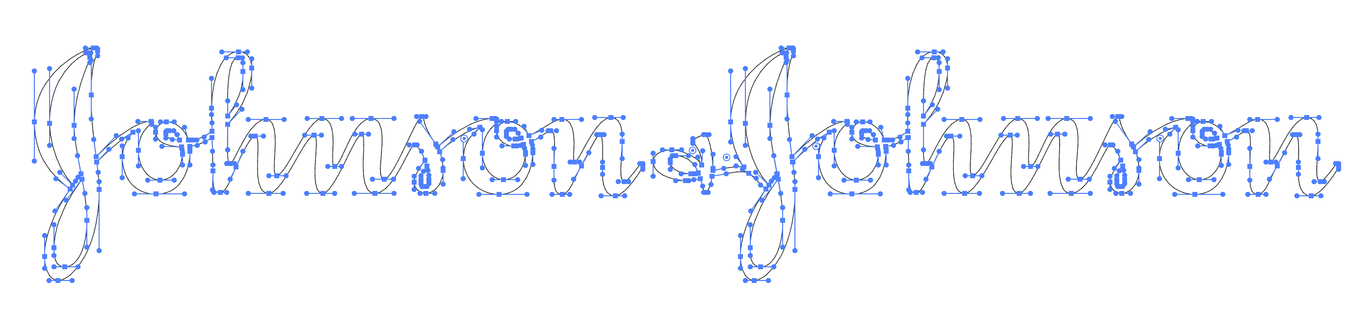
In that sense, it is strange that this logotype is appraised for its fidelity to a dexterous hand, rather than an ambidextrous synergy with digital equipment. For what is referred to as the original Johnson & Johnson design will have passed through all manner of mediating technologies. The final iteration (before the redesign) would have been a vector file made of nodes and handles that can be represented abstractly as Cartesian coordinates. We find a Spencerian script digitally enmediated [9] via Sutherlandian script [10].
Even when a design explicitly employs abstract techniques, that one might associate with Plato’s realm of forms, many remain beholden to ahistorical ideas and ideals. As Frederich Nietzsche reminds us, the continued belief in origins, that ‘things are most precious and essential at the moment of birth’ [11] means the new is always compared (unfavourably) to a vaunted original (hierarchical) rather than a dialectical synthesis of genealogical study. Developing critiques of contemporary typography will require us to attend to this ongoing softwarisation and consider how it impacts and affects relations of production.
Moreover, the CEOs of monopolising corporations are not concerned with whether consumers trust their products or services, as theirs is often the only viable and initially affordable option on the market. Consequently, their priority shifts towards communicating value to billionaires investors and government departments to secure funding for sectors like military, health, and education, ultimately boosting shareholder value and highlighting the complex interplay between consumer trust and corporate strategy in the modern era.
In this vein, the rebranding of Johnson & Johnson finds resonance with the transition undergone by Alphabet, formerly Google. In this corporate shift, what was once a single company, Google, transformed into one of numerous services under the Alphabet umbrella. Johnson & Johnson now represents the corporation itself, while the Johnson script logotype will still be employed on key consumer products.
Critical
Within this transformative landscape, it becomes essential to scrutinise the relevance of design analysis. While not without merit, many critiques and comments fail to capture the intricate interplay between contemporary aesthetics, technical mediation, and the broader dynamics of economic reproduction. Branding is no longer defined by products and goods but operates within a larger framework of financialisation and shareholder value optimisation. In the era of monopolisation, branding departs from its consumer-centric origins. It metamorphoses into a vehicle for projecting and consolidating value within the financial sphere. Aesthetic analysis, therefore, must be complemented by a comprehensive and detailed examination of the intricate interplay between branding and the inner workings of contemporary capitalism. To conduct a meaningful critique in this contemporary milieu, it is imperative to explore how aesthetics, design, and semiotics function not solely as visual markers but also as integral components of the broader narrative of capital accumulation, market positioning, and economic power. This perspective is indispensable for a comprehensive critique that mirrors the realities of our present economic landscape.
The development from the aesthetics of merchant capitalism to consumer capitalism and, ultimately, to computational capitalism highlights the relation of branding and its significance within these economic paradigms. Understanding this trajectory is crucial for dissecting the recent Johnson & Johnson rebrand and situating it within the context of computational capitalism.
—
This text is a development of a thread I posted X (formerly Twitter) on September 18 2023.
References
1. Due to constraints this is a somewhat reductive and simplistic argument. That in itself indicates how aesthetics are a result of (but not determined by) the material conditions they emerge out of. In that sense, to be critical is not to make judgements of objects or subjects but to highlight how surfaces, interfaces, processes and the circulatory order of social relations are not only interrelated but dialectically co-constitutive.
2. Walter Benjamin’s ‘The Work of Art in the Age of its Mechanical Reproducibility’ is a seminal essay in media history. In relation to aura he writes, “The technology of reproduction detaches the reproduced object from the sphere of tradition. By replicating the work many times over, it substitutes a mass existence for a unique existence. And in permitting the reproduction to reach the recipient in his or her own situation, it actualises that which is reproduced.” However, Benjamin considers books and literature as a special case of mechanical reproduction and the text provides only a brief account of the printing press. See: Berret, C. (2017). ‘Walter Benjamin and the Question of Print in Media History.’ Journal of Communication Inquiry. Volume 41 Issue 4. pp. 349–367.
3. Bernays, E.L. (1928). Propaganda. New York: IG Publishing.
4. Public opinion is significantly shaped and influenced by the media. The relationship between media and public opinion has been a subject of extensive research and analysis within the fields of media studies, communication, and political science.
5. The ‘enclosure of the commons’ refers to the process of transforming shared resources into private property. Historically, this began with the fencing off of common lands in England, heralding a shift from communal to individual ownership. Today, this principle extends beyond physical land to encompass a wide array of communal assets – including shapes, colours, words and numbers.
6. Bernard Stiegler, a French philosopher, who developed the term ‘computational capitalism’ to describe a new phase in the evolution of capitalism, one that is fundamentally shaped by digital technology and computation. See: Stiegler, B. (2017) Automatic Society, Volume 1: The Future of Work. Polity.
7. Peter Checkland coined the term ‘capta’ derived from the Latin word ‘capere,’ meaning ‘to take,’ to differentiate it from ‘data,’ which is information that is ‘given’ and can be readily recorded and observed. See: Checkland P, Holwell S (1998) Information, Systems, and Information Systems: Making sense of the Field. Wiley, Chichester.
8. “Futur stands for the future as the continuation of the present, as the full actualisation of the tendencies which are already present, while avenir points toward a radical break, a discontinuity with the present — avenir is what is to come (à venir), not just what will be.” See: Žižek, S. (2023). ‘What Lies Ahead?’ Jacobin. https://jacobin.com/2023/01/slavoj-zizek-time-future-history-catastrophe-emancipation
9. David M. Berry’s concept of enmediation emphasises the transformation of media formats through computational techniques, distinct from traditional mimesis. It represents a paradigm shift in understanding mediation, focusing not on mere information transfer, but on the specificities of computational mediation as a distinct process. See: Berry, D. M. (2012). ‘Against Remediation’ Stunlaw. https://stunlaw.wordpress.com/2012/10/19/against-remediation
10. Ivan Sutherland’s Sketchpad, a groundbreaking computer program developed in the early 1960s, is widely considered a significant precursor to vector graphics. Sketchpad allowed users to interact directly with a graphical display to create and manipulate geometric figures. See: Sutherland, I. E., (2003) ‘Sketchpad: A man-machine graphical communication system.’ Technical Report Number 574 . Cambridge University.
11. Nietzsche, F. W., (1994). On the Genealogy of Morality: A Polemic. Ed. Keith Ansell Pearson, trans. Carol Diethe. New York: Cambridge University Press.
About Marcus Leis Allion
Marcus Leis Allion (Undt) is a graphic designer, educator and practice-based researcher interested in technology, history and critical theory. He has been involved in a number of projects that investigate the politics of creativity, including; LOCA Records, the Libre Society, and Remix Brighton.
