Introduction to the Glyphzian Space
My recent fascination in type and programming has been trying to navigate the immaterial spaces that exist within digital letterforms, and trying to explore the endless world of possibilities within them. There is a galaxy of information hidden in the smallest of fonts, and infinite variations of sketches possible from the simplest of forms. You may have heard of the term ‘Hertzian Space’[1]. Coined by Anthony Dunne and Fiona Ravy, it refers to the hidden electromagnetic environment generated by electronic devices. The Hertzian space encompasses everything that gives off an electro-magnetic field, from visible light to radio waves. I now present the idea of the Glyphzian Space, the space that encompasses everything that surrounds the digital representation of letterforms. For every glyph that is encoded within the digital space, there is a world waiting to be explored. From the visible to the subliminal, from Bézier curves to file data structures, there are many layers that are traversable.
My Ever-Evolving Mental Chart of the World of Type
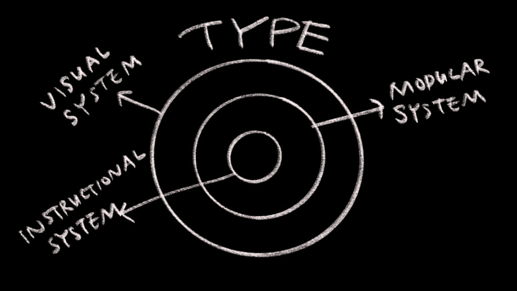
Before I knew anything about typography, I used to think each letter was unique; When I was learning graphic design, I realized that a typeface is a visual system rather than a mere collection of individual shapes. As I started learning type design, I made the connection that a typeface is a system of modular shapes that exist within the larger visual system. As I started learning how to code and investigate the data structure of digital font files, I understood that typefaces are a system of instructions. The more I learn, the more I see that there is much to be explored within the world of type. This is the idea of the Glyphzian Space, that there is a whole space that encircles the font.
Today, no one can doubt that a significant portion of our lives is spent interacting with letterforms through a digital screen, whether it be through a mobile phone or a platform display at a train station. What many may not notice, however, is the fundamental difference between digital letterforms and their analog ancestors. At first glance, this difference might seem superficial. One might assume that the paper newspaper has somehow been reformatted and reconstituted to be on a screen, as if someone has taken scissors to it. However, the difference is much more granular than what can be seen with the eye.
For letterforms to appear on the screen, we humans have to explain the concept of the letter to the computer. Because computers don’t understand human language the way we do, we need to learn how to explain things to the machine.
Illustration of the parable of the elephant and the group of blind men (Image credit: Wikipedia)
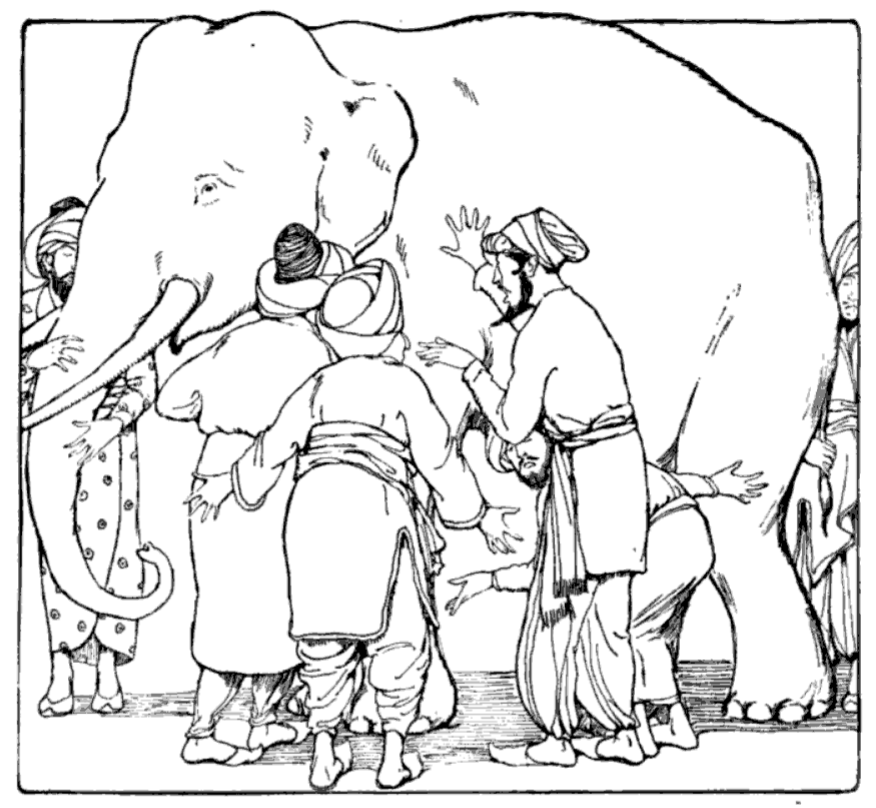
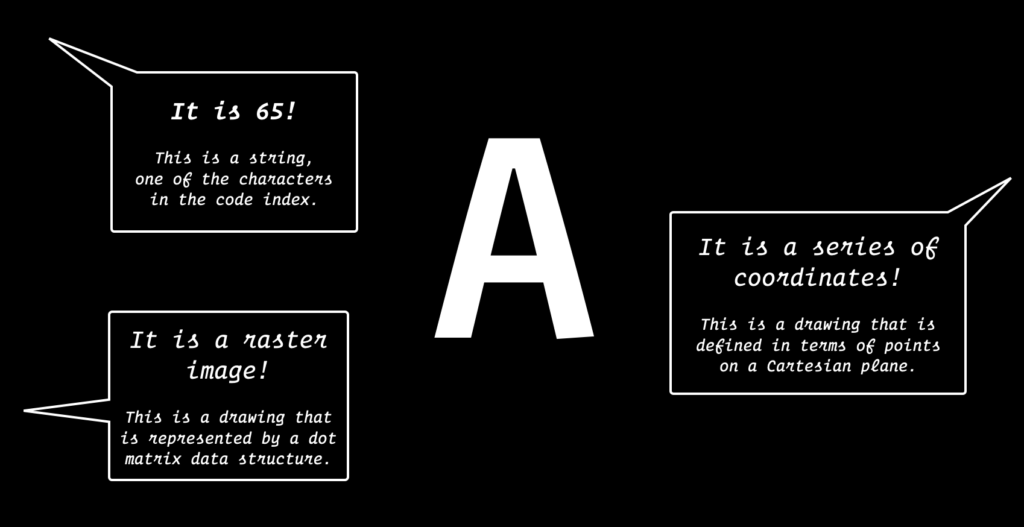
When I am trying to convey this concept to a group of students, I often refer to the Indian parable of the elephant and the group of blind men[2]. It is a story of a group of blind men who conceptualize what an elephant is like by touching it. Since the elephant is very large, and they have never met one before, each has a different experience. One man touches the leg and claims it feels like a tree trunk, whereas the second touches its ear and thinks of it as a kind of fan. Yet, the third who touches the nose thinks it is shaped like a thick snake. All explanations are different, yet correct. I use this analogy to illustrate what it’s like to teach a computer to draw letterforms. Describing the concept of a letterform to a computer is rather like trying to describe this hypothetical elephant to someone who has never encountered it before. For example, You can describe a letter ‘A’ in a number of ways, and they could all be different, yet correct. A letter ‘A’ can be represented as a numbered unicode value, a raster image that contains a dot matrix data structure, or as a series of coordinates on a Cartesian plane.
Three different examples of explaining an ‘A’. (Typeface credit: Operator)
Becoming a programmer means that you become proficient in communicating your ideas to the machine. This requires that you think about your intentions ahead of time, compelling you to examine your thought process and giving you many insights. As a letterform designer and technologist, I often think about Donald Knuth’s quote from Concept of a Meta-Font[3]:
“We know from experience that we understand an idea much better after we have succeeded in teaching it to someone else; and the advent of computers has brought the realization that even more is true: The best way to understand something is to know it so well that you can teach it to the computer… Machines provide the ultimate test, since they do not tolerate ‘hand waving’ and they have no ‘common sense’ to fill the gaps and vagaries in what we do almost unconsciously.”
Navigating the Digital Letterform Universe
From teaching the computer, we can also gain a deeper insight into the Glyphzian Space, the conceptual world occupied by digital letterforms. Beyond looking at digital type as a utilitarian tool, we can consider fonts as much more than a digital packet living on our font menu panels. We can find a series of instructions within a font file that are reminiscent of a cooking recipe. And just like we tend to modify cooking recipes to create fun new dishes, what miraculous things might happen if we were to explore and rediscover a font file?
This thought process has been continually evolving, and I expect my ideas to change over time. Perhaps for the reader, it will be helpful to mention my past experiences for context:
- I studied graphic and motion design for my undergraduate studies at SVA, and then went through Type@Cooper, a yearlong postgraduate program in Type Design in 2014.
- Afterwards, I studied calligraphy extensively, while working as a graphic designer.
- In 2017, I decided to pursue type design full time with the Monotype studio.
- During my time there I became interested in technology and attended residency programs at the School for Poetic Computation, becoming interested in creative coding.
- Eventually, in 2019 I decided to pursue that interest further and left Monotype to start working on a masters degree at NYU in technology.
During all this time I ended up specializing in a number of letterform-related fields: lettering, calligraphy, type design, and generative typography. Although at the moment it seemed like disjointed pursuits, in time I have come to realize that dipping my toes in all of these fields has allowed my idea of letterforms to become a flexible one. In my mind a form can flow from the pen into the digital realm seamlessly; all are related to each other. Although I am no specialist in all these areas individually, I have rather become a specialist in knowing all these areas and being able to connect them. When I try to conceptualize this idea in my head, I often think about the concept of Alex Singh’s explanation of a ‘Liminist’.[3] I like the visualization that Singh draws, and I imagine that this is what has been happening in my head with the concept of letterforms:
“The opposite of the specialist is not the generalist, but the Liminist… In a world of disconnected silos stretching vertically into the sky, the Liminist stretches horizontally across them. They function as guides, navigating people across these intersecting planes to comprehend the work and ideas of their unrelated peers. It is very much its own specialization, but where all other domains specialize in Form, the Liminist specializes in Non-Form. The evidence of their work exists at the intersections between objects.”
In relation to exploring digital mediums, I recently came up with several ways to collaborate with the machine to generate new letterforms. I’d like to share two recent experiments. The first one uses a machine learning model called StyleGAN[5], and the second is a computational drawing tool. Each is imperfect in its own quirky way, and provides interesting rabbit holes to investigate.
Style GAN or Sans Serifs
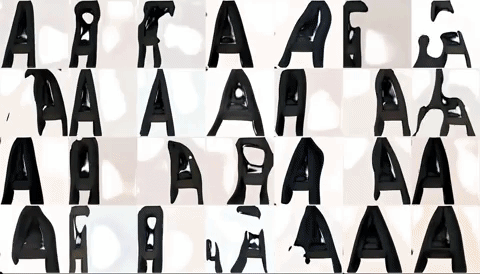
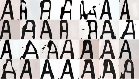
Last spring, I trained a StyleGAN via Runway ML with tens of thousands of sans serif sample images. I figured that since sans letterform designs are much simpler than serifs, it’d be a good subject to try to train a model on. The common hurdle of any machine learning project is that the machine needs lots of data to train, but fortunately the MyFonts developer API proved helpful in providing raw samples of sans serif images. Then, the data was processed and cleaned so the machine had a better chance of recognizing letter shapes. The initial model on RunwayML is trained on faces, so as a result you get to see an uncanny series of images where faces turn into letters.
Initial RunwayML StyleGAN model getting trained on a sans serif letter ‘A’
The process of a StyleGAN model trained on the letter ‘A’ getting retrained to the word ‘ASH’
Eventually, I wanted to experiment with training on a word, so I picked a short word ‘ASH’, and trained it on about 24,000 sans serif images. The result is a very legible looking word (by ML standards, at least). You can see that the A is the most garbled of the three — I suspect that this is because the letter ‘A’ has the most variation in designs compared to the ‘S’ or the ‘H’.
Although I achieved my goal of making a convincing result, I wish there had been more variations in the output. What I wasn’t able to discern was the level of comprehension that the machine had achieved. After tens of thousands of images, had the computer understood the concept of a stem? The idea of a baseline? I am curious which portion of the Glyphzian space the model had understood, and was replicating. For next time, I am hoping to train the model on various letter styles to identify the details that it has been recognizing.
Computer–Aided Drawing Tool
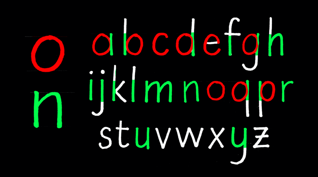
Moving on from machine learning experiments, I wanted to see if there was a more controllable way of computationally drawing letterforms. What is the smallest unit of language? A type designer knows that the design components of characters are not unique. For example, the design of a D is derived from the left side of an H and the right side of an O. In the lower case, this is even more pronounced. With the ‘n’ and the ‘o’, we can effectively gain enough information to construct the p, d, b, and q.
Illustrative example of the modular nature of letterforms, shown with the ‘o’ and ‘n’ example
So then, perhaps it could be argued that these ‘letter parts’ are the smallest unit of language. What happens when we break language down into those smallest pieces, and try to modify the material of language from there? To aid myself in this process, I created a computational tool that would allow me to draw modular units and iterate over the forms. Here is a demonstration of the software in use, built in PyQt5 utilizing Allison Parrish’s Bezmerizing library. I have created four possible strokes (Straight, Round, Thin, Diagonal Stem) that the user can draw with. The program stores the original skeletal stroke separately, so the thickness parameters can be updated and refreshed at any time.
This kind of ‘rational’ thinking structure dates back to the Renaissance and the Romain du Roi[6]. The so-called logical design of the Romain du Roi wasn’t the most beautiful, but it did lay down the idea of the ‘rational letter’.
Teaching Generative Typography
Recently I have started encouraging people in creative fields to also leap into the technological sphere, blurring the boundaries between different fields that surround letterforms. Technology for creative coding environments has become very accessible in just the last few years, and although there is a learning curve inherent to any new tool, it is delightful to see people get a quick start on their ideas.
One of the classes I have been teaching is Generative Type with Kevin Yeh. The course focuses on creating interactive and iterative typography through P5.js, an open source JavaScript library. As with any new technology though, there is a danger of letting the tool influence us too much. To not be tempted by the tool itself, we try to stress the importance of the history of generative mediums, and how computers and programs are but one tool among many that people have used to create generative form. Some artwork from the past that I am in awe of include analog ways of addressing generative letterforms such as typewriter art, asemic writing, and concrete poetry. Take for example Mirtha Dermisache’s asemic writing from Argentina in the 60s and 70s — it is all handcrafted, and no recognizable letterform is present, yet we can see that the idea of written expression is preserved and exhibited in all its glory.
Mirtha Dermisache, 1970. image credit: Flickr user Iliazd

Closing Thoughts
I find that for many people, the process of creating digital forms is shrouded in mystery. The process by which digital typefaces or generative typography is made is often opaque; almost as if they spring out of a black box. The reaction presents a divide: on one hand, magical and mythical; on the other, cold and impersonal. I remember how impersonal using a font felt before I became a type designer; today when I try to pick a typeface, I can almost imagine a row of friendly faces behind the menu. I now know what the process of creating these forms are like, and can imagine the human touch behind these letters. I imagine this initial reaction might be familiar for anyone who is fresh to navigating this new area of technology. If you are someone who is curious about this space, and how digital letterforms operate behind the screen, I highly encourage you to explore. You might enjoy being lost in the Glyphzian Space as I do; at the very least, it might give you a new perspective.
Thanks to : Kevin Yeh, Maxime Gau & Sabrina Nacmias for proofreading, and Ryan Bugden for all his invaluable advice.
References:
- Dunne, Anthony. “Hertzian Space.” Hertzian Tales: Electronic Products, Aesthetic Experience, and Critical Design, MIT Press, 2005, pp. 101–121.
- “Blind Men and an Elephant.” Wikipedia, Wikimedia Foundation, 3 July 2020, https://en.wikipedia.org/wiki/Blind_men_and_an_elephant.
- Knuth, Donald E. The Concept of a Meta-Font. Department of Computer Science, Stanford University, 1981.
- Singh, Alex. “The Liminist.” Are.na, 2018, www.are.na/block/2319233.
- Karras, T., Laine, S., & Aila, T. A Style-Based Generator Architecture for Generative Adversarial Networks. https://arxiv.org/abs/1812.04948.
- “Romain Du Roi.” Wikipedia, Wikimedia Foundation, 4 Feb. 2018, https://en.wikipedia.org/wiki/Romain_du_Roi.
About Lynne Yun
Lynne Yun is a NYC-based type designer, educator and technologist. From crafting handwritten calligraphic pieces to designing type for the screen, she enjoys the balancing act of form and function that is required when designing tools for communication. Lynne is a founder of Space Type, a studio practice operating at the intersection of type and technology. She holds a BFA in graphic design from the School of Visual Arts, postgraduate in typeface design from Type@Cooper, and MPS from ITP in New York University.
