NaN Rage
With this project we told ourselves “this time we’ll keep it simple”, “only a weight and a width axis”. If only we had known.
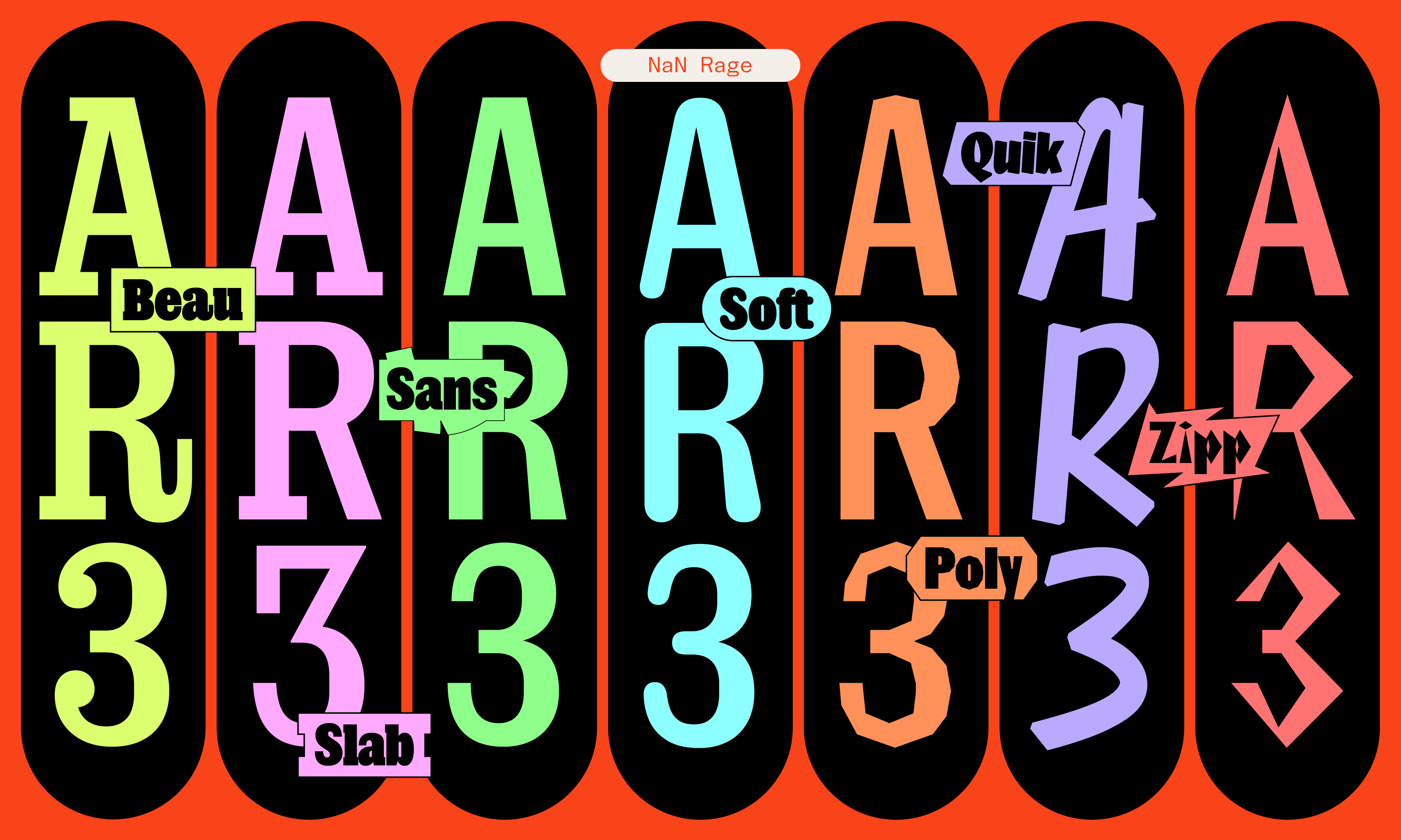
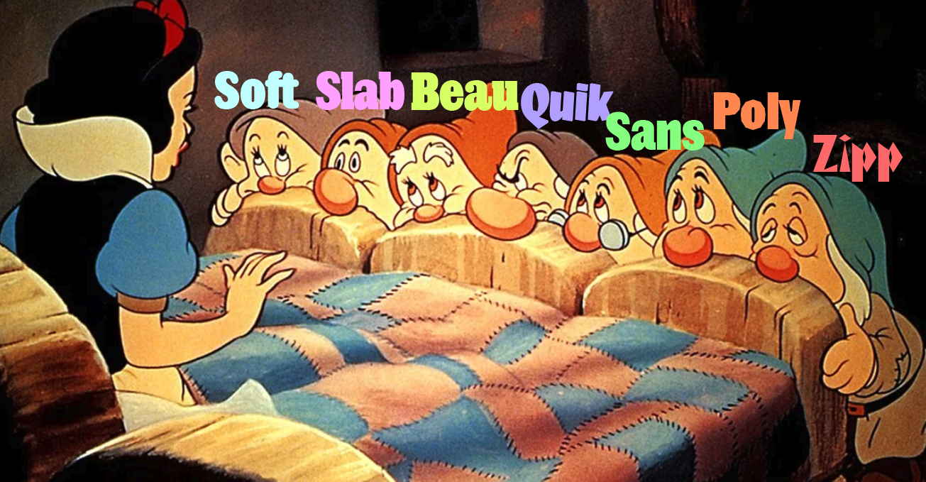
Rage started at the beginning of the year 2024 as what is now the Rage Beau sub-family, an exploration on the sub-genre of Egyptian-style faces with our own added NaN spice. But things escalated, oh they did. Today as we release it, NaN Rage comprises 252 styles separated into 7 distinct sub-families, each with their own voice. We named these dramatis personae: Beau, Slab, Sans, Soft, Poly, Quik and Zipp. A bit like the 7 dwarfs, but different.
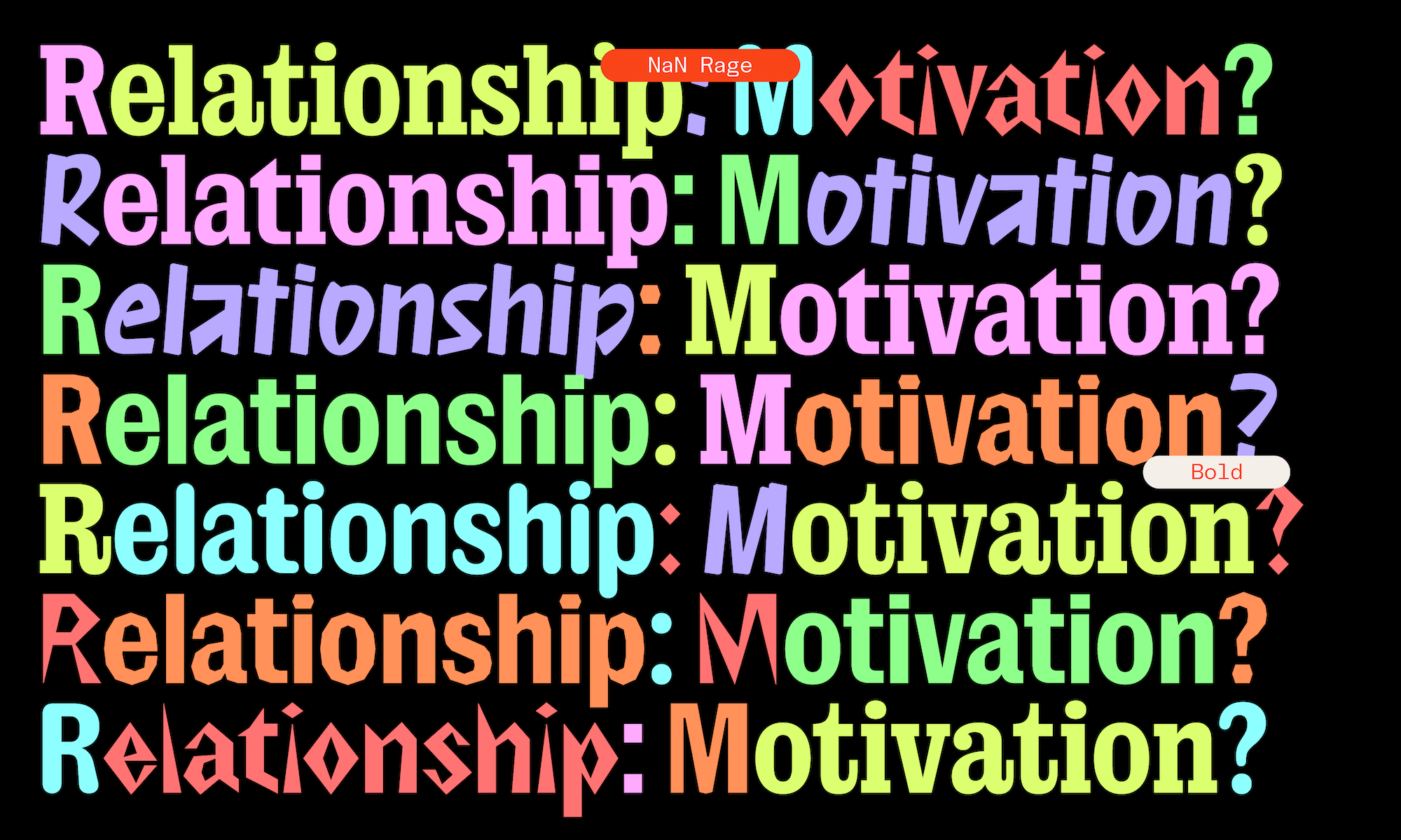
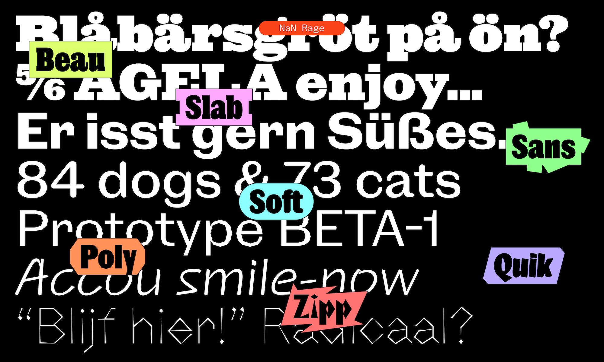
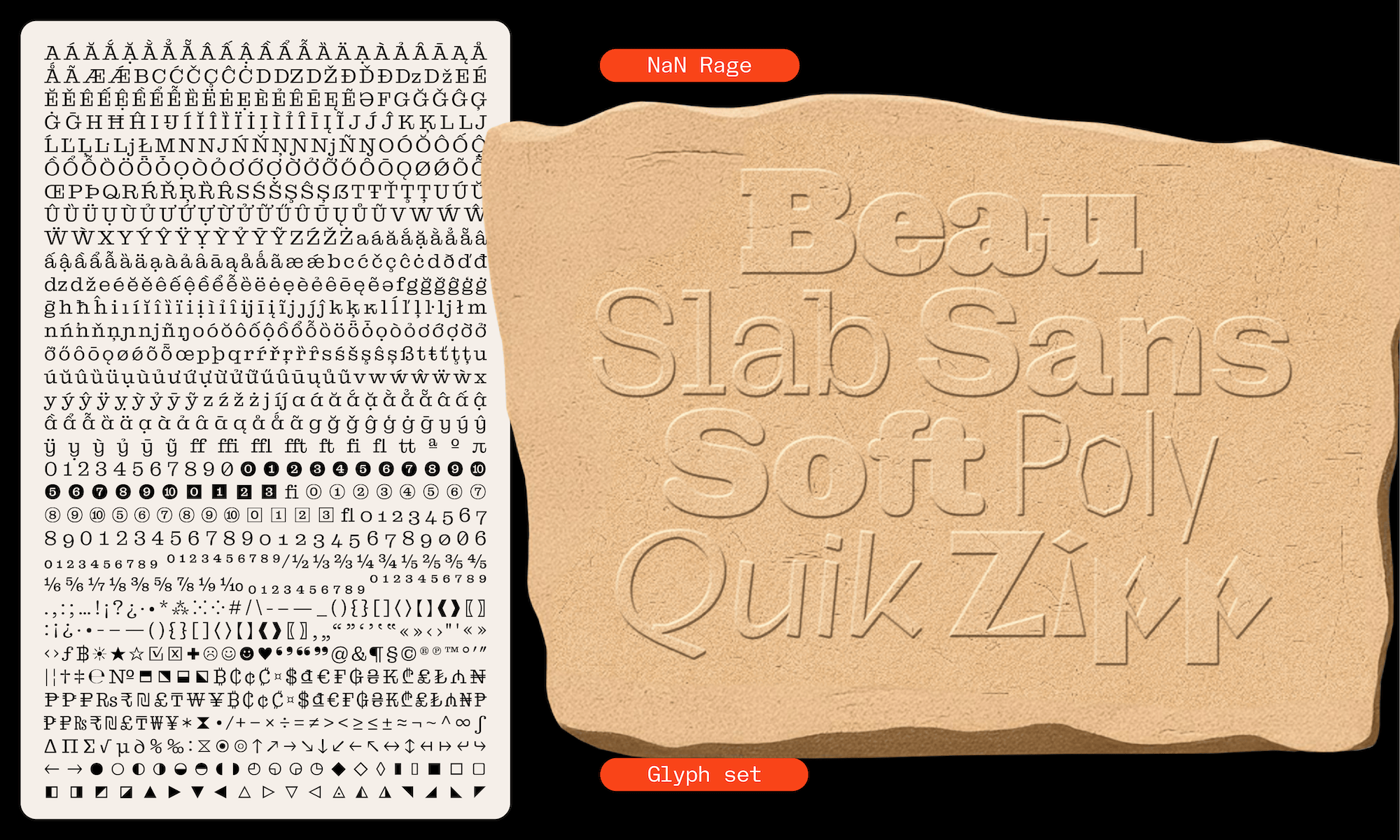
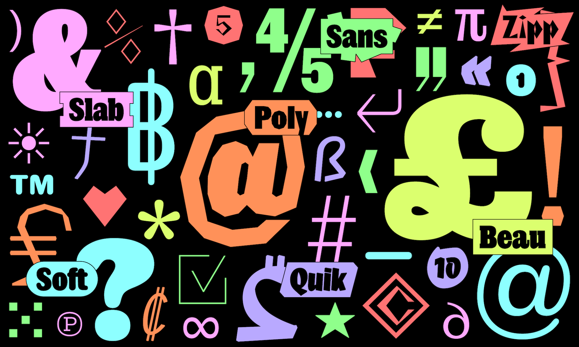
If some of Rage members are closely related (Beau+Slab, Sans+Soft+Poly), one may still ask themselves how and why the whole still forms a family and why do we release them together. The answer is that we designed them as a system. They are consistent and related in ways that matter to a type user: they share the same proportions, the same weight scale, the same vertical metrics, the same language support and the same robust character set. Which means that it feels like a breeze to work with them together and to interchange them. No line shifts, always a matching weight, no weird line-spacing, no missing glyph, etc. As a system, they are able to be deployed for projects simple or complex, for projects with with multiple typographical voices as well as for rich branding programs.
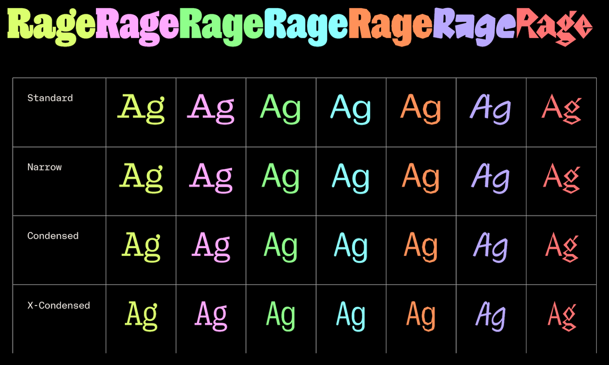
How do we encourage all fonts are used and mixed together? Our answer to this question is with licensing and pricing, two points that have been at the heart of NaN policy. We want to be as innovative with our licensing and pricing as we are in our designs. We decided to offer the whole 7 Rage families as a unique package with the very healthy price of €450, so you get 7 families for the price of 2. Now we know that a type designer can only do so much regarding how their font will be used and with which other fonts – but – we would feel very grateful to see some designers embrace the possibilities opened by this Rageous toolbox and use the different Rages together as the different musicians of a jazz band.
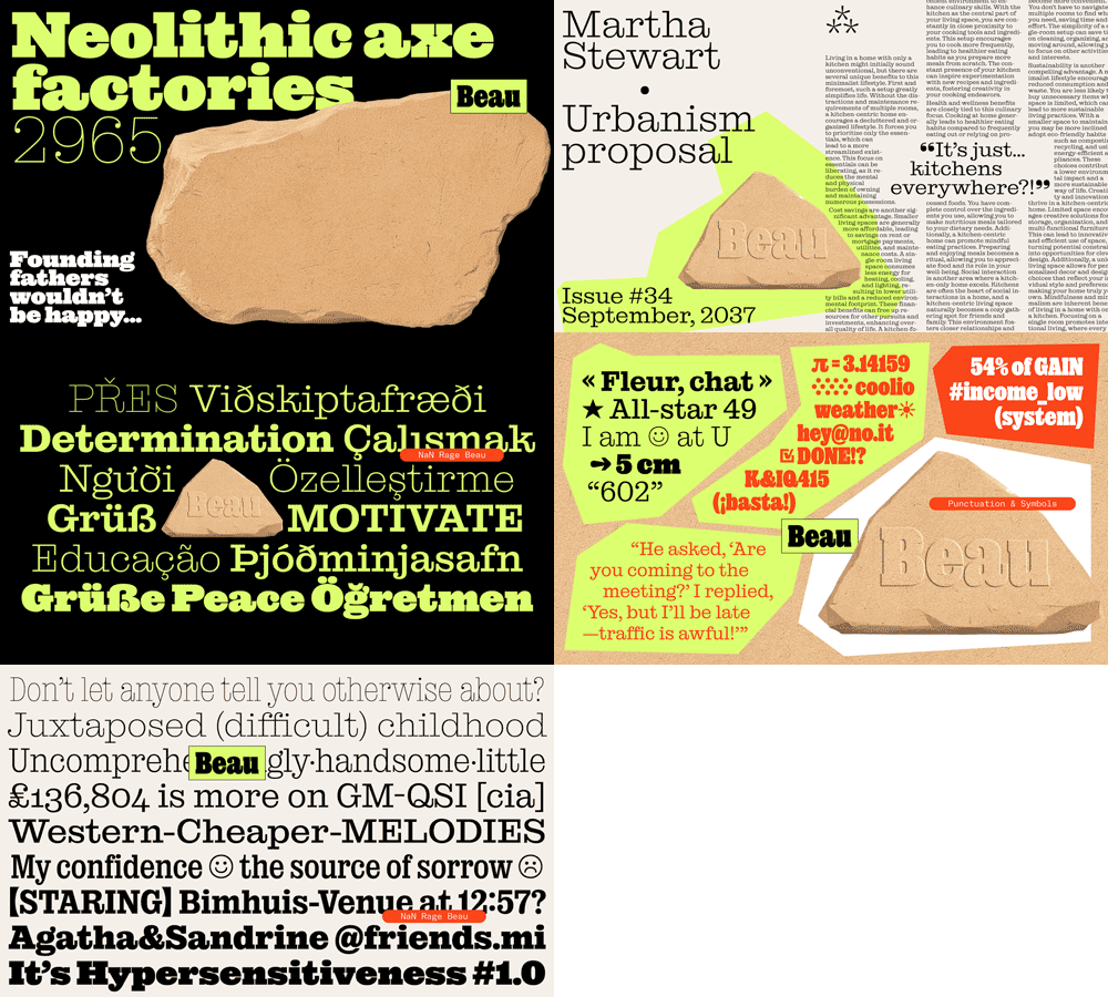
Fairytale, History, Uchrony, Family Tree
Through its sub-families, and because of some of its inspirations, Rage could almost make the case of being a mini-history of Latin type design by itself. But, coming back to the 7 dwarfs, we preferred to embrace a fairy-tale approach to type design instead of a truly historical one.
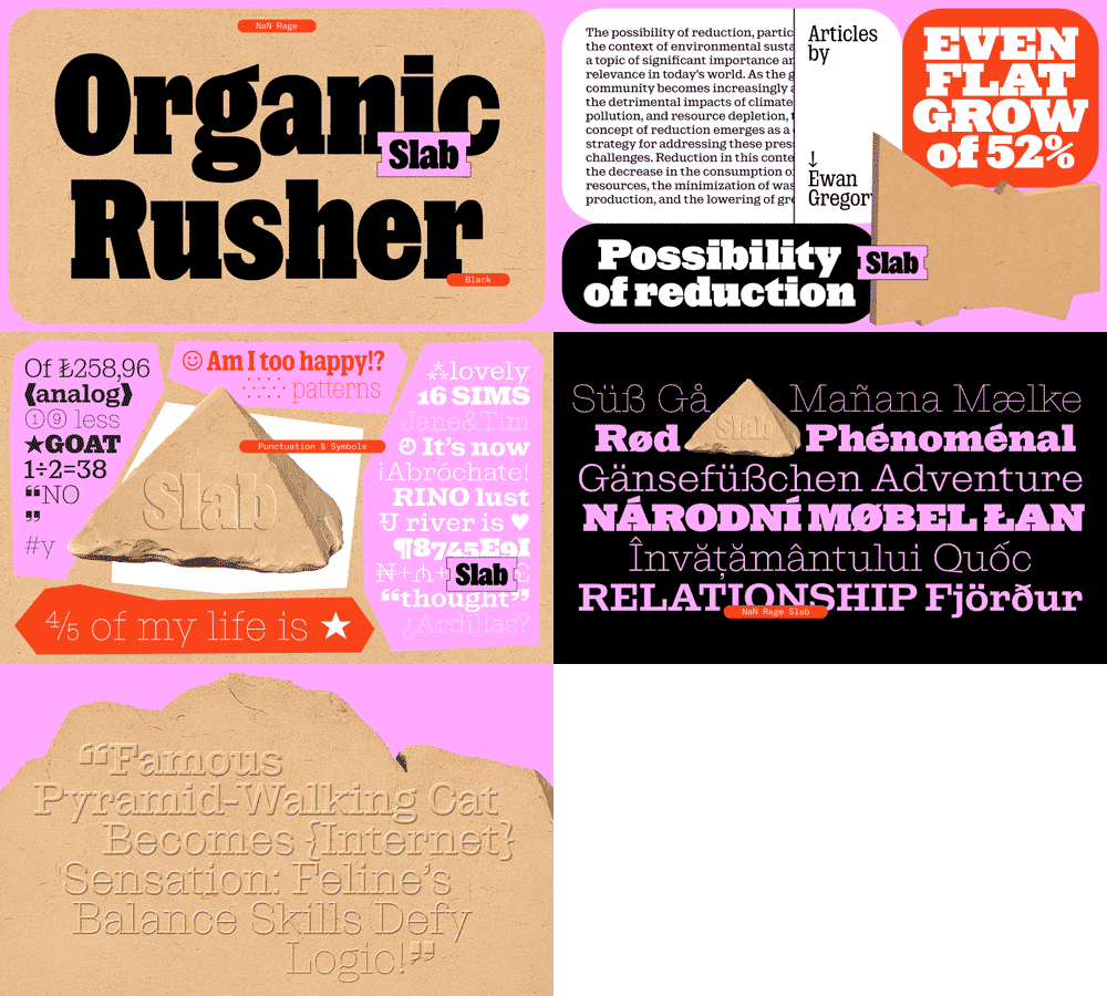
Which means that we added some elements of type tradition and archetypes to our caldron — Egyptians, rounded types, some design decisions more linked to early computer aesthetics, curve-less fonts, as well as choices made through purely contemporary or personal lens. We added some ingredients that some among you following NaN’s work for a while might start to be used to, and to be fond of we hope. The first of these ingredients is a reach for a sort of sleekness, a will to go down to the essence of a style. This manifests itself in the way we got rid of the brackets of the serifs of Rage Beau, and even more in Rage Slab itself, the sleeker sibling of Beau.
The second of these NaN Special Spices™ is how we push our projects (way) beyond what’s reasonable. In Rage’s case you can find it in the number of families but also in the relatively short period of less than a year in the which we conceived, prototyped and finalised the project. [happy/dying face] Which sounds insane even to us considering the staggering amount of work we managed to squeeze in to such a short period of time.
Talking about time, we thought that the best way to let you dive deeper into the project was to chronologically discuss how each of these families were born, often out of each other, a bit like if they were alive and conceived down the family-tree.
Diving Deeper into the Family
Beau is the most historical of all the seven families and the one which started the whole project. At first, Rage was a slab-centric family.
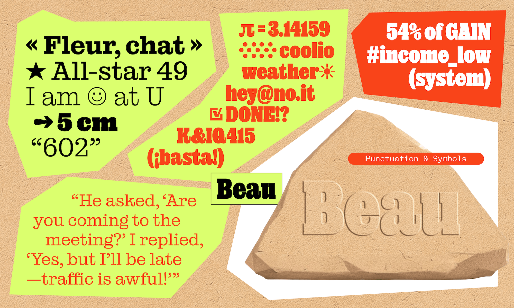
Rage Beau is a take on the classical genre of Egyptian or Clarendon faces (Ionic) which originated in 1833 and 1844 as British type cutters Figgins and Caslon were adding brackets to the serifs of the slab-serif typefaces which had appeared not long before. Clarendon typefaces and their more recent interpretations came with a particular texture that we tried to capture in Beau, but taking a time machine, we deleted this brackets that are at the heart of the genre. To summarise, Beau is like an Ionic (or Clarendon) which would wear the simpler shoes of its Antique elder. Two steps forward, one step backward. As such, it’s already ahistorical.
This decision allowed us to keep most of the warmth, decoration, readability and versatility of Clarendon faces while making Beau a tad sharper and losing an artefact that recalls the metal type era. With its perfectly rectangular serifs, Beau embraces a cleanness and sharpness very compatible with the digital era and allowing for neat pixel-rendering of its outlines.

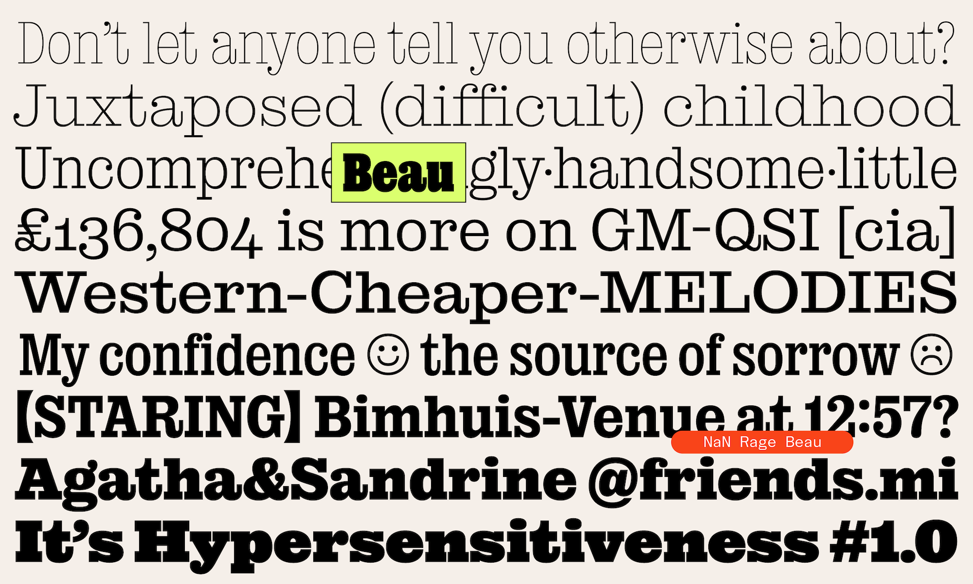
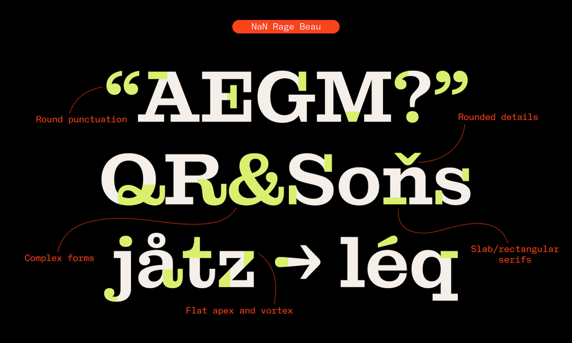
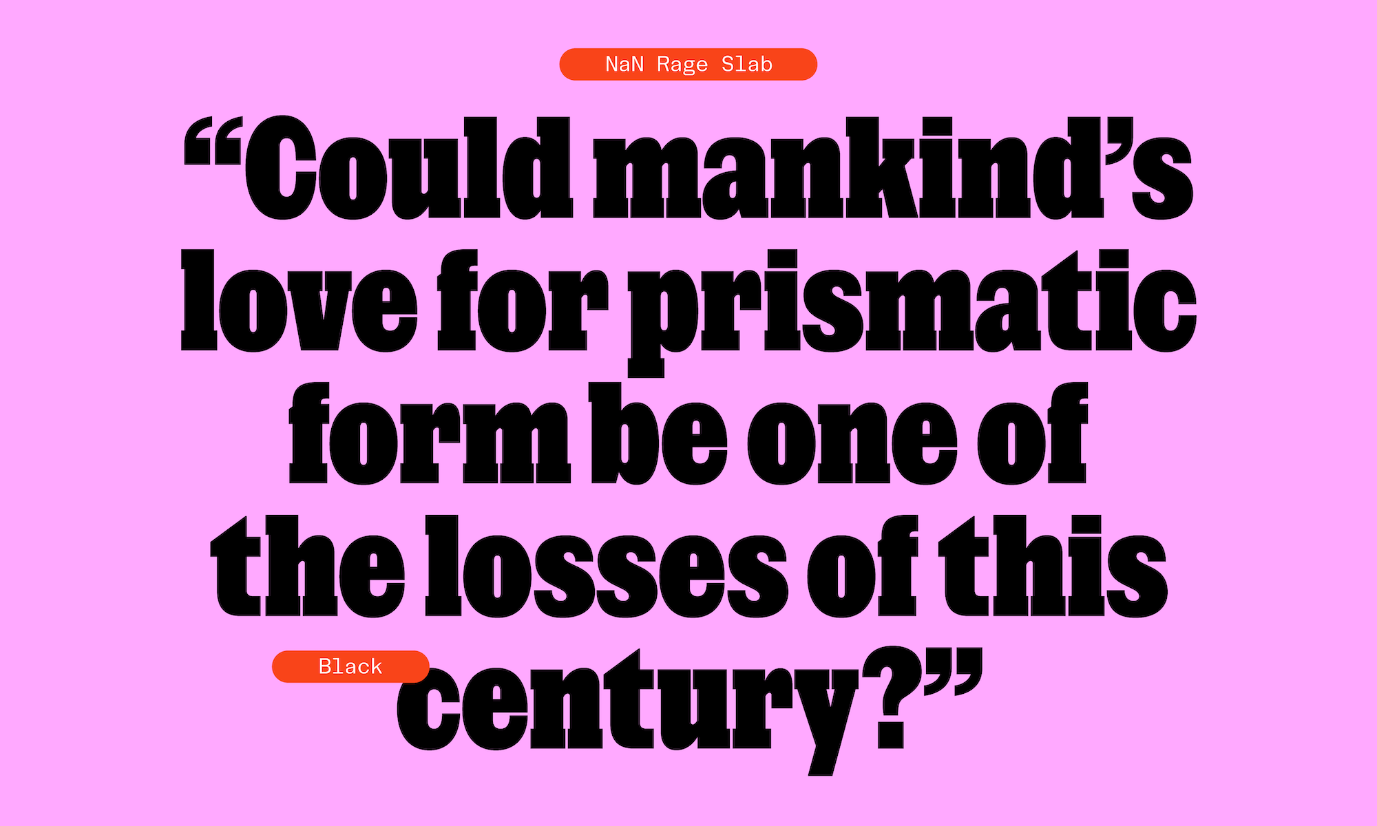
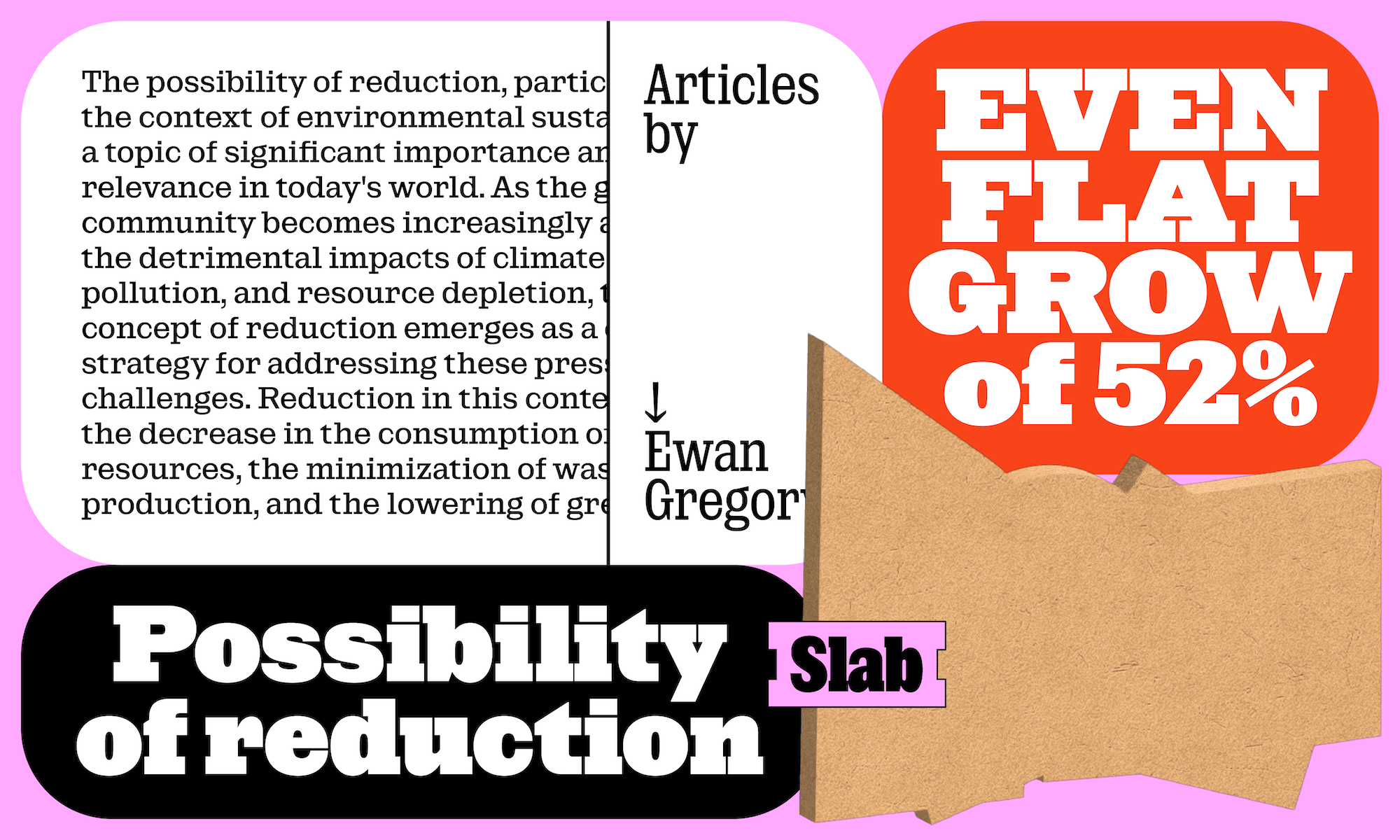
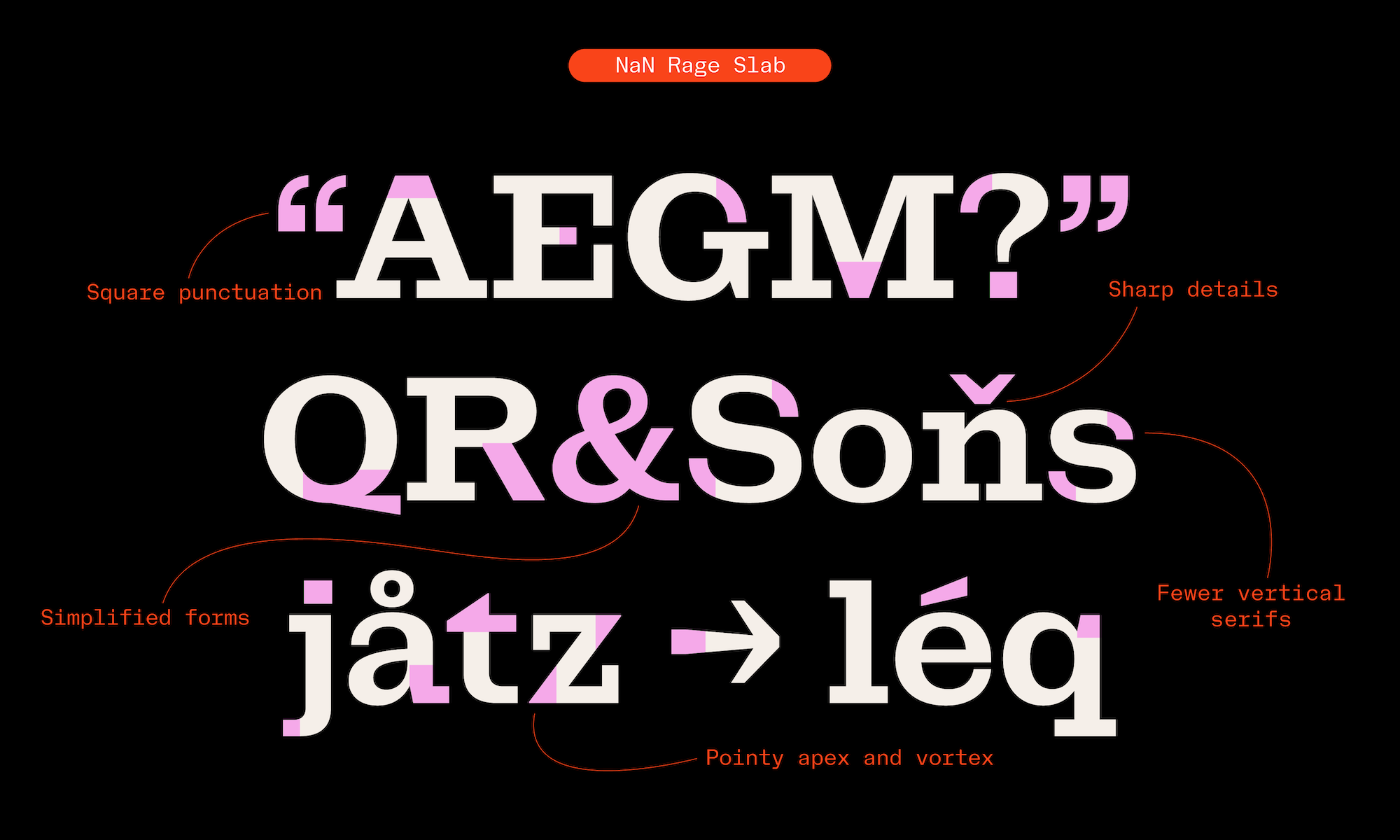
While working on Beau, the question quickly came of how much you could cut and take away from a Clarendon before it’s not a Clarendon anymore. Deleting brackets was OK, but we discovered that you ended up with a strikingly different typeface when you cut the teardrops. Rage Slab is what happens when you leave a 3-years old with digital scissors and let it cut away most of the softness remaining in Beau as well as most vertical serifs. To double down on the horizontality brought by the serifs, all teardrops and vertical serifs were replaced with clean horizontal cuts. A particular choice that we made was to not compensate in weight for the lost drop/serif, meaning the vertical end curves are lighter/brighter than in Beau. Structures were also simplified (/R, /Q /K…). All of this together makes that the rounded letters, deprived from their drops or serifs look like they come directly from a sans family.


This drastic diet could be seen as a modernist spin-off, also reminding of Adrian Frutiger’s approach with his Serifa (1966) drawn as a (slab-)serif companion to his Univers, the neo-grotesque masterpiece. The relative low contrast of Rage helps infuse this idea that you could almost look at a sans-serif which decided to disguise itself with rectangular shoes.
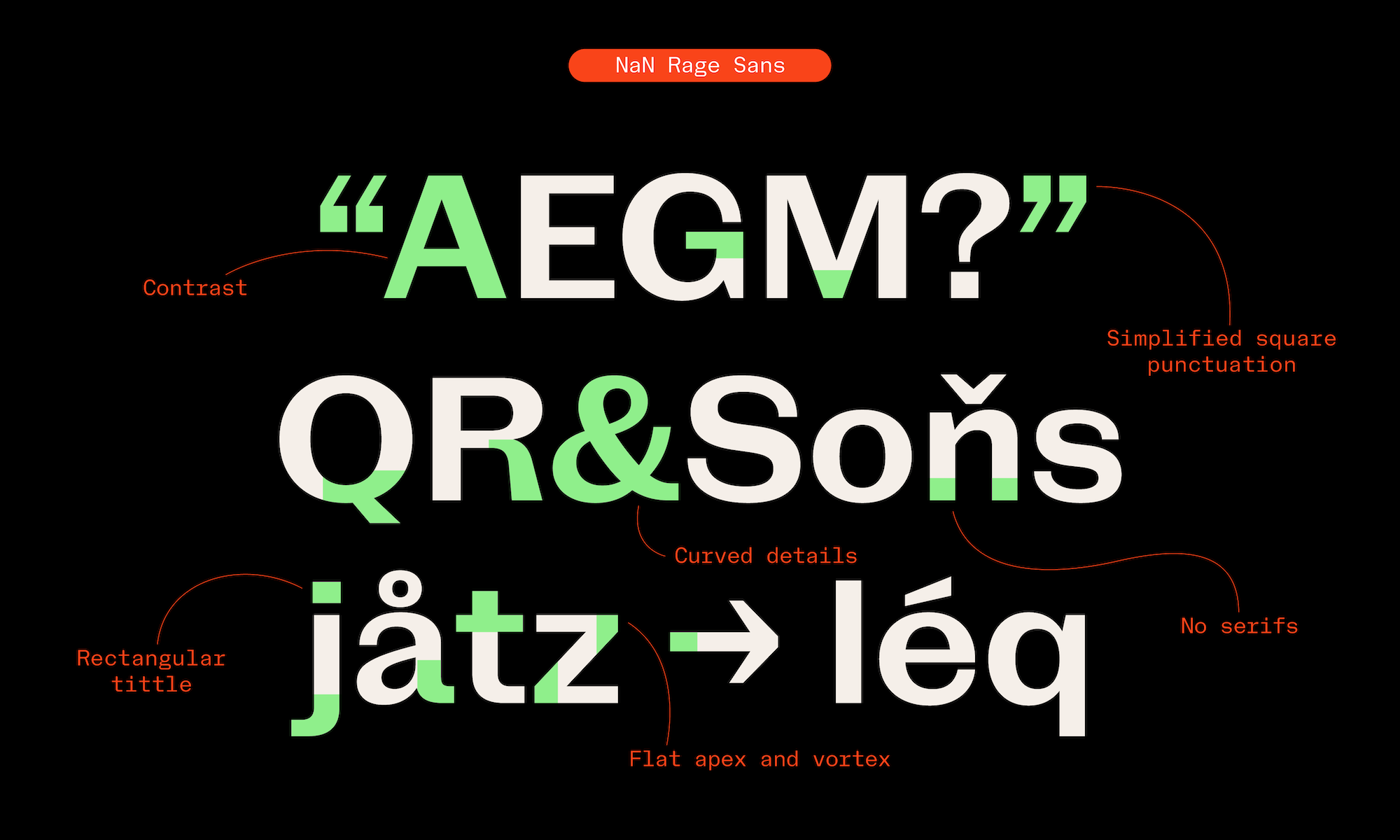
The end-result is an even sleeker and brighter texture than Beau’s, with more open counters and less visual complexity. One could also say a “colder” texture. We pursued in this direction by making all punctuation and tittles square, as well as infusing spiky detailing here and there (/M, N, K, R, Z, t, y…). Altogether, all these transgressions to the historical references give Rage Slab a distinctive contemporary concrete taste.
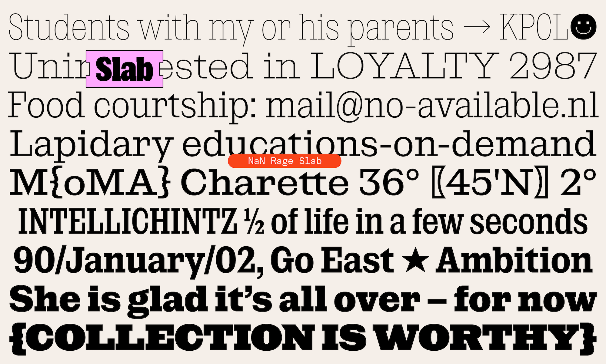
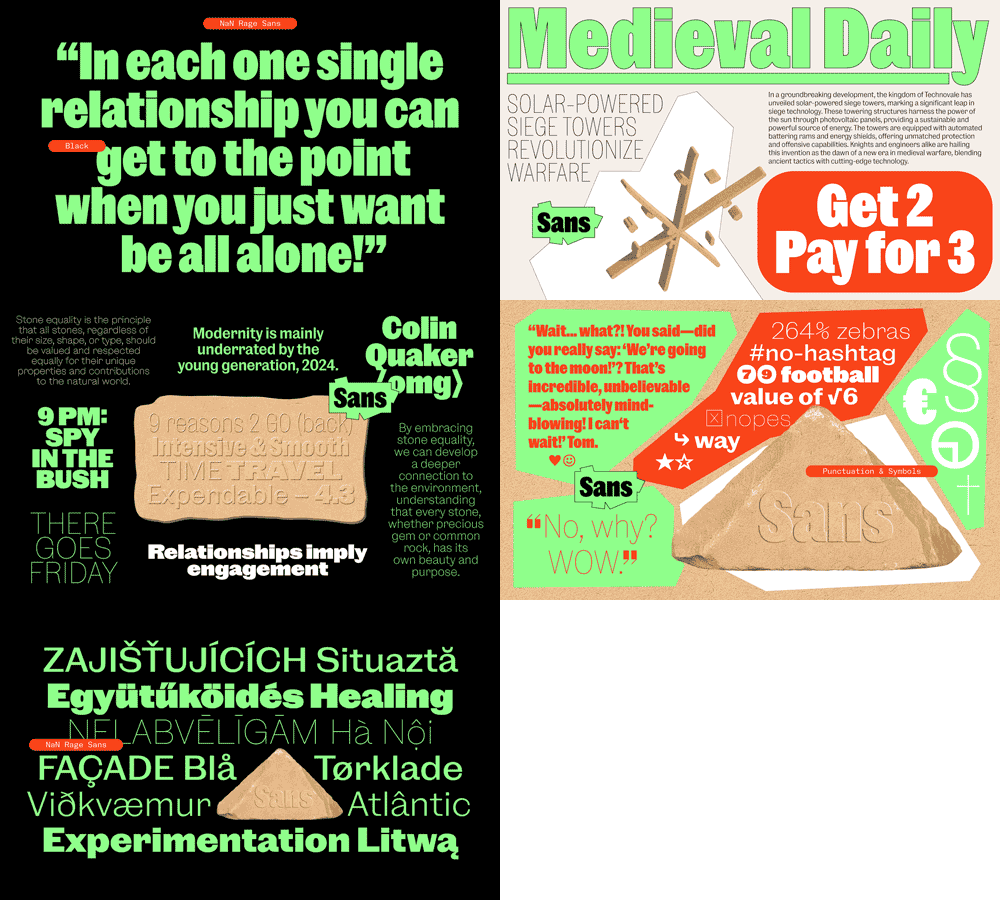
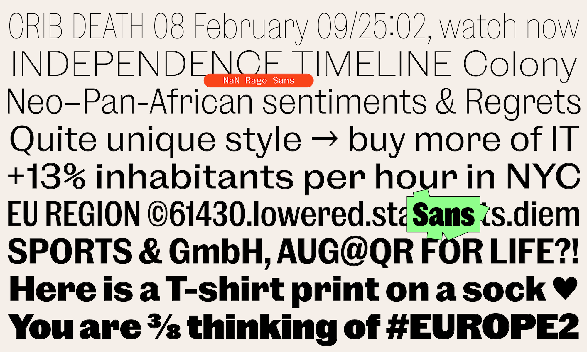
Remember when we realised that cutting down Beau’s vertical serifs made it look like a Sans (duh)? This pushed us to want to see what happened when you cut *all* serifs off. This is like replaying history, as the first Latin sans-serifs appeared in the 19th century as foundries were indeed cutting out the chunky rectangular serifs of their then not-so-old poster slab-serif typefaces.
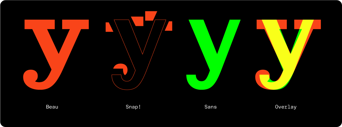
Like the masters did, we kept the original contrast of the serif character, a relatively low-contrast for a serif typeface but a relatively high one for a sans-serif considering our modern standards and the quasi monolinearity of geometric sans and neo-grotesques. This contrast gives Rage Sans a sense of delicacy and warmth often lacking in other sans-serif genres. Following the recipe started with Rage Slab, the ending strokes that previously carried drops or serifs are kept thinner in Rage Sans, increasing the feeling of a bright and open character contradicting its relatively closed apertures.
The perfectly horizontal endings, square tittles and punctuation, and minimalist detailing found also in Rage Slab, help balance the warmth evoked above to end with a typeface that doesn’t feel historical nor nostalgic but at ease in a digital-first world.


With Rage Soft we take our time-travel machine back to 19th century Great Britain. As a continued exploration of their newly cast sans serifs (ionics), the Caslon foundry cast what must be the first ever metal rounded sans serif of history in 1836. This was an all-cap typeface meant mostly for titling. Caslon never released any version with lowercase.
Following Caslon’s steps, our idea of having a rounded member for the Rage family came pretty early but we started with a serif version made after Beau. The results were interesting but there was something a tiny bit odd in the absence of bracketing of the serifs in contrast with this new rounding. Still there was something interesting there but we left it to rest in our digital drawers. Not long after that, Rage Sans came to life and we realised that we might have the perfect base for a rounded typeface. Quick prototyping and finding the right amount of roundness and softness in this one proved how much potential there was and it appeared clear that Rage Soft would indeed exist.
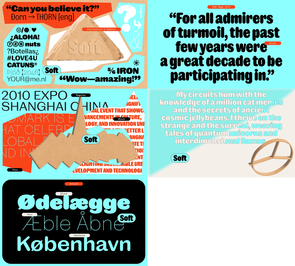
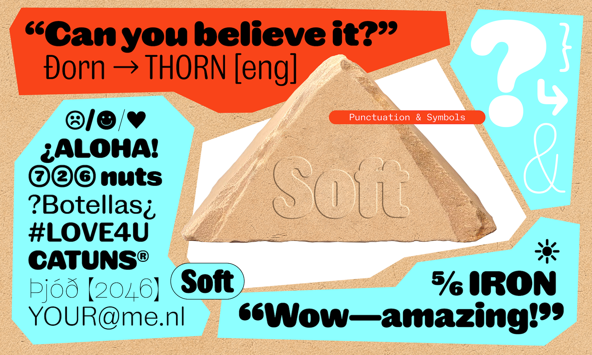
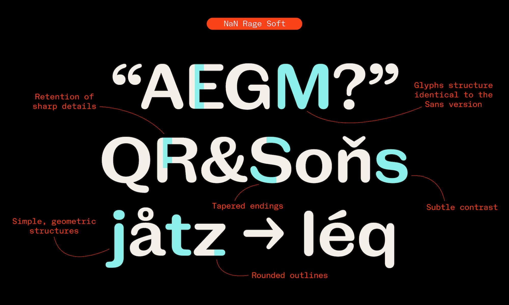
When rounding a typeface, one has two main options: either rounding the corners, considering the stems as rectangles and keeping their straight edges on all sides, or considering the stems more like strokes, with a perfectly round ending to them. This more extreme second type is also sometimes called “round” instead of rounded. Rage Soft embraces this second approach, only keeping sharp corners in its negative space, which helps maintain a certain clearness and tension and not fall into something that would be overly goofy.

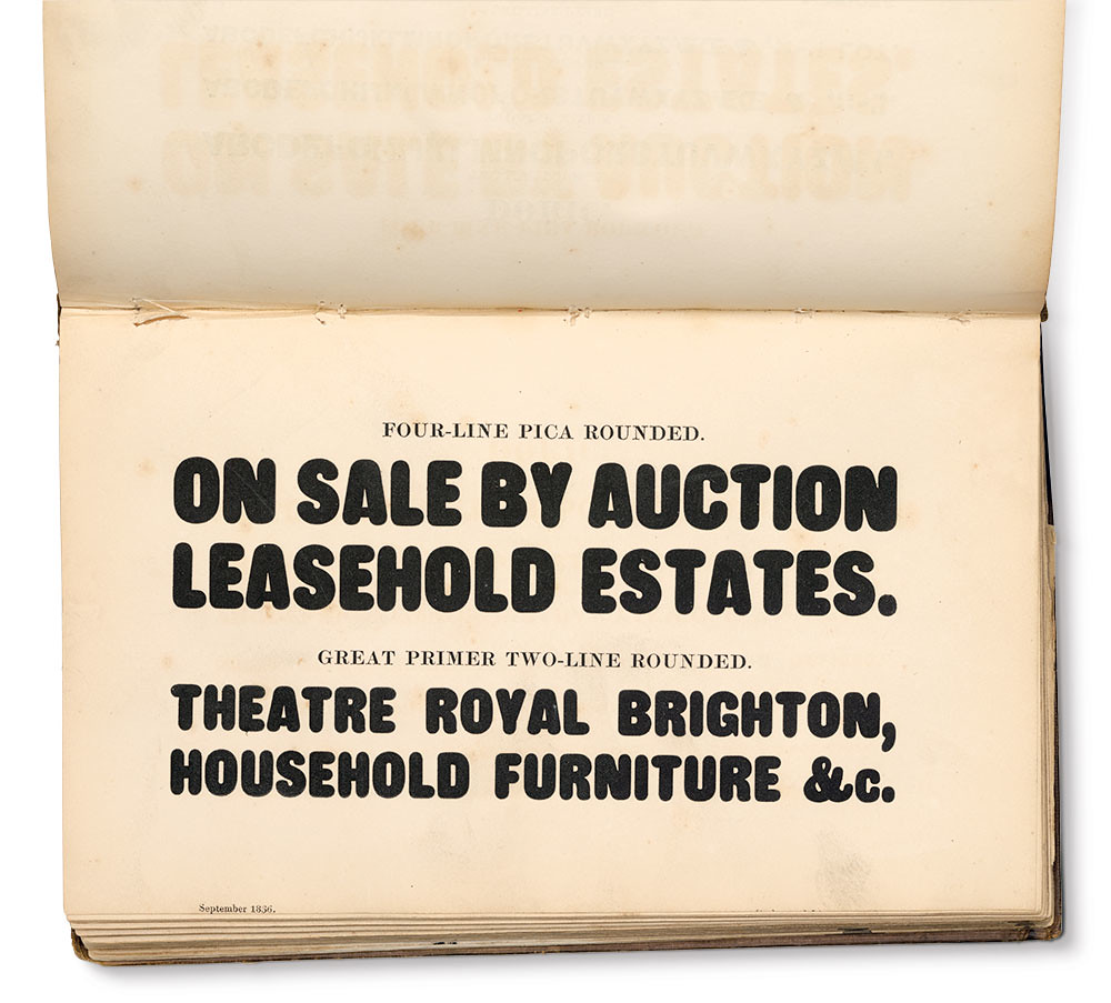
Specimen of Printing Types by Henry Caslon, Letter-Founder, Chiswell Street, London. 1844
Source
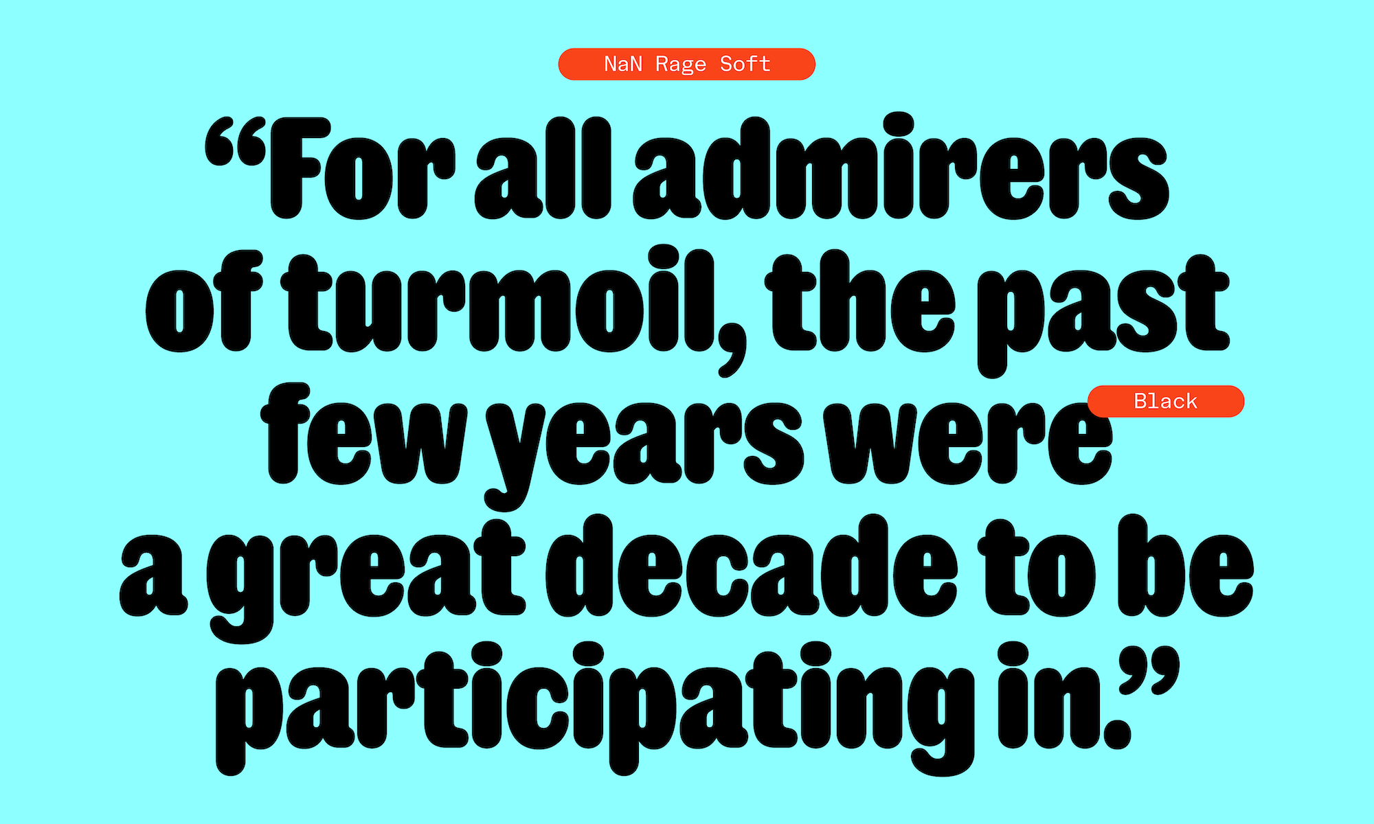
Rage Soft is definitely the warmest member of the Rage family. The rounded corner opens its counter-shapes even more, letting more light enter and giving it more openness. In its thinner monolinear weights it reminds of laser-cut or embossed letters, techniques summarising letter shapes to their skeleton. But in its bolder weights, Rage Soft is a meaty character with subtle contrast and a tapering of its endings that might even recall the drops of its slab-serif cousin Rage Beau. As a foundry with its headquarters in Germany, it was impossible for us to not think about and crave a bag of Haribo sweets (or something würsty) each time we worked on Soft’s boldest weights. We are sorry if this craving is contagious.
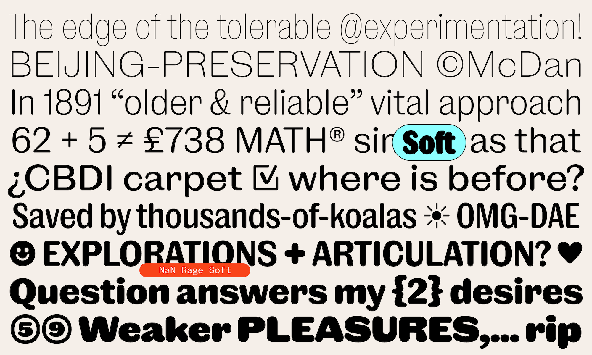
If the first 4 members of the Rage meta-family already take a lot of freedom with the 19th century type history, Rage Poly breaks totally free from the epoch. Maybe it started as a joke like “what if we made the opposite of NaN Soft?”. Maybe. Anyway, the idea came of drawing a version of NaN Sans totally deprived of curves. The result is a very digital font in the sense that it’s crude geometry, sharp angles and straight line segments are a testimony to the purely mathematical data underlying fonts nowadays.
In doing so, it refers to the first ever digital fonts created by Dr. Allen Vincent Hershey at the Naval Weapons Laboratory (Virginia, USA) in 1967. Hershey created a collection of letter shapes only made of straight segments; strokes of which the computer (or the ray tube displays) would apply an outline. Amusingly, these first ever fonts still survived to this day in contemporary software, the main example being the industrial design and architecture software AutoCAD which implements a collection of typefaces based on Hershey’s.
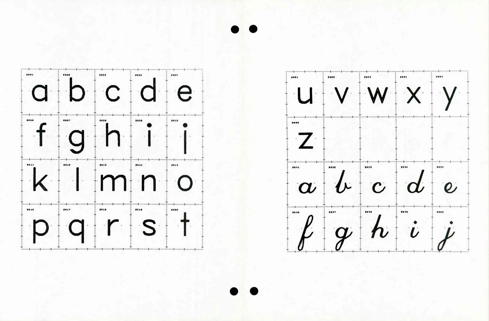
Calligraphy for Computers,
1967Source

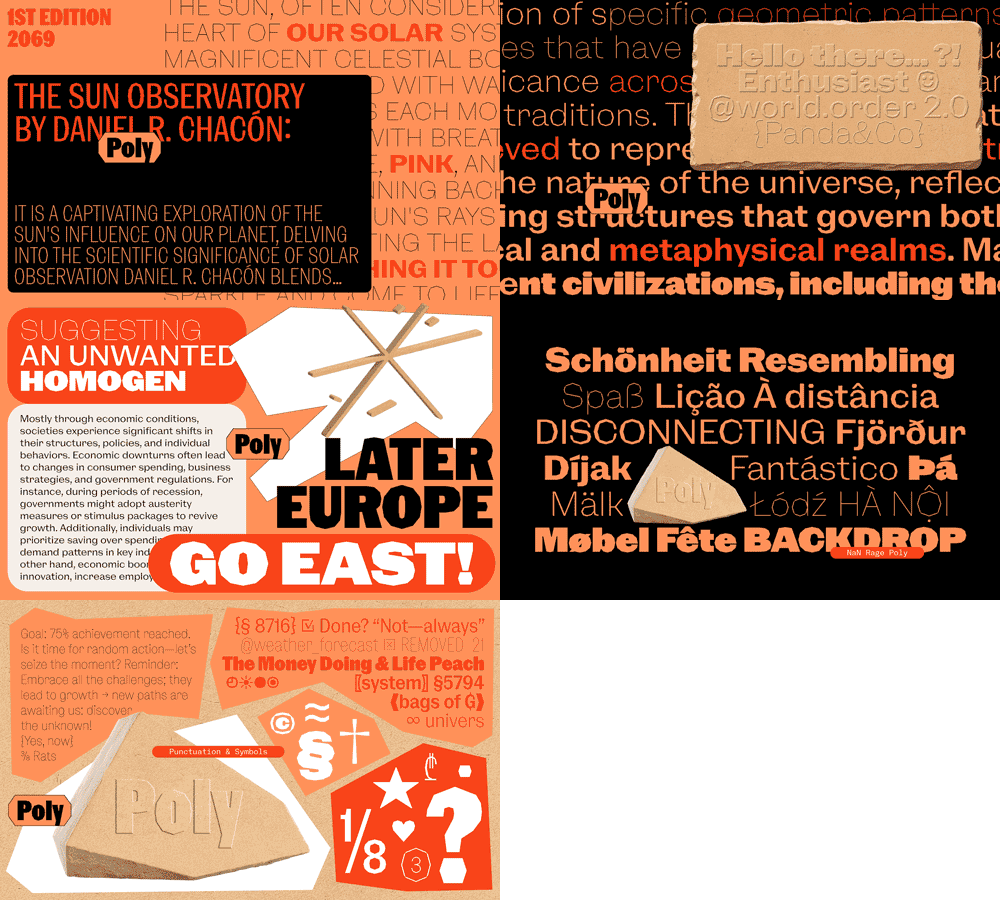
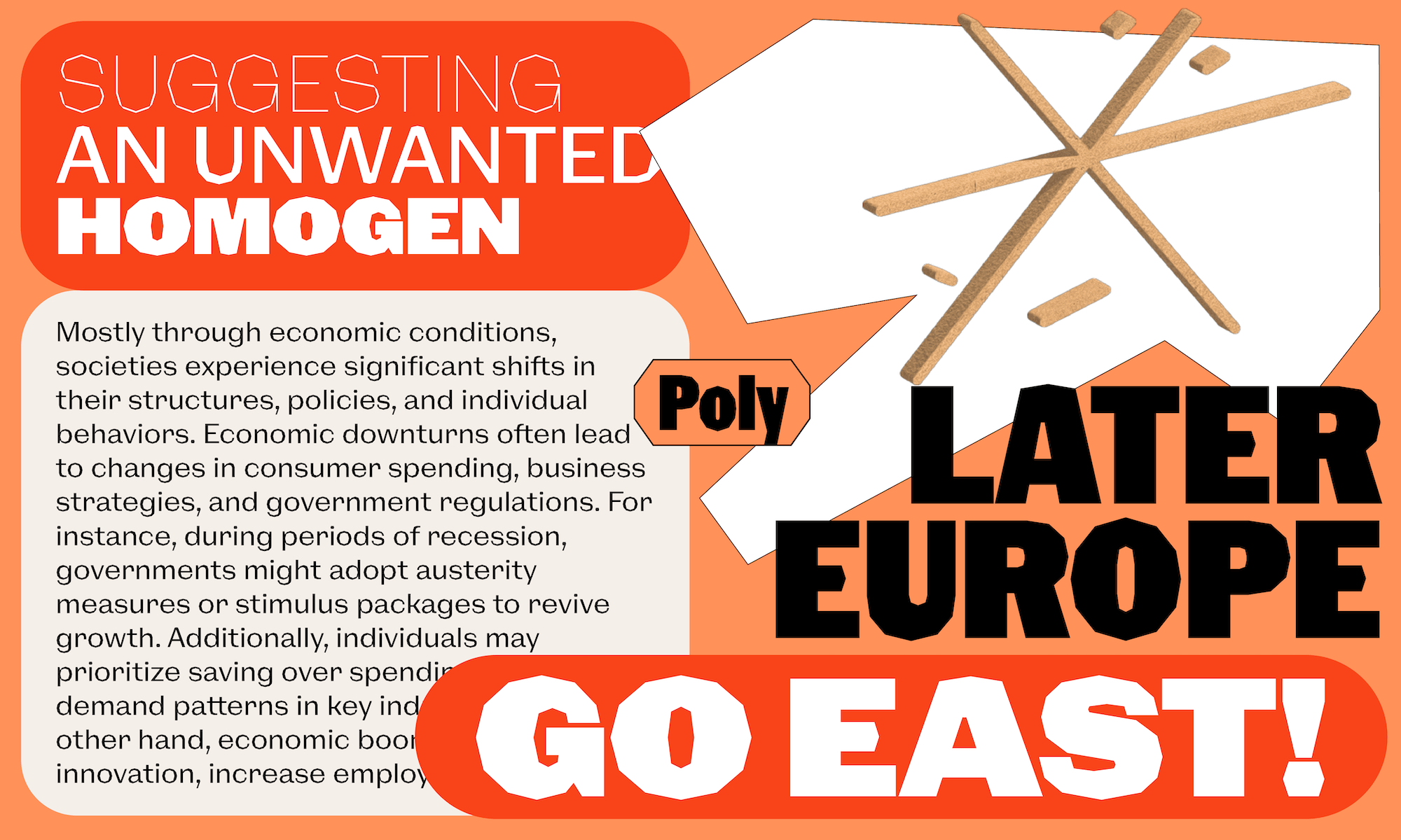
Poly doesn’t follow a stroke-logic but an outline one, transforming each quarter circle in a series of 2 to 4 straight segments. This strategy leads to a surprisingly subtle result in bold weights and in small sizes, where one sees curves instead of corners. But in lighter weights, the crudeness of this process is unavoidable and forced us to embrace stronger choices. Weight artefacts that are hard to discern in Black become striking in Regular and Light, curves starting to get thinner as they turn, to a point where the counter-shapes look almost like they will shine through the outer shapes. This leads the lighter weights of Rage Poly to look like they sit further towards the direction of display typefaces.
When the first half of the members of the Rage family refer to the industrial revolution era, Poly, while not carrying anything from this epoch has its own industrial spirit. The straight segments composing its outlines could almost appear like machine-cut in metal or the sides of a steel nut.



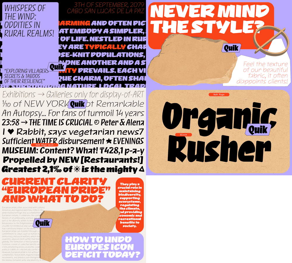
And then comes Rage Quik, the outlier of the family, not sharing any skeletal similarity with its cousins. The idea behind Quik came when it appeared more and more that Rage, as a system, was starting to become an editorial power-house, able to fulfill all the typographic needs of a magazine or a newspaper. But then we lacked an accent-font, one that would really stand out from the rest of the layout to provide a different type of information.

We kept the proportions (horizontal as well as vertical) and the weight of the other Rage families but started from scratch and drew a typeface with a totally different structure. Quik is for now (please kill us) the only slanted/italic family of the whole Rage system. Its shapes are rooted in hand-lettering, Sharpie© felt pens and graffiti. It’s flowy, but keeps tension and sharpness. And most strikingly, it’s never too logical nor consistent. Some unconventional structures like the angular, counterless /a or the two-strokes angular /s breaks away from a *soft* lettering font and give it an edge.
Following the construction of the other families, it ranges from thin to Black and is available in 4 widths, something unconventional for a script font which allows rarely seen fine-tuning possibilities to make it match or contrast other fonts.
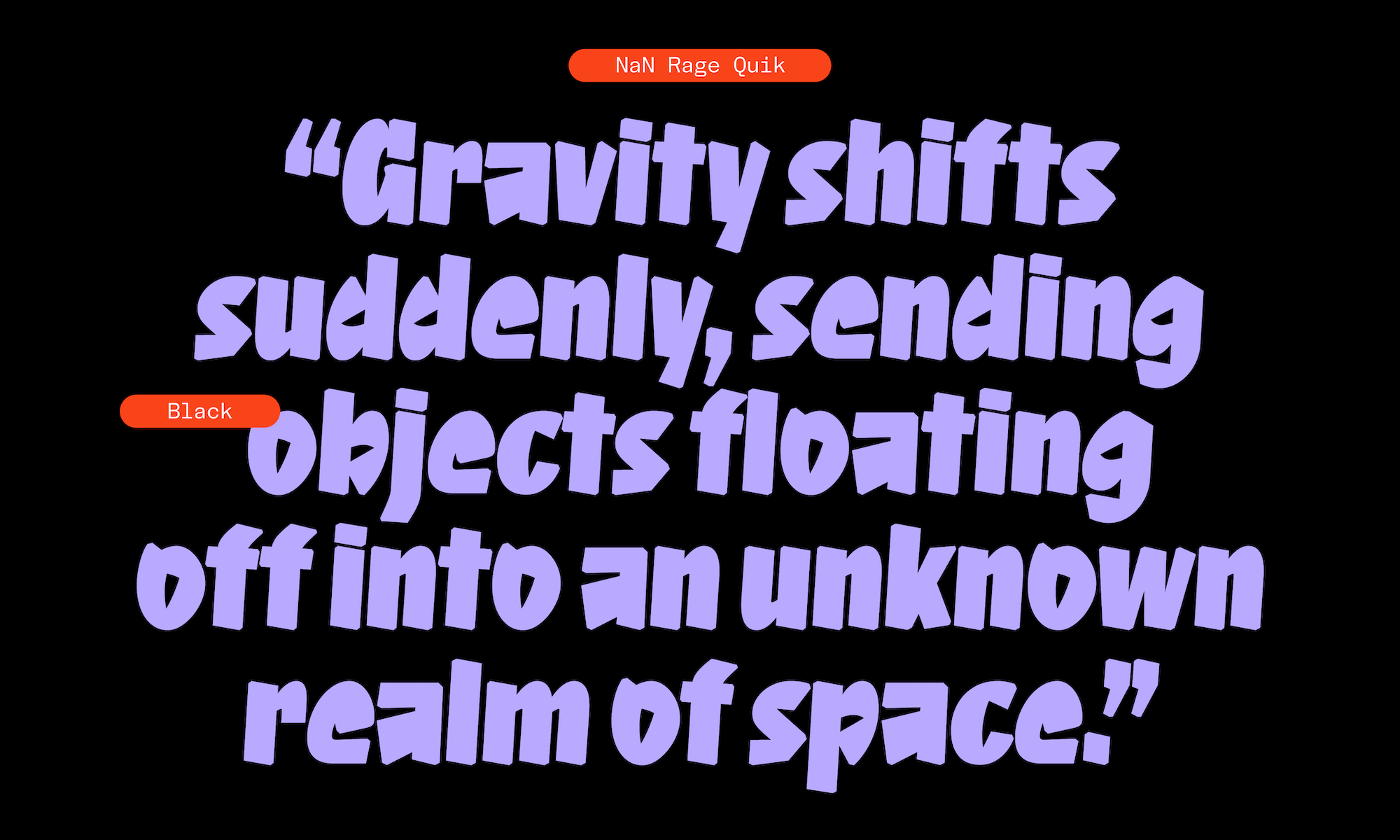
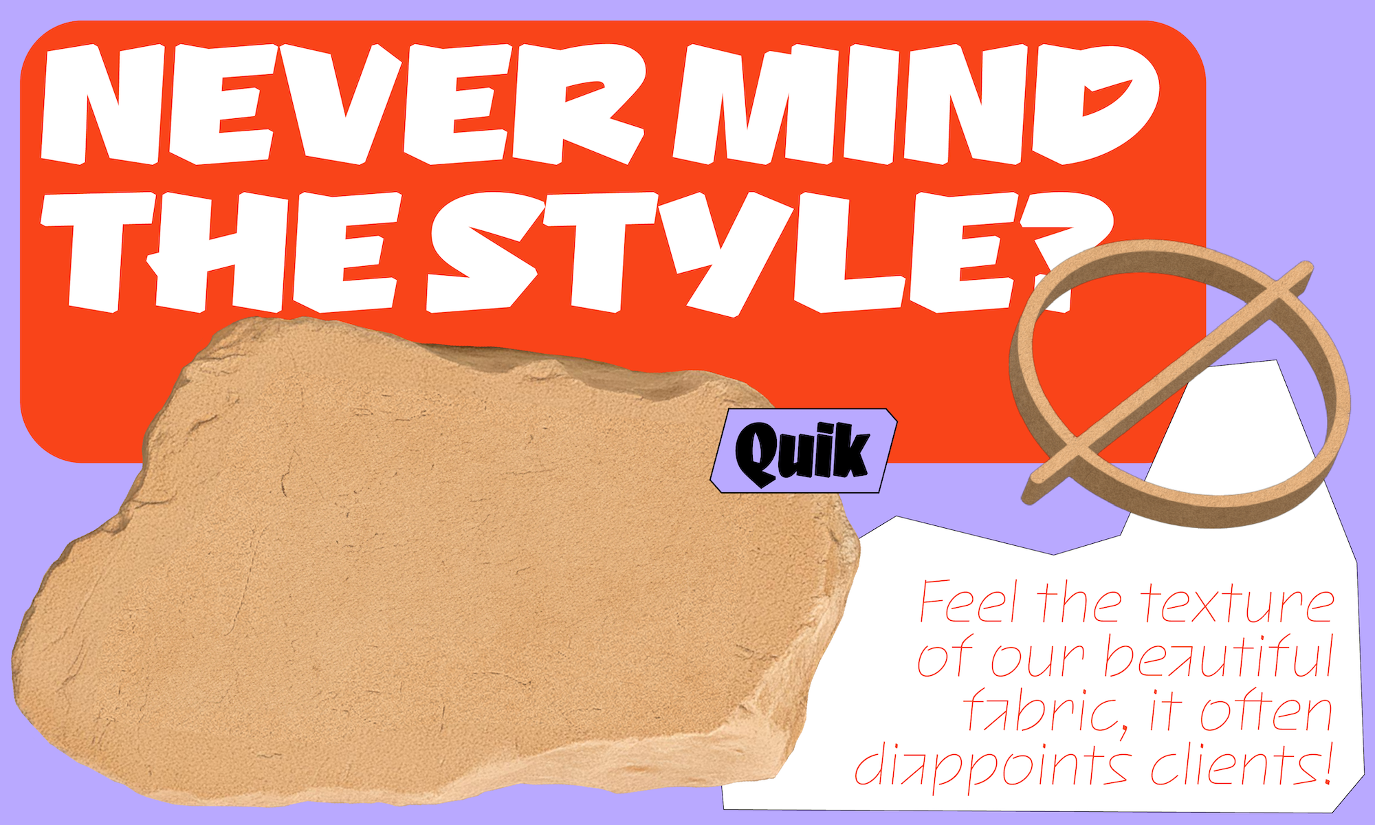

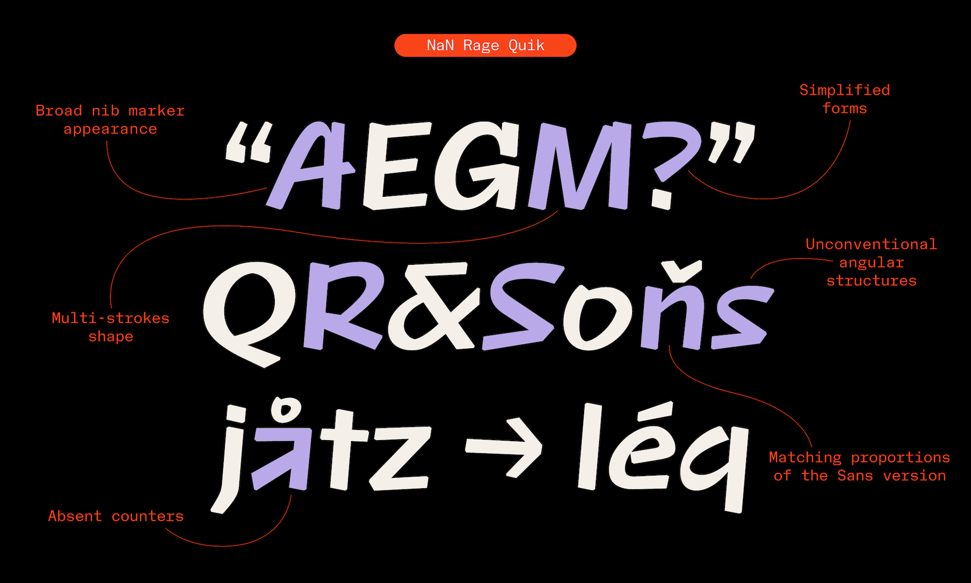
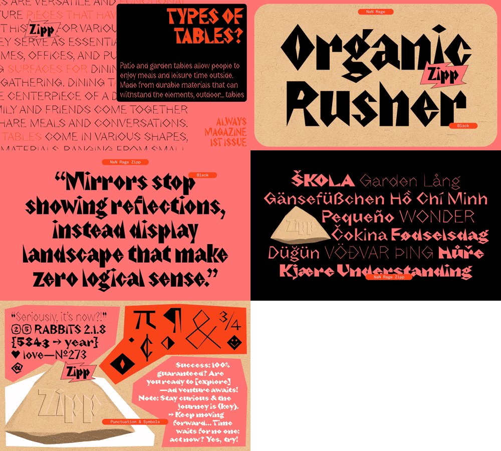
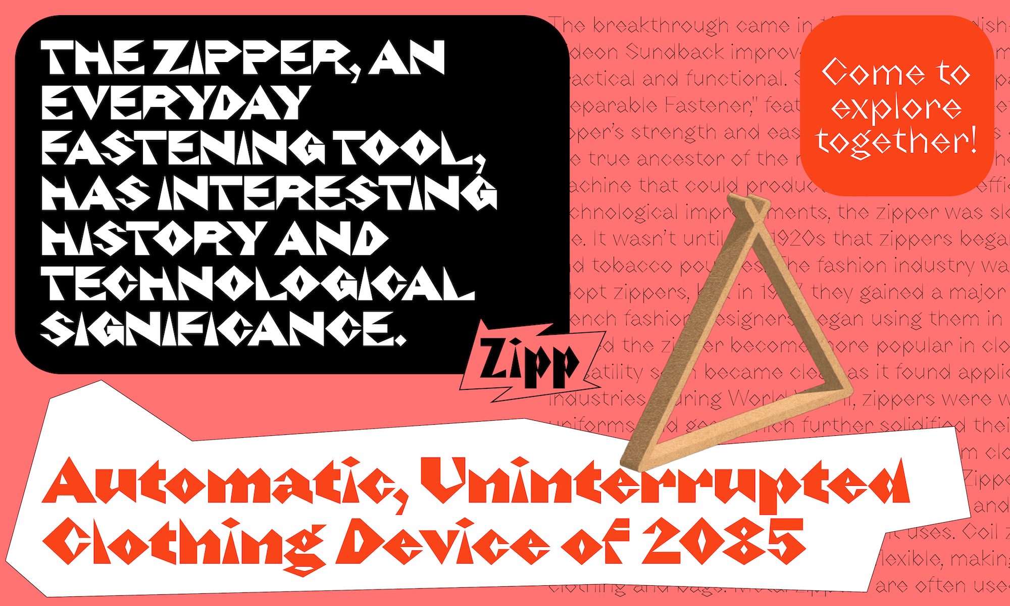
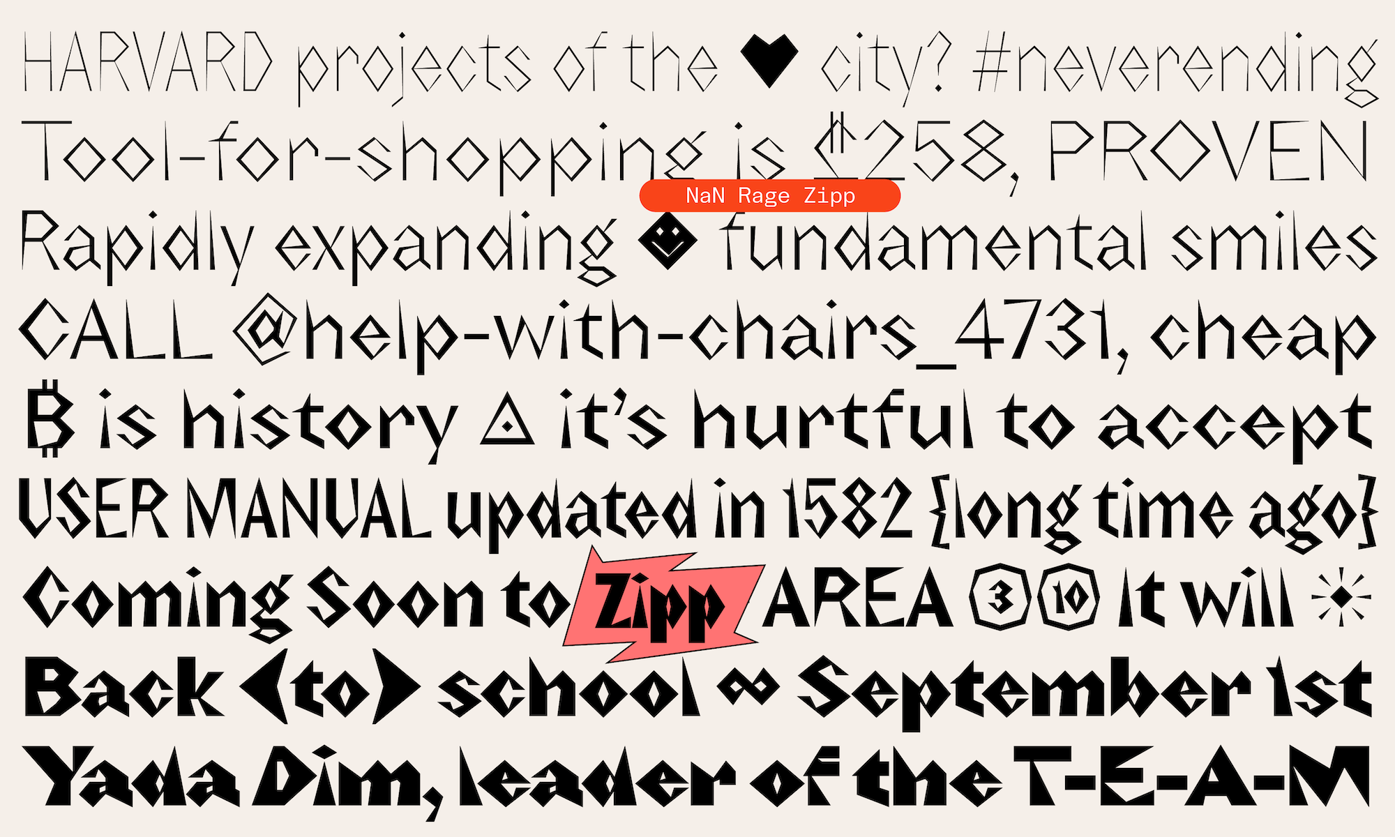
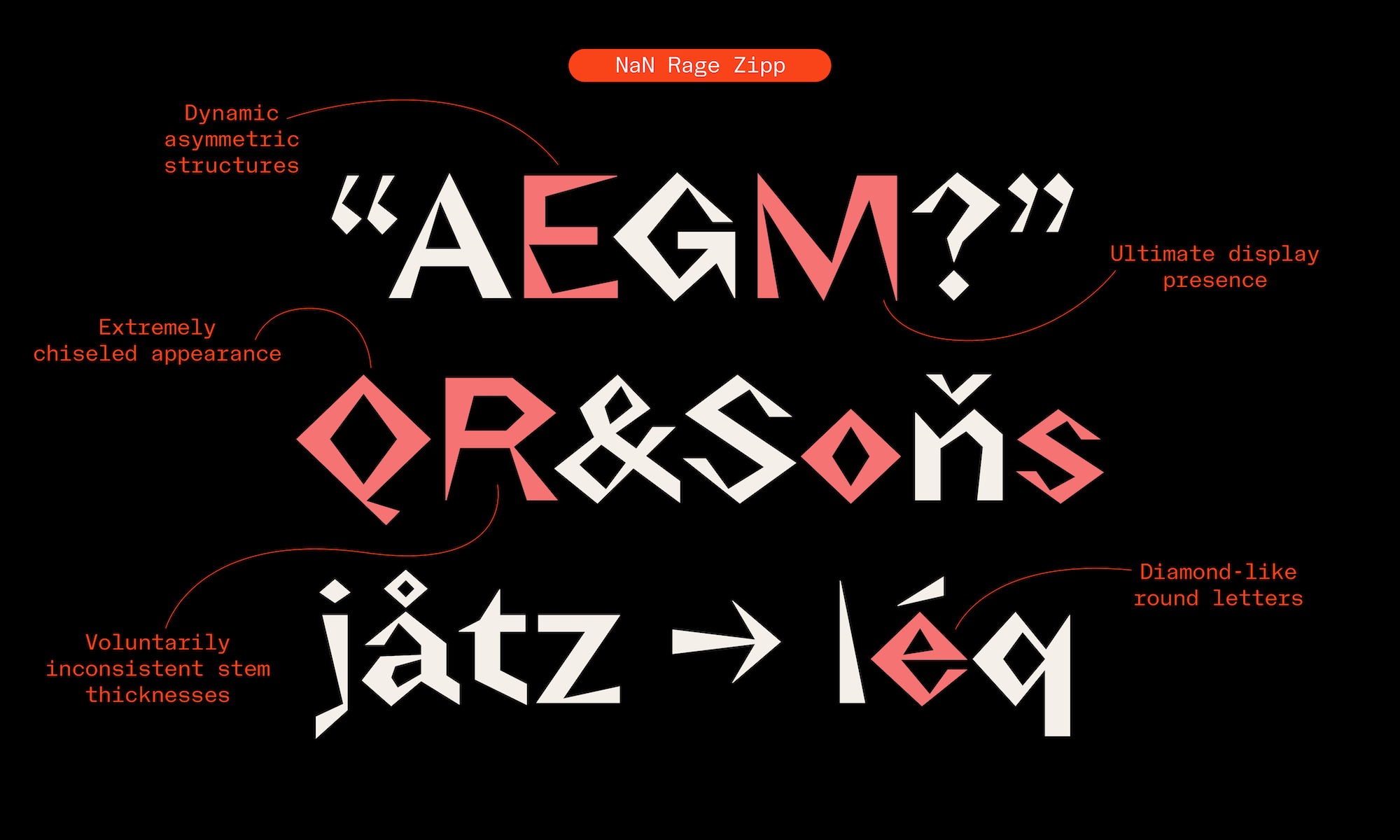
We won’t discuss which between Rage Quik or Zipp is the most extreme member of the Rage Typographic Universe (RTU). Still, it’s easy to acknowledge that Zipp is the most aggressive member of the RTU. The ragest Rage, if you will. So what is Zipp? It’s like if you sent Rage Poly through a violent data compression software, deleting half of the points. The result is a spiky, glitchy weirdo where every round shape was turned into a diamond standing on its tip.
But is Zipp only digital? Its angles and intense contrast couldn’t help but remind us of German expressionist woodcuts. Think Ernst Ludwig Kirchner. Pushing the comparison an inch further, is then Rage Zipp perhaps the brainchild of a feverish W.A. Dwiggins who would have pushed his infamous M-Formula too far?

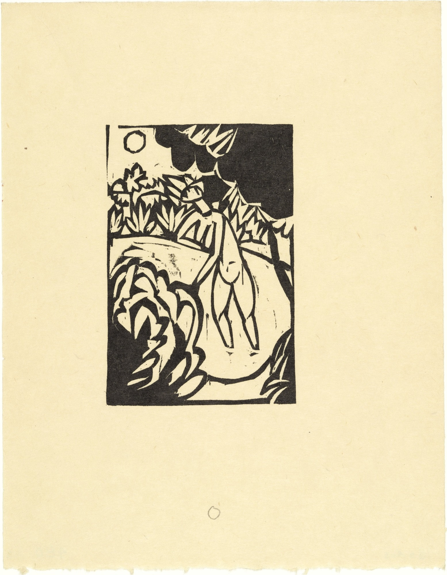
The Canoness in the Lake (Das Stiftsfräulein im See) from the illustrated book Das Stiftsfräulein und der Tod (The Canoness and Death)
Source: MoMa
In its bolder weights, it looks like Zipp’s letter shapes were sculpted or created with the famous Chinese puzzle game of Tangram. In lighter styles, the weight contrast is less extreme, giving almost the impression to look at a delicate digital lace.
Where Rage Poly is all in subtlety and balance, Rage Zipp embraces the weirdness and the quirks coming from its constraints. Rectangular stems become asymmetrical spiky toothpicks and weights are all over the place. Saying f*** it to consistency, Zipp creates a very distinct texture. At smaller sizes, the diamond-like shape of its round letters and its overall spikiness make it almost look like a black-letter which would have drunk too much coffee.
If fonts are tools, then Rage Zipp is one that needs you to wear protective gear before you even touch it. Beware, sharp edges. NaN shall not be liable for any direct or incidental damages arising out of the use of NaN Zipp. You’re warned.

Harder Better Faster Rager
Beau. Slab. Sans. Soft. Poly. Quik. Zipp. The seven horsemen of the NaNpocalipse. Choose your fighter or choose them all. Each of them sits comfortably as an individual with a complex personality, a testimony to a specific sub-genre in the typographic landscape, always with a dose of NaN Secret Spice thrown in. Together, as a pair, a trio or even the whole seven, they offer a depth and an ease of use to deploy a rich typographic language without the hassle. And remember, we offer the whole Rage Typographic Universe for a starting price of €450.

