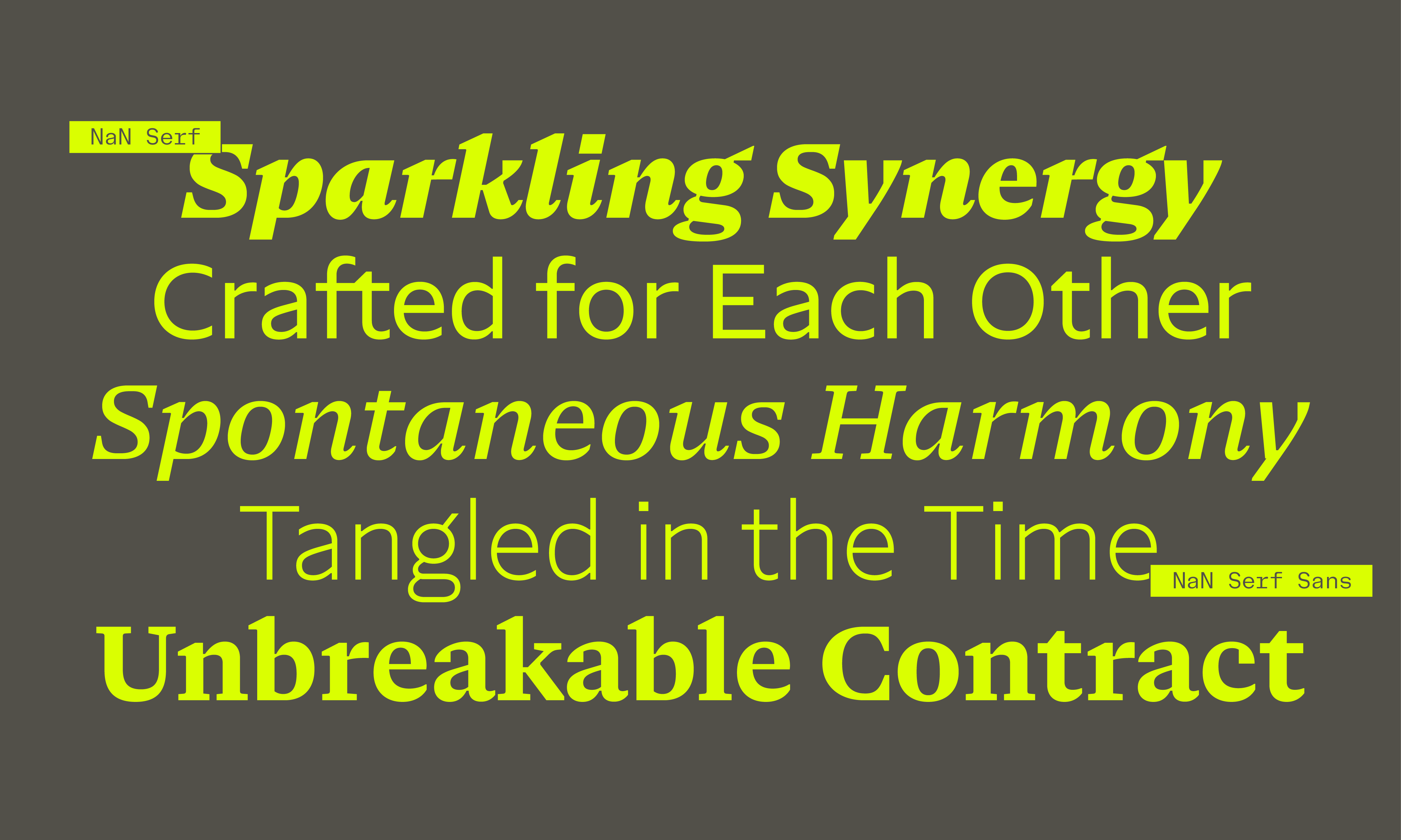
In this article, we will delve in the process behind the creation of both NaN Serf and NaN Serf Sans, explaining why we made some choices and why it should matter to you, the user.



Introduction: on the relevance of 600 years old fonts
Although born in the 15th century, serif fonts are still up to use and still relevant today. This magical aspect of the story of type design is that trends and new shapes add to each others instead of replacing. The pool of available styles for designers is just getting bigger. In this context, one can only wonder why there is such normalization of the font styles used for almost any purpose in almost any place. Is this a side effect of our stage of the globalization of culture where a common visual language rises for the whole world, with no consideration for the local particularities or taste? I’m looking at you, neo-grotesque and geometric sans.
But, as we said earlier, serif typefaces are still in use today and should maybe take back a bigger slice of the cake monopolized by sans-serif today. And, if it’s true that styles created centuries ago are still relevant today, they go through stages of re-actualizations. Both technically and stylistically, old designs are consistently made up-to-date by alive designers. NaN Serf is born out of this reflection. At NaN, we started to have a wide collection of sans-serifs in many fresh voices and flavours, but we were short on a serif counterpart, a font that translates NaN savoir-faire and taste to offer a modern tool for designers, a serif that would be as utilitarian as it is elegant.
We looked at this point in the middle of the 18th century when rationalization kicked in and typefaces started to really dive away from their calligraphic references that were still the back-bone of the type practice back then. Evolution in both technique and taste allowed punch-cutters such as John Handy (working for Baskerville) and Grandjean to straightened the contrast axis, bring more symmetry and fineness to the letter shapes. We took these as a starting point and considered how we could push this rationalization a step further with our modern digital tools.
Draw me like one of your 6pt fonts
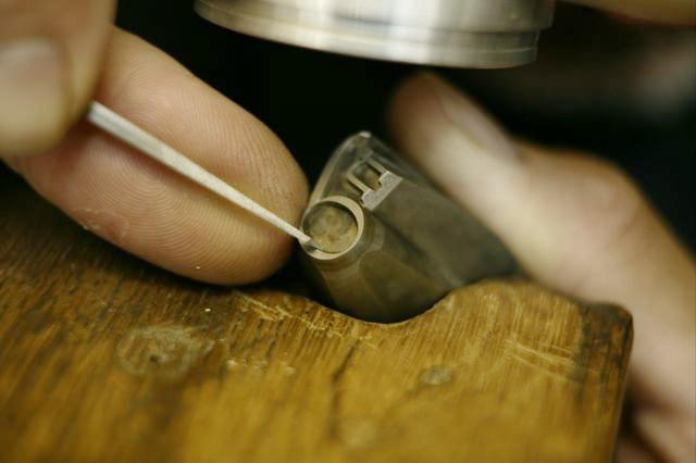
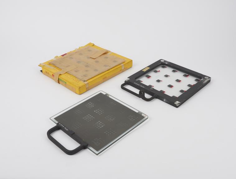
As often with NaN fonts, Serf is not a direct revival of any specific typeface but more a summary of many styles that becomes its own idea. Furthermore, with its optical sizes, NaN Serf reconnects with the way fonts were drawn before the digital era, and even before the phototypesetting era. When type-designers, then punch-cutters, were creating a new font, they were doing so at real size, meaning they were engraving a small metal punch with the shape of the letter at the exact size it would later be printed, a couple of millimetres hight for a text font. They was no zooming-in back then. The same font at a different size was in fact a different font, redrawn from ground up. This allowed and even forced punch-cutters to make different choices for each size.
This was lost when phototypesetting appeared in the 1949 — before booming in the 60’s — with the ability to have fonts made of photographic film instead of metal. With the help of a few lenses, the exact same letter could be used for a 7pt text or a 70pt title. In this, phototypesetting laid the foundations for how we use digital fonts today. But with this time-saving innovation came the problem that font designers could hardly anymore draw size-specific fonts, providing their best results at a specific size range.
Size-specific drawings and style-bridging features
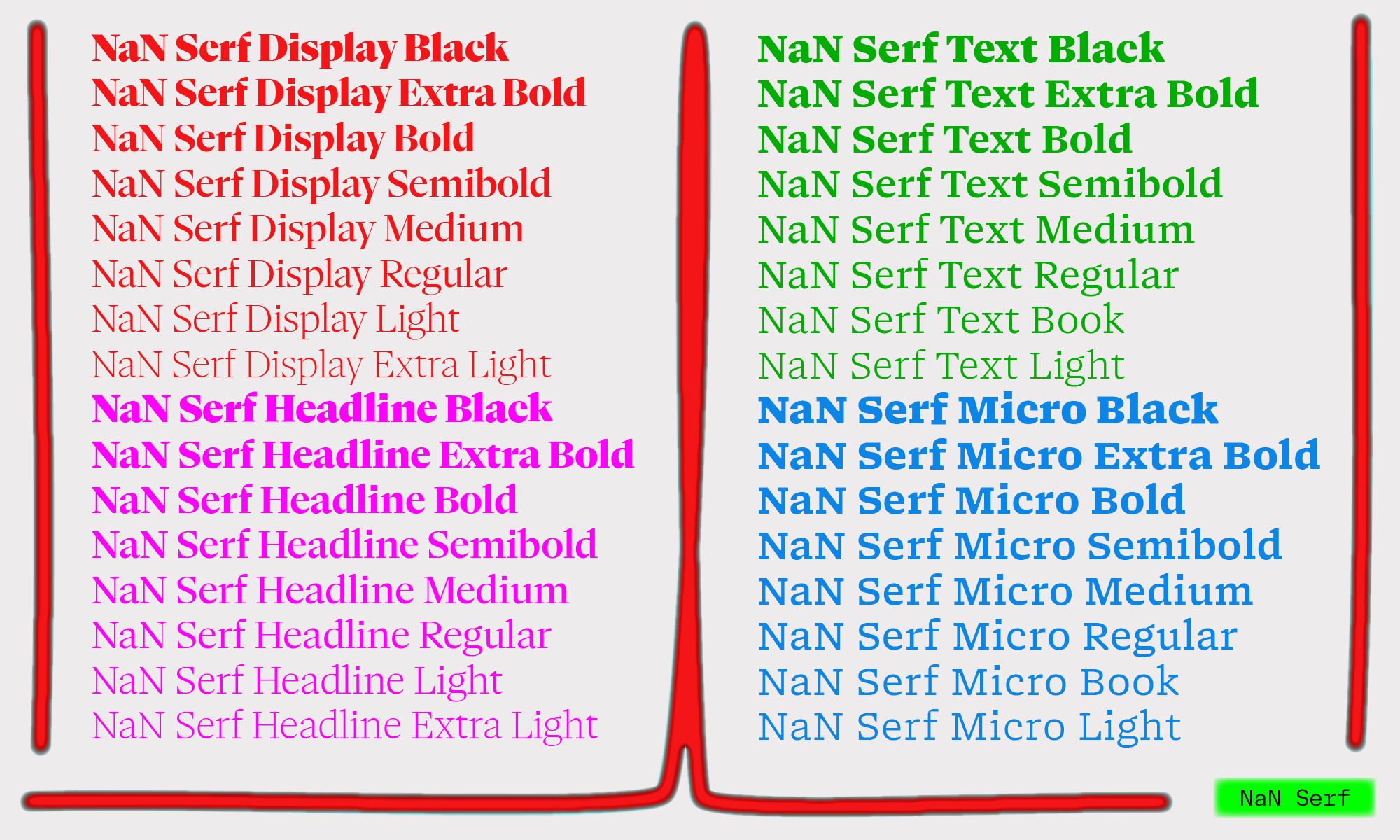
With NaN Serf, we decided to re-connect with the craft of our elder and provide digital fonts tailored for specific sizes, would it be on print or on screen. The variable font technology furthermore allows us to deliver those in a unique lightweight font file, allowing the user to fine-tune exactly how they want the font to look and behave. But what are size-specific drawing choices?
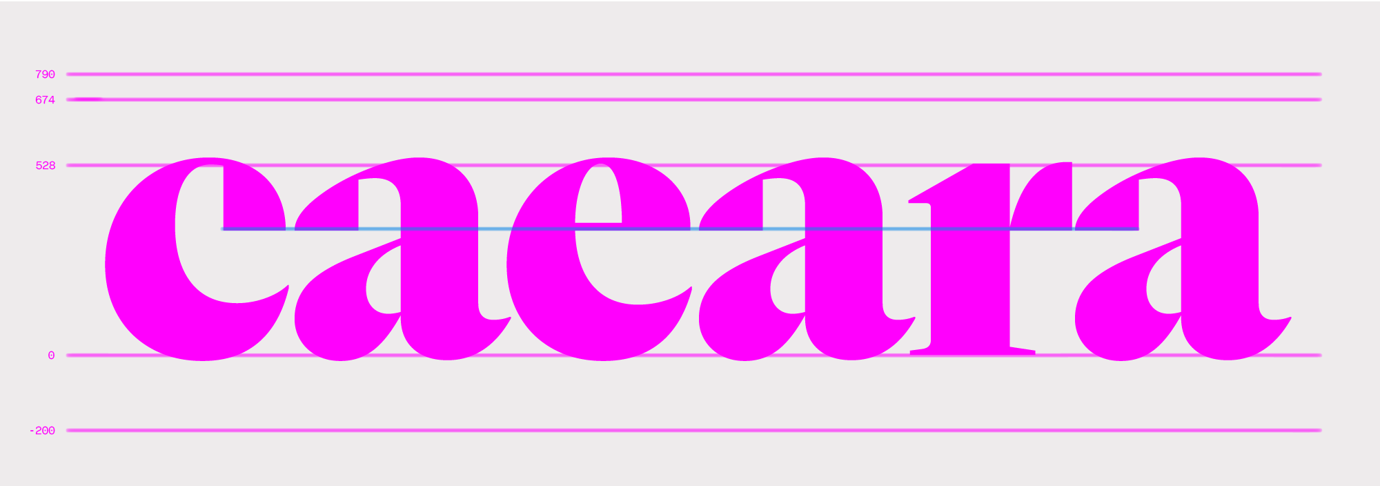
give an impression of elegance and control
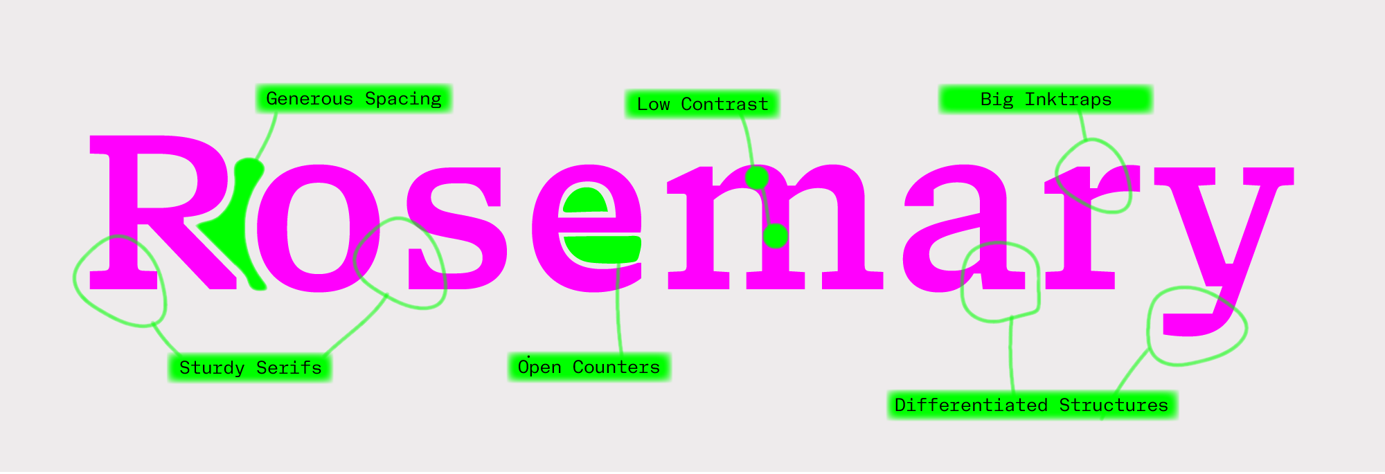

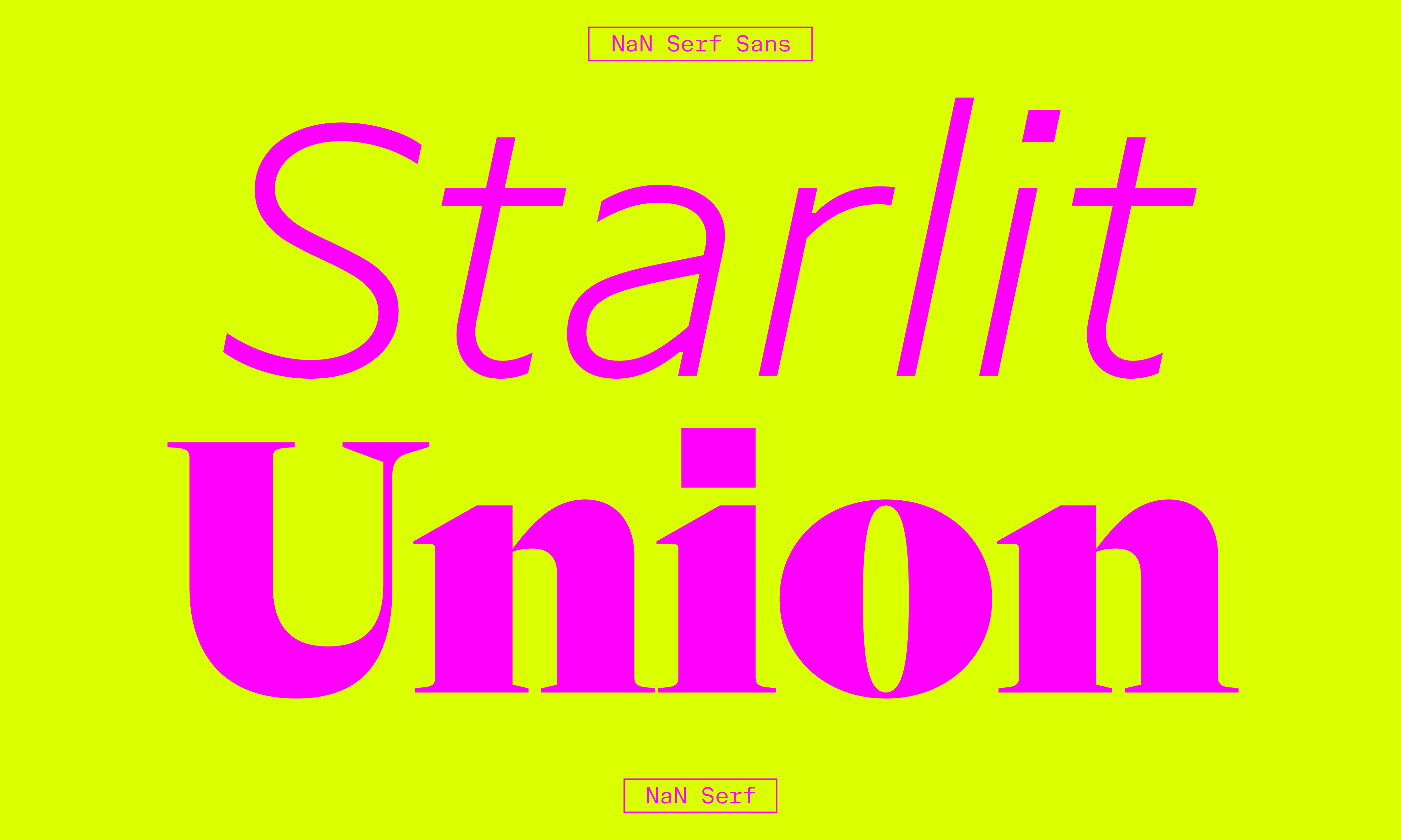
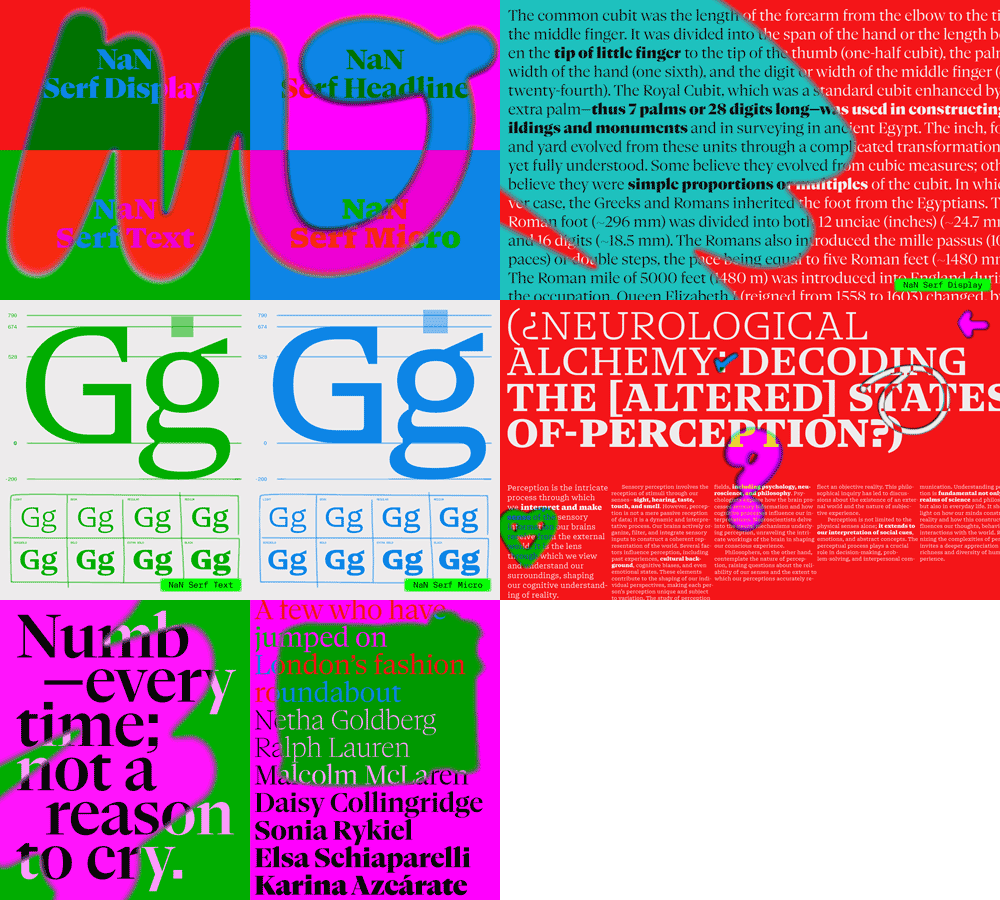
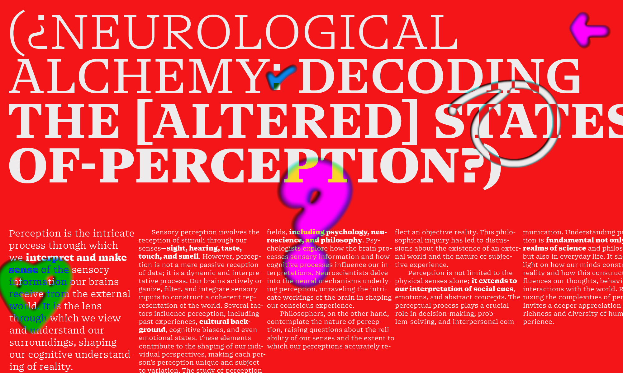
We can make a list of features that drastically change between the 2 opposed optical sizes of NaN Serf: Display and Micro. We have: the contrast between thick and thins, the size of the thinnest and smallest elements, the spacing, the openness of the counter-shapes. In Display, the contrast is at its highest and the thins and serifs are their thinnest and shortest. The serifs are almost monolinear and the thinner parts are so delicate they look like they could almost break. Contrarily, in Serf Micro, the contrast is at its lowest, thick and thins being almost equal, and the serifs are longer, thicker and sturdier. And that’s when Serf is bridging styles. With its fat rectangular serifs, Serf Micro is almost as much a slab-serif typeface as a transitional one. Earlier we wrote about how metal typefaces were being made at and for a specific size. With its crude details and optimization for legibility at small sizes, Serf Micro does reconnect with the cold-metal type era, when fonts were actually created to be used small ; it evokes and emulates their warmth and reading ease.
By allowing us to take the best of each epoch and bring them together, we create a type anachronism but we also provide the best tool for our epoch. Because it doesn’t need to be true to any history book, it can be the most contemporary version of itself.

Orthogonal detailing
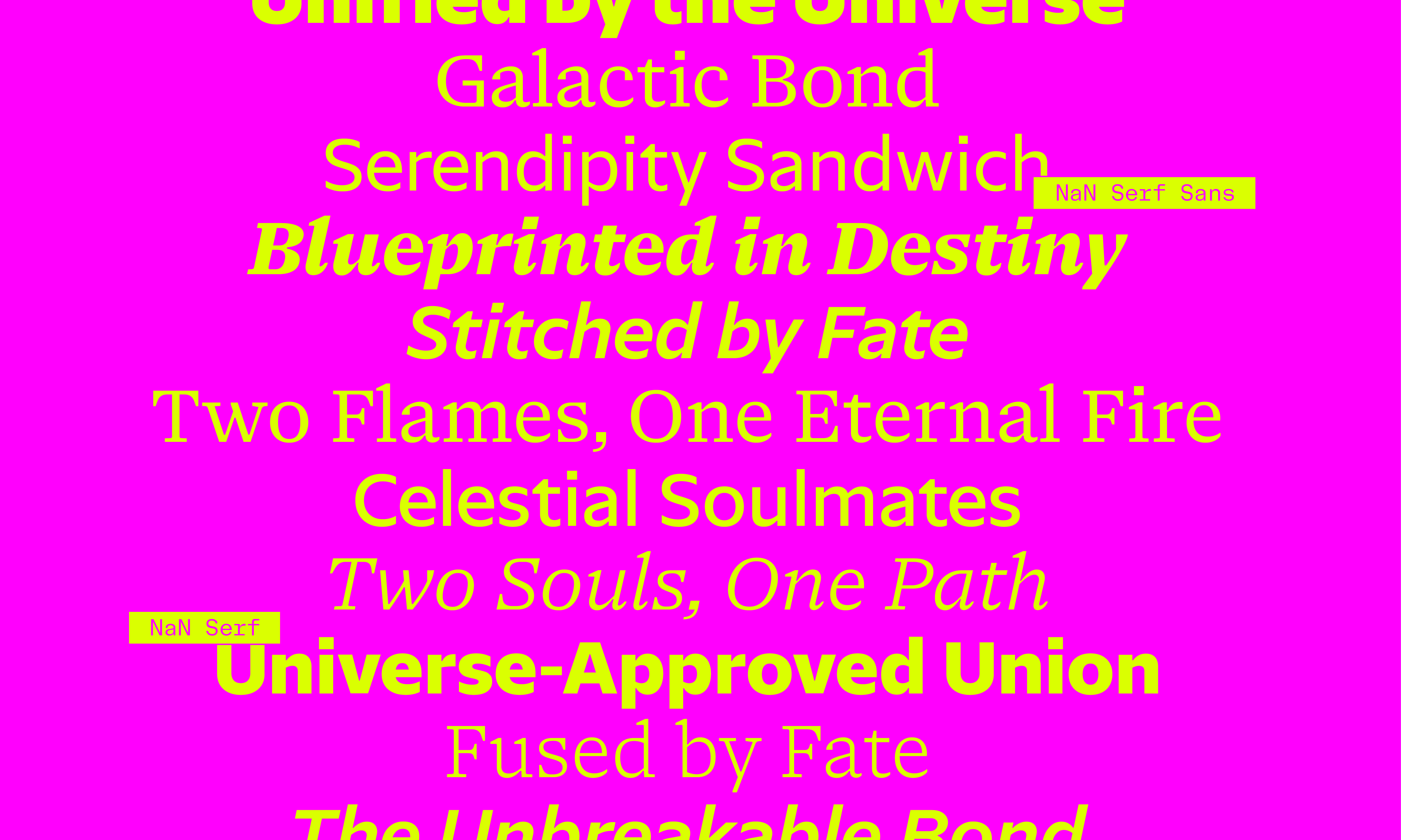
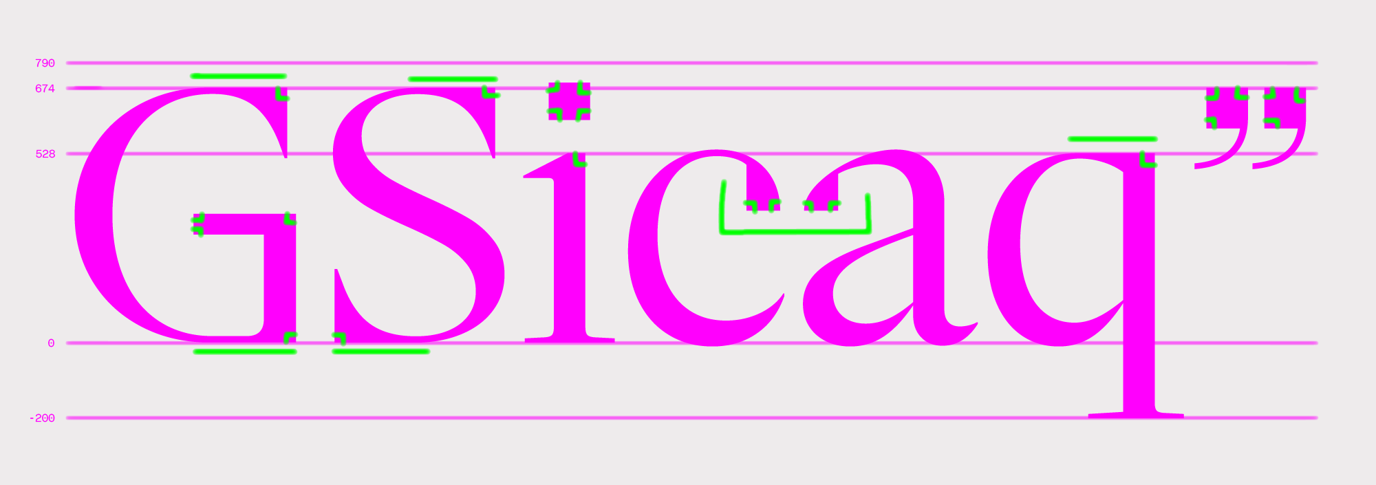
Talking about anachronisms, we made a lot of choices with Serf that embrace digital tools and aesthetics, rooting the font into its age. The most obvious example are the square tittles and punctuation. Why bother drawing a circle when a square would do the job? we asked ourselves. If creating a perfect square with sharp angle is a challenge in metal, it’s the default and most obvious shape in a vector software. Almost unnoticeable at small size, this detail gives a subtle recognizable, sleek and rational undertone to Serf A. But if you would prefer a more traditional and soft choice, we created Serf B for you, a version offering round punctuation and tittles out of the box.
Someone didn’t skip math class at school.
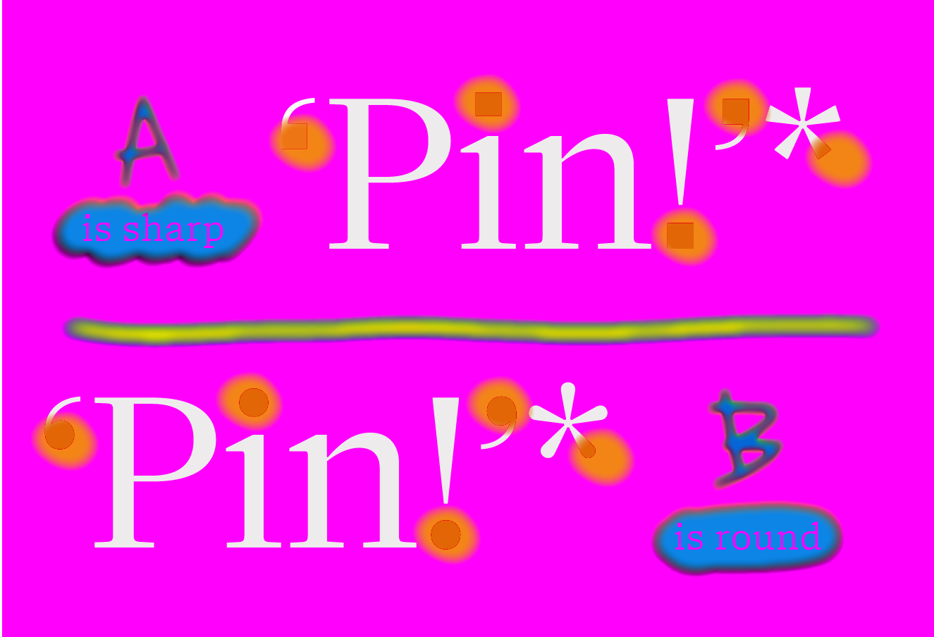
punctuation and many other soft details,
either sharp or round.
We pushed this tight digital references a step further in Serf in bringing orthogonal detailing where we could. The stronger examples are drops of the /a and /c, showing a perfectly rectangular profile on their inside, even in italic. More surprisingly, the curves of /C/G/S/p/q/s become totally flat at the top and bottom of the letters, bringing a square vibe to these usually round letters and forming once more a perfect 90° angle with their vertical serifs.
Embracing such strong orthogonal detailing makes Serf apart but also brings the additional benefit of allowing to perform even better on screen, where all those square details fall perfectly on the pixel grid. You can judge for yourself, after all, that’s the font you are reading right now.
What’s next?
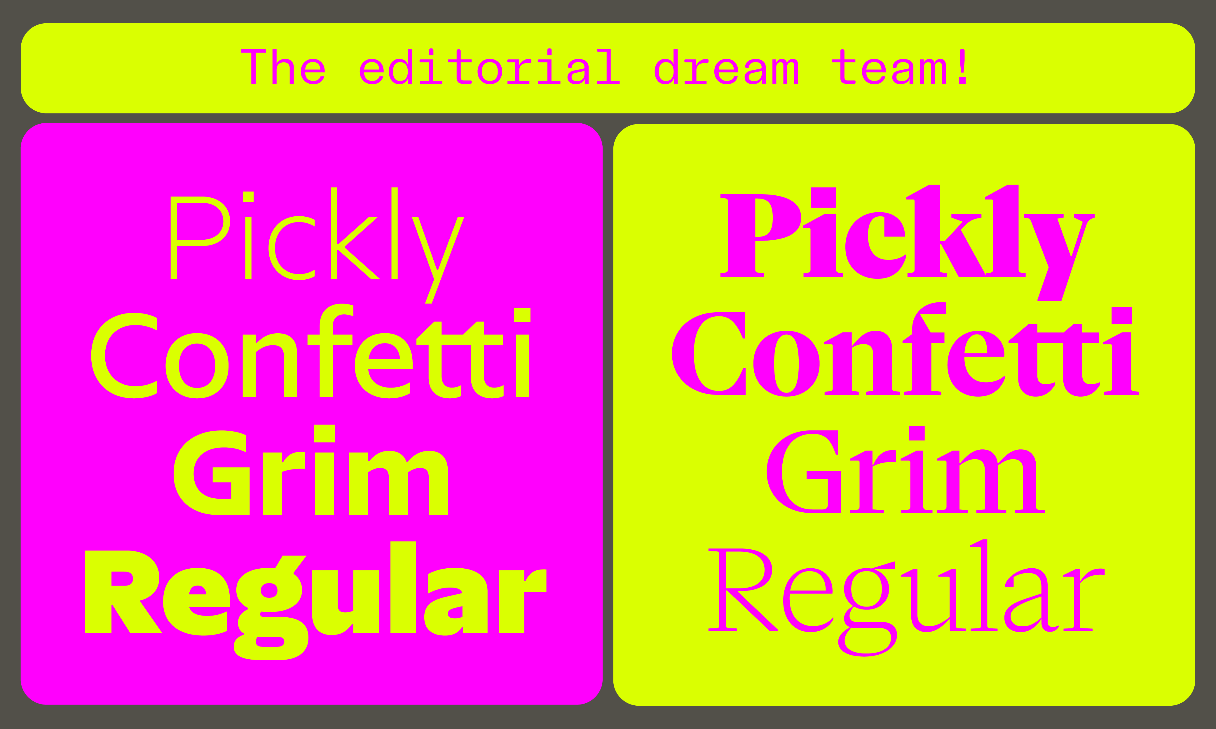
We were very happy and proud with ourselves after finishing and releasing Serf, able to take a deserved break. Or did we? Anyways, a question started to tickle us soon enough: what would be the best sans-serif companion for Serf? An obvious choice is NaN Metrify. We drew both Serf and Metrify with matching proportions, which makes it very easy to mix the neo-grotesque and the transitional serif together.
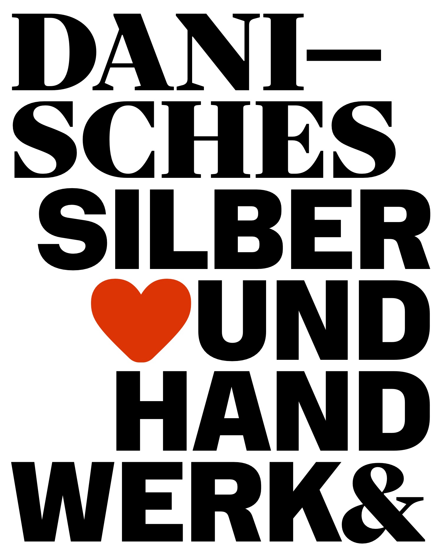
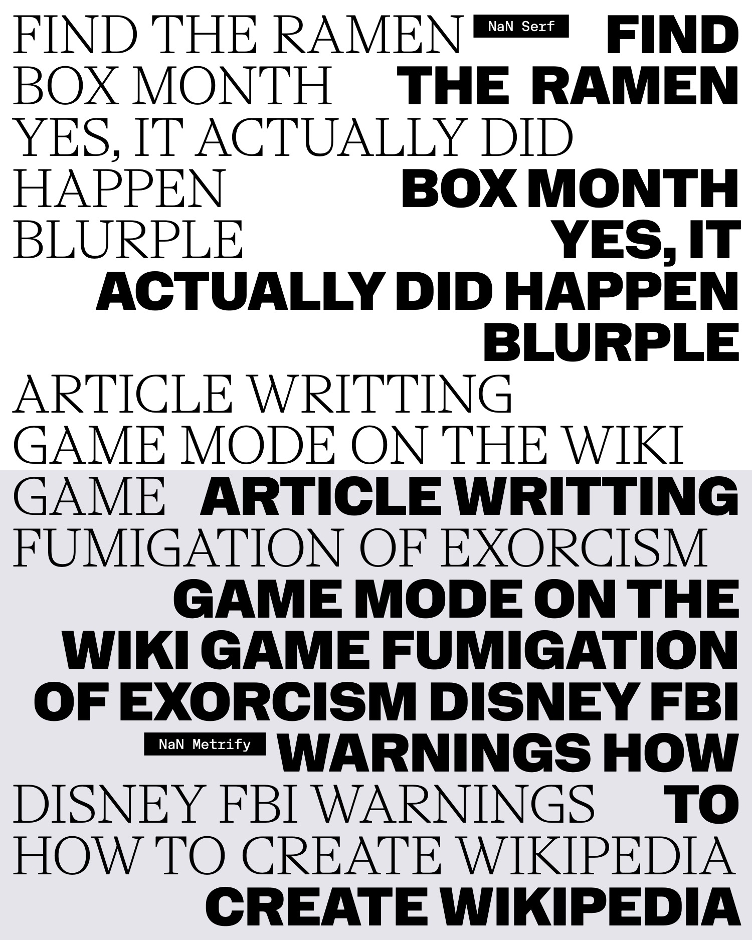

But what if Serf was a sans? What if we could inject all the sleekness and the legibility of Serf in a sans serif? A sans Serf, or better a Serf Sans. It became obvious we had to try translating Serf minimalist approach to a sans, using its humanist proportions and structures to make a gentle and hyper-legible sans serif. After all, after 5 years of activity, NaN still lacked an humanist sans serif in its collection. This subgenre appeared at the beginning of the 20th century in the UK, came back under another form in the 90’s and flourished and peaked in the early 2000’s, even attacking Helvetica’s then monopole.
The idea behind the appearance of humanist sans is pretty simple: step 1, take what we call a humanist serif typeface, e.g. one that is influenced by calligraphy, typically something that’s influenced by the work of 15th century Italian calligraphers and punch-cutters. Step 2, turn this serif typeface into a sans-serif, cutting away the serifs, decreasing the contrast and tuning down details. In doing so, you jump over 4 century of type design history, creating shortcuts that bring new structures to the sans serif genre.
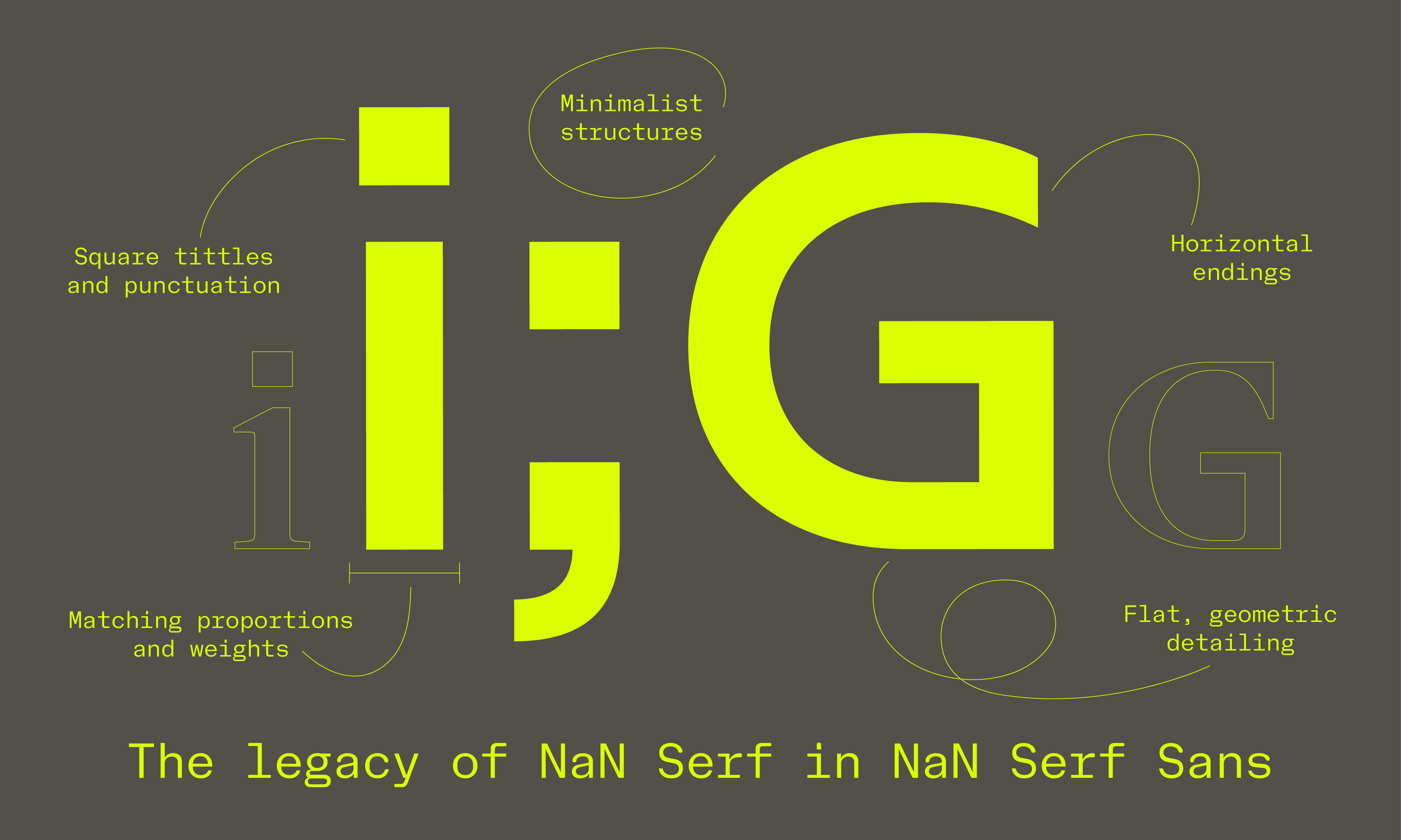
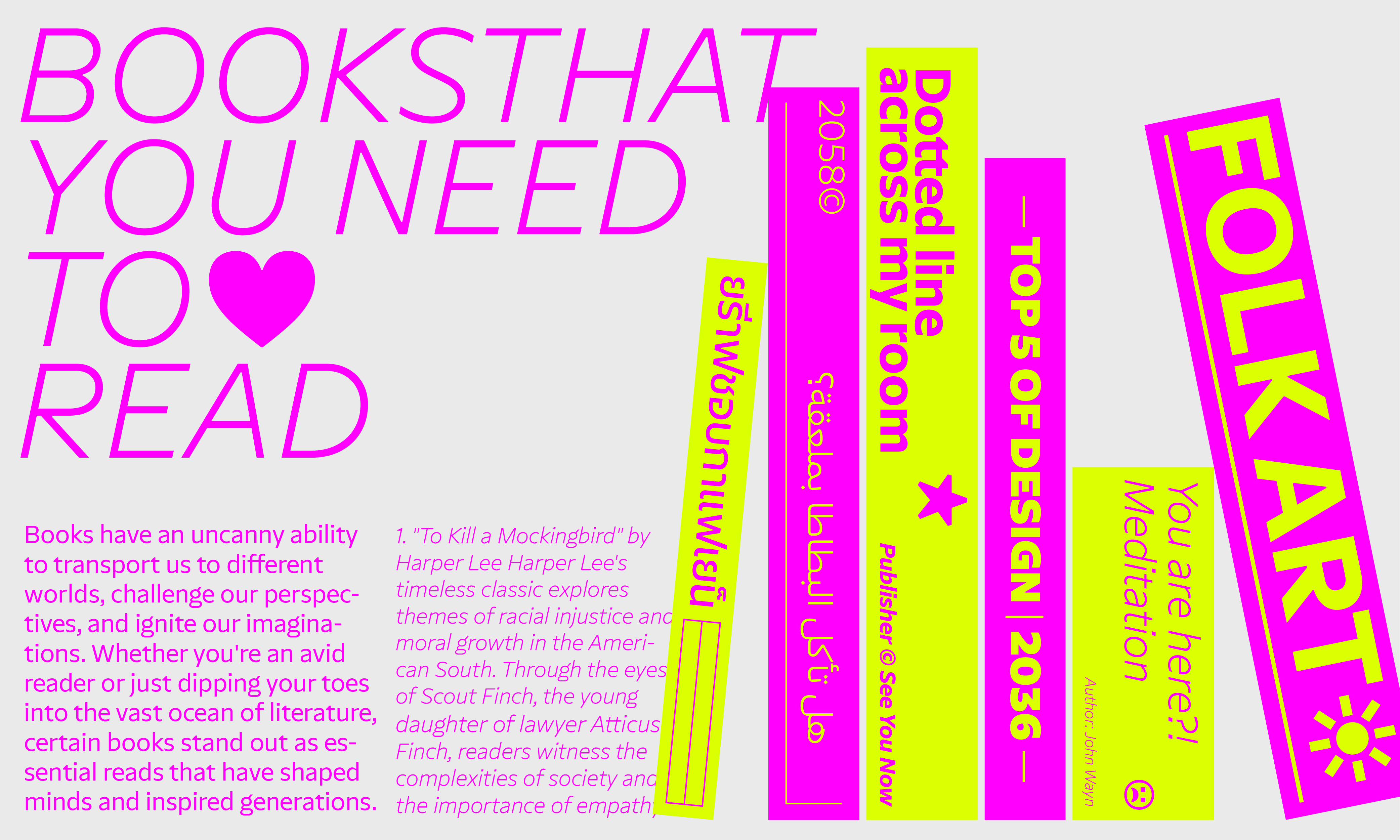
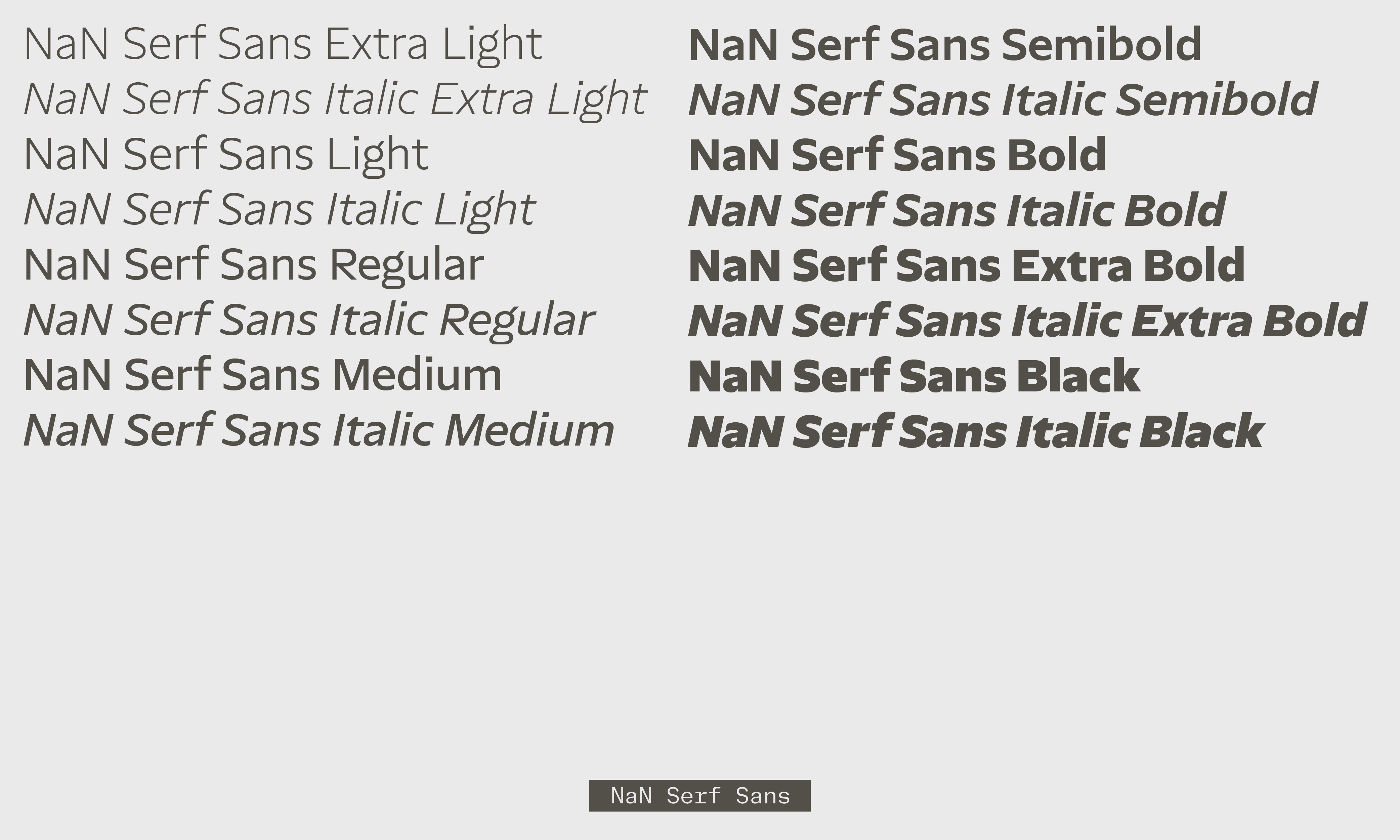
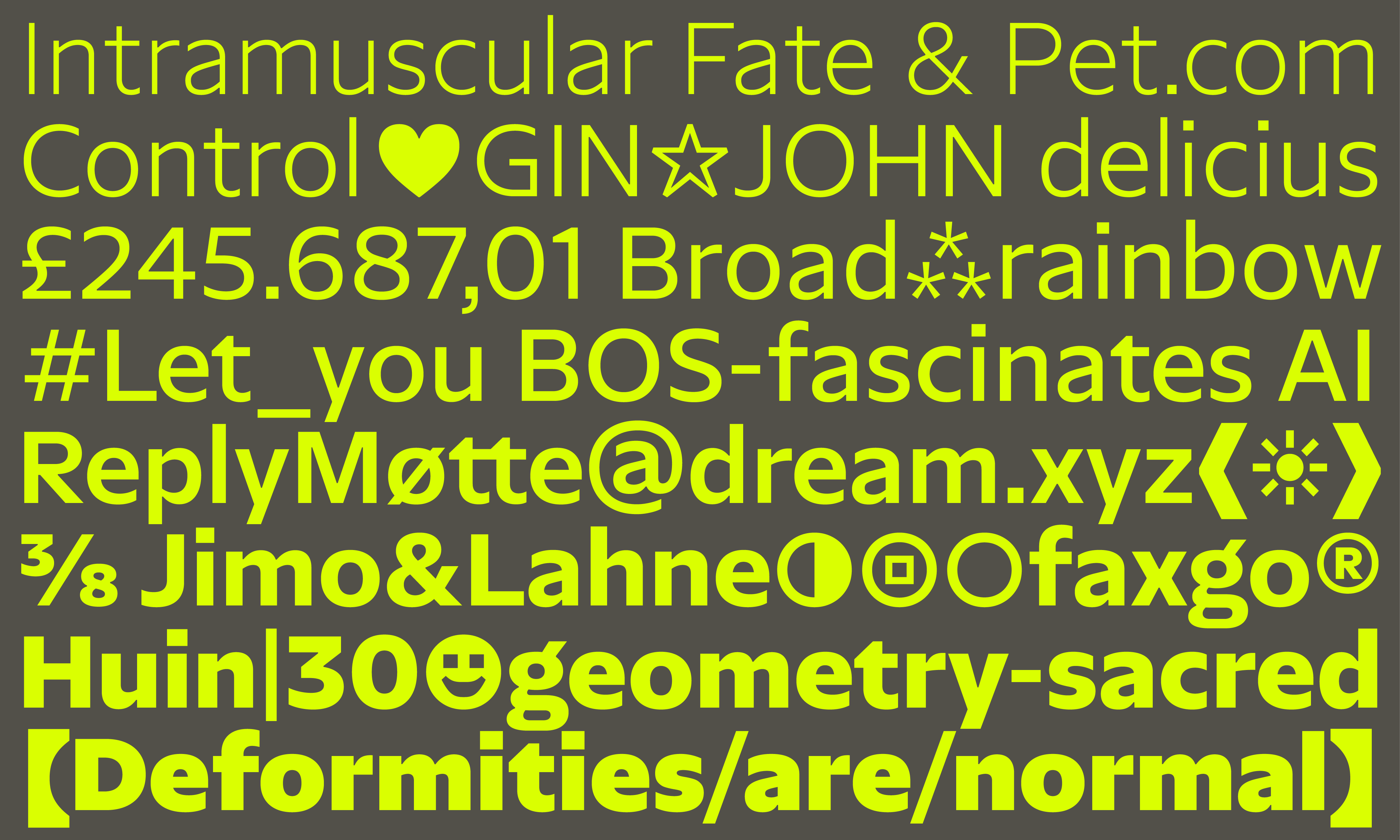
We applied this recipe to create Serf Sans, keeping Serf skeleton but applying a low-contrast sans-serif outline to it. Serf already had a strong relationship to true verticals, so we opted for horizontal curve endings with a clean vertical cut. Creating open counter-shapes, this allowed us to push Serf Sans legibility to its maximum. Countering for the deletion of the serifs, we were able to widen a bit the letters proportions, giving it a comfortable texture while not taking more place than its serif counterpart.
One optical size to rule them all
While Serf strong contrast called for the creation of optical sizes, Serf Sans relatively very contrast allowed us to concentrate on a unique design aiming to excel well at most sizes. We said it earlier, Serf Sans is created with a strong focus on legibility, but it also borrows the sleekness of it older sibling Serf, which make it behave really well at bigger sizes. For its spacing, we decided for an intermediate solution, a choice once again made with legibility and the use at smaller sizes in mind. But it has been kept just tight enough so that it never looked over-spaced at bigger sizes.
What’s a modern sans-serif if not a multi-script one?
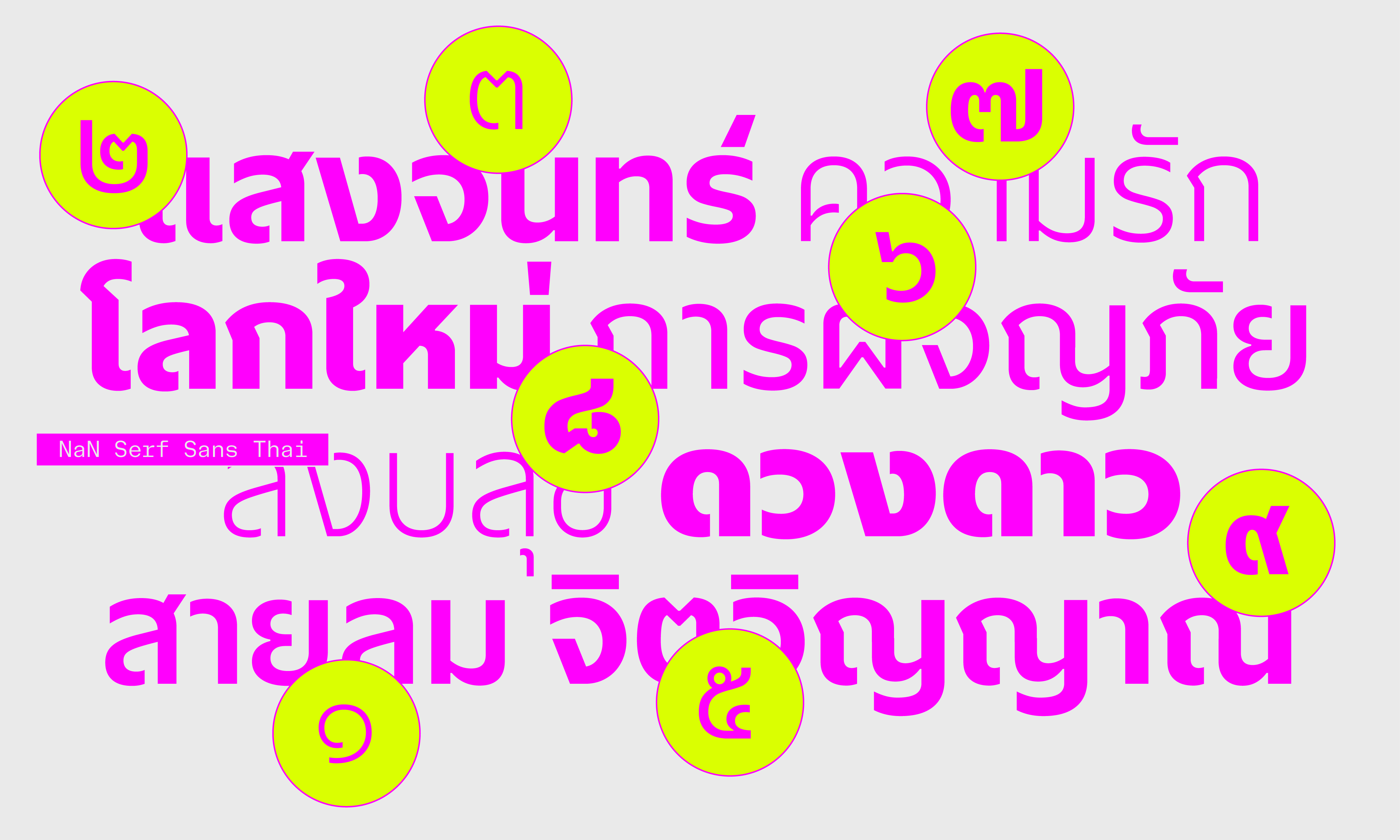
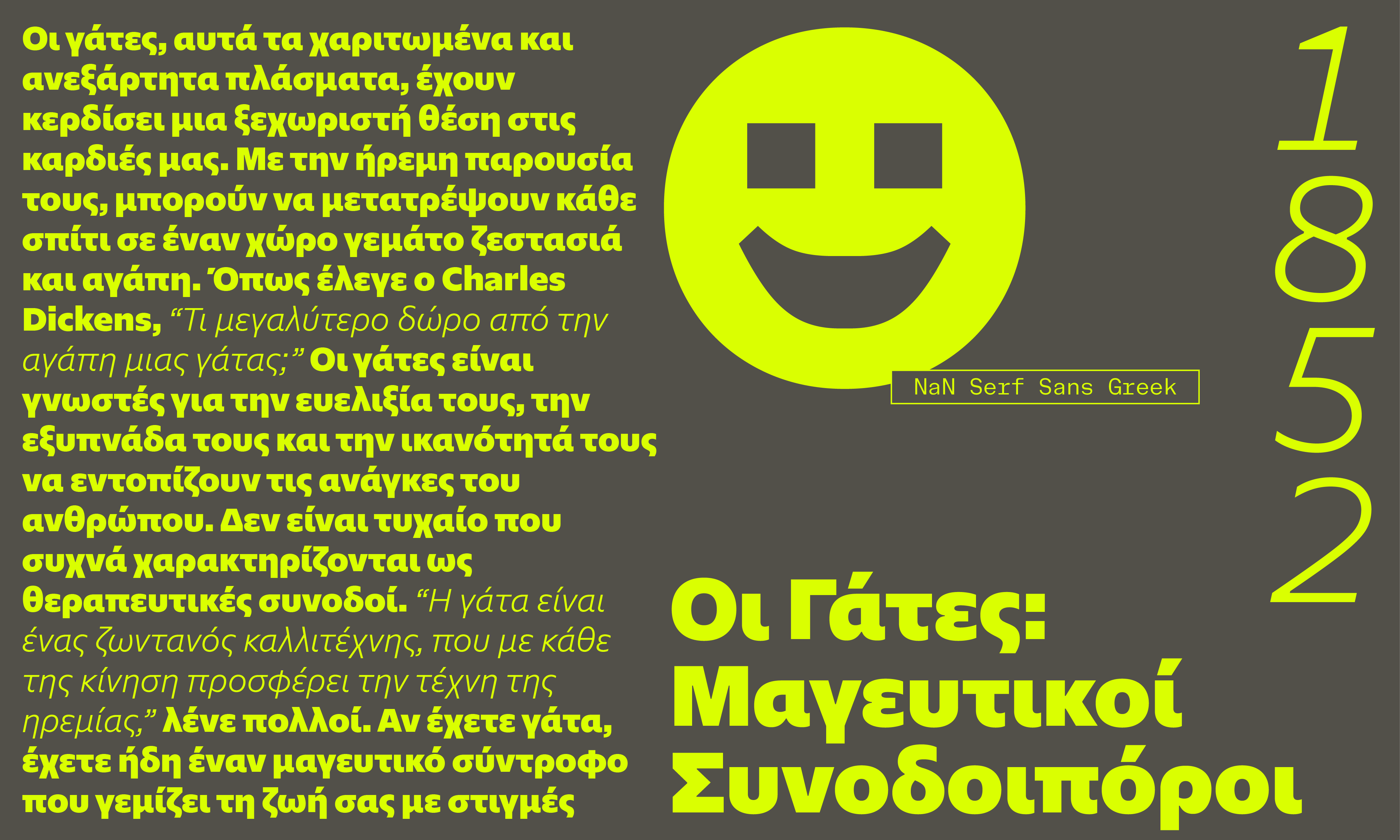
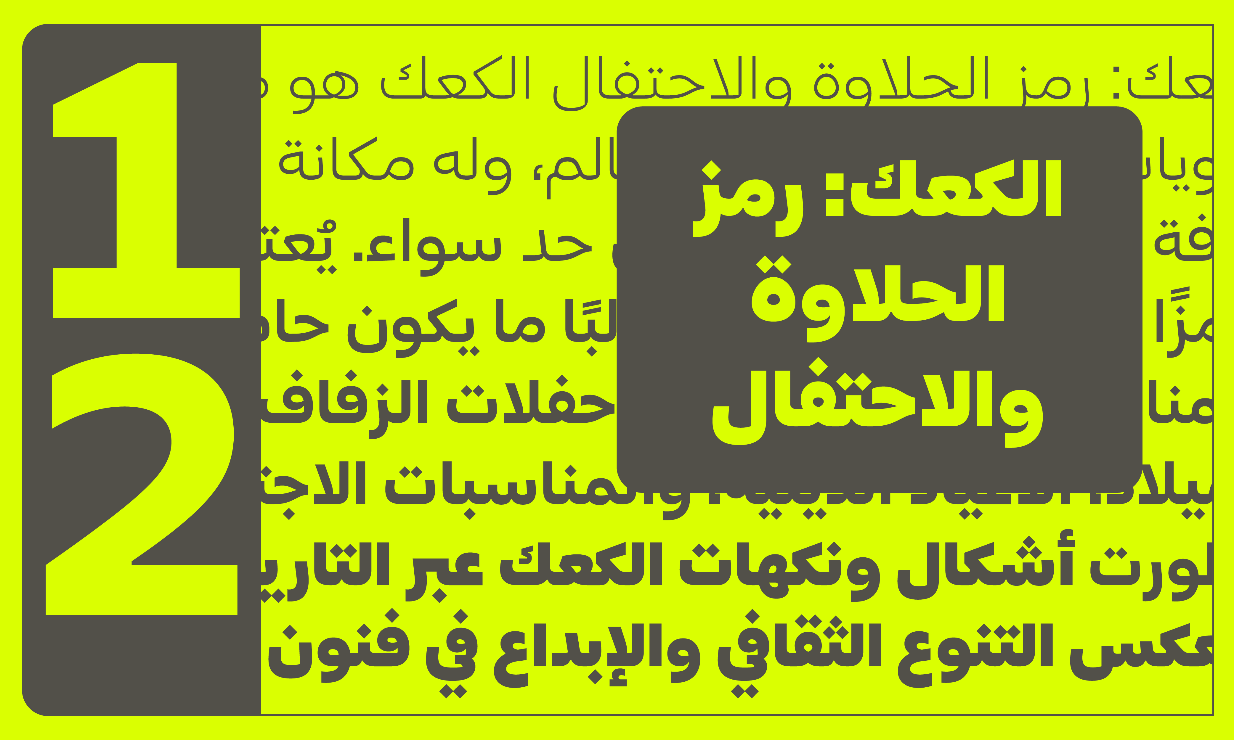
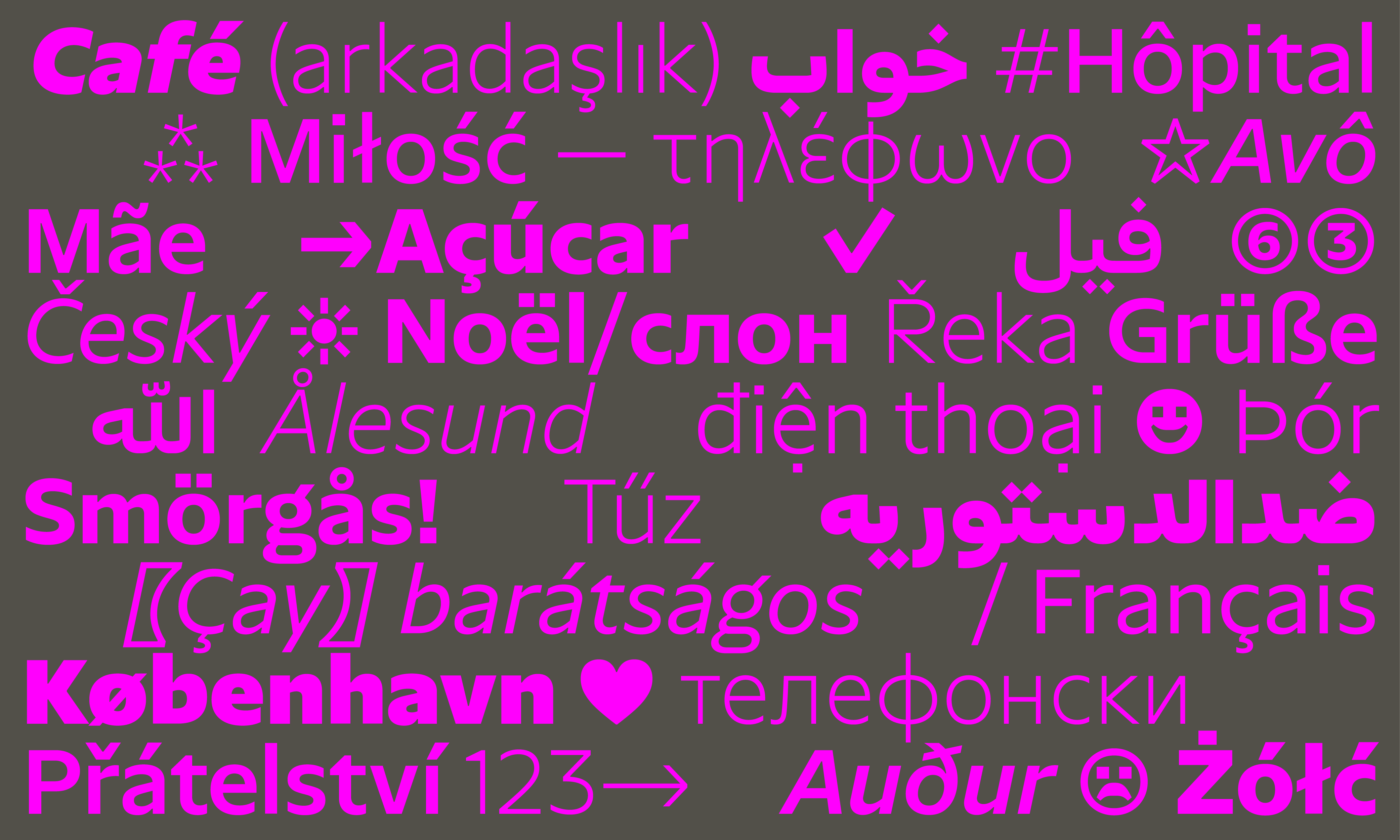
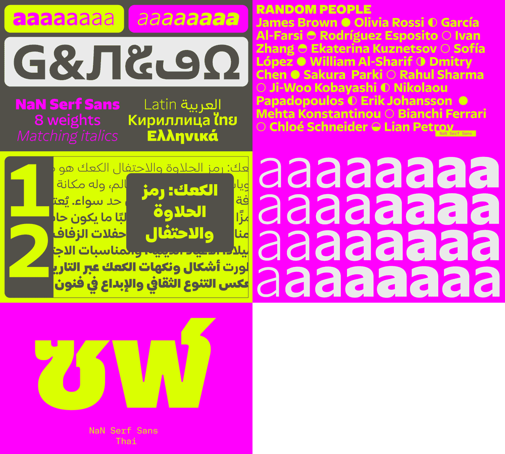
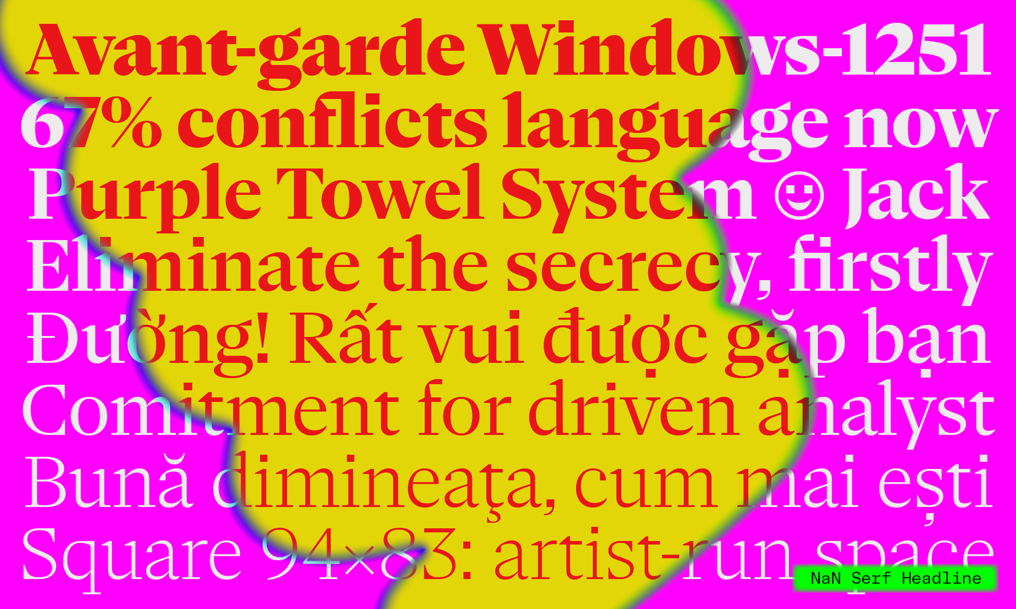
Sleekness, openness, comfort and legibility. Some features that, we believe, make Serf Sans a great affordable font to talk to most people, be it for signage, UI or documents. Serf Sans can bring calm and simplicity. But then, if we wanted to talk to “most people”, how could we limit ourselves to providing a font for users of the Latin alphabet only? Following the traces of other of NaN’s world-ready fonts (Metrify, Tresor, Unbounded), we started by drawing an out-of-the-box pan-african Latin for Serf, supporting all Latin-based languages, on top of our mandatory covering of Vietnamese for all NaN fonts.
Then we applied the same key concepts of openness, minimalist structures and detailing, gentle round counters and horizontal endings to create Serf Sans Arabic, Cyrillic, Greek and Thai. Each script was drawn following its own logic, with a focus on the ease of reading and the comfort they provide, while also making sure that all the script would cohabit well on the page.
We hope that Serf Sans can be the voice of many speakers and readers with too few fonts at hand. With our Fair Font Pricing model where the price of our fonts is proportional to each country purchase power, Serf Sans should be affordable for users in most country and not only in the global North.
