As the Russian War in Ukraine goes, war is not only on the battlefield but also on computers and in the office. Obviously there is a cyber-war. But there is also an office war. A font war.
A food war, too…
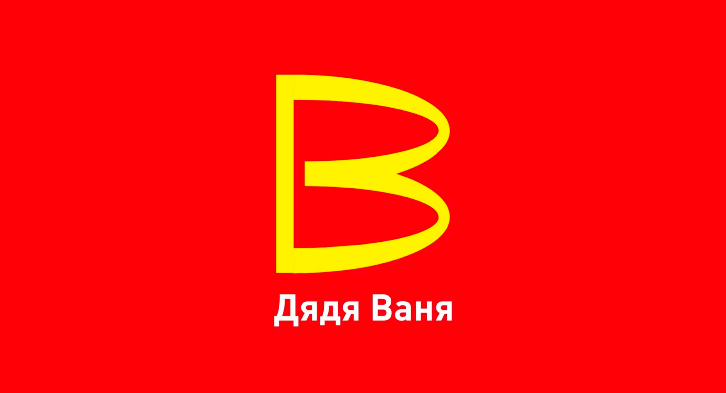
“The McDonald’s trade name is being taken over by a Russian fast food chain named Дядя Ваня pronounced Dyadya Vanya, and known in English as Uncle Vanya.The chain revealed a near-identical logo of McDonald’s, flipped on its side and turned into a B as in the initial of their last name Ваня. Clever, cunning and possibly unstoppable. The Russian government issued a statement saying patents from unfriendly countries can be used without payment or permission.” [1]
The invasion of Ukraine by Russia brings back the spectre of the Great Russia.
Yet this return of history to Europe does not date from 2022. In fact, the Crimean War of 2014 was not over. Some of the sanctions put in place on that occasion were still in force, including those on fonts. Seemingly innocuous yet essential elements of our daily lives, fonts offer a good vantage point for observing Russian ambitions and Western measures to counter-balance them.
The standardization of the Cyrillic alphabet initiated by Peter the Great in the early 18th century led to both a rapprochement and a growing rivalry with the Latin alphabet.
During the Soviet Union, one of the most popular typefaces, Literaturnaya [2], was an extension of a Latin typeface from the German foundry Berthold, Lateinisch. After the end of the USSR, Literaturnaya declined in favor of Times New Roman. This was enshrined in the standard of composition of official documents (GOST R. 6.30-2003 in particular). The Soviet era when typographic assets were placed on a special register by the KGB might seem to be over.
But Russia invaded Crimea in 2014 and this led to sanctions, American in particular. Monotype, as a U.S. company, enforced this policy. At the end of 2016, as a consequence of those sanctions, Monotype Imaging refused to licence Times New Roman and Arial to RusBITech, developer of the Russian operating system Astra Linux but also contractor with the Russian Defense Ministry.
This is where the other major player in this story, Paratype type foundry, comes into play. Heir to the typographic department of the Soviet State, Paratype is an essential instrument of the typographic policy of the Russian Federation. Starting 2009-2010, Paratype engaged with the Public Type project celebrating the 300th anniversary of the introduction of the Cyrillic alphabet by Peter the Great for which in early 2008, the Federal Agency on Press and Mass Communications (Rospechat/Роспечать) held a round table. Rospechat is part of the Ministry of Digital Development, Communications and Mass Media where there is the feared Federal Service for Supervision of Communications, Information Technology and Mass Media also called Roskomnadzor (Роскомнадзор). The Public Type project, which led to the publication of open sources typefaces PT Serif and PT Sans, was about bringing quality type for minority languages of the Russian Federation but, as it turned out, was also an instrument of Russian typographic sovereignty.
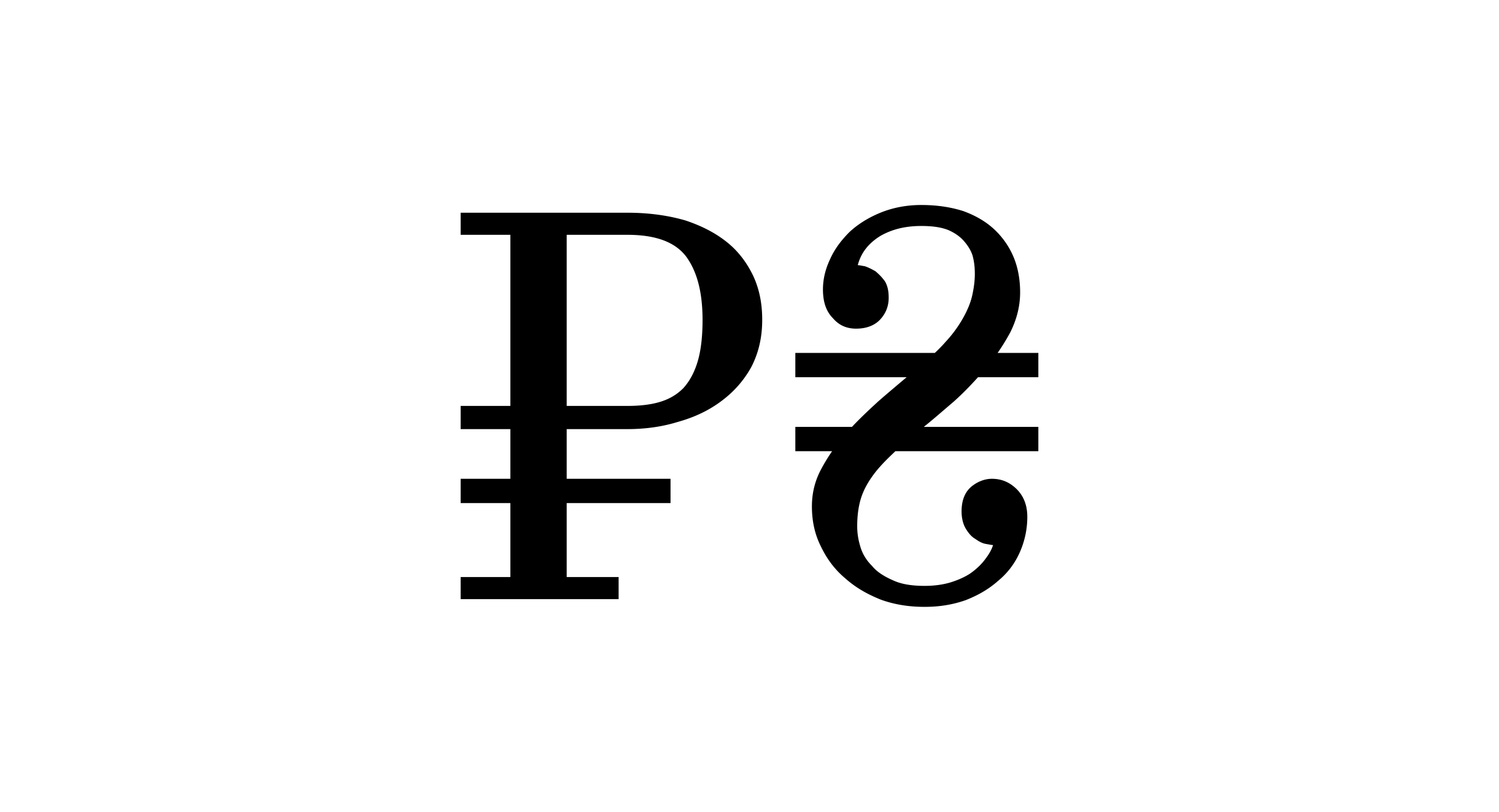
As a side note, starting 2011, there is an Ukrainian national typeface, Arsenal [3]. “This typeface by Andrij became a winner of the Ukrainian Type Design Competition Mystetsky Arsenal. The judges sought designs with three main criteria: Hitting the zeitgeist, being practical, and feeling Ukrainian.” [4] As monetary symbols, besides the usual ones (euro, dollar, yen, sterling pound), ruble (₽), hryvnia (from Ukraine) (₴) and tenge (from Kazakhstan) (₸) symbols. These days, both PT typefaces from the Russian Federation and Arsenal from Ukraine co-exist in Google Fonts, a neutral position so to say, even if Google applies to some extent US sanctions on Russia [5].
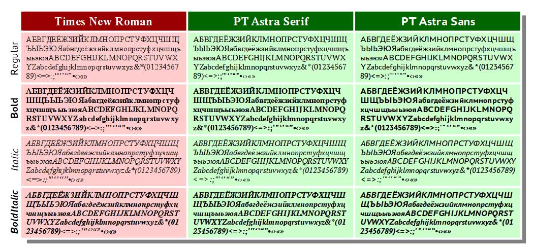
In order to circumvene restrictions on Times New Roman, metric-compatibles substitutes for Times New Roman commissioned by RusBITech were developed by Paratype, based upon PT Serif and PT Sans. Those typefaces, PT Astra Serif and PT Astra Sans, were released in 2016.
Translated: “The fonts are designed on the basis of Pt Sans and PT Serif, modified in such a way that they conform to the standards of document formatting for which the Times New Roman is the standard.” [6]
Times New Roman is, as matter of fact, a key element for document production in Russia. It is mandatory for creating official documents in Russia but, as a Monotype assets, it is now legally unavailable in Russia.
Earlier in 2016, in March, Vladimir Putin had ordered state-owned companies to buy or license Russian software rather than foreign programs. In fact, starting 2011, Russian governments agencies were urged to go open source [7]. In 2016, the GOST (ГОСТ) R 7.0.97-2016 standard was established in replacement of GOST (ГОСТ) R 6.30-2003 to be applicable starting July 1, 2018. The following fonts and sizes are still required for drafting documents in that new standard: Times New Roman point sizes 13 or 14 ; Arial point sizes 12 or 13; Verdana point sizes 12 or 13, Calibri point size 14
In December 2018, Monotype Imaging refused again to license Times New Roman, Arial and Verdana. It seems that Monotype Imaging, for those matters, is also the copyright holder for Verdana, even if this typeface was initially commissioned by Microsoft. In May 2019 [8], the Ulyanovsk (Ульяновск) Oblast was the first region to implement the GOST (ГОСТ) R 7.0.97-2016 standard so that PT Astra Serif could be use instead of Times New Roman [9].
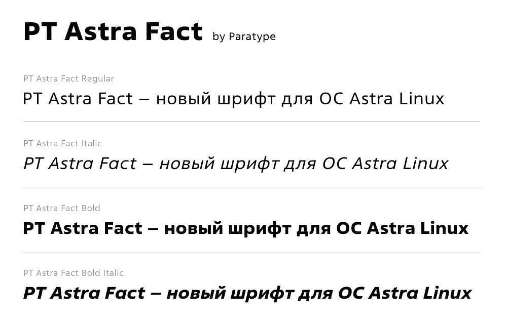
In June 2021, PT Astra Fact was introduced as a replacement for Verdana, so also metric-compatible. Unlike PT Astra Serif and PT Astra Sans, PT Astra Fact is a proprietary typeface dedicated to Astra Linux. It is designed to be used as an interface typeface supporting all kinds of display, including 4K displays. PT Astra Fact is based on Fact, a typeface by Paratype, inspired by Frutiger [10]. Therefore, Paratype used Frutiger to make a substitute for Matthew Carter’s Verdana. Quite a sneaky move.
Source: Paratype
This policy is called “import substitution” and Paratype is quite clear about that:
In order to use foreign proprietary fonts, you need to purchase licenses from their copyright holder, Monotype Imaging Inc. At the same time, the jurisdiction of the United States is included in the license agreement , and the risks associated with violating their sanctions legislation are quite serious. Therefore, import-independent domestic fonts are created for Astra Linux. The creation of PT Astra Fact is a natural step towards the creation and development of Russian digital products. — said Sergey Bobryshev, Commercial Director of ParaType [11].
It is probably not exaggerated to talk about a new Cold War in type. If we take the Vignelli Canon as an observation point, we can notice that three typefaces out of six [12] had a recent major overhaul supporting the variable font technology: Helvetica, Futura and Bodoni. Again, Monotype on one side, Paratype on the other side. As seen by a designer from the Type Design Department (ONSH) of the NIIPoligrafmash (Printing Research Institute) – the ancestor of Paratype –, Helvetica is “the Western typeface of the advertising kind” [13]. And indeed Helvetica Now by Monotype (2019 as static fonts, 2021 as variable fonts) is all-Western first-world oriented. No support for Latin-B, no support for Cyrillic nor for any other non-Latin script. But the monetary symbols included are quite interesting, perhaps they reveal something.
Helvetica Now monetary symbols — source : Monotype
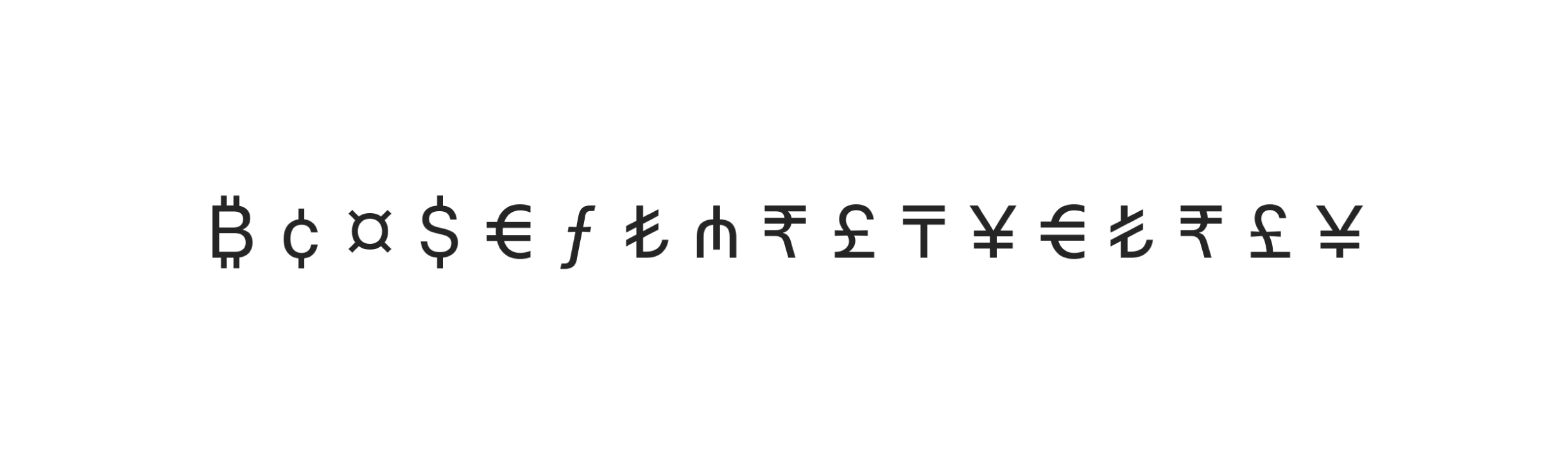
Besides euro, dollar, sterling pounds and yen, there are the manat sign (₼) from Azerbaijan, the rupee sign (₹) from India and the tenge sign (₸) from Kazakhstan. But no the ruble sign, even if it was introduced in Unicode 7.0, the same version as for the manat sign. As a matter of fact, Azerbaijan and Kazakhstan have close relationships with NATO and India is allied with US as part of the quad alliance. My theory is that the currency signs supported by Helvetica Now are also those from Western allies (there is also Turkish lira, Turkey is a NATO member). The only exception is Bitcoin — a pragmatic move probably. Futura Now by Monotype supports Cyrillic and also supports ruble monetary symbol. But perhaps the goal is to be competitive with Futura PT, an respected version of Futura by Paratype [14].
On the other side, Bodoni PT by Paratype (2021) is a major and very elegant Bodoni revival with optical sizes. It supports Latin and Cyrillic. The monetary symbols supported, besides the usual ones, are the ruble and the hryvnia (the currency from Ukraine).
Ruble (left) and hryvnia (right) monetary symbol in Bodoni PT
Din typeface could be the next battle. Earlier this month, Paratype released Gate A1, previously known as DIN PT.
Source: Paratype
And Monotype communicated recently several times [15][16] about a forthcoming new DIN release with a dedicated Twitter account.
We cannot conclude a geopolitical-flavoured paper without talking about oil and more broadly energy. In the wake of US sanctions, most Western oil majors cut ties with Russia — BP, Shell, Equinor and Exxon Mobil. But the French TotalEnergies stays. TotalEnergies consider it has just too many interests in Russia to leave. Even from a typographic point of view, it is tangible. TotalEnergies (formerly Total) made a corporate identity overhaul in May 2021. The logotype is based on Gotham Rounded and the main typeface for identity is supposed to be Gotham Rounded.

However Gotham Rounded has a major flaw: it does not support Cyrillic. Therefore the brand standards stipulated a secondary typeface, Nunito, when the Cyrillic is needed.
Source: Paratype
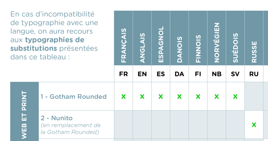
Guess which one won? The typeface with Cyrillic! Nunito is now mostly used for TotalEnergies identity in places where Gotham Rounded should have been seen. Regardless we like Russia or not, as far as type is concerned, it is often better to have a Cyrillic strategy.
Here I want to mention the courage of Type Today (Ilya Ruderman and Yuri Ostromentsky and their teammates), who stood against war, starting day 1 [17] offering free licenses to help stop the war.
References
1. https://reelchicago.com/article/russian-fast-food-chain-uncle-vanya-replaces-mcdonalds-and-copies-logo/
2. Tekst by Lewis McGuffie (based in Tallinn, Estonia) made a pleasant revival of this typeface — https://www.futurefonts.xyz/lewis-mcguffie/tekst
3. http://ukrainian-type.com/home/
4. https://fonts.google.com/specimen/Arsenal
5. https://blog.google/inside-google/company-announcements/helping-ukraine/
6. https://paratype.livejournal.com/58340.html
7. https://www.computerworld.com/article/2745061/putin-orders-russian-gov-t-to-move-to-open-source.html
8. Decree of its governor No. 41 dated May 20, 2019
9. https://www.gost.ru/portal/gost/home/presscenter/news?portal:isSecure=true&navigationalstate=JBPNS_rO0ABXczAAZhY3Rpb24AAAABAA5zaW5nbGVOZXdzVmlldwACaWQAAAABAAQ2MDE1AAdfX0VPRl9f&portal:componentI d=88beae40-0e16-414c-b176-d0ab5de82e16
10. https://www.paratype.com/fonts/pt/fact
11. https://tadviser.com/index.php/Product:PT_Astra_Fonts_in_the_Astra_Linux_family
12. For the record, the other three are Times, Garamond and Century Expanded — https://www.rit.edu/vignellicenter/sites/rit.edu.vignellicenter/files/documents/The%20Vignelli%20Canon.pdf
13. https://typejournal.ru/en/articles/A-Letter-To-Yefimov
14. https://www.paratype.com/fonts/pt/futura-pt
15. https://twitter.com/ff_din_plus/status/1501913429589778435
16. https://twitter.com/ff_din_plus/status/1503800879144751105
17. https://twitter.com/TypeTodayNews/status/1497914206821232643
18. https://twitter.com/TypeTodayNews/status/1499047466112536582
About Frank Adebiaye
A Chartered Accountant, Frank Adebiaye (Paris, France) is also a document designer and type designer. He founded the open source type foundry Velvetyne Type Foundry in 2010. He has written or co-written numerous articles on typography and graphic design as well as several books including François Boltana & la naissance de la typographique numérique (Atelier Perrousseaux, 2011), Fontes Libres (Floss Manuals/Organisation Internationale de la Francophonie, 2011) or La Commande de design graphique (CNAP, 2014). His typographic and writing work has been the subject of exhibitions (Casco gallery, Utrecht, latent stare*, 2012 ; Une Saison Graphique, Le Havre, 2014 ; LIFEWTR for PepsiCo, 2020), lectures (Rencontres de Lure, 2008, 2011, 2015, 2017) and radio programmes (France Culture).
Frank Adebiaye is also a regular speaker at HEAR and ANRT on font licensing and advises type foundries on their marketing strategy.
