About NaN Fiasco
Peter Schmidt & Brian Eno
Honor thy error as a hidden intention
Look closely at the most embarrassing details and amplify them
BALANCE THE CONSISTENCY PRINCIPLE WITH THE INCONSISTENCY PRINCIPLE
In 1970, Peter Schmidt created “The Thoughts Behind the Thoughts”, a box containing 55 sentences letterpress printed onto disused prints that accumulated in his studio, which is still in Eno’s possession. Eno, who had known Schmidt since the late 1960s, had been pursuing a similar project himself, which he had handwritten onto a number of bamboo cards and given the name “Oblique Strategies” in 1974. There was a significant overlap between the two projects, and so, in late 1974, Schmidt and Eno combined them into a single pack of cards and offered them for general sale. The set went through three limited edition printings before Schmidt suddenly died in early 1980, after which the card decks became rather rare and expensive. Sixteen years later software pioneer Peter Norton convinced Eno to let him create a fourth edition as Christmas gifts for his friends (not for sale, although they occasionally come up at auction). Eno’s decision to revisit the cards and his collaboration with Norton in revising them is described in detail in his 1996 book A Year with Swollen Appendices. With public interest in the cards undiminished, in 2001 Eno once again produced a new set of Oblique Strategies cards. The number and content of the cards vary according to the edition. In May 2013 a limited edition of 500 boxes, in burgundy rather than black, was issued. In 1970, Peter Schmidt created “The Thoughts Behind the Thoughts” a box containing 55 sentences letterpress printed onto disused prints that accumulated in his studio, which is still in Eno’s possession. Eno, who had known Schmidt since the late 1960s, had been pursuing a similar project himself, which he had handwritten onto a number of bamboo cards and given the name “Oblique Strategies” in 1974. There was a significant overlap between the two projects, and so, in late 1974, Schmidt and Eno combined them into a single pack of cards and offered them for general sale.
NO PAIN, NO GAME
In 1970, Peter Schmidt created “The Thoughts Behind the Thoughts”, a box containing 55 sentences letterpress printed onto disused prints that accumulated in his studio, which is still in Eno’s possession. Eno, who had known Schmidt since the late 1960s, had been pursuing a similar project himself, which he had handwritten onto a number of bamboo cards and given the name “Oblique Strategies” in 1974. There was a significant overlap between the two projects, and so, in late 1974, Schmidt and Eno combined them into a single pack of cards and offered them for general sale. The set went through three limited edition printings before Schmidt suddenly died in early 1980, after which the card decks became rather rare and expensive. Sixteen years later software pioneer Peter Norton convinced Eno to let him create a fourth edition as Christmas gifts for his friends (not for sale, although they occasionally come up at auction). Eno’s decision to revisit the cards and his collaboration with Norton in revising them is described in detail in his 1996 book A Year with Swollen Appendices. With public interest in the cards undiminished, in 2001 Eno once again produced a new set of Oblique Strategies cards. The number and content of the cards vary according to the edition. In May 2013 a limited edition of 500 boxes, in burgundy rather than black, was issued.
You heard it – the mysterious Col Do Ma Ma Daqua. You're certain that you did. Well, maybe not quite certain, but... Let's say you're *hopeful*.
Yeah, it's another copotype -- the worst one. The most savage and brutal. The Art Cop. Nothing is good enough for him. Everything is *shit*. You have to employ an armada of adjectives to depict and demean the mediocrity of the works and visual institutions around you. Really *flex* that critical muscle. Until the vocabulary for PUNISHING mediocrity becomes second nature. Here we go... Trite, contrived, mediocre, milquetoast, amateurish, infantile, cliche-and-gonorrhea-ridden paean to conformism, eye-fucked me, affront to humanity, war crime, should *literally* be tried for war crimes, resolutely shit, lacking in imagination, uninformed reimagining of, limp-wristed, premature, ill-informed attempt at, talentless fuckfest, recidivistic shitpeddler, pedantic, listless, savagely boring, just one repulsive laugh after another.
“ABCDEFGHIJKLMNOPQRSẞTUVWXYZ”
abcdefghijklmnopqrsßtuvwxtz
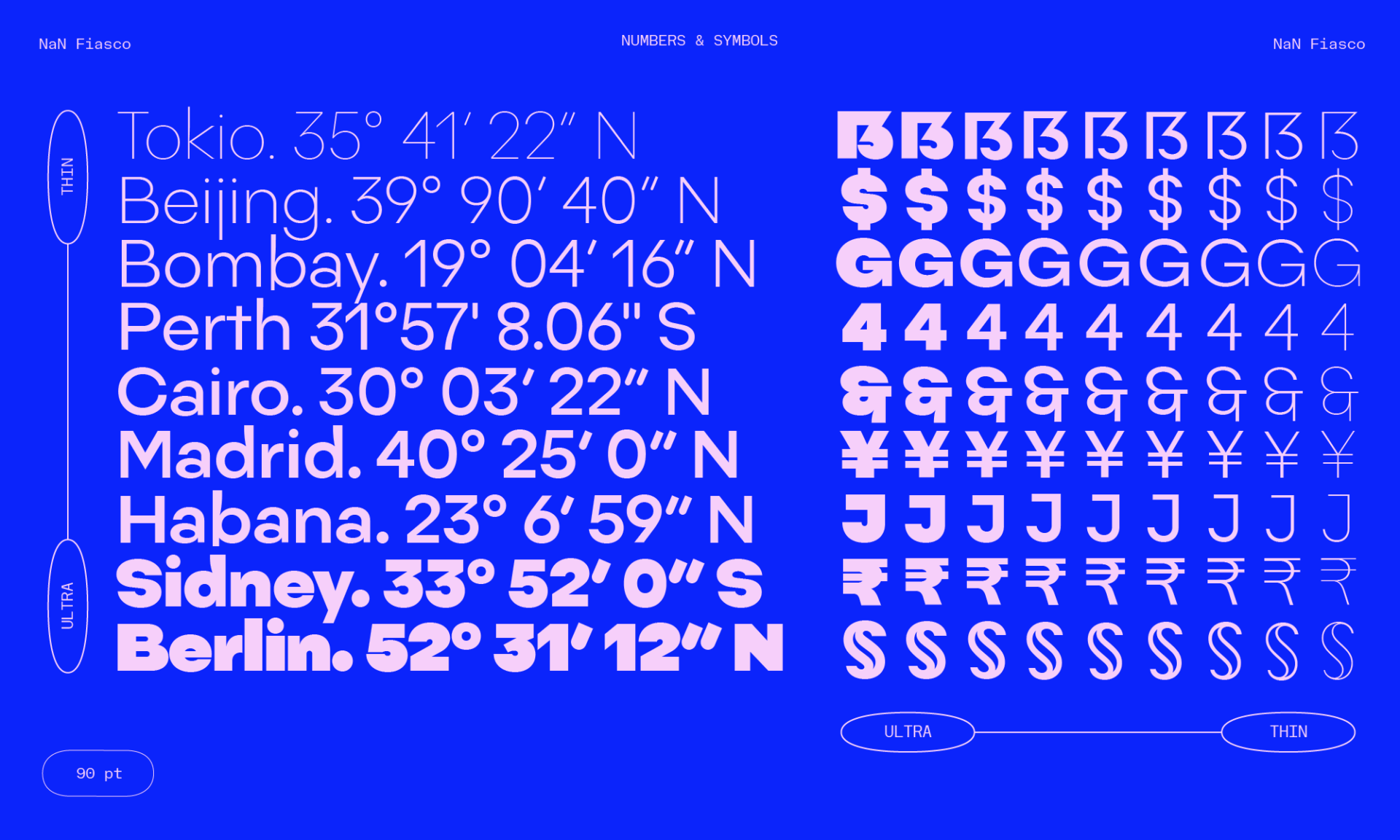
#0123456789
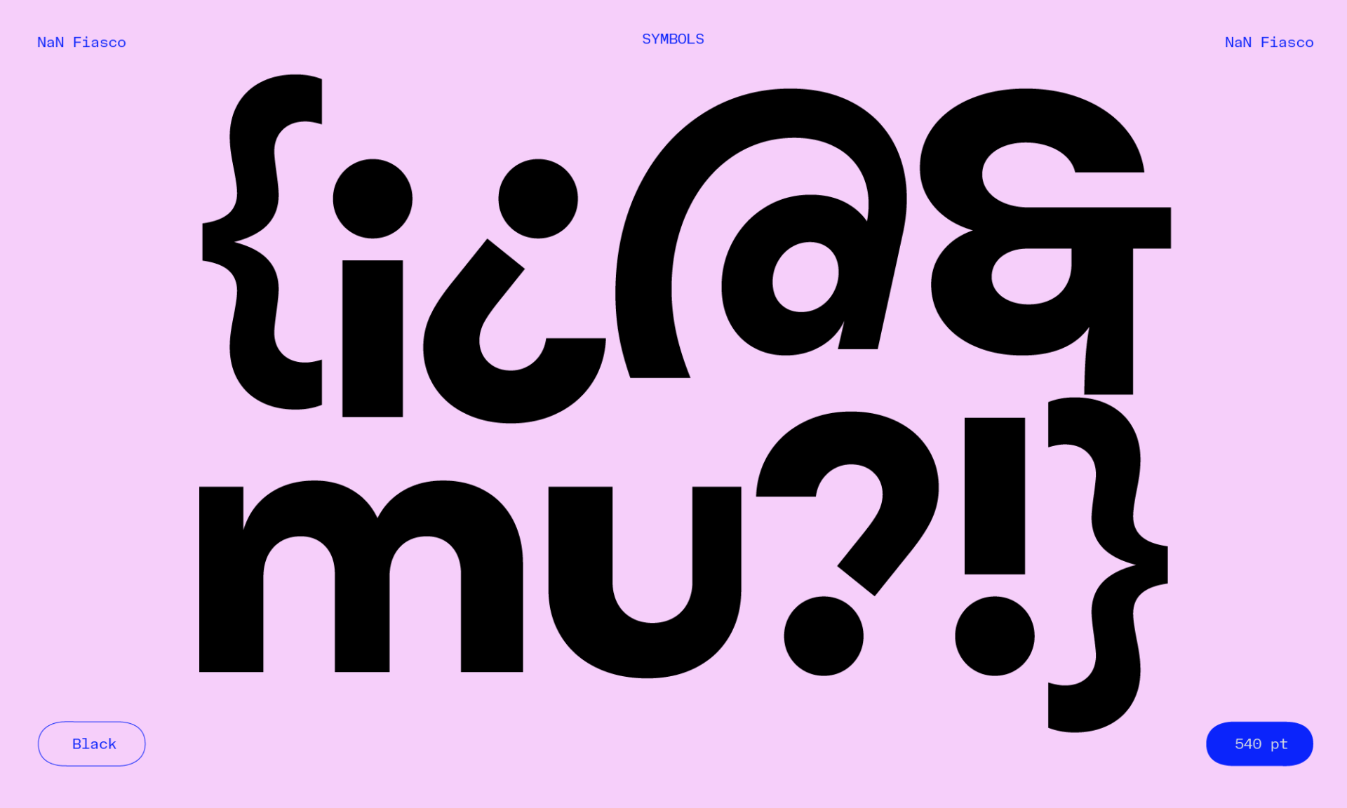
!?&%@({†*
:-)
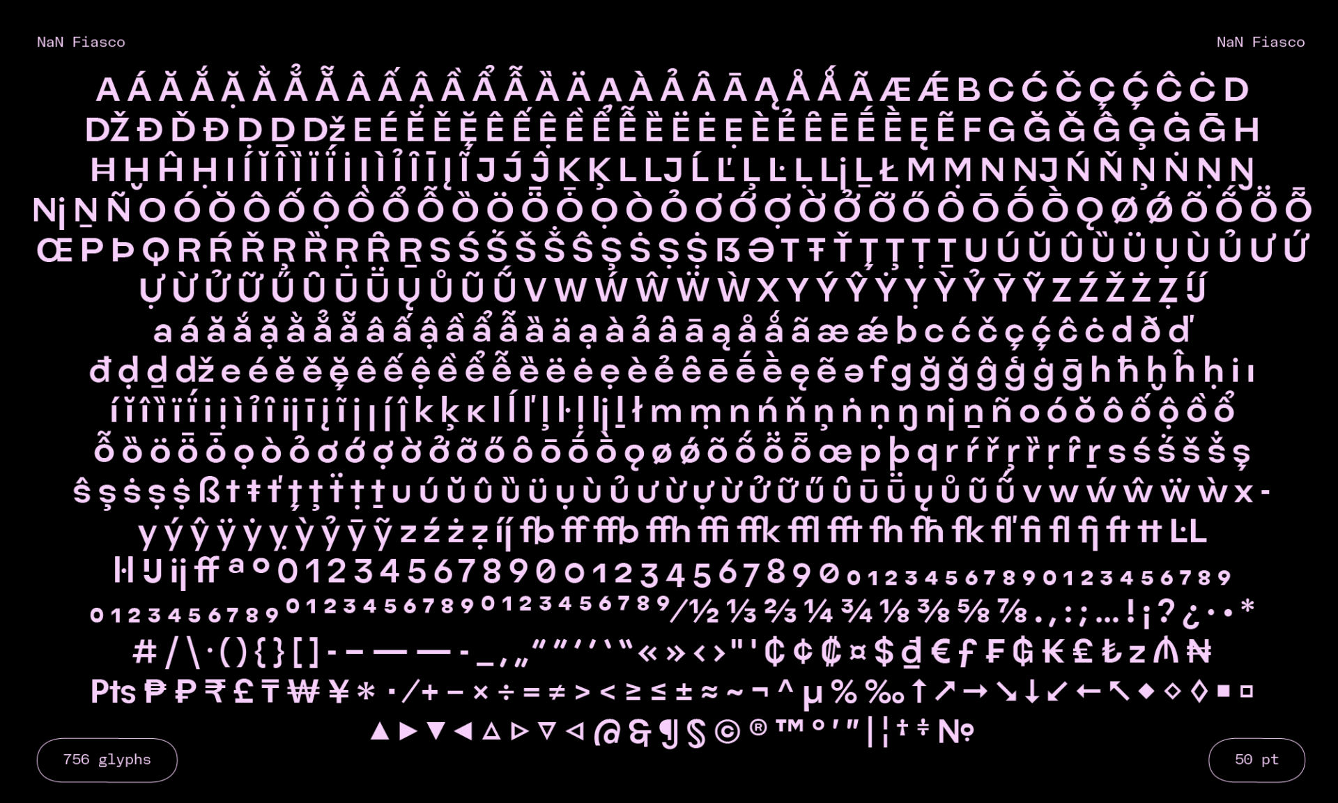
Selected Opentype Features
fewfold
Short (f)
Mouffette
Standard Ligatures
Samples
NaN Fiasco Ultra
Do the words need changing?
NaN Fiasco Extra Black
Errata (Korrekturverzeichnis)
NaN Fiasco Black
Oblique Strategies © 1975, 1978
NaN Fiasco Bold
Ein Auto fuhr durch Gossensaß
NaN Fiasco Medium
The Lord is a shoving leopard!
NaN Fiasco Regular
It deosn’t mttaer in waht oredr
NaN Fiasco Light
Systematic, random & blunderous
NaN Fiasco Extra Light
Décollage, in art, is the opposite of
NaN Fiasco Thin
TheCuriousCaseOfACamelWriting
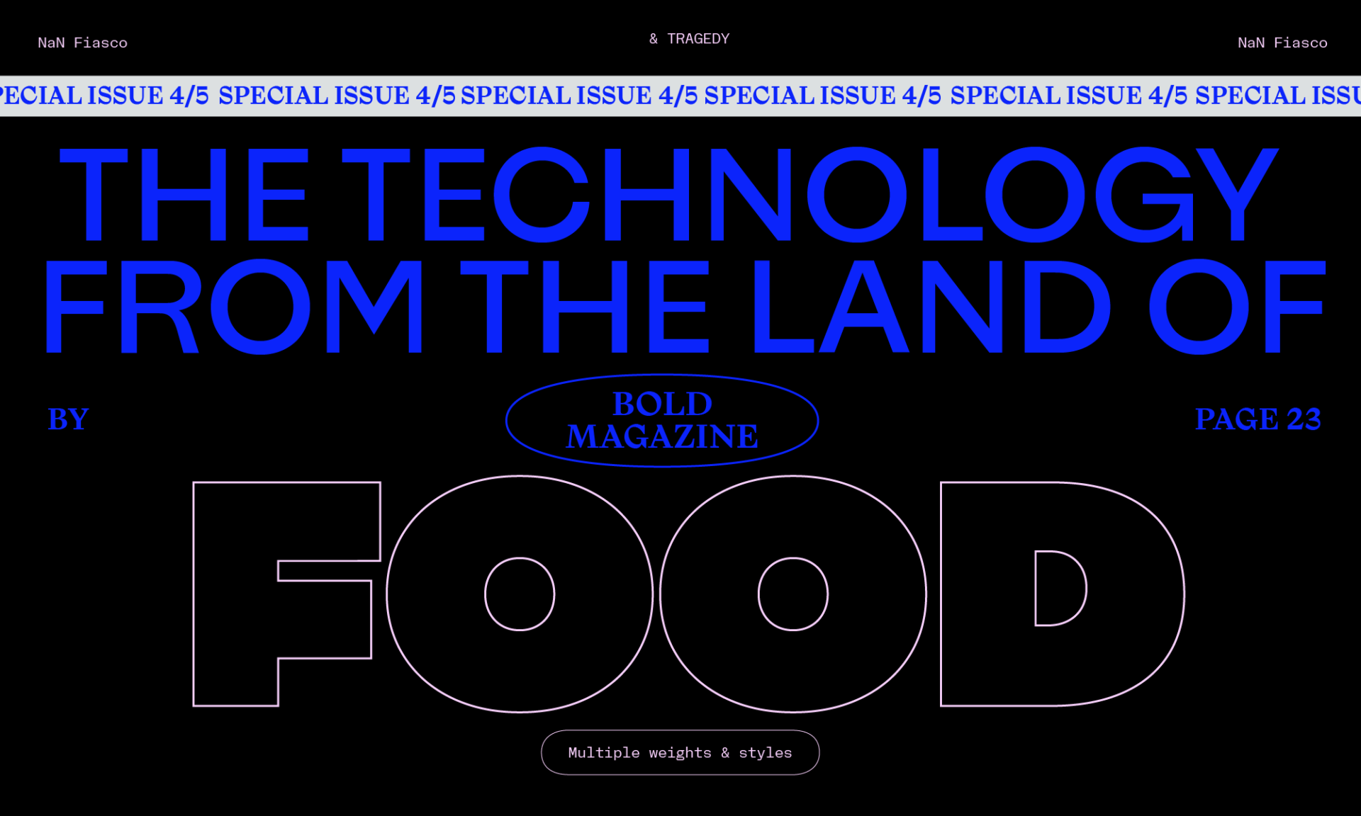
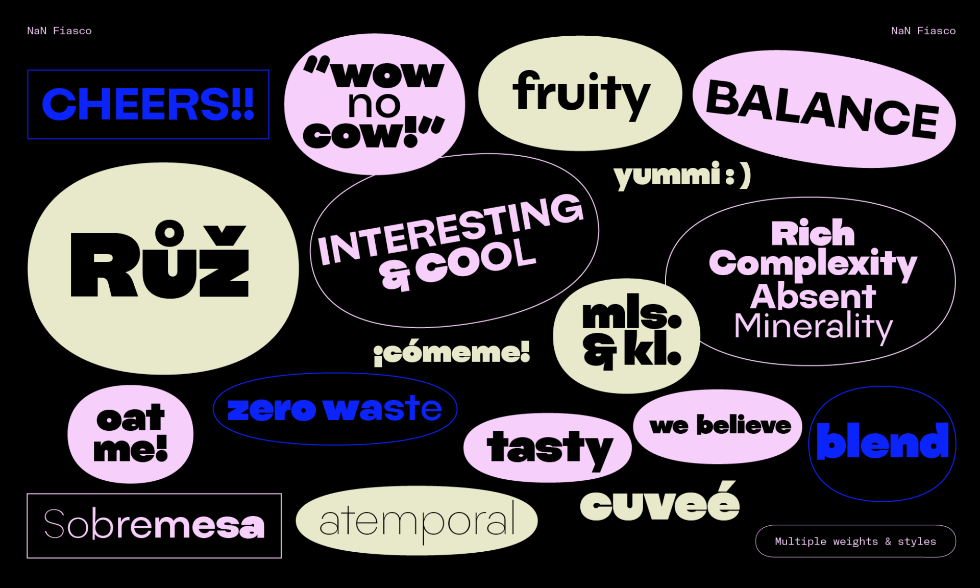
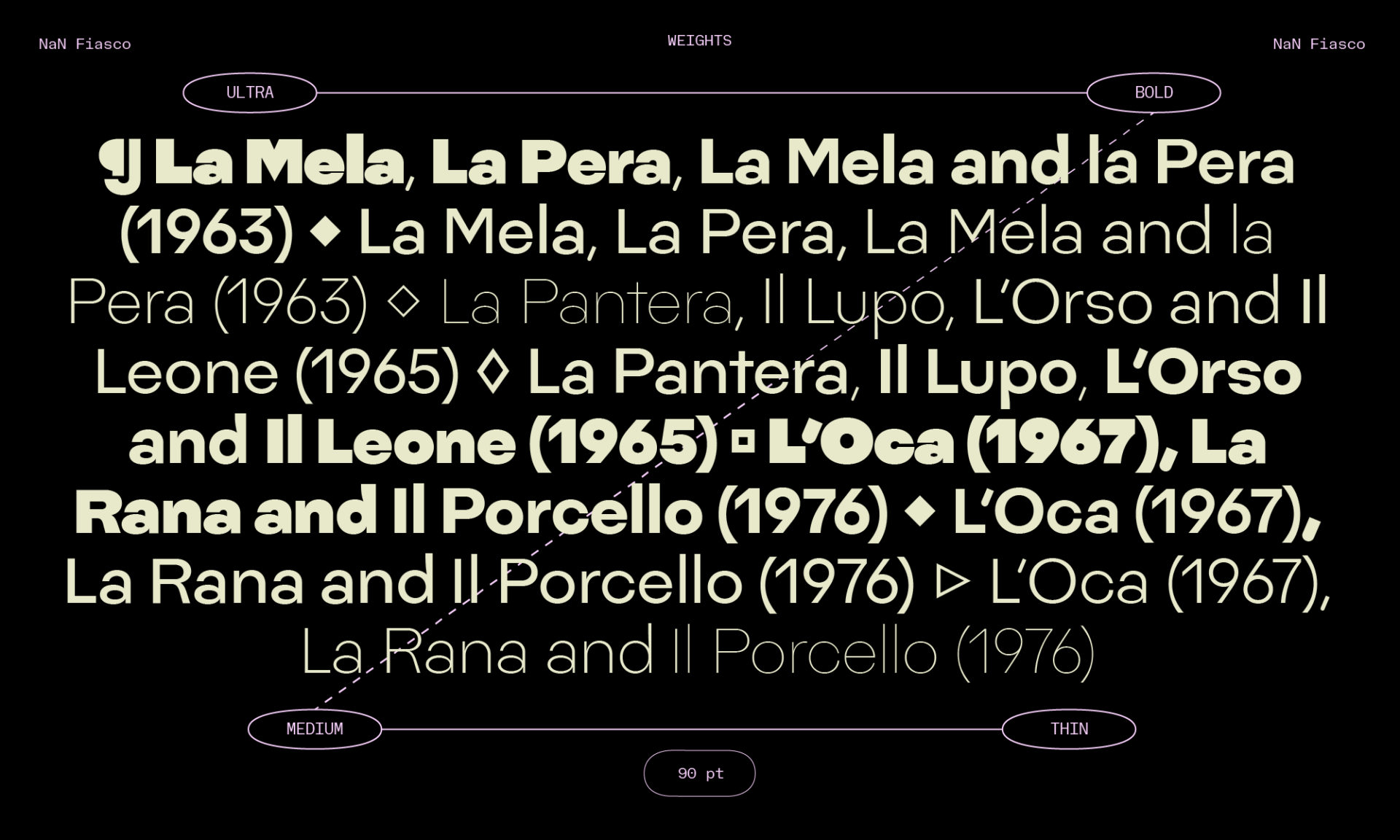
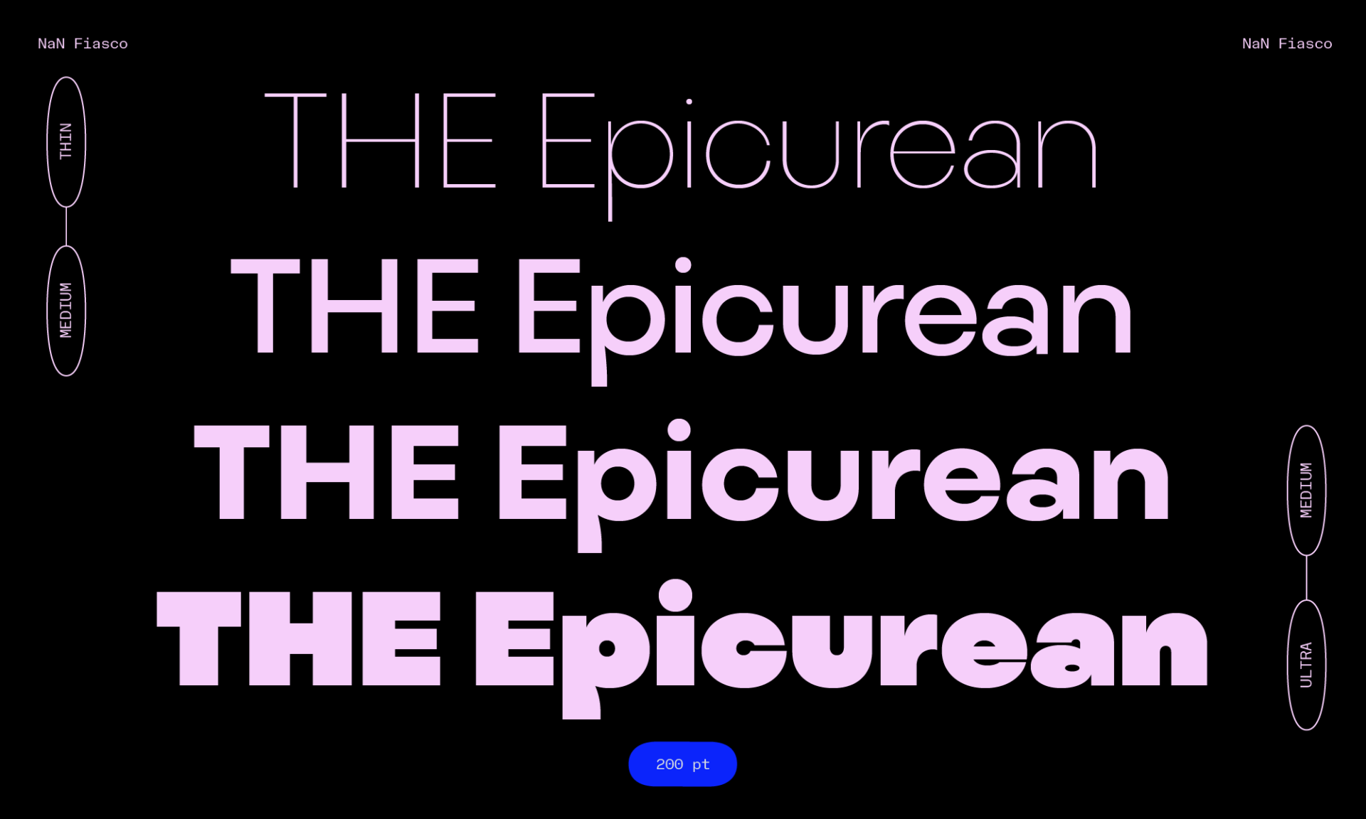
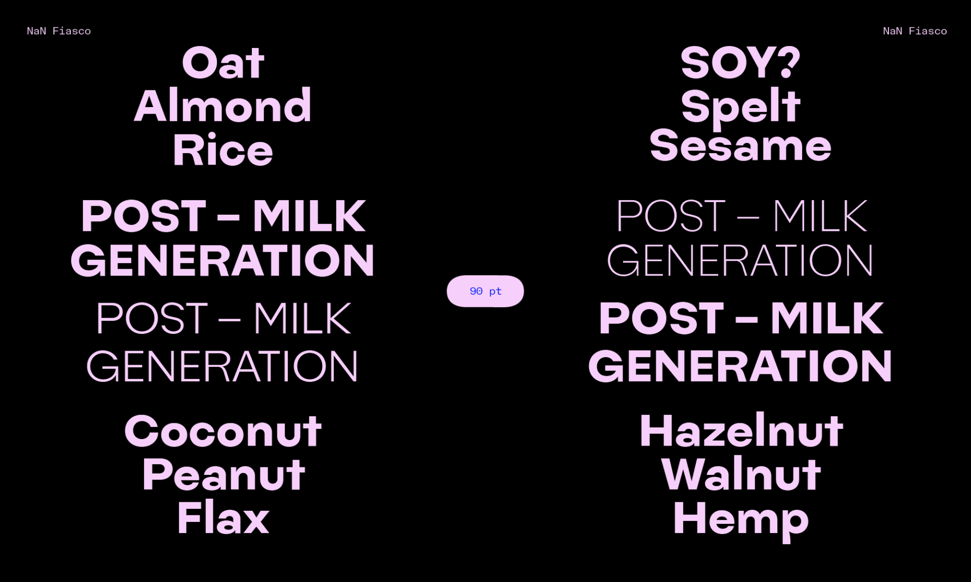
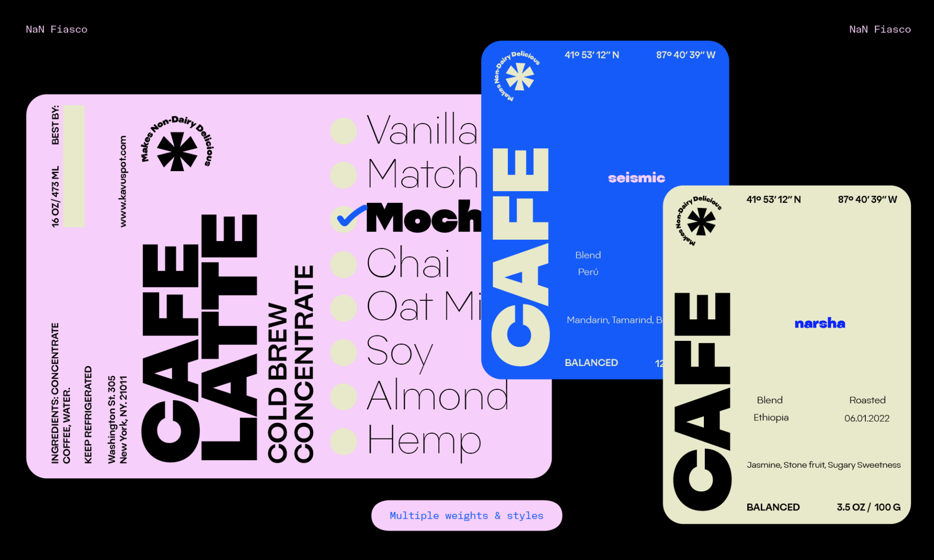
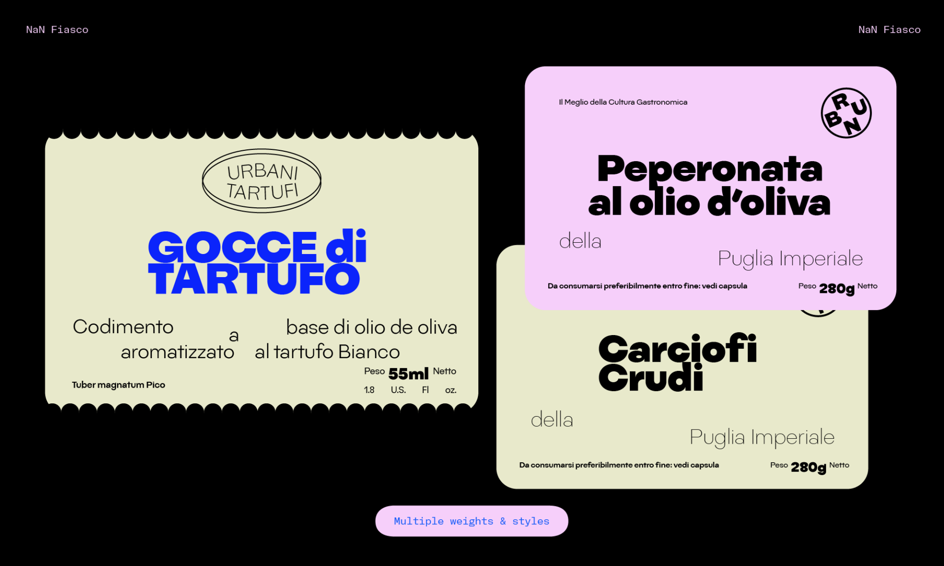
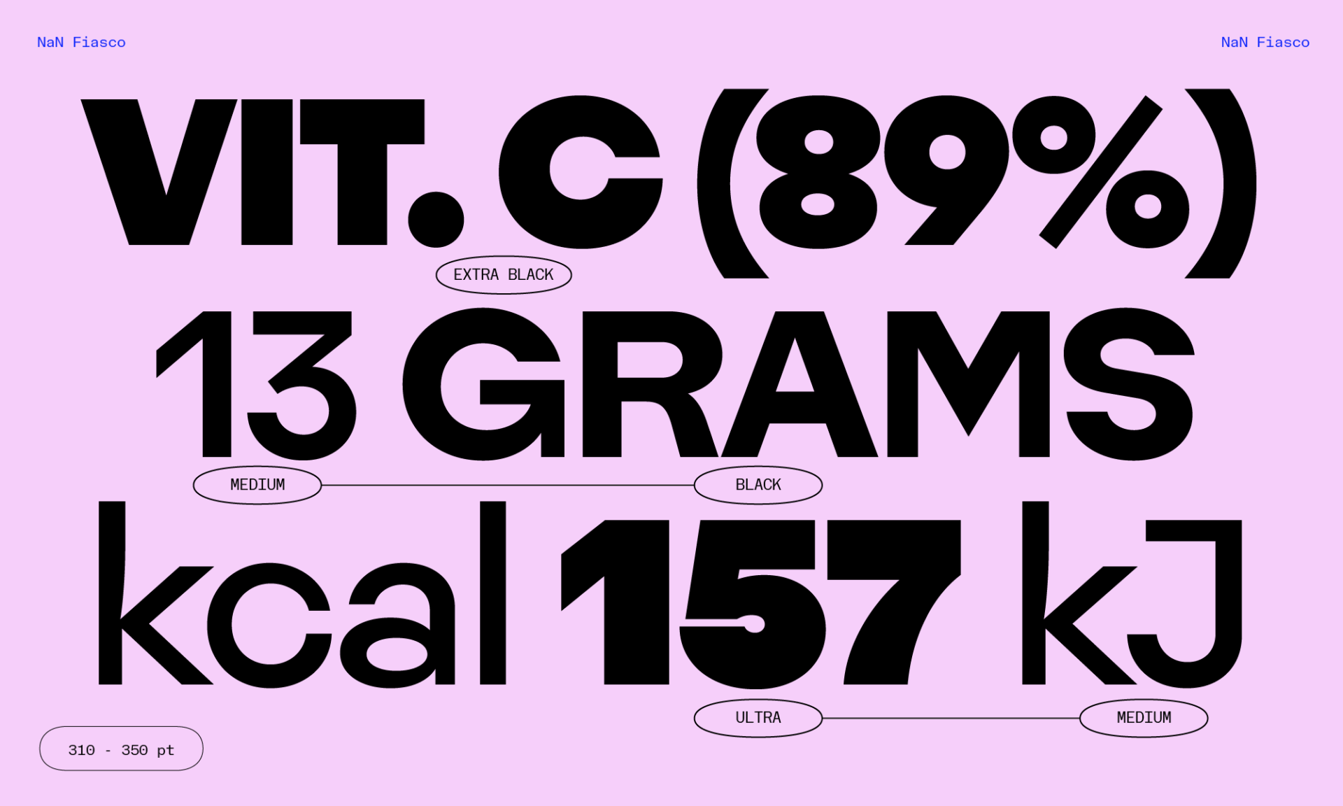
Styles
- NaN Fiasco Thin
- NaN Fiasco Extra Light
- NaN Fiasco Light
- NaN Fiasco Regular
- NaN Fiasco Medium
- NaN Fiasco Bold
- NaN Fiasco Black
- NaN Fiasco Extra Black
- NaN Fiasco Ultra
Variable Font Included With All Family Packages
Goemetirc Gortsek
Sign Up for Trial Fonts
Thanks for signing up. Trial fonts are on the way!

NaN uses Fair Font Pricing to ensure fair access to our fonts no matter where you are in the world. As a coffee doesn't cost the same depending of where you live, neither do our fonts. FFP is based on purchasing power parity by the World Bank. It looks like you’re in Germany. Your total cost will be adjusted down by 20%. Country and final pricing confirmation at checkout.
