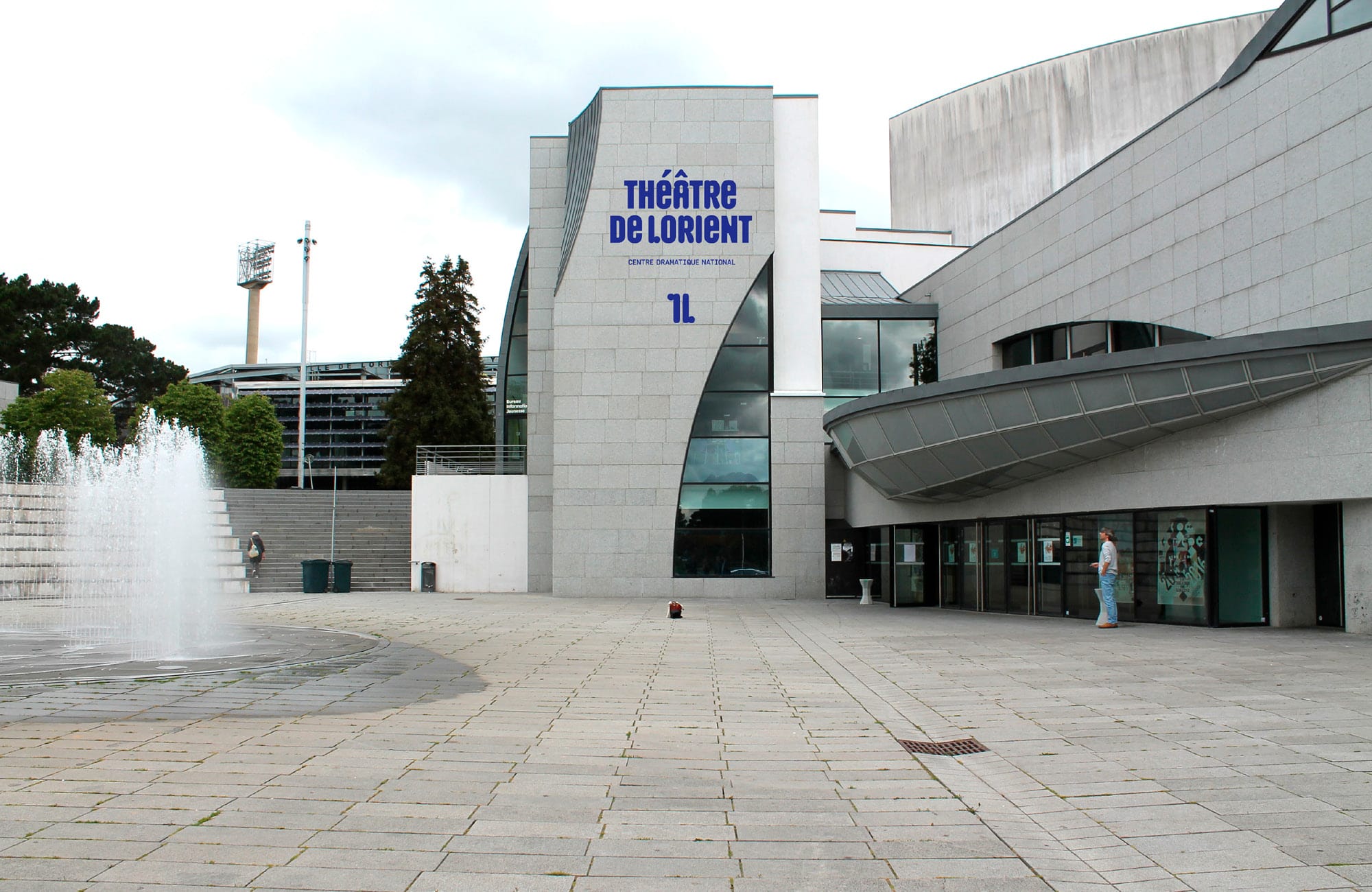
Théâtre de Lorient
Trial fontsCustom
Typeface
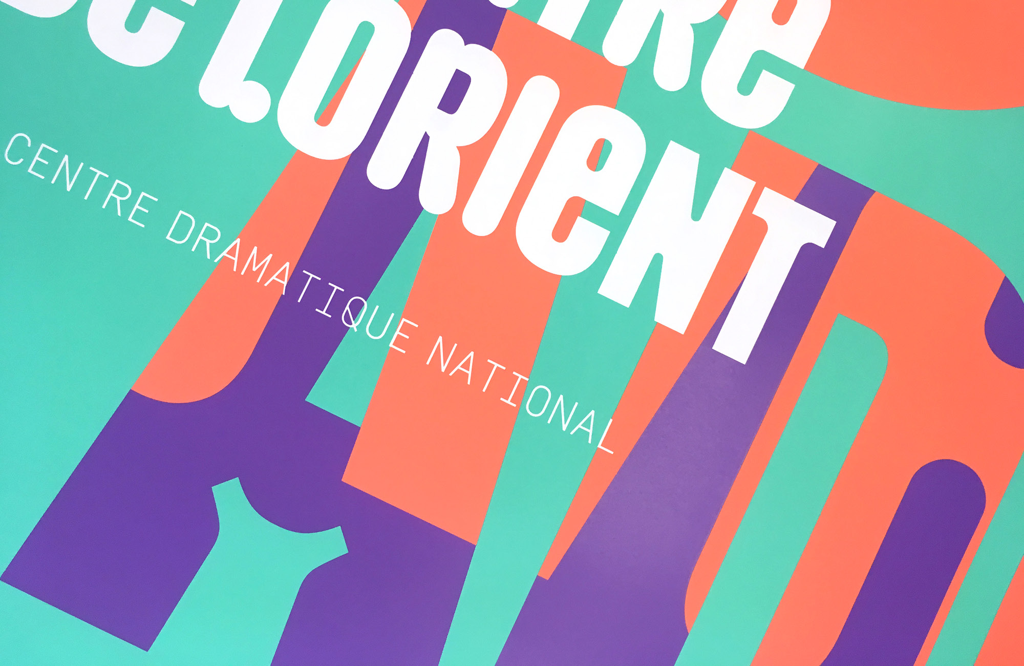
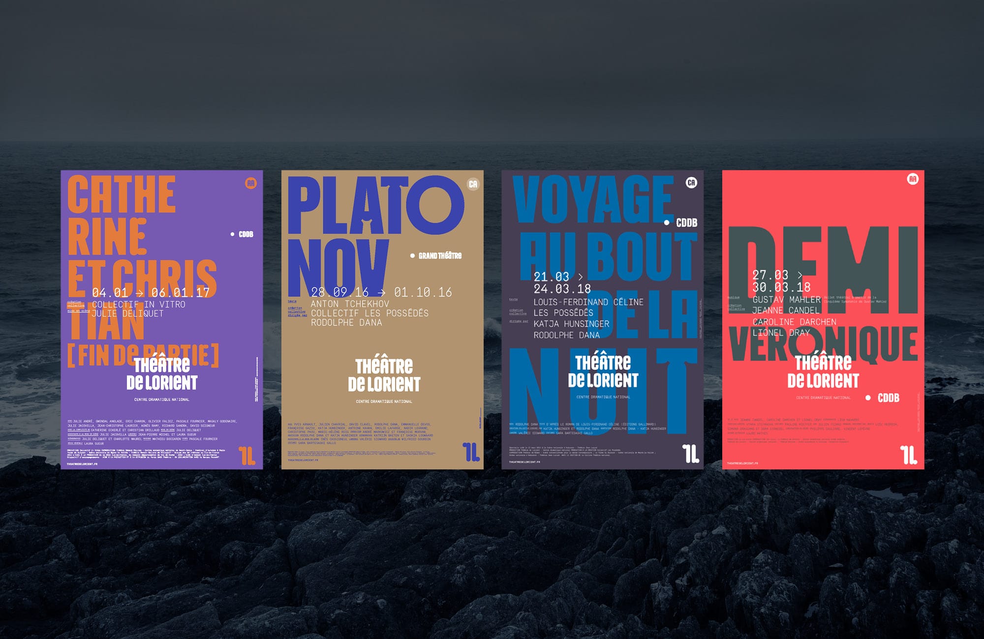
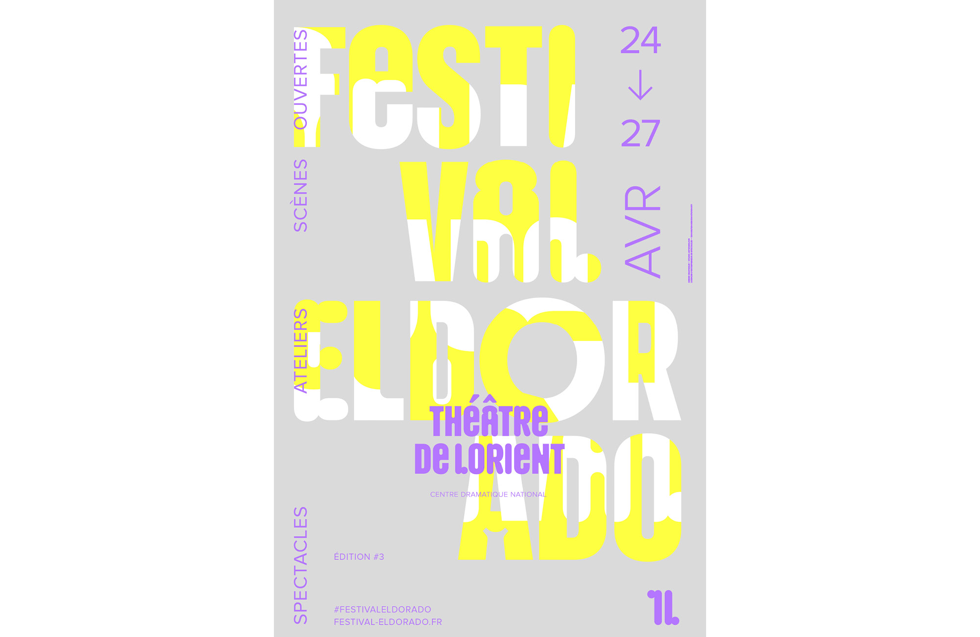
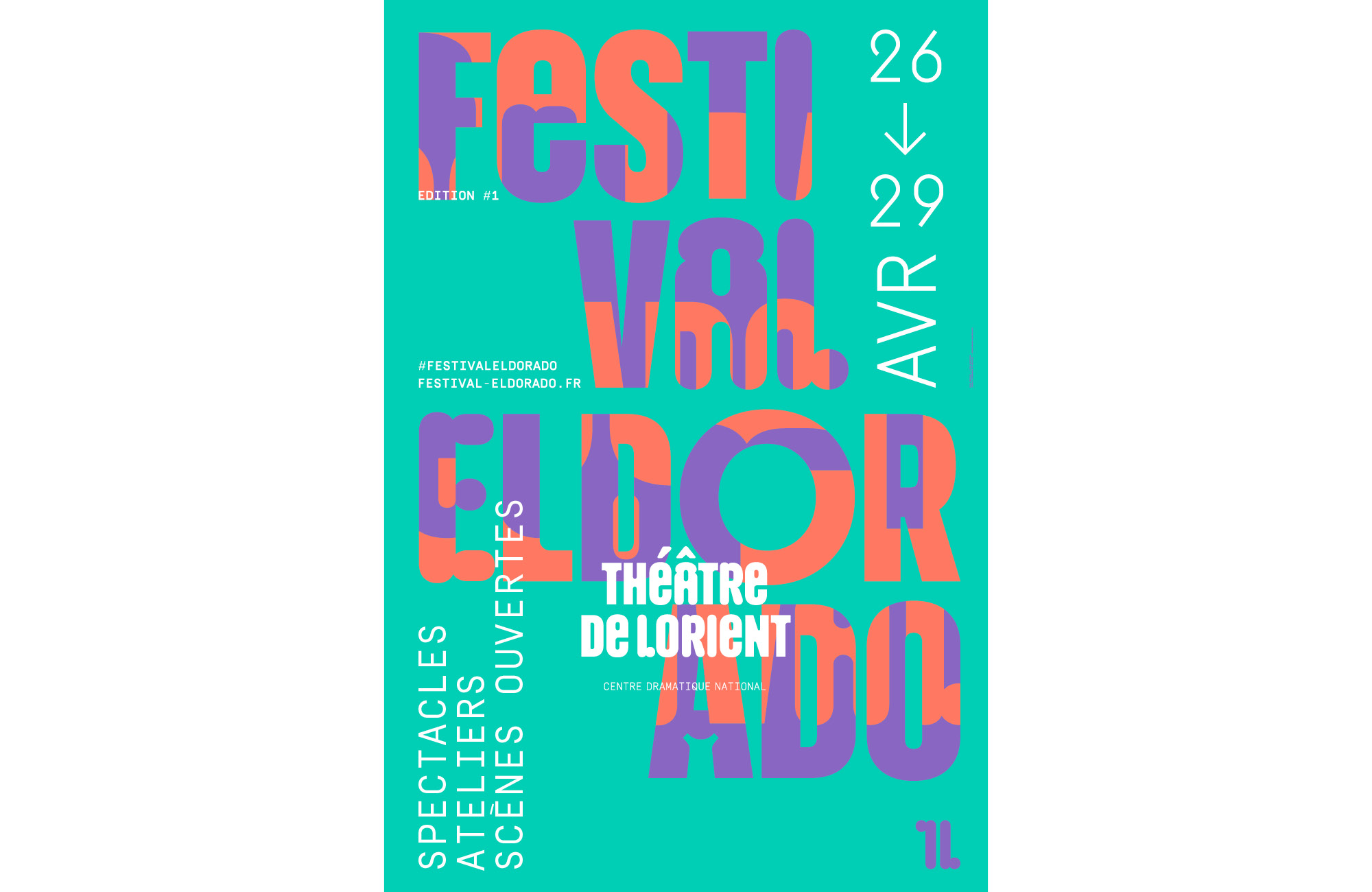
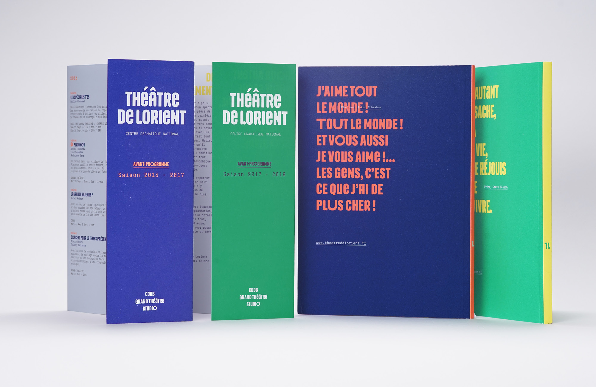
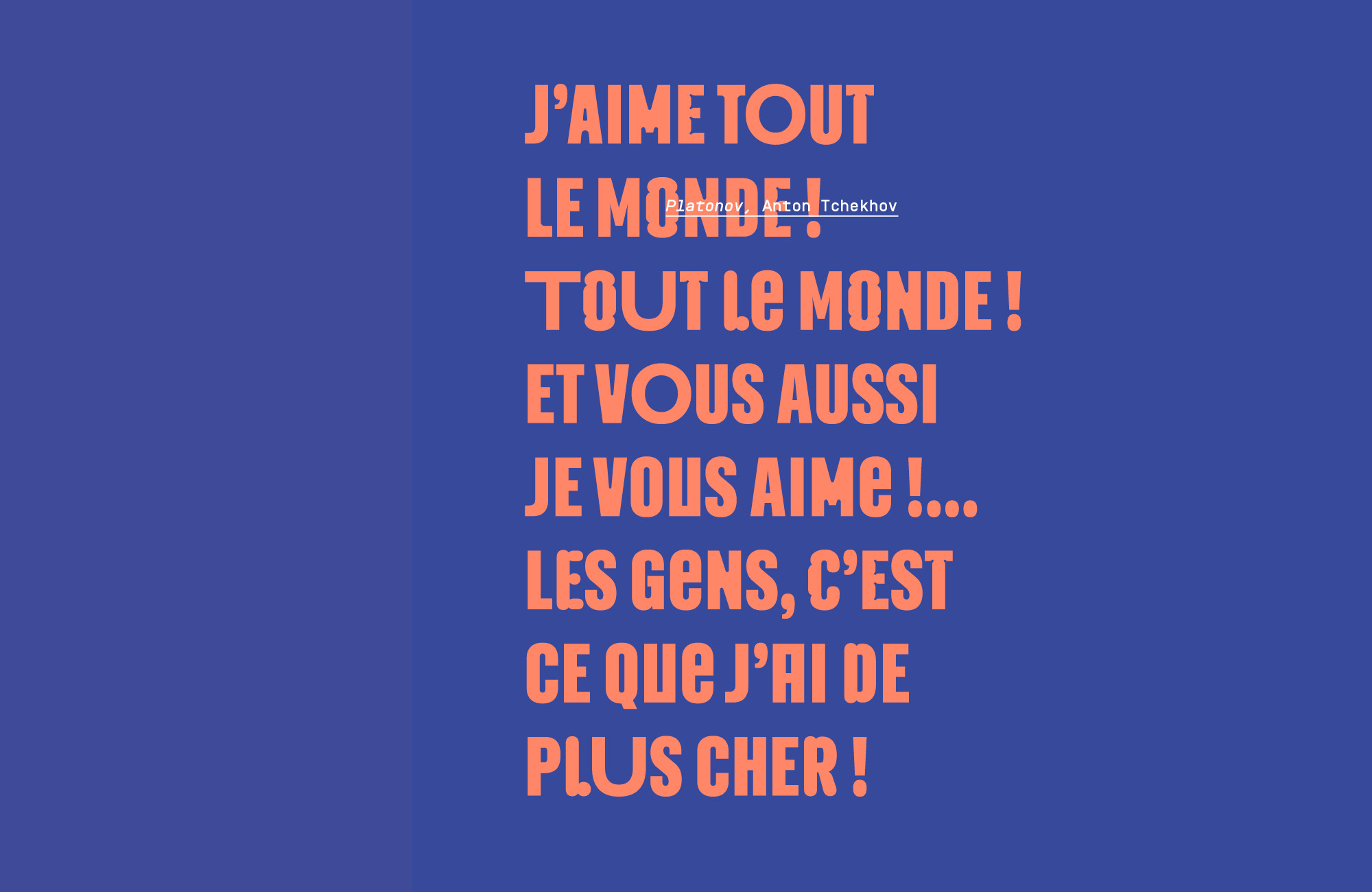
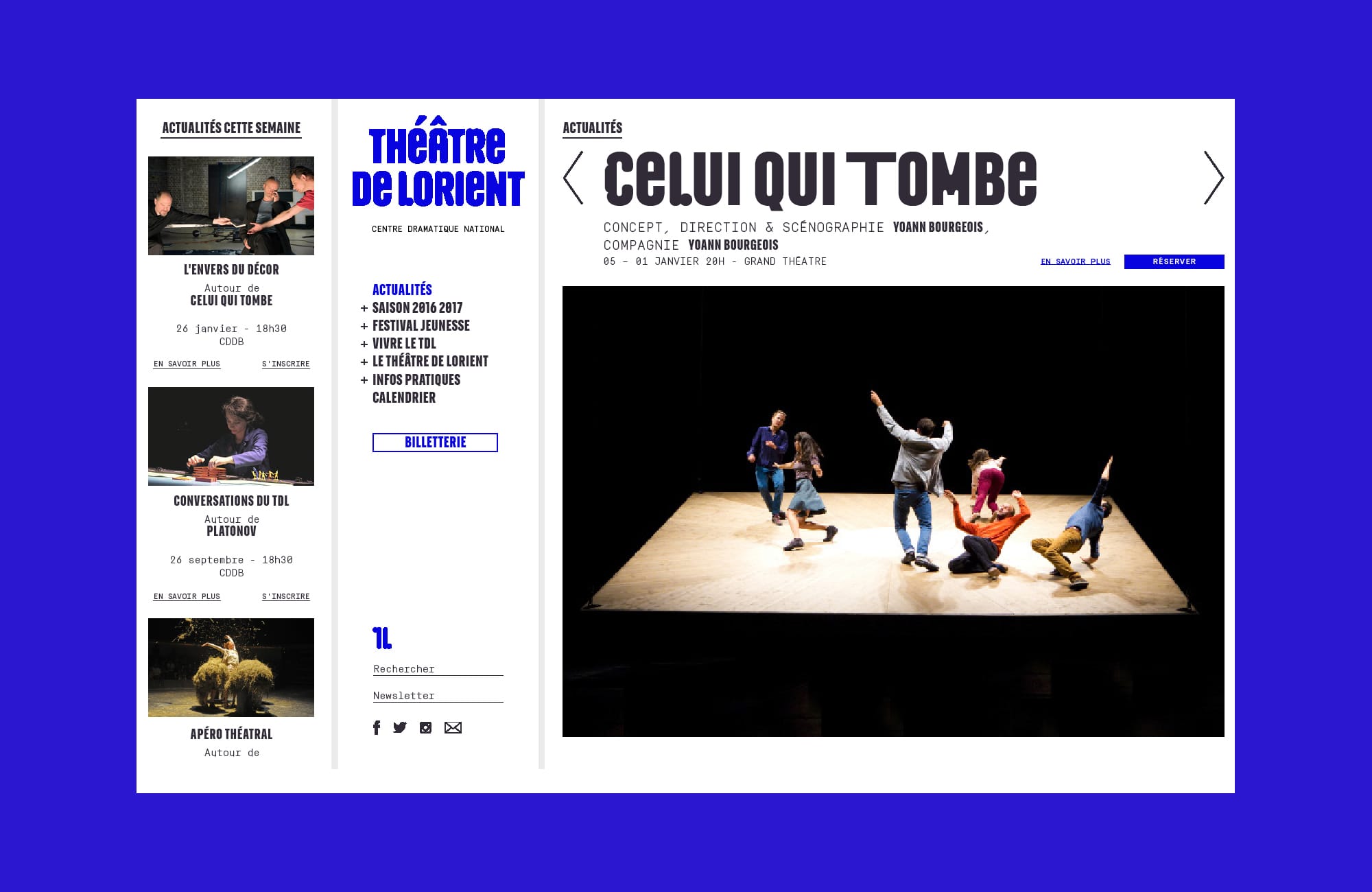
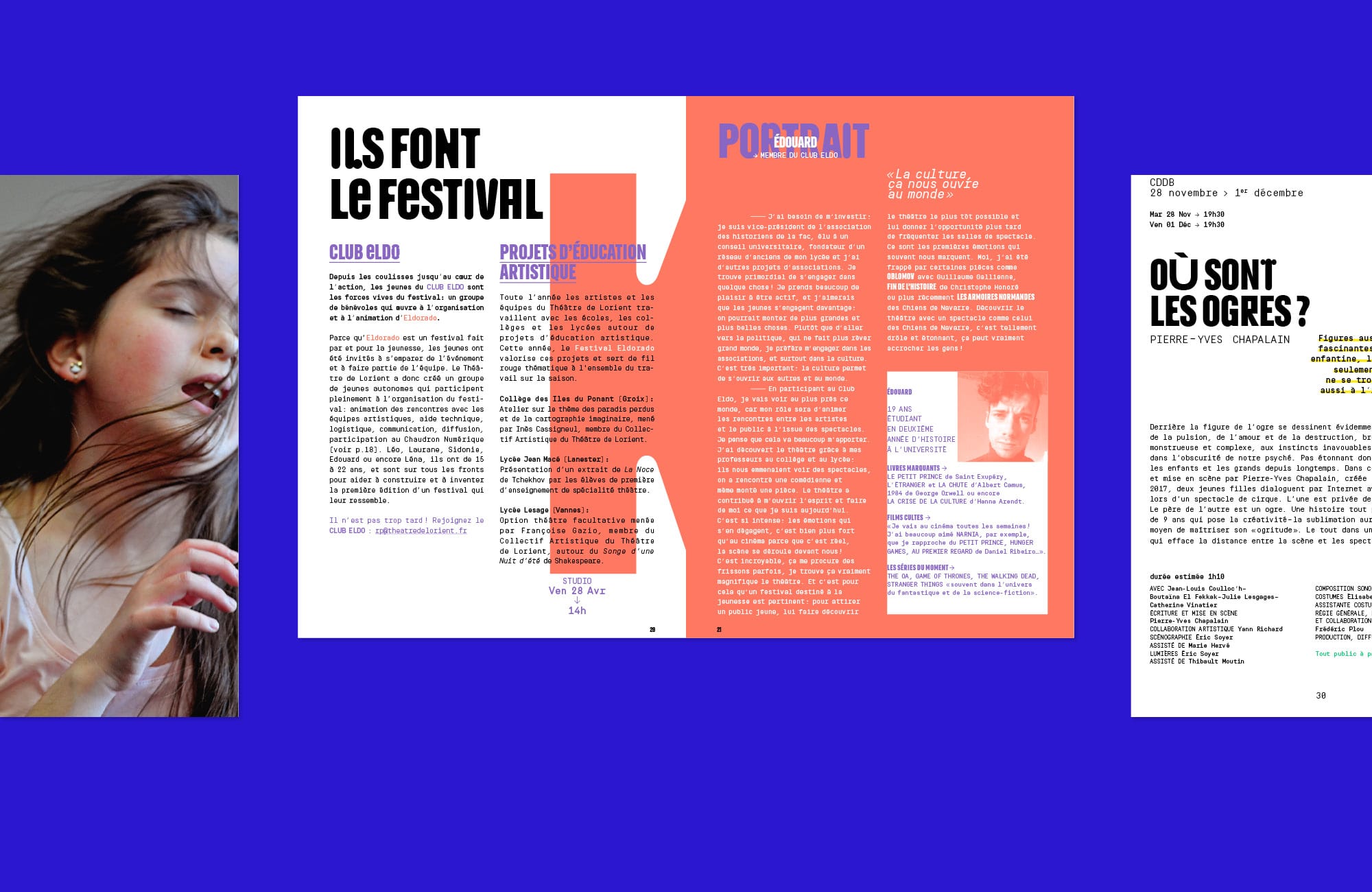
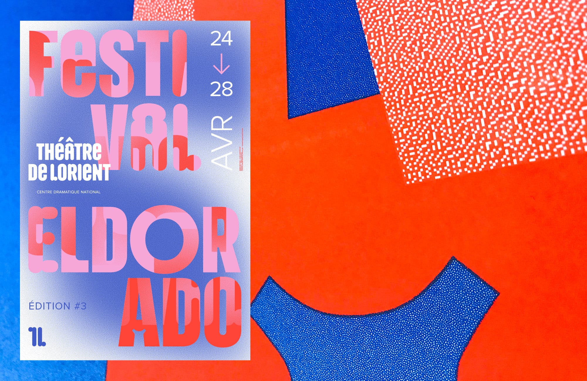
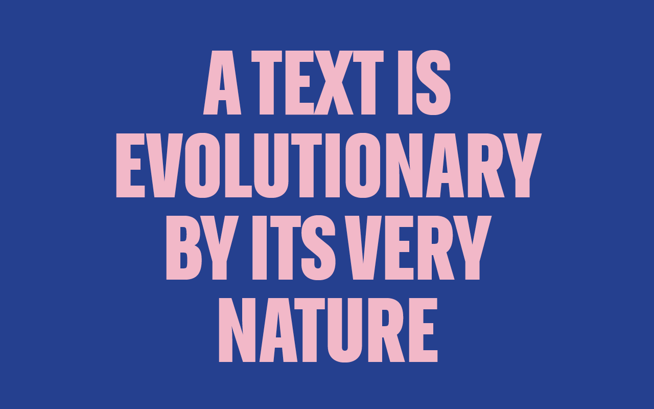
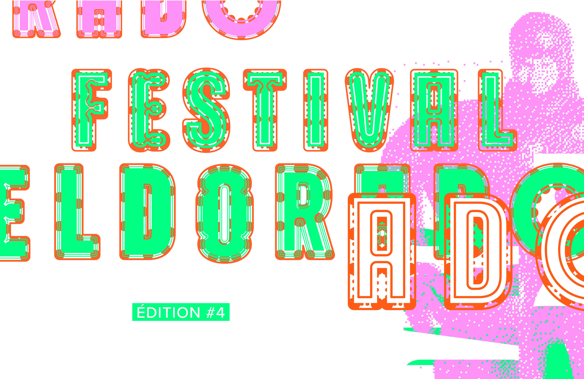
With Paris-based studio ArtWorkLove we created Kalon, the brand typeface of the Théâtre de Lorient in 2008. The typeface system, based on the modular skeleton of a narrower bold Sans, allows the birth of a zoo of different styles, breaking with the traditional idea of a type family. Rounded, ink-trapped, blurred (…), the different styles cohabit the same page or even the same word, flirting with the accident, to create maximum visual impact and playfulness across the brand. The result is an ever mutating, ever evolving typeface reflecting the vivid and diverse life of the theatre’s program. A type improv of some sort.
Custom Typeface
Year: 2008
Client: Théâtre de Lorient
Agency: ArtWorkLove
Team: NaN, Marion Laurens
