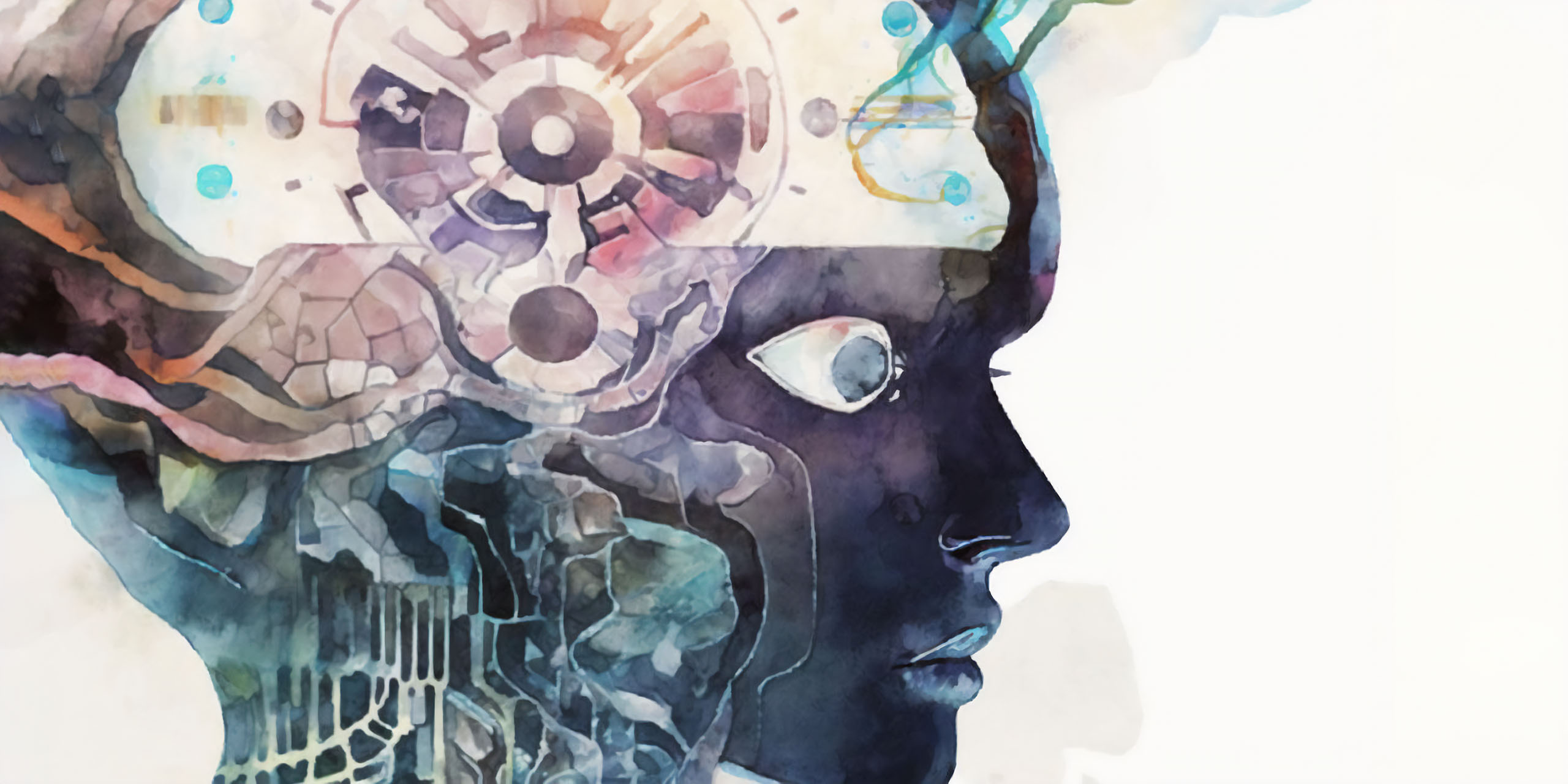
“Human and artificial intelligence, masterpiece, masterful watercolor style.” Illustration generated with niji·journey
The year 2022 marks the beginning a new era. Art is now different.
We witnessed the AI art has been developing at an unexpected tremendous speed in the past few months. And now, everyone is blessed with the talent to create any visuals they want. You can generate AI artworks anywhere, anytime and for any amount you wish, as long as you have an access to a fair graphics card or an online service for that.
Typeface design was no exception in the AI art trend. In fact, AI type design is not a new topic. It has been around for whole 5 years, and is already under a quiet integration into the CJK type industry.
The Motivation
方寸之間,氣象萬千。 >
You see a myriad of possibilities within a square inch.
― Chinese proverb for seal carving [^1], a fine art distant cousin of punchcutting [^b]
So, why? Why did they start out the AI type design researches? Why can the type designing AI keep evolving? Are people serious about that?
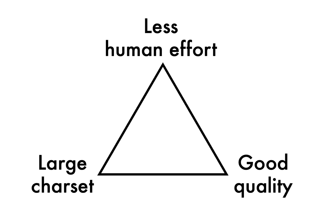
The motivation for the type designing AI is surprisingly serious. Some of the researches are even funded by tech giants like Alibaba [^2] and Naver [^3]. The AI’s magic is in need for CJK type design to provide the productivity and to replace the noncreative human efforts. Such noncreative human efforts are usually brought by the Chinese characters [^c] (aka. “CJK ideographs,” or “Hanzi/Kanji/Hanja”), which take up most of the codepoints in the Unicode. The massive charset and the complexity of individual characters curse the script an unbreakable trilemma for its type designing work, making the CJK typefaces extremely expensive and exhausting to design.
Roboto since 2014 (Source: J4lambert, Wikimedia, CC-BY-SA 4.0)
You can only satisfy two corners of the three. Before we get an AI that is as competent and communicable as a human designer, the trilemma will keep haunting there for the CJK type industry.
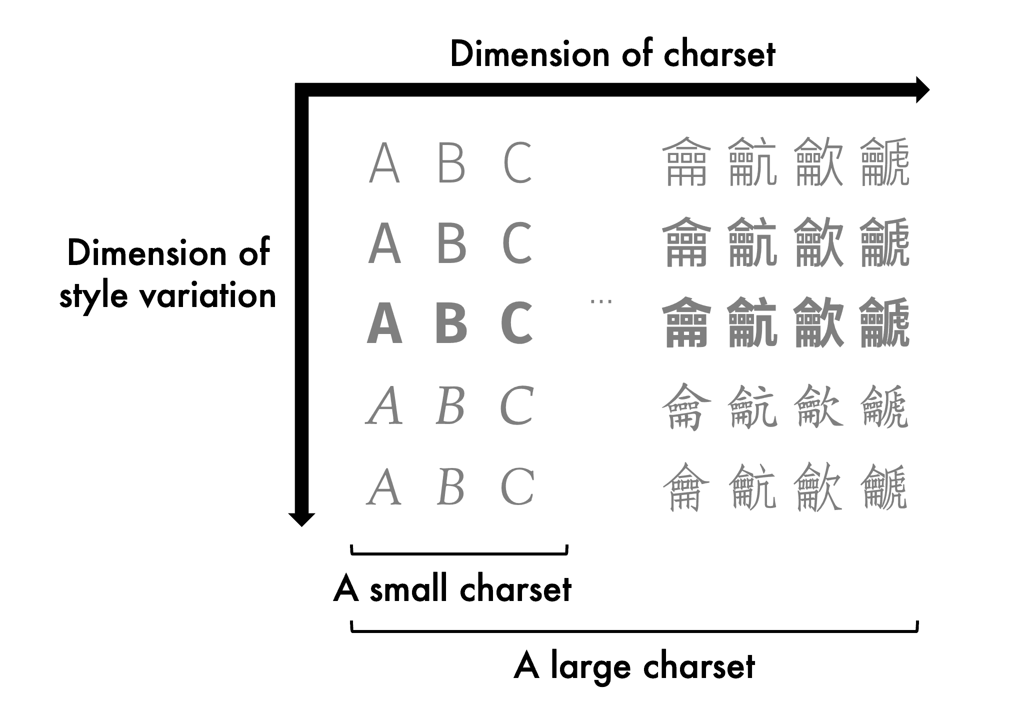
Unlike designing Latin, designing Hanzi is mostly about the possibilities of shapes, rather than the metrics. Shapes of the Hanzi are usually bounded within the em-squares, and type designers have to ensure the consistency of visual sizes, gravities, and styles across them.
Possibilities within the em-squares can be decomposed on two dimensions, i.e. the charset dimension and the style dimension. The former is countable, though it can be infinite if you treat the ideographs as an open set. And the latter, is we, type designer’s love and pursuit. The Hanzi AIs also took this idea, and in more recent papers, they prefer the names “content” and “style” respectively [^4].
Noto: a typeface to rule them all? (source: Faelis / Creative Commons, CC-BY-SA 4.0)
The fundamental task of a Hanzi AI is to complete a large charset starting from a subset of characters of a certain style. Such a task, when conducted by human, is usually known as the “production stage” for Chinese type design, and is the most noncreative and labor-intensive part in this creative industry. As for the AI model, basically, the training phase requires glyph images of different characters in various styles as the dataset. The model will learn how to generate images of glyphs in any combinations of the contents and the styles, and thus for the inference phase, we can let the model output glyphs in new combinations of the contents and the styles.
The Hanzi AIs are also capable of generating fusions of styles by interpolating in the style latent space. With some tricks, it can generate novel contents as well, i.e. non-existent Chinese characters.
Most Chinese characters in this “dynamic fishes” animation are unencoded “gaiji”.
AI types, in Latin
A typeface is a beautiful collection of letters, not a collection of beautiful letters.
― Matthew Carter
The content–style division in Hanzi AIs made it possible to generate harmonic collections of characters. The models are aware of what style and/or what character a glyph image is. In this sense, to follow the great teaching of Matthew Carter, supervision in aspect of the content–style labeling is a must for type designing AIs.
Applying AI algorithms on Latin won’t be a big problem, but one significant difference between the Latin and the Hanzi script is the scale difference on the content dimension, which is also reflected on the dataset properties. Another difference is that, the glyphs are no longer bounded in squares, and the metrics become important.
If you are going to have an AI to help with your type design at home, asking the right questions is vitally important. When your target is to generate fusions, or even extrapolations, the font manifold approach[^5], that was not yet deep, is already awesome to play with. But for more interesting questions, the good old image-to-image translation models can be useful by allowing us to ask the what-ifs.
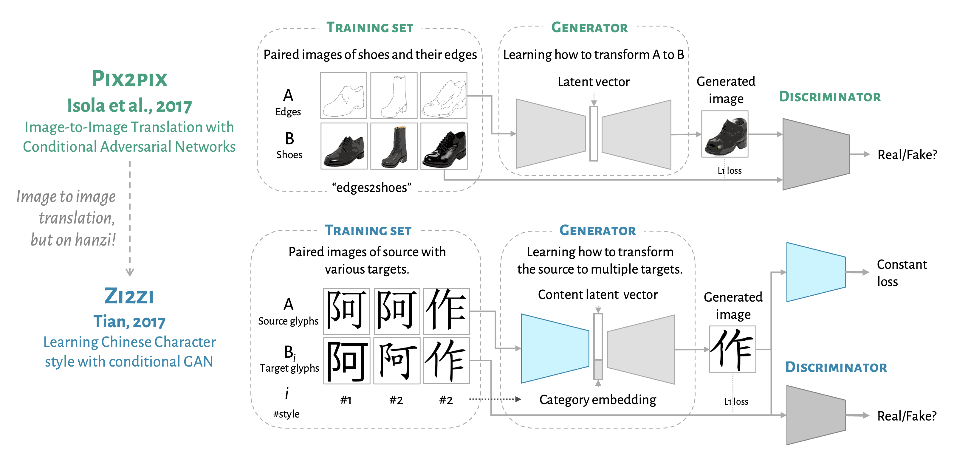
In 2017, Yuchen Tian open-sourced a CJK typeface style transferring project, zi2zi, which later became the groundbreaking work of the Hanzi AI researches [^6]. Zi2zi is an adaptation of pix2pix [^7], an image-to-image translation model using paired images in two categories as the training set.
Unlike designing Latin, designing Hanzi is mostly about the possibilities of shapes, rather than the metrics. Shapes of the Hanzi are usually bounded within the em-squares, and type designers have to ensure the consistency of visual sizes, gravities, and styles across them.
Possibilities within the em-squares can be decomposed on two dimensions, i.e. the charset dimension and the style dimension. The former is countable, though it can be infinite if you treat the ideographs as an open set. And the latter, is we, type designer’s love and pursuit. The Hanzi AIs also took this idea, and in more recent papers, they prefer the names “content” and “style” respectively [^4].
Gotham and Montserrat side by side — source: Wikimedia
Let’s start with the pix2pix model to see what it can do. The fundamental idea is quite simple. So long as you have two different categories of images, like in the figure, Category A is a collection of edges of the shoes, Category B is a collection of photos of the shoes, and besides, for every image in one category, there is a corresponding image in another; the model will then learn how to translate the edges of the shoes to become photo-realistic shoe images. And for the inference phase, you can get new shoe photos with simple doodle inputs.
This is pure magic. It’s simply a data-driven black box that can find out the conversion method from a group of images to another. Before the deep-learning-based image synthesis algorithms appeared, you would have to know everything about such a conversion when you do creative coding for generative art. But now, things are different with AI. All you need is data. What’s more tempting is that, we know it’s usually easier to mess things up than fixing them via creative coding, but with such a powerful black box, we can do the reverse easily, again, as long as you have the data.
(1/5) 汉云黑体/漢雲黑體/漢雲ゴシック/Hànyún Sans, is a typeface project I have been working on since 2018. It is designed as a modern gothic (sans) Chinese/Japanese typeface with hints of geometric and classical flavors. pic.twitter.com/0VUdxouxq7
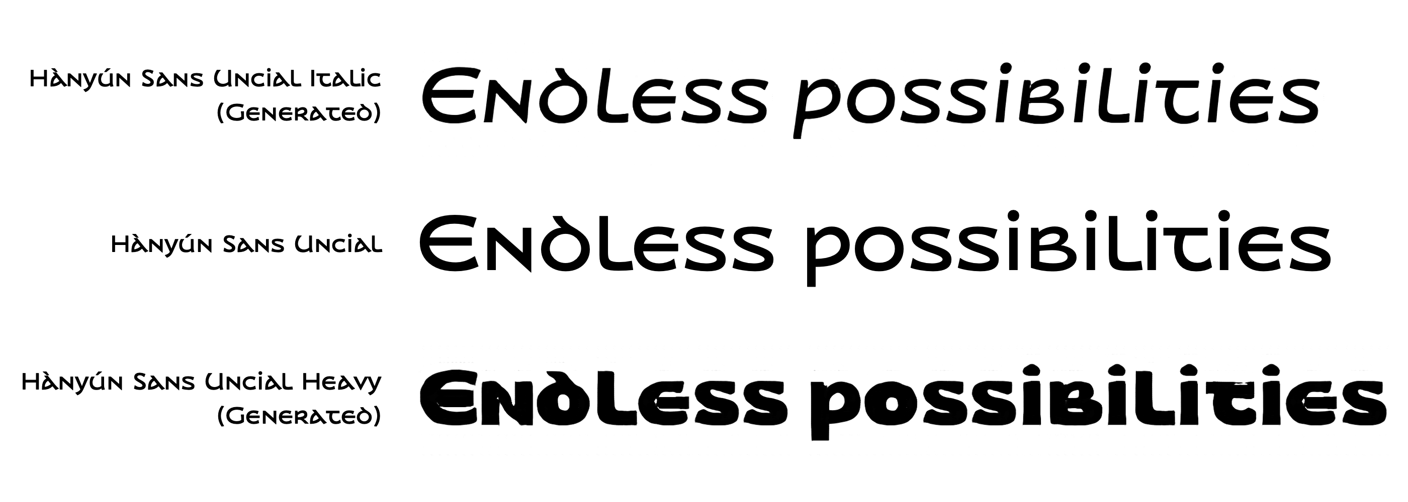
Hànyún Sans is a modern Chinese/Japanese Gothic with hints of geometric and classical flavors. Both of its Hanzi and Latin scripts refer to the classical letterforms.
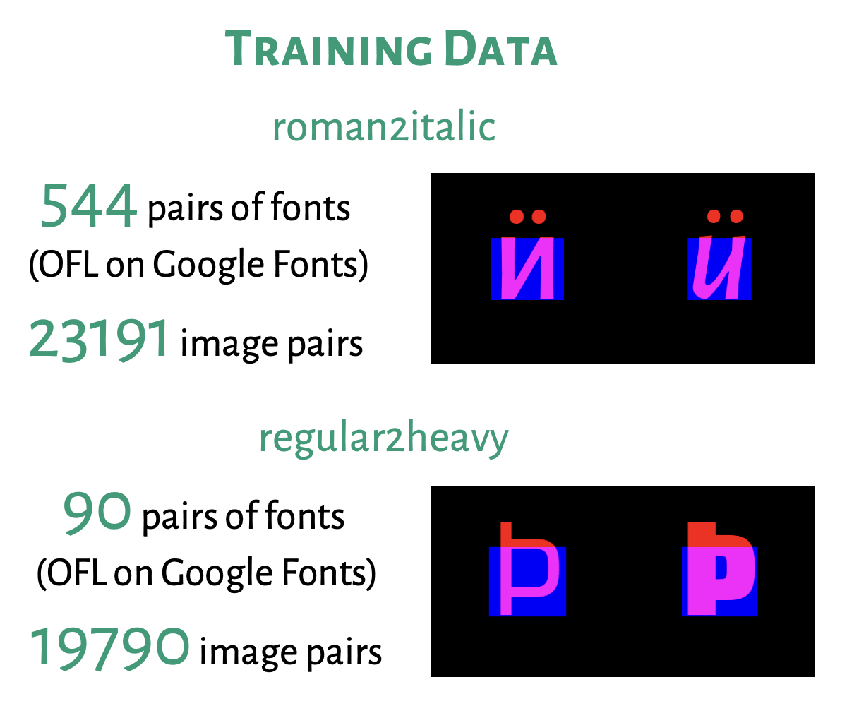
I gave two PoCs a try. My two questions were, what if my Hànyún Sans Uncial becomes Italic, and how about a heavy weight for it? These questions are later reduced to a “roman2italic” model and a “regular2heavy” model, leaving out the content labels and the style labels.
Gotham and Montserrat side by side — source: Wikimedia
Two pix2pix models were trained for these tasks. The fonts in use was gathered from Google Fonts [^d], and then images containing individual glyphs were generated [^e]. In response to our previous mention that the metrics become important for Latin letters, we hereby apply a simple dataset trick that enables pix2pix to infer the side bearings without modifying the model. That is, encoding the shape into the red channel of the image, and at the same time, a rectangle bounded by the left/right sides, the baseline, and the midline, into the blue. This makes sure the metrics information would not all be lost, except the kerning, which remains a drawback.
Gotham and Montserrat side by side — source: Wikimedia
The result does not look perfect at its first glance, but when typeset together, it’s so cool to see our imagination come true. The Italic generated is most appealing. The model handles well with the contrast, curves of the strokes, though no letterform changes happened. The heavy weight generated looks not as appealing. One possible reason might be, the dataset for regualr2heavy is diverse but not diverse enough. The model seems to be hesitating and struggling thickening the letters.
Pix2pix can be a great prototyping tool to help us image the what-ifs [^f], and it’s easy to start with at home. The model also leaves the fun of creating a dataset and training from scratch to the user. Though less powerful than recent large models, it is generally more predictable and more obedient for type designers at this point of time.
The Madoka’s Ramen
I tried to generate the Madoka Higuchi eating ramen scene with NovelAI Diffusion. I don’t know much about this character, but I can tell she is a daring girl.
Recently, the “Madoka eating ramen” meme went viral on the Japanese and Chinese social media among the young. NovelAI Diffusion doesn’t seem to understand human need chopsticks to eat ramen. This lack of common sense invited peoples’ scoff at the “artificial stupidity”.
In the long run (that will be only a few months considering the current progress), this is an insignificant technical limitation of Stable Diffusion. But I personally treasure such imperfection. This lack of common sense is some imagination that we Homo sapiens don’t have.
I love staring into what the AI has generated, and thinking about what it was thinking, even though we don’t know exactly what’s going on—the algorithms make sense mathematically, and statistically we know what we want it to do, yet it remains hard to understand its decision-making from an artist’s or a designer’s perspective. However, I find it good that we don’t know, and I wish we never will, since revealing such a powerful “creative” black box would deconstruct the meaning of creativity. Creators’ ideas would thus lose their value. That would be the true disaster.
Are we type designers safe in this AI trend? Temporarily, yes. All those powerful AI we talked about before are based on images, rather than vector graphics. The vectorial font representation, the now industrial standard of digital typefaces, still need some time to work well with the deep learning approach. Bridging raster images and vector graphics in manual-trace quality is also not as easy as it seems to be. And what’s more, to be ambitious, we must believe there aren’t too many typefaces for now. The diversity of dataset is not yet ready for a type designing AI to awe us.
But I care so much about the type designing AIs as a Chinese type designer. I have seen so many excellent CJK typeface prototypes that can never enter the production stage, as well as a handful of marvelous typefaces ruined by rough production. If there were a silver bullet to break the curse of the trilemma, the diversity of CJK typeface products would be no inferior to Latin types. I wish my peers can one day create whatever they want without taking the cost under consideration.
That day, we will enter the realm of freedom (das Reich der Freiheit) of type design, a world where imagination truly matters. Maybe decades later, we can converse with an AI to let it be our type designing assistant. That will be a world where everyone [^g] is enabled to create. We used to think that world unreachable, but after the year 2022, some preconceptions have to be thrown away. We creators may be resistant to the trend, but do you still remember how everyone became a literate, a photographer, and a typesetter?
後之視今,亦由今之視昔。
The future generations will look upon us just like we look upon the past.
Preface to the Poems Collected form the Orchid Pavilion*](https://en.wikipedia.org/wiki/Lantingji_Xu), the most masterful semi-cursive Chinese calligraphy of all time, also the source of the quote. How sad it is for humans to be born, aging, ill and died, but when it comes to AI, the technology evolves constantly and vibrantly, towards which, we can take an optimistic attitude.
Why resistant to a world where beauty is no longer a luxury? A myriad of possibilities are revealing. Are we ready for it?
A Chartered Accountant, Frank Adebiaye (Paris, France) is also a document designer and type designer. He founded the open source type foundry Velvetyne Type Foundry in 2010. He has written or co-written numerous articles on typography and graphic design as well as several books including François Boltana & la naissance de la typographique numérique (Atelier Perrousseaux, 2011), Fontes Libres (Floss Manuals/Organisation Internationale de la Francophonie, 2011) or La Commande de design graphique (CNAP, 2014). His typographic and writing work has been the subject of exhibitions (Casco gallery, Utrecht, latent stare*, 2012 ; Une Saison Graphique, Le Havre, 2014 ; LIFEWTR for PepsiCo, 2020), lectures (Rencontres de Lure, 2008, 2011, 2015, 2017) and radio programmes (France Culture). Frank Adebiaye is also a regular speaker at HEAR and ANRT on font licensing and advises type foundries on their marketing strategy.
We use cookies to give you the most relevant experience by remembering your preferences and repeat visits. By clicking “Accept”, you consent to the use of these cookies.
This website uses cookies to improve your experience while you navigate through the website. Out of these, the cookies that are categorized as necessary are stored on your browser as they are essential for the working of basic functionalities of the website. We also use third-party cookies that help us analyze and understand how you use this website. These cookies will be stored in your browser only with your consent. You also have the option to opt-out of these cookies. But opting out of some of these cookies may affect your browsing experience.
Necessary cookies are absolutely essential for the website to function properly. These cookies ensure basic functionalities and security features of the website, anonymously.
Cookie
Duration
Description
cookielawinfo-checbox-analytics
11 months
This cookie is set by GDPR Cookie Consent plugin. The cookie is used to store the user consent for the cookies in the category "Analytics".
cookielawinfo-checbox-functional
11 months
The cookie is set by GDPR cookie consent to record the user consent for the cookies in the category "Functional".
cookielawinfo-checbox-others
11 months
This cookie is set by GDPR Cookie Consent plugin. The cookie is used to store the user consent for the cookies in the category "Other.
cookielawinfo-checkbox-necessary
11 months
This cookie is set by GDPR Cookie Consent plugin. The cookies is used to store the user consent for the cookies in the category "Necessary".
cookielawinfo-checkbox-performance
11 months
This cookie is set by GDPR Cookie Consent plugin. The cookie is used to store the user consent for the cookies in the category "Performance".
viewed_cookie_policy
11 months
The cookie is set by the GDPR Cookie Consent plugin and is used to store whether or not user has consented to the use of cookies. It does not store any personal data.
Functional cookies help to perform certain functionalities like sharing the content of the website on social media platforms, collect feedbacks, and other third-party features.
Performance cookies are used to understand and analyze the key performance indexes of the website which helps in delivering a better user experience for the visitors.
Analytical cookies are used to understand how visitors interact with the website. These cookies help provide information on metrics the number of visitors, bounce rate, traffic source, etc.
Advertisement cookies are used to provide visitors with relevant ads and marketing campaigns. These cookies track visitors across websites and collect information to provide customized ads.