

In this article, Hélène Marian delves into the process behind the creation of NaN Archy, her new release at NaN, a non-literal glitchy transcription of her hand-lettering practice.
What begun as a simple translation from brush to machine became an introspective journey on what designing a typeface actually means today (and maybe only today). It’s also a testimony of the center place of the human hand and eye in the type making process.
A Magic Trick?
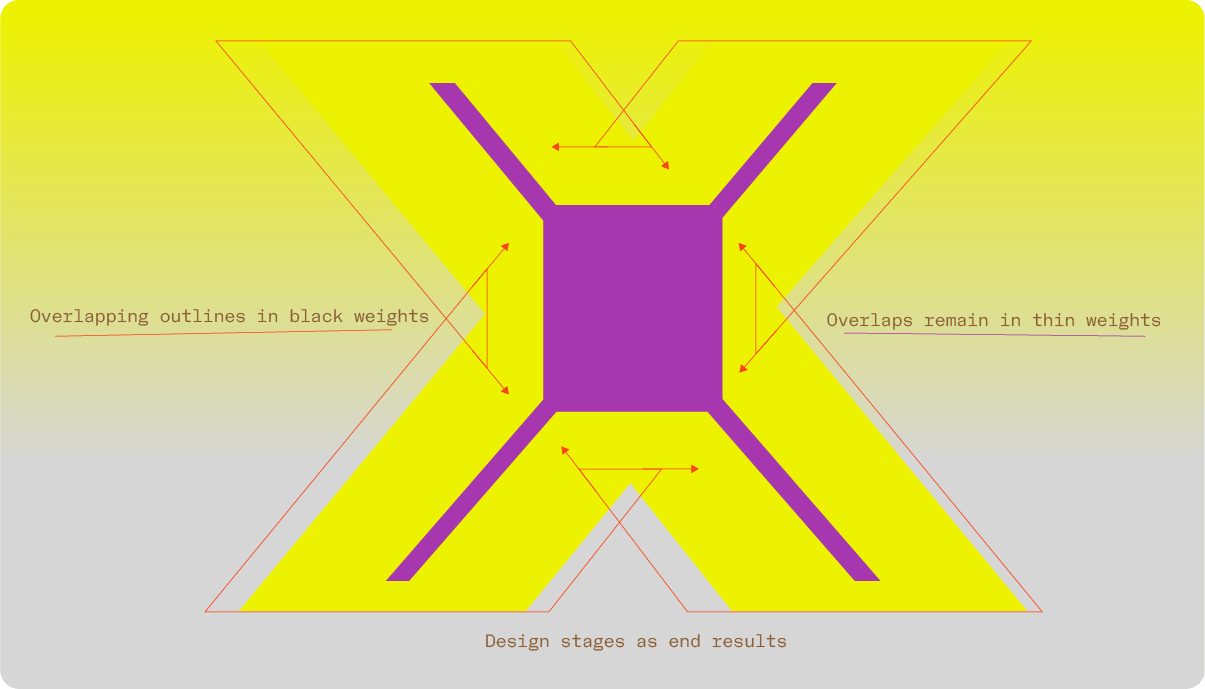
Everything in type design is but an illusion: to appear identical or aligned, shapes need to have different sizes and weight (we call that “optical corrections”). This is the abc of type design.
Behind these billions of engineered curves lies a very manual and organic work, correcting geometro-digital perfections that would look just odd to the human eye. One has to alter them in a perfect but non mathematical way in order to trick other human eyes, closer to distorting mirrors than to precision lenses. In that, type design is but a complex magic show where the designer uses their tricks to produce shapes that should be perceived without intention, without humanity, transparent. We use to say that a good typeface is one that makes itself be forgotten. The crystal goblet metaphor.
What if disclosing some of these tricks, making them visible, instead of destroying the show, gave it even more spice? From its blackest to its thinnest style, NaN Archy brings you behind the type making scene, letting you squint at the hours of rehearsals necessary to the credible disappearance of the rabbit in the hat.

Uniform Rhythm is Soooo 20th Century (In Progress as a Process)
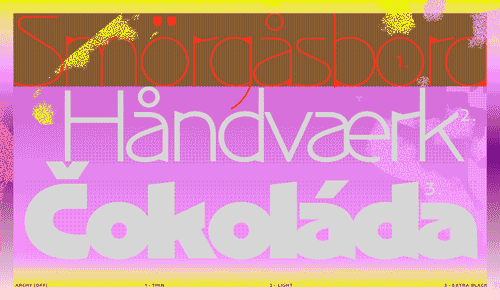
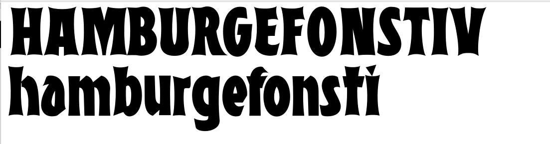
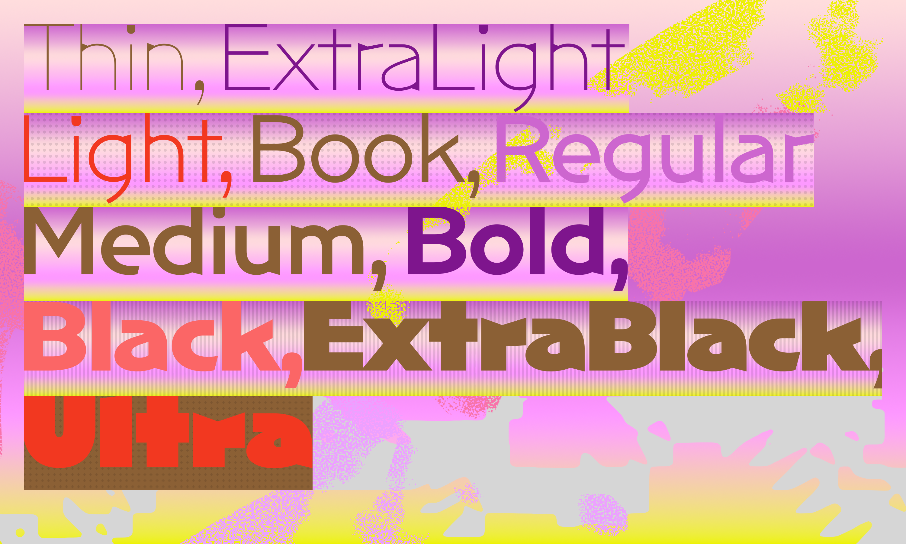
A bold weight is rarely automatically made from a regular, there is no really convincing “draw bold” button in our software (yet). But instead it is consciously drawn by the designer to tell the particular story of a typeface, controlling the extreme weights. In Archy, the boldest weights were sketched before the thinner ones. The skeleton was then extracted from the flesh of the bolder styles. My first dabble in the realm of retail variable fonts, Archy is a reflection about the nature of boldness differences in a type family and of the creative possibilities that the relationships between the different weights offer. What do they have in common, what opposes them, and which choices a designer has to make when drawing a matching thin and black weights?
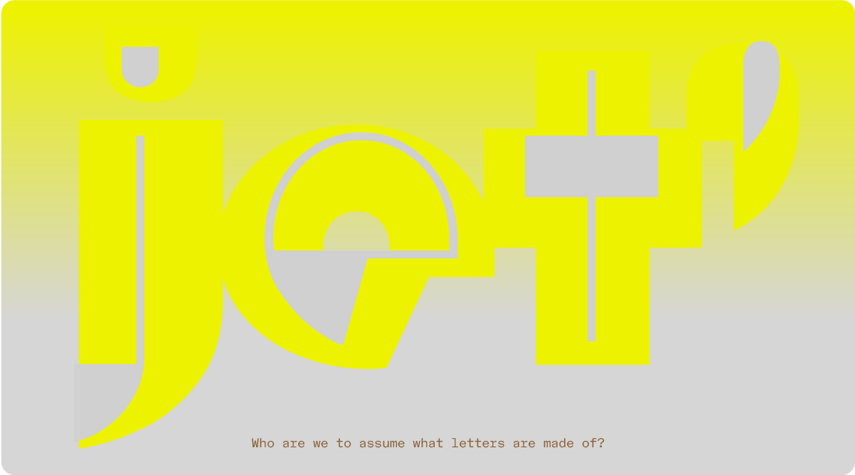
NaN Archy exposes the hidden layers of the design process, revealing in its shapes the decisions that were made in the change of weight. Finally a bit of honesty in this world of false pretense! It is an attempt to reveal the type design process and its choices.

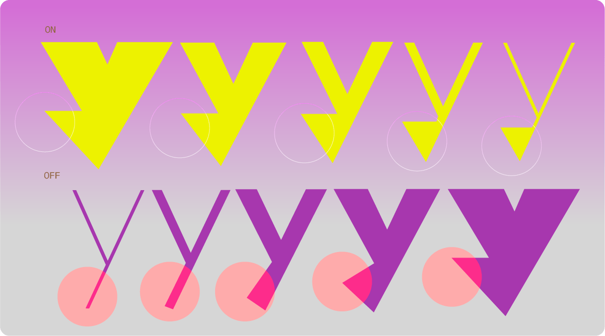
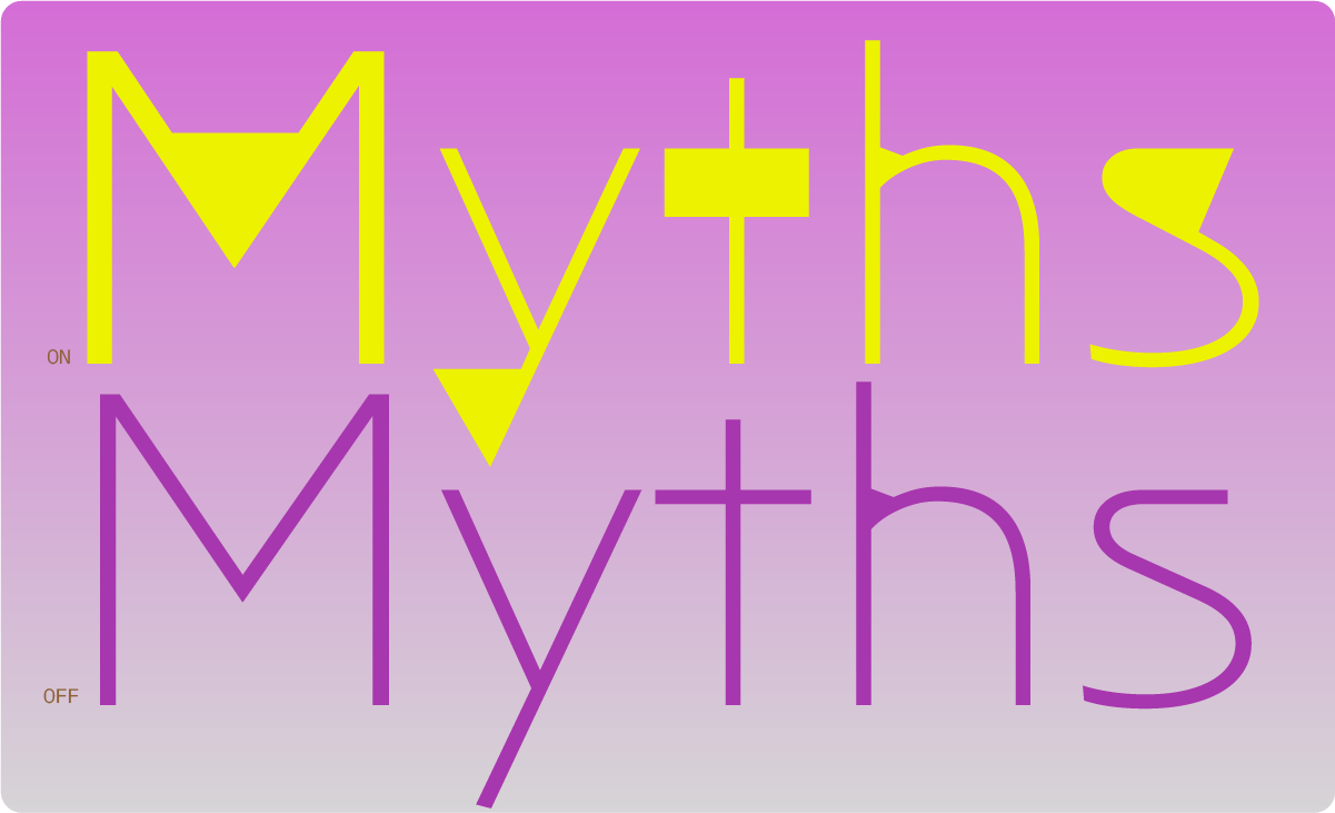
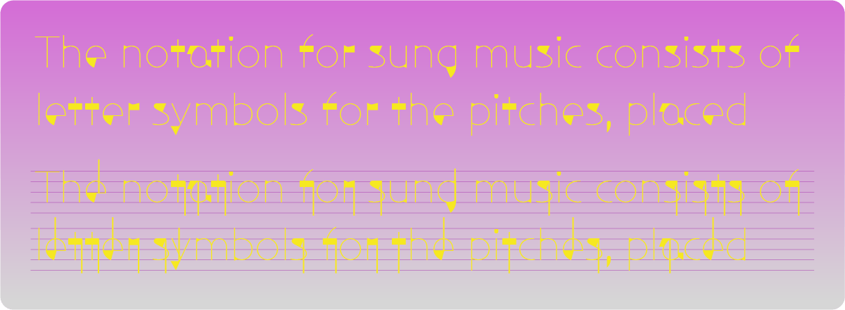
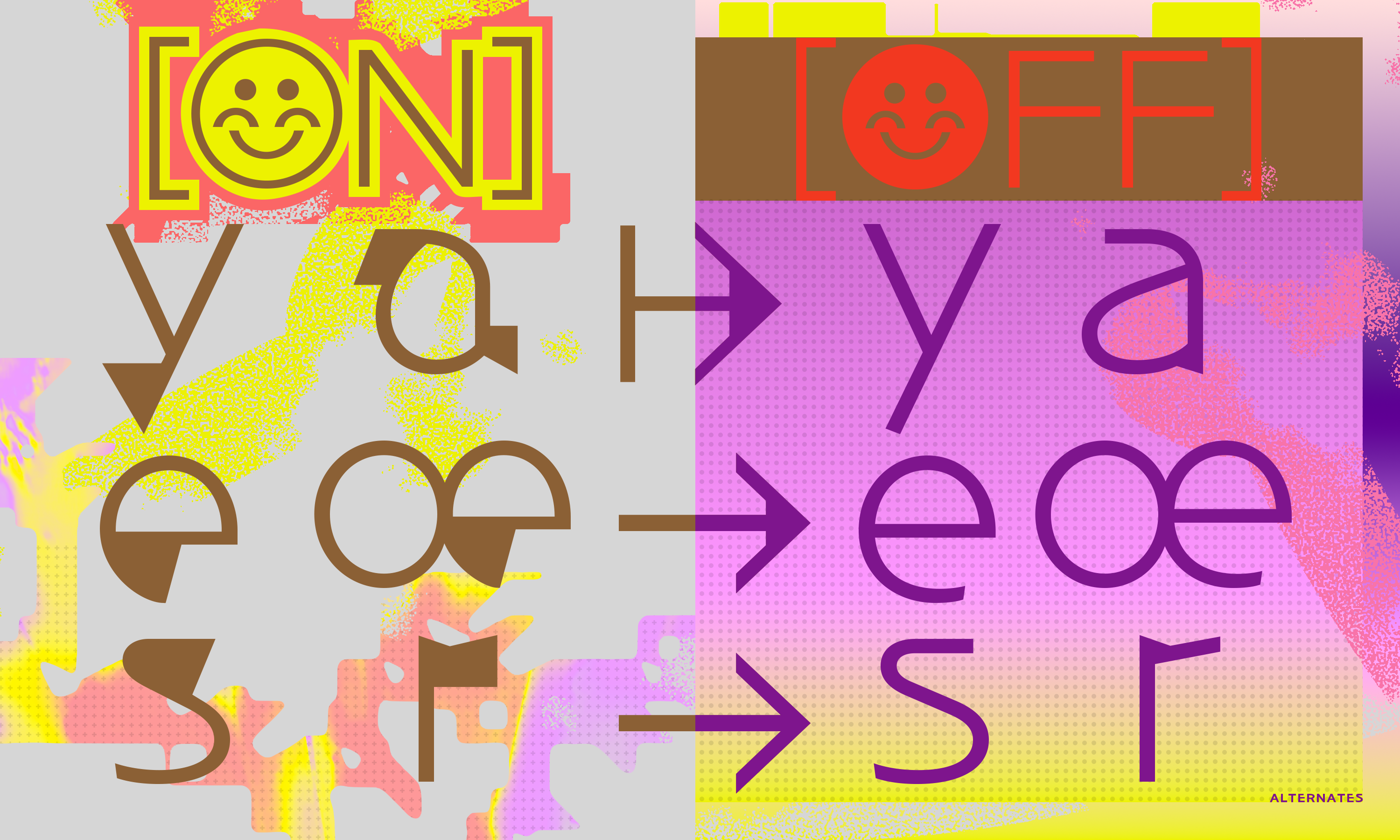
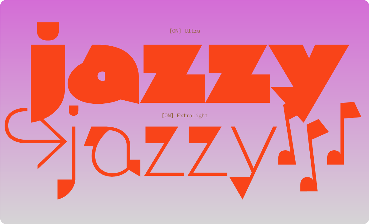
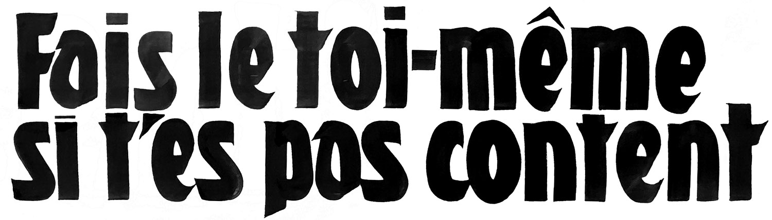
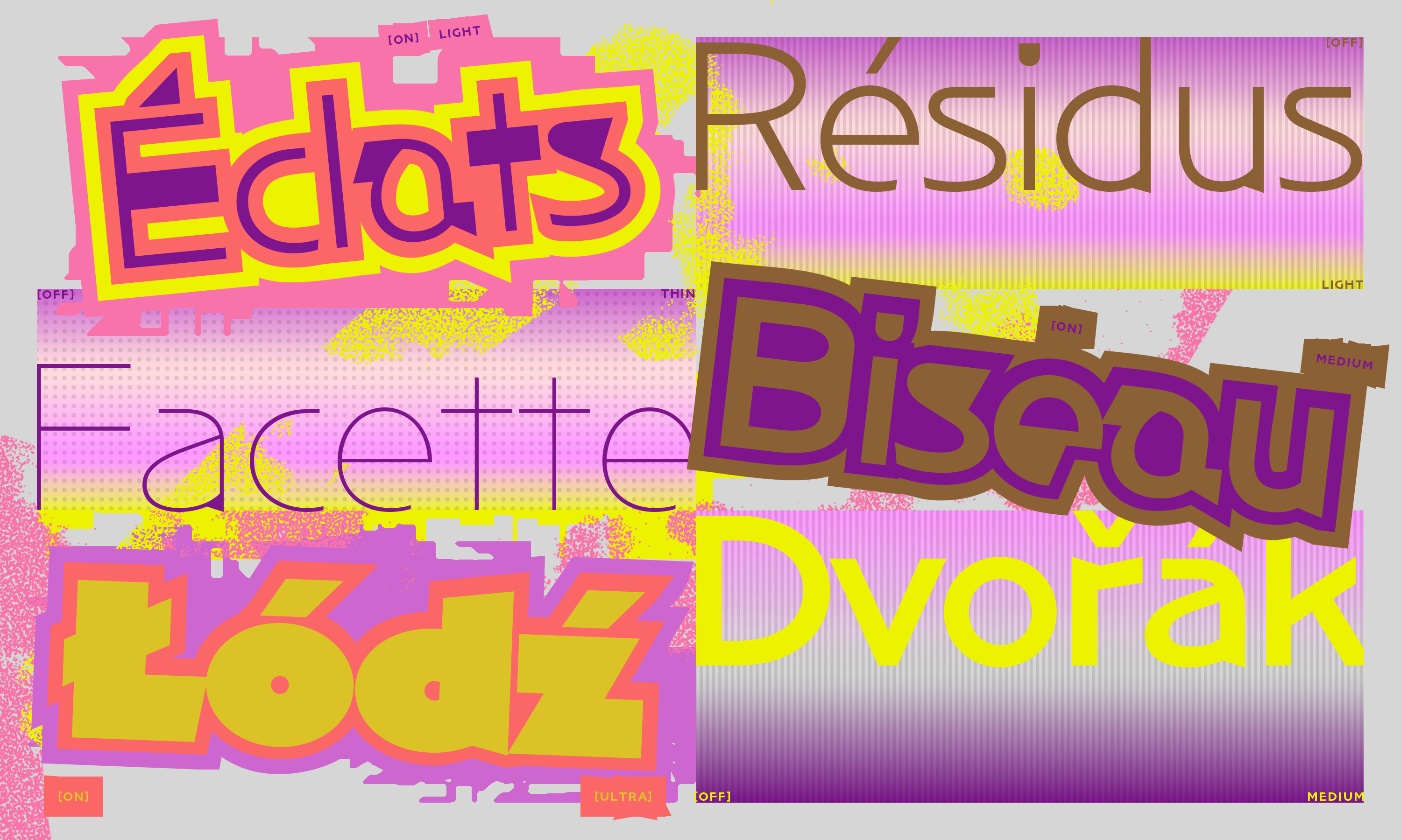
The faux-glitches that can be seen in NaN Archy ON are in fact some artefacts of the design process that have been kept, then refined, homogenized and crafted to be fully part of this typeface. They were brewed in this font by a constant back and forth, the drawing process made immodest. The result is a musicality very specific to Archy in its lightest styles. With these voluntary spots and stains, Archy turns its back to the traditional notion of an uniform rhythm for a typeface. In that, it embraces some of the music that was always there during its design process and that my lettering were made for: experimental and noise musics that question the notion of harmonies and consistent rhythm that are ubiquitous in most music productions.
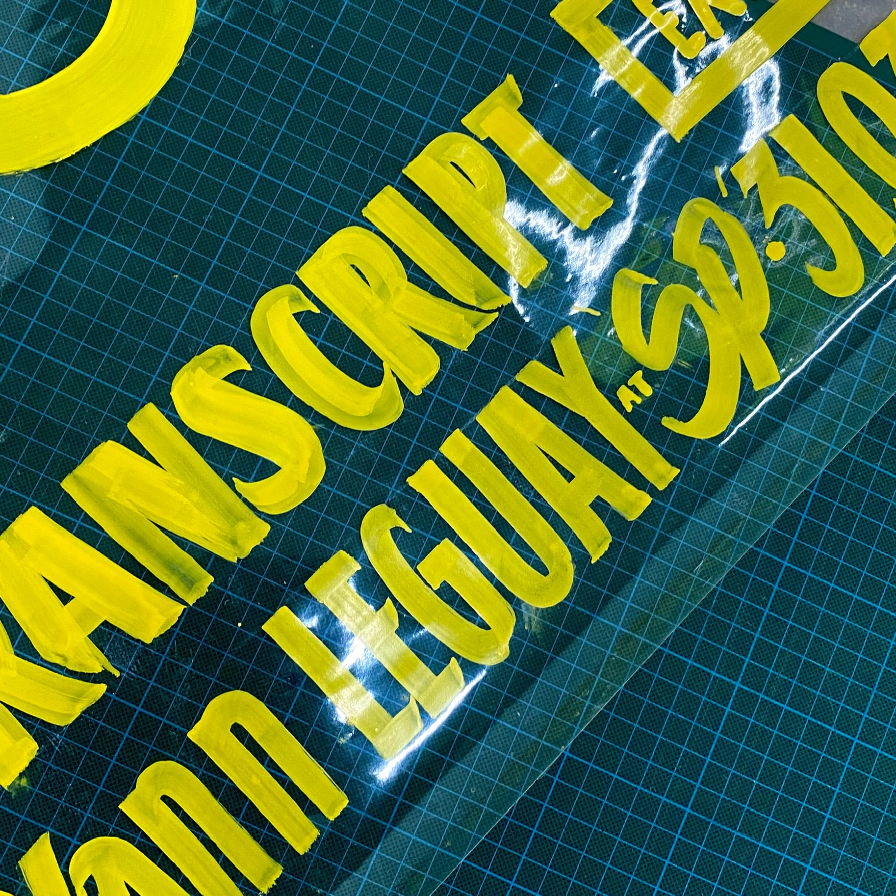
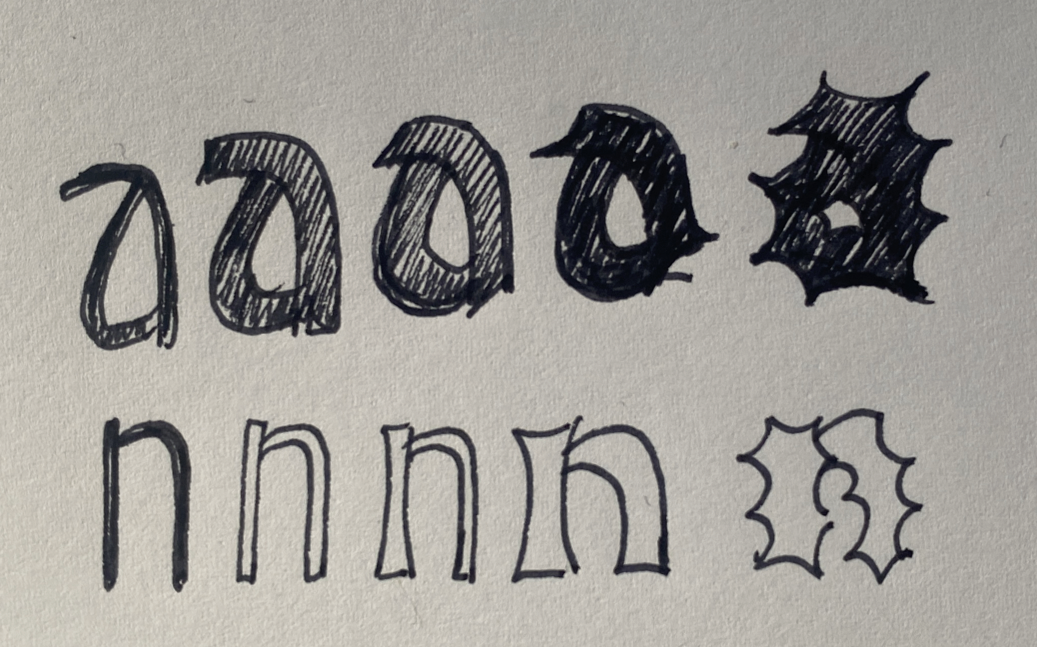
From Brush to Vector – to Even More Vectors
What if the skeleton of a character wasn’t simply a lighter version, but a past or future version of itself? What will be left of our glyphs when time will uncover their bones? What will we discover? Were these “a” made of sweat or of electricity? Of ink or of coordinates?

Bottom Left and Top Right: First digital sketches.
If my first sketches, the embryo of this typeface, were indeed made by hand, with brushes and wet paint, the digitization process sometimes left me the impression to have painted with lithium. It’s an hybrid story that NaN Archy tries to tell, from the thick masses hand-painted in a tangible reality towards their digital future: what’s left of them, what’s left of the hand, what was lost, and what they became, what was added with their vector transition.
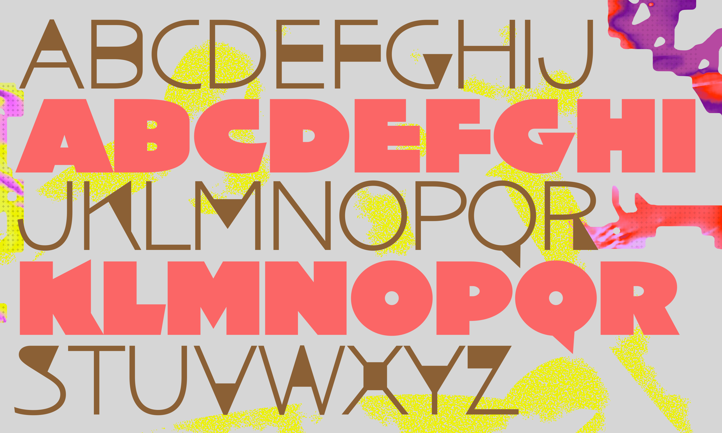
What starts out as generous human-like and gestural flesh appears, as its thinner weights, as a rationalized and digitized skeleton.
Becoming a system, they admittedly lost a part of their liveliness in the trip, but they gained in autonomy and in potential: from one single immutable physical stroke, they can now become an infinity of texts. With a tonality that reveals itself different with every weight, from warm to cold, soft and plum to mechanical, many are the tricks to be invented while typesetting with NaN Archy.
“2 for One / Twenty for Ten”
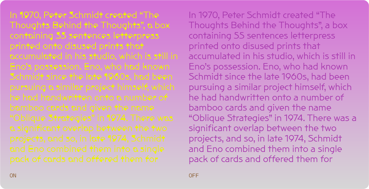
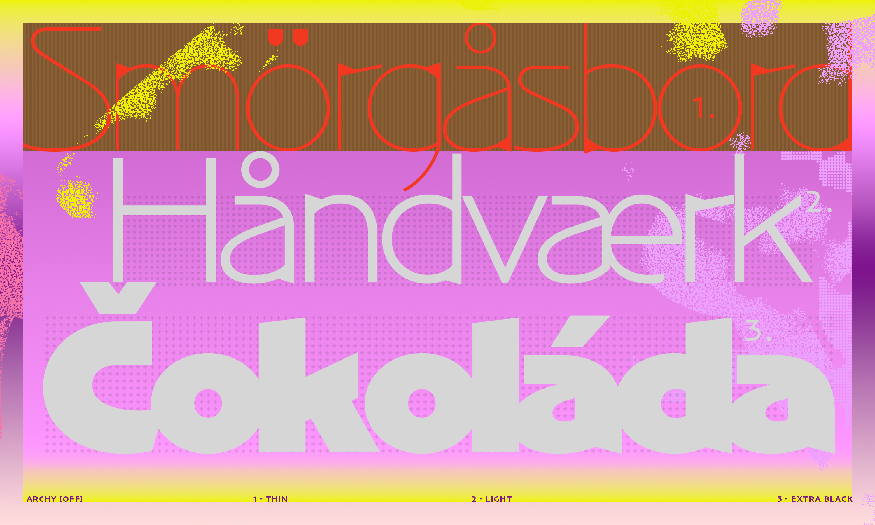
Archy is not a statement. It’s been crafted to be a widely usable and versatile typeface. Once you deactivate and mute those glitches, you get a text typeface that oddly still has a distinctive voice, or should we say voices. NaN Archy OFF is the quieter counterpart of NaN Archy ON, where glitches were removed and tamed. The result is a calmer typeface, a more legible one suited for long-form text-setting.
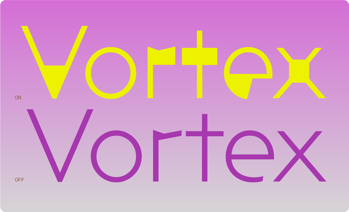
What appears in Archy OFF are the remnants of the hand-painted origin of the family. The structures are the ones of a gentle humanist sans serif. The proportions born from my hand also give it a slight Art-Déco undertaste. The open counters and vertical stroke endings make it affable and legible at small sizes.
ON and OFF, each subfamily unveils different possibilities: from serious to playful, geometric to dynamic, dry to generous, human to digital.
About Hélène Marian
Hélène Marian is a letter worker: whether she’s designing them for a national basketball league, tracing them on boat sails, laying them out on noise LP’s or teaching them, letters are her raw material. Her thundering, all-terrain practice combines typographic rigour and unbridled gesturallity.
