Lyft
Trial fontsCustom
Typeface
Lyft is a leading ride-sharing platform offering on-demand transport services. Faced with increasingly fierce competition in the market, the brand has revamped its identity to project a more mature and focused image, whilst remaining true to its people-centred values. By presenting journeys as moments of connection rather than mere transactions, Lyft has strengthened its distinctive identity through a clearer and more assertive visual system.
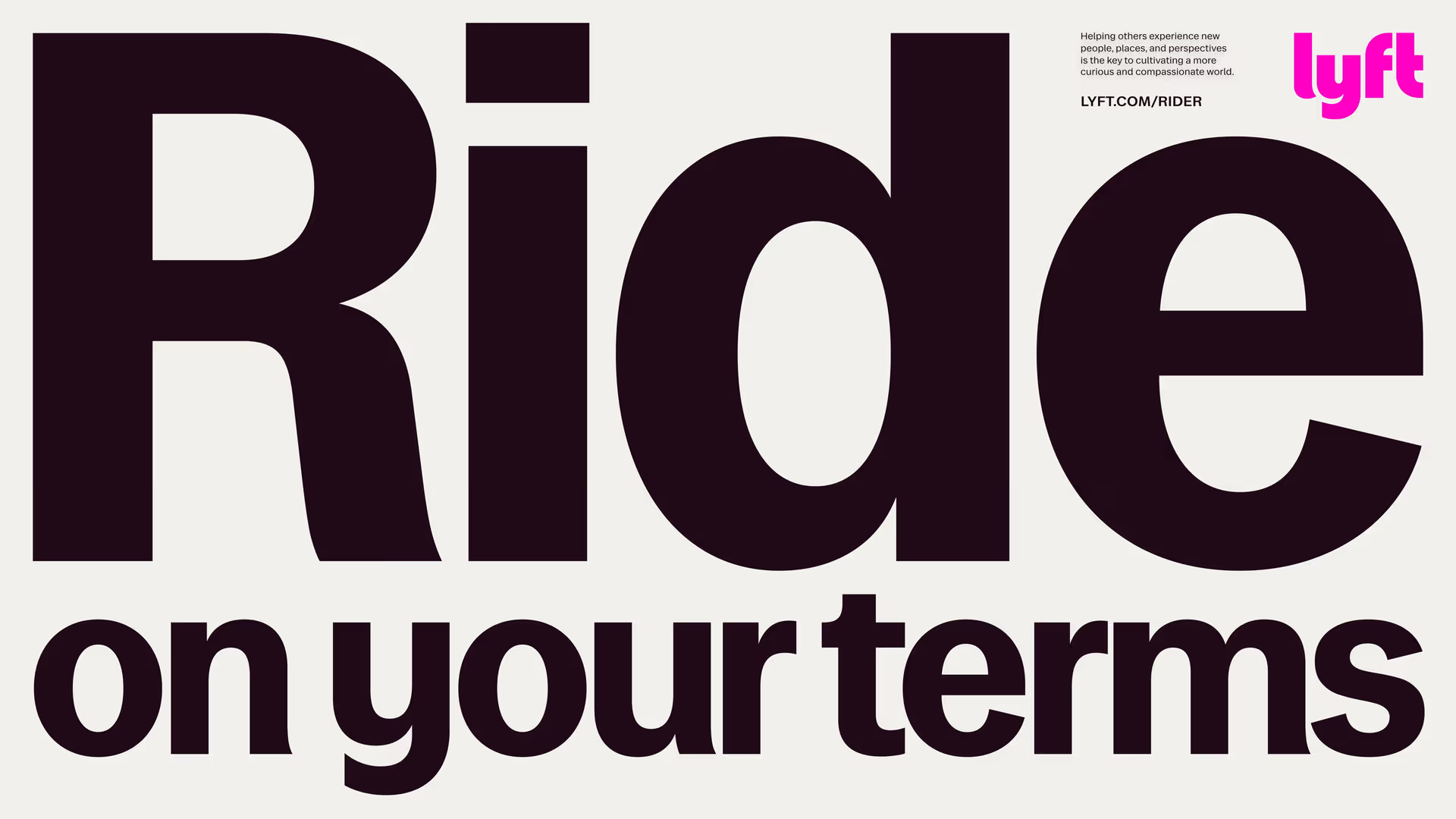
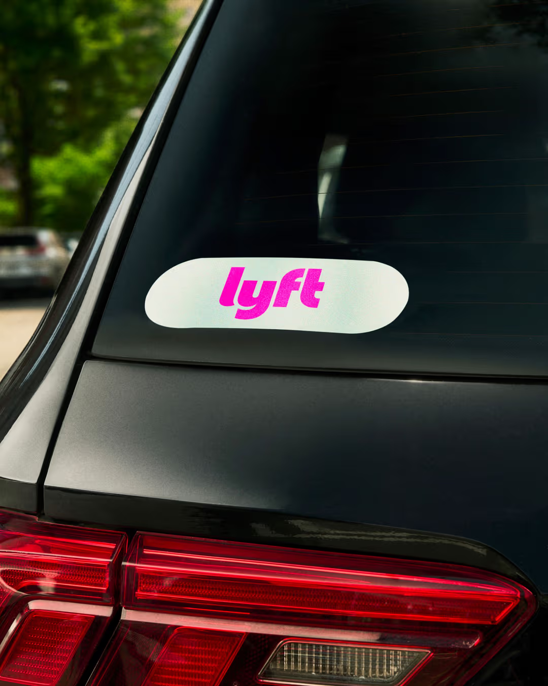
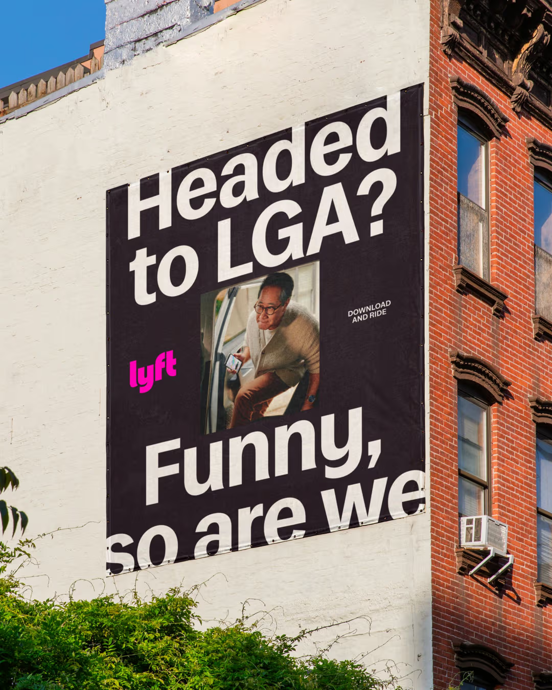
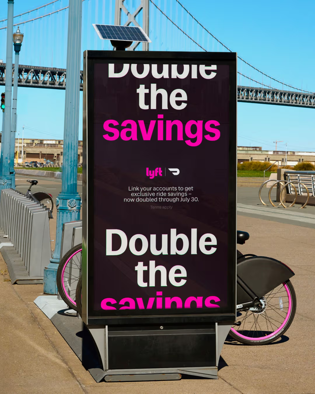
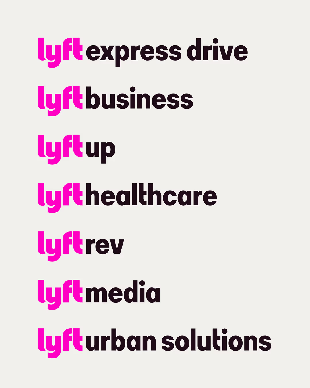
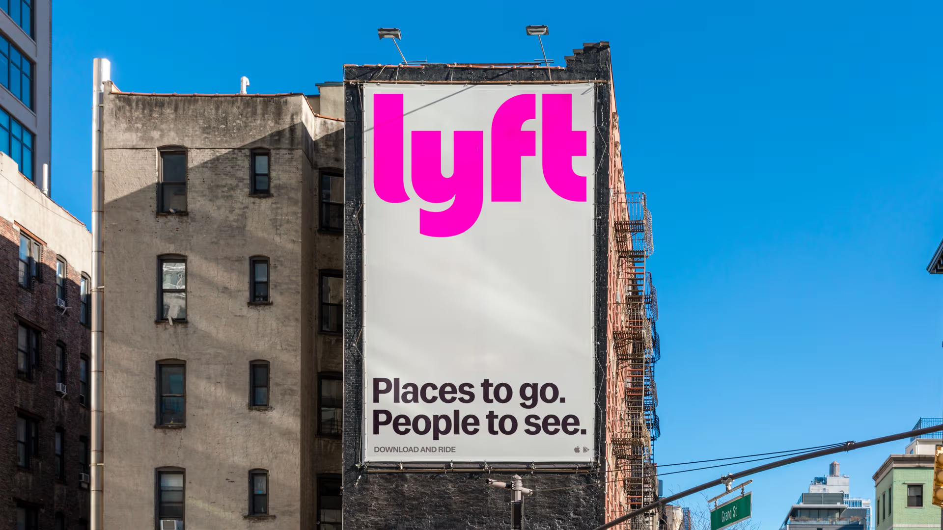
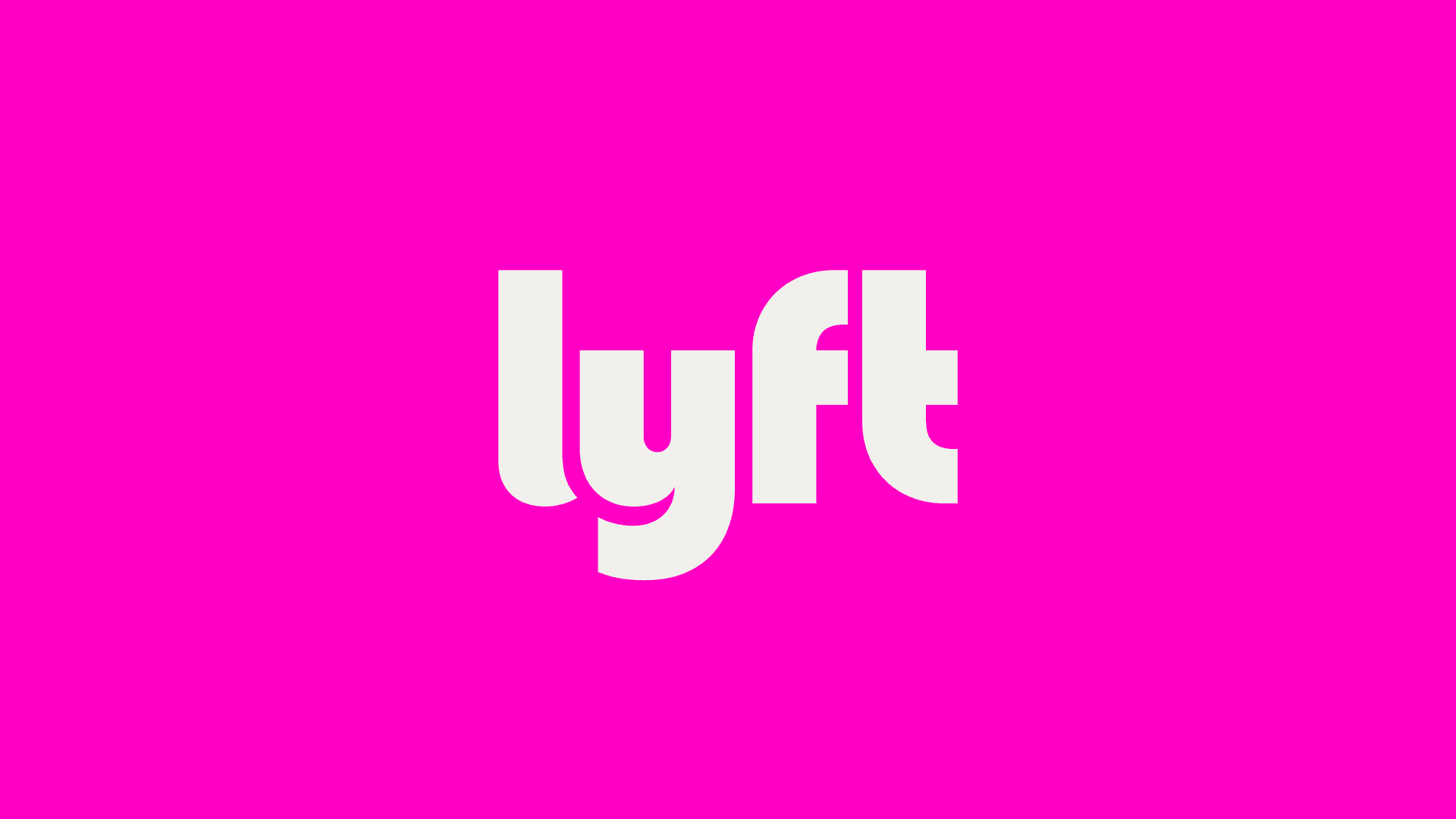
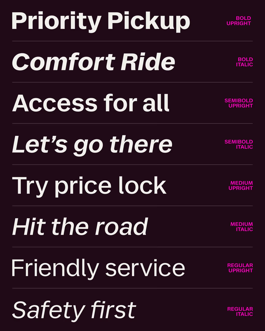
Lyft’s custom typeface is a sans-serif font with moderate contrast, featuring angular terminals and asymmetrically flared strokes. The typeface family comprises three styles: a ‘Logo’ font for Lyft’s sub-brands, a ‘Display’ font for the visual identity, and a ‘Text’ font for small sizes and body text. All typefaces are available in two axis: weight (from Regular to Bold) and style (Roman and Italic). To enhance their visual impact, the Logo typeface incorporates the geometric ‘f’ and ‘t’ letters from the original Lyft logo. On the other hand, the Text version features certain dynamic details inspired by the Display style, such as the terminals of the letters ‘a’, ‘d’ and ‘q’, whilst offering solid legibility thanks to a distinctive ‘l’. This wide range of designs allows the custom font to integrate seamlessly into all applications, from app screens to outdoor advertising campaigns.

Custom Typeface
Year: 2025
Client: Lyft
Agency: Koto
Team: NaN (Luke Prowse, Jean-Baptiste Morizot, Léon Hugues, Fadhl Haqq, Jolana Sýkorová, Fanny Hamelin), Koto